-
Notifications
You must be signed in to change notification settings - Fork 0
/
index.Rmd
84 lines (63 loc) · 2.22 KB
/
index.Rmd
1
2
3
4
5
6
7
8
9
10
11
12
13
14
15
16
17
18
19
20
21
22
23
24
25
26
27
28
29
30
31
32
33
34
35
36
37
38
39
40
41
42
43
44
45
46
47
48
49
50
51
52
53
54
55
56
57
58
59
60
61
62
63
64
65
66
67
68
69
70
71
72
73
74
75
76
77
78
79
80
81
82
83
84
---
title: "Towards a unified approach R and Python"
author: "Nils Indreiten"
output:
html_document:
theme:
yeti
code_folding: show
---
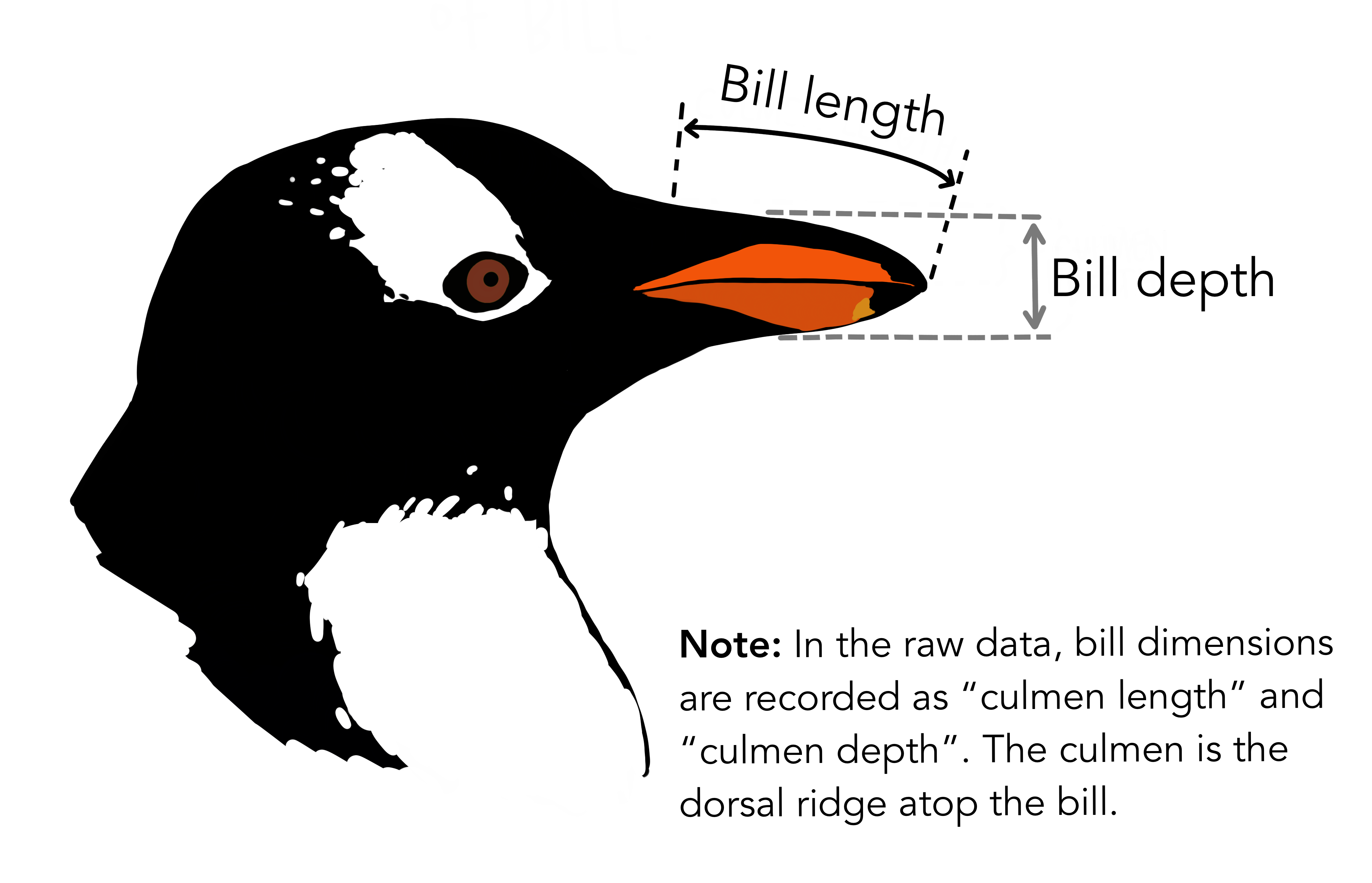
{width="523"}
```{r setup, include = FALSE}
library(tidyverse)
library(palmerpenguins)
library(reticulate)
penguin_df <- penguins
options(reticulate.repl.quiet = TRUE)
```
The code for this `python` example, has been adapted from an article by [Ekta Sharma](https://towardsdatascience.com/plotly-pandas-for-the-palmer-penguins-f5cdab3c16c8) on the Palmer Penguins dataset.
```{python}
import pandas as pd
import os
# add the R df into Python
penguins_df = r.penguin_df
```
### Lets explore the data
Lets take a quick look at the data using `describe()`, this will give us an indication of the variables and their respective
values:
```{python}
penguins_df[["species", "sex", "body_mass_g", "flipper_length_mm", "bill_length_mm"]].dropna().describe(include='all')
```
------------------------------------------------------------------------
### Deeper Dive
Lets take a closer look into the data.
Grouping the penguins according to species demonstrates a particular relationship between weight an flipper length, where Adelie female penguins appear
to be the lightest and have the shortest flippers.
```{python, warning = FALSE, message = FALSE}
(penguins_df
.dropna()
.groupby(["species", "sex"])
.agg({"body_mass_g": "mean", "flipper_length_mm": "mean", "sex": "count"})
.sort_index()
)
```
It seems that the _Gentoo_ is the largest penguin species. We can also
take a closer look at their distribution along with the overall
distribution:
```{python}
larger = penguins_df[penguins_df.species=="Gentoo"].dropna()
larger
```
### Plot Section
Let's move on to some plots,this time using ggplot for visualising the
overall distribution of body mass for the Gentoo species:
```{r}
penguin_plot <- py$larger %>%
filter(!is.na(sex)) %>%
ggplot(aes(body_mass_g, fill = sex)) +
geom_density(color = "white", alpha = 0.5) +
scale_fill_manual(values = c("darkorange","purple")) +
labs(x = "Body Mass (g)")+
theme_minimal()
penguin_plot
```