LiveSelect supports 3 styling modes:
tailwind: uses standard tailwind utility classes (the default)daisyui: uses daisyUI classes.none: no styling at all.
The choice of style is controlled by the style option in live_select/1.
tailwind and daisyui styles come with sensible defaults which can be extended or overridden via options.
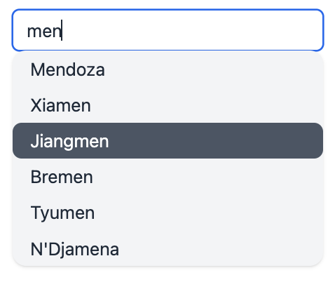
This is what each default style looks like:
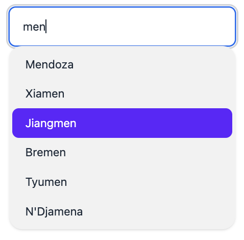
(the actual colors may differ depending on the selected daisyui theme)
These defaults can be selectively overridden or extended using the appropriate options to live_select/1.
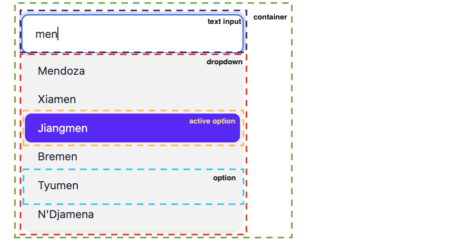
You can control the style of the following elements:
- The outer container of the live_select component
- The text input field
- The text input field when an option has been selected
- The dropdown that contains the selectable options
- The single selectable option(s)
- The currently active option
- The clear button for the selection (if
allow_clearis set)
Here's a visual representation of the elements:
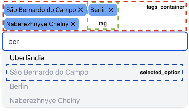
In tags mode there are 4 additional stylable elements:
- The tag showing the selected options
- The tags_container that contains the tags
- The selected_option. This is an option in the dropdown that has already been selected. It's still visible, but can't be selected again
- The available_option. This is an option in the dropdown that has not been selected and is available for selection
- The clear buttons to remove the tags
For each of these elements there is an {element}_class and for some also an {element}_extra_class option, which can
be used
to override or extend the default CSS classes for the element, respectively. These options accept both strings and lists of strings.
You can't use both options together:
use {element}_class
to completely override the default classes, or use {element}_extra_class to extend the default.
The following table shows the default styles for each element and the options you can use to adjust its CSS classes.
| Element | Default daisyui classes | Default tailwind classes | Class override option | Class extend option |
|---|---|---|---|---|
| active_option | active | bg-gray-600 text-white | active_option_class | |
| available_option | cursor-pointer | cursor-pointer hover:bg-gray-400 rounded | available_option_class | |
| clear_button | cursor-pointer hidden | cursor-pointer hidden | clear_button_class | clear_button_extra_class |
| clear_tag_button | cursor-pointer | cursor-pointer | clear_tag_button_class | clear_tag_button_extra_class |
| container | dropdown dropdown-open | h-full relative text-black | container_class | container_extra_class |
| dropdown | bg-base-200 dropdown-content menu menu-compact p-1 rounded-box shadow w-full z-[1] | absolute bg-gray-100 inset-x-0 rounded-md shadow top-full z-50 | dropdown_class | dropdown_extra_class |
| option | px-4 py-1 rounded | option_class | option_extra_class | |
| selected_option | disabled | text-gray-400 | selected_option_class | |
| tag | badge badge-primary p-1.5 text-sm | bg-blue-400 flex p-1 rounded-lg text-sm | tag_class | tag_extra_class |
| tags_container | flex flex-wrap gap-1 p-1 | flex flex-wrap gap-1 p-1 | tags_container_class | tags_container_extra_class |
| text_input | input input-bordered pr-6 w-full | disabled:bg-gray-100 disabled:placeholder:text-gray-400 disabled:text-gray-400 pr-6 rounded-md w-full | text_input_class | text_input_extra_class |
| text_input_selected | input-primary | border-gray-600 text-gray-600 | text_input_selected_class |
For example, if you want to remove rounded borders from the options, have the active option use white text on a red background, and use green as a background color for tags instead of blue, render live_select/1 like this:
<.live_select
   form={my_form}
   field={my_field}
   id="live_select"
   mode={:tags}
   placeholder="Search for a city"
   active_option_class="text-white bg-red-800"
   option_extra_class="!rounded"
   tag_extra_class="!bg-blue-400 bg-green-200" />
You can remove classes included with the style's defaults by using the !class_name notation in an {element}_extra_class option. For example, if a default style is
rounded-lg px-4, using an extra class option of!rounded-lg text-blackwill result in the following final class being applied to the element:
px-4 text-black