Skip to content
New issue

Have a question about this project? Sign up for a free GitHub account to open an issue and contact its maintainers and the community.

By clicking “Sign up for GitHub”, you agree to our terms of service and privacy statement. We’ll occasionally send you account related emails.

Already on GitHub? Sign in to your account

Molecule -> buttons #2789

Closed
justinscherer opened this issue Apr 18, 2018 · 9 comments
Closed

Molecule -> buttons #2789

justinscherer opened this issue Apr 18, 2018 · 9 comments
Assignees
Milestone

Comments

@justinscherer
Copy link

justinscherer commented Apr 18, 2018

Analysis

Our current buttons are:

  • numerous. We have way too many button styles
  • Inaccessible because they constantly use allcaps to demonstrate tappability. Allcaps are harder to read.
  • Heavily use drop shadows to bump up contrast and show clicked states
  • Lot’s of muddy grey on greys
  • We have no link button style

Solution

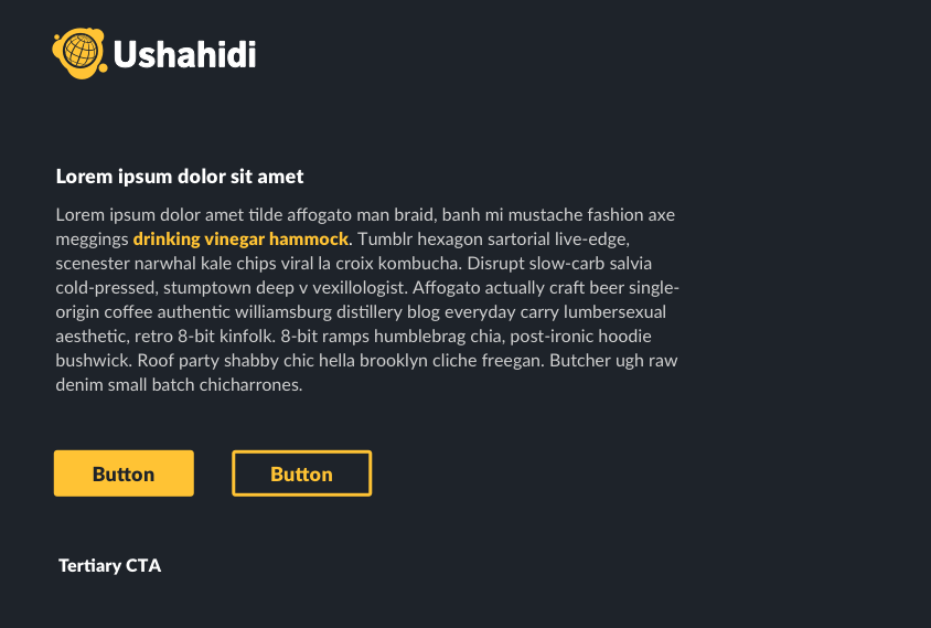
Some example treatments with our type and branding.

New styles on white
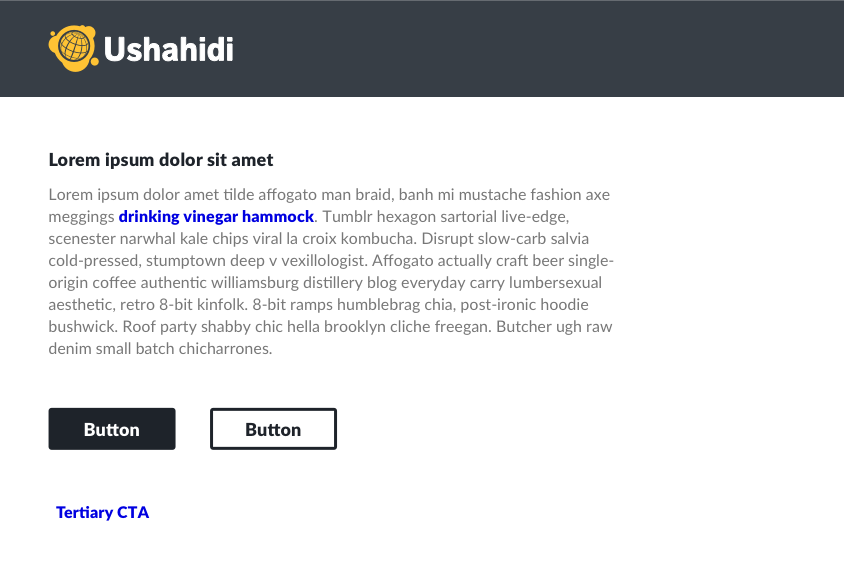
new styles on white blue buttons.png

New styles on black
new styles on black copy.png

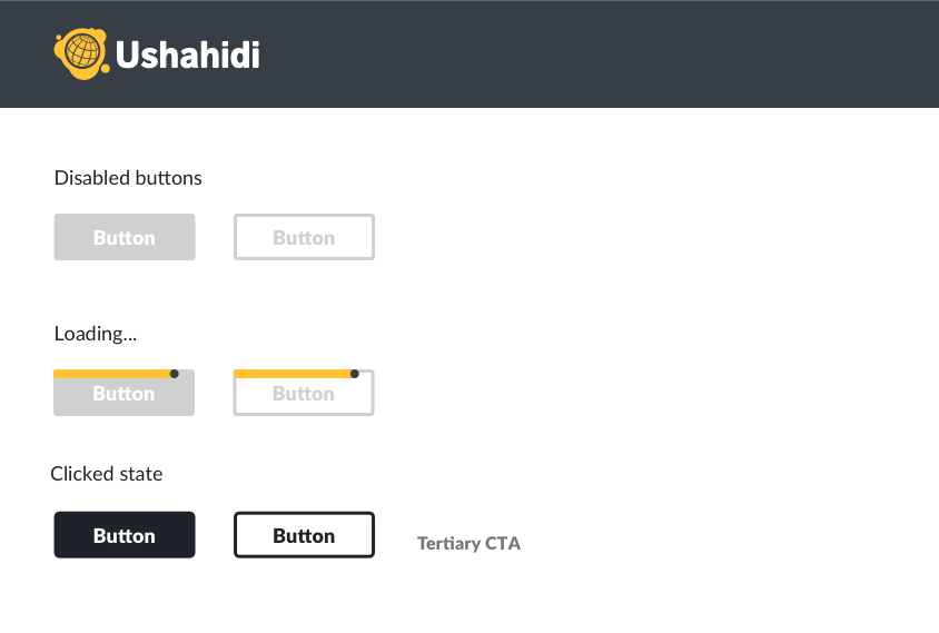
New styles on white with alt states
new styles on white with alts.png

Rationale

Limit buttons to 3 button types:

  1. solid button (primary action)
  2. hollow button (secondary action)
  3. link button (tertiary action)
    This forces us to be more selective with our calls to action on complex pages but still gives us plenty of flexibility with colour variation.
  • the buttons get rid of the allcaps in favour of our "tappable" type style from #148 i.e. Lato Black with 0.2px letter-spacing
  • Properly contrasting colours replace drop shadows
  • clicked styles nudge in the corner radius of the button from 3 -> 5. Very subtle.
  • Disabled buttons are #D0D0D0 which is our generally disabled colour.
  • buttons can have determinate loaders instead of our current treatment with the bouncing balls inside buttons.
  • sizing of buttons follows our new sizing rules
  • Colours may vary depending on context, but should follow our colour rules
@Erioldoesdesign
Copy link

Erioldoesdesign commented Jun 22, 2018

Testing in Chrome Version 67.0.3396.87

FE QA notes:

  • Looks like our 'Gamma' button's clicked colour state on a white background should actually be grey #777777 (it's currently in the PL as a darker shade of blue #1c1284 which also isn't in our colour palette)
    Screen Shot 2018-06-22 at 14.55.07.png
    Screen Shot 2018-06-22 at 14.55.07.png)

  • Gamma button gets a border on it when 'active' or 'focus'. Shouldn't get this border (tis a bug)
    Screen Shot 2018-06-22 at 14.49.21.png

  • Loading buttons should have the bar at the very top on the button and travels/animates over the top of the top border (this may be quite hard to achieve?):
    Current PL:
    Screen Shot 2018-06-22 at 14.55.38.png

Designs:
Screen Shot 2018-06-22 at 14.55.50.png

I love the new button that has a label and then the label disappears on smaller screen to show just an icon button!

I raised this in another ticket but we still have allcaps/uppercase across everything but this should be sentence case. Will make sure I mention this in the typography ticket too.

@sethburtonhall
Copy link

sethburtonhall commented Jun 26, 2018

@Erioldoesdesign I have made these changes and moved the issue back into QA pipeline.

ushahidi/platform-pattern-library@45d2d7d

@justinscherer
Copy link
Author

Double-checking this and moving back to FED:

for text inside buttons letter-spacing: 1px;should be letter-spacing: 0.2px;

border-radius on buttons should be 3px not 5px. 5px is a clicked state only.

all buttons change colour and become invisible after being clicked. e.g.

Screen Shot 2018-06-28 at 10.05.37 AM.pngScreen Shot 2018-06-28 at 10.05.54 AM.png

Can we figure out a way to keep the border radius in the top left corner during the loading state?
Screen Shot 2018-06-28 at 10.07.54 AM.png

@justinscherer justinscherer removed Needs: feedback waiting for feedback from either a team member, client, or user UX/UI debt labels Jun 28, 2018
@justinscherer
Copy link
Author

justinscherer commented Jun 28, 2018

also: left and right padding between the text and the inside edges of all buttons should be 34px

vertical padding between the text and the top/bottom of the button should be 8px

@rowasc rowasc modified the milestones: Cycle 7, Cycle 8 Jul 31, 2018
@sethburtonhall
Copy link

@Erioldoesdesign I moved this from "Ready for Front-End" to "QA for Design" on June 29 but I see you moved it back. I have made all the above changes and don't see any more revisions. Am I missing something or was this an oversight on your part?

@Erioldoesdesign
Copy link

@sethburtonhall Yup looks like I didn't check the 8px & 34px button padding properly but I see it's there now:

Screen Shot 2018-08-07 at 15.21.20.png

Closing this ticket :)

@Erioldoesdesign
Copy link

Trying this out here @all-contributors add @justinscherer for design, ideas, userTesting

@allcontributors
Copy link
Contributor

@Erioldoesdesign

I've put up a pull request to add @justinscherer! 🎉

Sign up for free to join this conversation on GitHub. Already have an account? Sign in to comment
Projects
None yet
Development

No branches or pull requests

6 participants