VisualDL is a visualization tool designed for Deep Learning. VisualDL provides a variety of charts to show the trends of parameters. It enables users to understand the training process and model structures of Deep Learning models more clearly and intuitively so as to optimize models efficiently.
Currently, VisualDL provides seven components: scalar, image, audio, graph, histogram, pr curve, ROC curve and high dimensional. VisualDL iterates rapidly and new functions will be continuously added.
| Component Name | Display Chart | Function |
|---|---|---|
| Scalar | Line Chart | Display scalar data such as loss and accuracy dynamically. |
| Image | Image Visualization | Display images, visualizing the input and the output and making it easy to view the changes in the intermediate process. |
| Audio | Audio Play | Play the audio during the training process, making it easy to monitor the process of speech recognition and text-to-speech. |
| Text | Text Visualization | Visualizes the text output of NLP models within any stage, aiding developers to compare the changes of outputs so as to deeply understand the training process and simply evaluate the performance of the model. |
| Graph | Network Structure | Visualize network structures, node attributes and data flow, assisting developers to learn and to optimize network structures. |
| Histogram | Distribution of Tensors | Present the changes of distributions of tensors, such as weights/gradients/bias, during the training process. |
| PR Curve | Precision & Recall Curve | Display precision-recall curves across training steps, clarifying the tradeoff between precision and recall when comparing models. |
| ROC Curve | Receiver Operating Characteristic curve | Shows the performance of a classification model at all classification thresholds. |
| High Dimensional | Data Dimensionality Reduction | Project high-dimensional data into 2D/3D space for embedding visualization, making it convenient to observe the correlation between data. |
At the same time, VisualDL provides VDL.service , which allows developers to easily save, track and share visualization results of experiments with anyone for free.
The data type of the input is scalar values. Scalar is used to present the training parameters in the form of a line chart. By using Scalar to record loss and accuracy, developers are able to track the trend of changes easily through line charts.
The interface of the Scalar is shown as follows:
add_scalar(tag, value, step, walltime=None)The interface parameters are described as follows:
| parameter | format | meaning |
|---|---|---|
| tag | string | Record the name of the scalar data,e.g.train/loss. Notice that the name cannot contain % |
| value | float | Record the data |
| step | int | Record the training steps |
| walltime | int | Record the time-stamp of the data, the default is the current time-stamp |
*Note that the rules of specifying tags (e.g.train/acc) are:
- The tag before the first
/is the parent tag and serves as the tag of the same raw - The tag after the first
/is a child tag, the charts with child tag will be displayed under the parent tag - Users can use multiple
/, but the tag of a raw is the parent tag--the tag before the first/
Here are three examples:
- When 'train' is created as the parent tag and 'acc' and 'loss' are created as child tags:
train/acc、train/loss,the tag of a raw is 'train' , which includes two sub charts--'acc' and 'loss':

- When 'train' is created as the parent tag, and 'test/acc' and 'test/loss' are created as child tags:
train/test/acc、train/test/loss, the tag of a raw is 'train', which includes two sub charts--'test/acc' and 'test/loss':

- When two parent tags are created:
acc、loss, two rows of charts are named as 'acc' and 'loss' respectively.

- Fundamental Methods
The following shows an example of using Scalar to record data, and the script can be found in Scalar Demo
from visualdl import LogWriter

if __name__ == '__main__':
    value = [i/1000.0 for i in range(1000)]
    # initialize a recorder
    with LogWriter(logdir="./log/scalar_test/train") as writer:
        for step in range(1000):
            # add accuracy with tag of 'acc' to the recorder
            writer.add_scalar(tag="acc", step=step, value=value[step])
            # add loss with tag of 'loss' to the recorder
            writer.add_scalar(tag="loss", step=step, value=1/(value[step] + 1))
After running the above program, developers can launch the panel by:
visualdl --logdir ./log --port 8080Then, open the browser and enter the address: http://127.0.0.1:8080to view line charts:

- Advanced Usage--Comparison of Multiple Experiments
The following shows the comparison of multiple sets of experiments using Scalar.
There are two steps to achieve this function:
- Create sub-log files to store the parameter data of each group of experiments
- When recording data to the scalar component,developers can compare the same type of parameters for different experiments by using the same tag
from visualdl import LogWriter

if __name__ == '__main__':
    value = [i/1000.0 for i in range(1000)]
    # Step 1: Create a parent folder: log and a child folder: scalar_test
    with LogWriter(logdir="./log/scalar_test") as writer:
        for step in range(1000):
            # Step 2: Add data with tag train/acc to the recorder
            writer.add_scalar(tag="train/acc", step=step, value=value[step])
            # Step 2: Add data with tag train/loss to the recorder
            writer.add_scalar(tag="train/loss", step=step, value=1/(value[step] + 1))
    # Step 1: Create a second child folder: scalar_test2
    value = [i/500.0 for i in range(1000)]
    with LogWriter(logdir="./log/scalar_test2") as writer:
        for step in range(1000):
            # Step 2: Add the accuracy data of scalar_test2 under the same name `train/acc`
            writer.add_scalar(tag="train/acc", step=step, value=value[step])
            # Step 2: Add the loss data of scalar_test2 under the same name as `train/loss`
            writer.add_scalar(tag="train/loss", step=step, value=1/(value[step] + 1))
After running the above program, developers can launch the panel by:
visualdl --logdir ./log --port 8080Then, open the browser and enter the address: http://127.0.0.1:8080 to view line charts:

- Developers are allowed to zoom in, restore, transform of the coordinate axis (y-axis logarithmic coordinates), download the line chart.
- Details can be shown by hovering on specific data points.

- Developers can find target scalar charts by searching corresponded tags.

- Specific runs can be selected by searching for the corresponded experiment tags.

- Display the global extrema


- Only display smoothed data


- There are three measurement scales of X axis
- Step: number of iterations
- Walltime: absolute training time
- Relative: training time

- The smoothness of the curve can be adjusted to better show the change of the overall trend.

The Image is used to present the change of image data during training. Developers can view images in different training stages by adding few lines of codes to record images in a log file.
The interface of the Image is shown as follows:
add_image(tag, img, step, walltime=None, dataformats="HWC")The interface parameters are described as follows:
| parameter | format | meaning |
|---|---|---|
| tag | string | Record the name of the image data,e.g.train/loss. Notice that the name cannot contain % |
| img | numpy.ndarray | Images in ndarray format |
| step | int | Record the training steps |
| walltime | int | Record the time-stamp of the data, the default is the current time-stamp |
| dataformats | string | Format of image,include NCHW、HWC、HW,default is HWC |
The following shows an example of using Image to record data, and the script can be found in Image Demo.
import numpy as np
from PIL import Image
from visualdl import LogWriter


def random_crop(img):
    """get random 100x100 slices of image
    """
    img = Image.open(img)
    w, h = img.size
    random_w = np.random.randint(0, w - 100)
    random_h = np.random.randint(0, h - 100)
    r = img.crop((random_w, random_h, random_w + 100, random_h + 100))
    return np.asarray(r)


if __name__ == '__main__':
    # initialize a recorder
    with LogWriter(logdir="./log/image_test/train") as writer:
        for step in range(6):
            # add image data
            writer.add_image(tag="eye",
                             img=random_crop("../../docs/images/eye.jpg"),
                             step=step)
After running the above program, developers can launch the panel by:
visualdl --logdir ./log --port 8080Then, open the browser and enter the address: http://127.0.0.1:8080to view:

- Developers can find target images by searching corresponded tags.

- Developers are allowed to view image data under different iterations by scrolling the Step/iteration slider.

Audio aims to allow developers to listen to the audio in real-time during the training process, helping developers to monitor the process of speech recognition and text-to-speech.
The interface of the Image is shown as follows:
add_audio(tag, audio_array, step, sample_rate)The interface parameters are described as follows:
| parameter | format | meaning |
|---|---|---|
| tag | string | Record the name of the audio,e.g.audoi/sample. Notice that the name cannot contain % |
| audio_arry | numpy.ndarray | Audio in ndarray format |
| step | int | Record the training steps |
| sample_rate | int | Sample rate,Please note that the rate should be the rate of the original audio |
The following shows an example of using Audio to record data, and the script can be found in Audio Demo.
from visualdl import LogWriter
from scipy.io import wavfile


if __name__ == '__main__':
    with LogWriter(logdir="./log/audio_test/train") as writer:
        sample_rate, audio_data = wavfile.read('./test.wav')
        writer.add_audio(tag="audio_tag",
                         audio_array=audio_data,
                         step=0,
                         sample_rate=sample_rate)
After running the above program, developers can launch the panel by:
visualdl --logdir ./log --port 8080Then, open the browser and enter the address: http://127.0.0.1:8080to view:

- Developers can find the target audio by searching corresponded tags.

- Developers are allowed to listen to the audio under different iterations by scrolling the Step/iteration slider.

- Play/Pause the audio

- Adjust the volume

- Download the audio

visualizes the text output of NLP models within any stage, aiding developers to compare the changes of outputs so as to deeply understand the training process and simply evaluate the performance of the model.
The interface of the Text is shown as follows:
add_text(self, tag, text_string, step=None, walltime=None)The interface parameters are described as follows:
| parameter | format | meaning |
|---|---|---|
| tag | string | Record the name of the text data,e.g.train/loss. Notice that the name cannot contain % |
| text_string | string | Value of text |
| step | int | Record the training steps |
| walltime | int | Record the time-stamp of the data, and the default is the current time-stamp |
The following shows an example of how to use Text component, and script can be found in Text Demo
from visualdl import LogWriter
if __name__ == '__main__':
    texts = [
        '上联: 众 佛 群 灵 光 圣 地	下联: 众 生 一 念 证 菩 提',
        '上联: 乡 愁 何 处 解	下联: 故 事 几 时 休',
        '上联: 清 池 荷 试 墨	下联: 碧 水 柳 含 情',
        '上联: 既 近 浅 流 安 笔 砚	下联: 欲 将 直 气 定 乾 坤',
        '上联: 日 丽 萱 闱 祝 无 量 寿	下联: 月 明 桂 殿 祝 有 余 龄',
        '上联: 一 地 残 红 风 拾 起	下联: 半 窗 疏 影 月 窥 来'
    ]
    with LogWriter(logdir="./log/text_test/train") as writer:
        for step in range(len(texts)):
            writer.add_text(tag="output", step=step, text_string=texts[step])
After running the above program, developers can launch the panel by:
visualdl --logdir ./log --port 8080Then, open the browser and enter the addresshttp://127.0.0.1:8080 to view:

-
Developers can find the target text by searching corresponded tags.

-
Developers can find the target runs by searching corresponded tags.

-
Developers can fold the tab of text.

Graph can visualize the network structure of the model by one click. It enables developers to view the model attributes, node information, searching node and so on. These functions help developers analyze model structures and understand the directions of data flow quickly.
There are two methods to launch this component:
-
By the front end:
- If developers only need to use Graph, developers can launch VisualDL (Graph) by executing
visualdlon the command line. - If developers need to use Graph and other functions at the same time, they need to specify the log file path (using
./logas an example):
visualdl --logdir ./log --port 8080
- If developers only need to use Graph, developers can launch VisualDL (Graph) by executing
-
By the backend:
- Add the parameter
--modeland specify the model file path (not the folder path) to launch the panel:
visualdl --model ./log/model --port 8080
- Add the parameter
After the launch, developers can view the network structure:

- Upload the model file by one-click
- Supported model:PaddlePaddle、ONNX、Keras、Core ML、Caffe、Caffe2、Darknet、MXNet、ncnn、TensorFlow Lite
- Experimental supported model:TorchScript、PyTorch、Torch、 ArmNN、BigDL、Chainer、CNTK、Deeplearning4j、MediaPipe、ML.NET、MNN、OpenVINO、Scikit-learn、Tengine、TensorFlow.js、TensorFlow

- Developers are allowed to drag the model up and down,left and right,zoom in and zoom out.

- Search to locate the specific node

- Click to view the model properties

- Display the model information by selecting corresponded attributes

- Files can be ex as PNG or SVG format

- Click nodes to view attribute information

- Switch the model by one-click

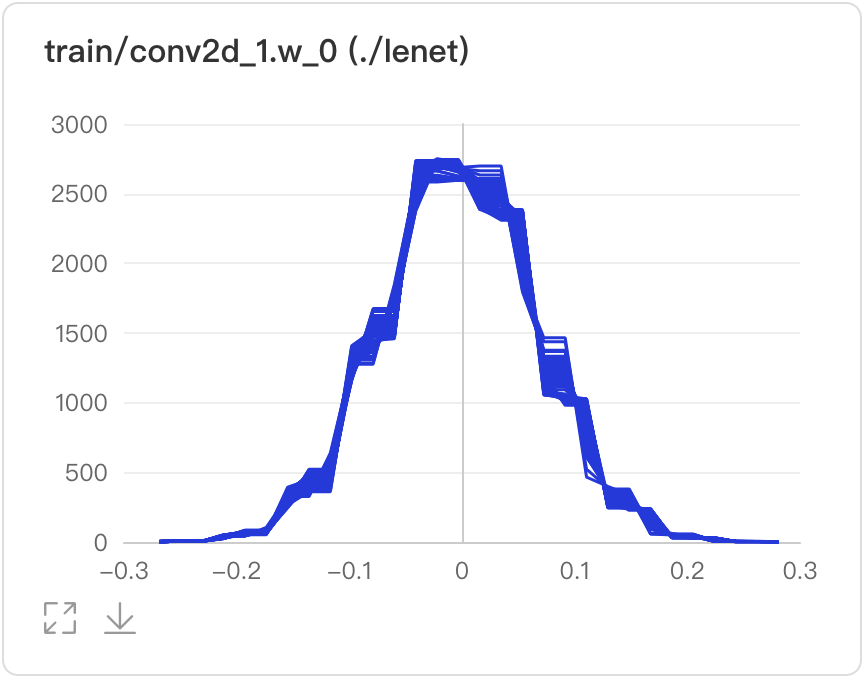
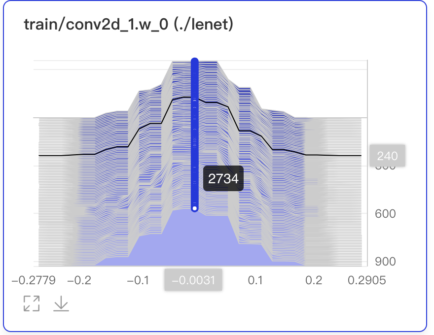
Histogram displays how the trend of tensors (weight, bias, gradient, etc.) changes during the training process in the form of histogram. Developers can adjust the model structures accurately by having an in-depth understanding of the effect of each layer.
The interface of the Histogram is shown as follows:
add_histogram(tag, values, step, walltime=None, buckets=10)The interface parameters are described as follows:
| parameter | format | meaning |
|---|---|---|
| tag | string | Record the name of the image data,e.g.train/loss. Notice that the name cannot contain % |
| values | numpy.ndarray or list | Data is in ndarray or list format |
| step | int | Record the training steps |
| walltime | int | Record the time-stamp of the data, and the default is the current time-stamp |
| buckets | int | The number of segments to generate the histogram and the default value is 10 |
The following shows an example of using Histogram to record data, and the script can be found in Histogram Demo
from visualdl import LogWriter
import numpy as np


if __name__ == '__main__':
    values = np.arange(0, 1000)
    with LogWriter(logdir="./log/histogram_test/train") as writer:
        for index in range(1, 101):
            interval_start = 1 + 2 * index / 100.0
            interval_end = 6 - 2 * index / 100.0
            data = np.random.uniform(interval_start, interval_end, size=(10000))
            writer.add_histogram(tag='default tag',
                                 values=data,
                                 step=index,
                                 buckets=10)
After running the above program, developers can launch the panel by:
visualdl --logdir ./log --port 8080Then, open the browser and enter the address: http://127.0.0.1:8080to view the histogram.
-
Developers are allowed to zoom in and download the histogram.
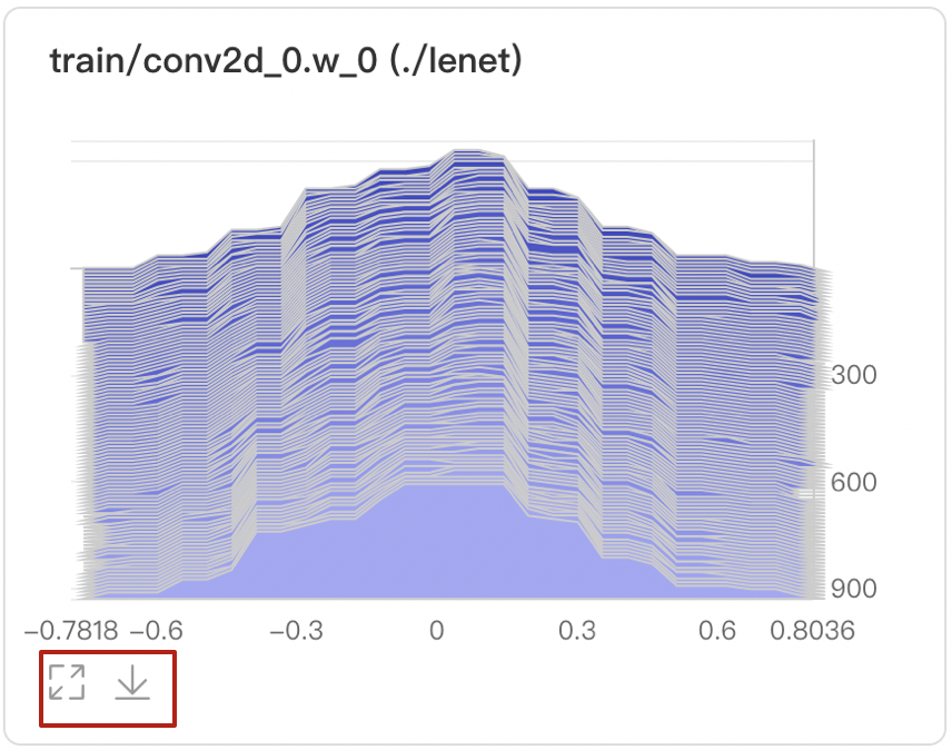
-
Provide two modes: Offset and Overlay.

- Offset mode
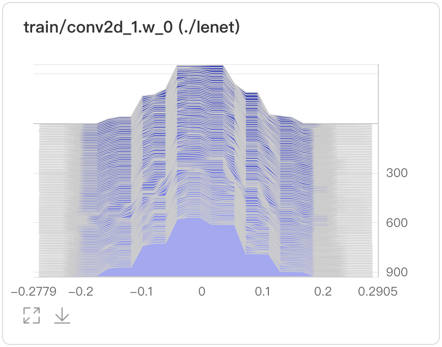
- Overlay mode
-
Display the parameters、training steps and frequency by hovering on specific data points.
- In the 240th training step, the weight is -0.0031and the frequency is 2734
-
Developers can find target histogram by searching corresponded tags.

-
Search tags to show the histograms generated by corresponded experiments.

PR Curve presents precision-recall curves in line charts, describing the tradeoff relationship between precision and recall in order to choose a best threshold.
The interface of the PR Curve is shown as follows:
add_pr_curve(tag, labels, predictions, step=None, num_thresholds=10)The interface parameters are described as follows:
| parameter | format | meaning |
|---|---|---|
| tag | string | Record the name of the image data,e.g.train/loss. Notice that the name cannot contain % |
| values | numpy.ndarray or list | Data is in ndarray or list format |
| predictions | numpy.ndarray or list | Prediction data is in ndarray or list format |
| step | int | Record the training steps |
| num_thresholds | int | Set the number of thresholds, default as 10, maximum as 127 |
| weights | float | Set the weights of TN/FN/TP/FP to calculate precision and recall |
| walltime | int | Record the time-stamp of the data, and the default is the current time-stamp |
The following shows an example of how to use PR Curve component, and script can be found in PR Curve Demo
from visualdl import LogWriter
import numpy as np

with LogWriter("./log/pr_curve_test/train") as writer:
    for step in range(3):
        labels = np.random.randint(2, size=100)
        predictions = np.random.rand(100)
        writer.add_pr_curve(tag='pr_curve',
                            labels=labels,
                            predictions=predictions,
                            step=step,
                            num_thresholds=5)
After running the above program, developers can launch the panel by:
visualdl --logdir ./log --port 8080Then, open the browser and enter the addresshttp://127.0.0.1:8080 to view:

-
Developers can zoom in, restore, and download PR Curves
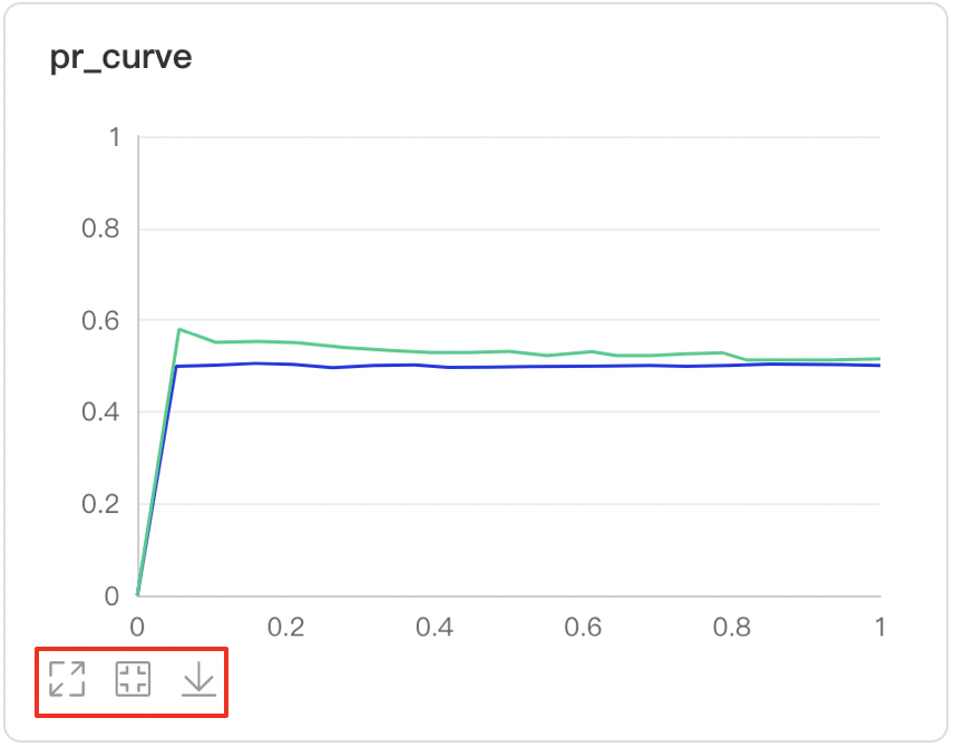
-
Developers hover on the specific data point to learn about the detailed information: TP, TN, FP, FN and the corresponded thresholds

-
The targeted PR Curves can be displayed by searching tags

-
Developers can find specific labels by searching tags or view the all labels

-
Developers is able to observe the changes of PR Curves across training steps

-
There are three measurement scales of X axis
- Step: number of iterations
- Walltime: absolute training time
- Relative: training time

ROC Curve shows the performance of a classification model at all classification thresholds; the larger the area under the curve, the better the model performs, aiding developers to evaluate the model performance and choose an appropriate threshold.
The interface of the PR Curve is shown as follows:
add_roc_curve(tag, labels, predictions, step=None, num_thresholds=10)The interface parameters are described as follows:
| parameter | format | meaning |
|---|---|---|
| tag | string | Record the name of the image data,e.g.train/loss. Notice that the name cannot contain % |
| values | numpy.ndarray or list | Data is in ndarray or list format |
| predictions | numpy.ndarray or list | Prediction data is in ndarray or list format |
| step | int | Record the training steps |
| num_thresholds | int | Set the number of thresholds, default as 10, maximum as 127 |
| weights | float | Set the weights of TN/FN/TP/FP to calculate precision and recall |
| walltime | int | Record the time-stamp of the data, and the default is the current time-stamp |
The following shows an example of how to use ROC curve component, and script can be found in ROC Curve Demo
from visualdl import LogWriter
import numpy as np

with LogWriter("./log/roc_curve_test/train") as writer:
    for step in range(3):
        labels = np.random.randint(2, size=100)
        predictions = np.random.rand(100)
        writer.add_roc_curve(tag='roc_curve',
                             labels=labels,
                             predictions=predictions,
                             step=step,
                             num_thresholds=5)
After running the above program, developers can launch the panel by:
visualdl --logdir ./log --port 8080Then, open the browser and enter the addresshttp://127.0.0.1:8080 to view:
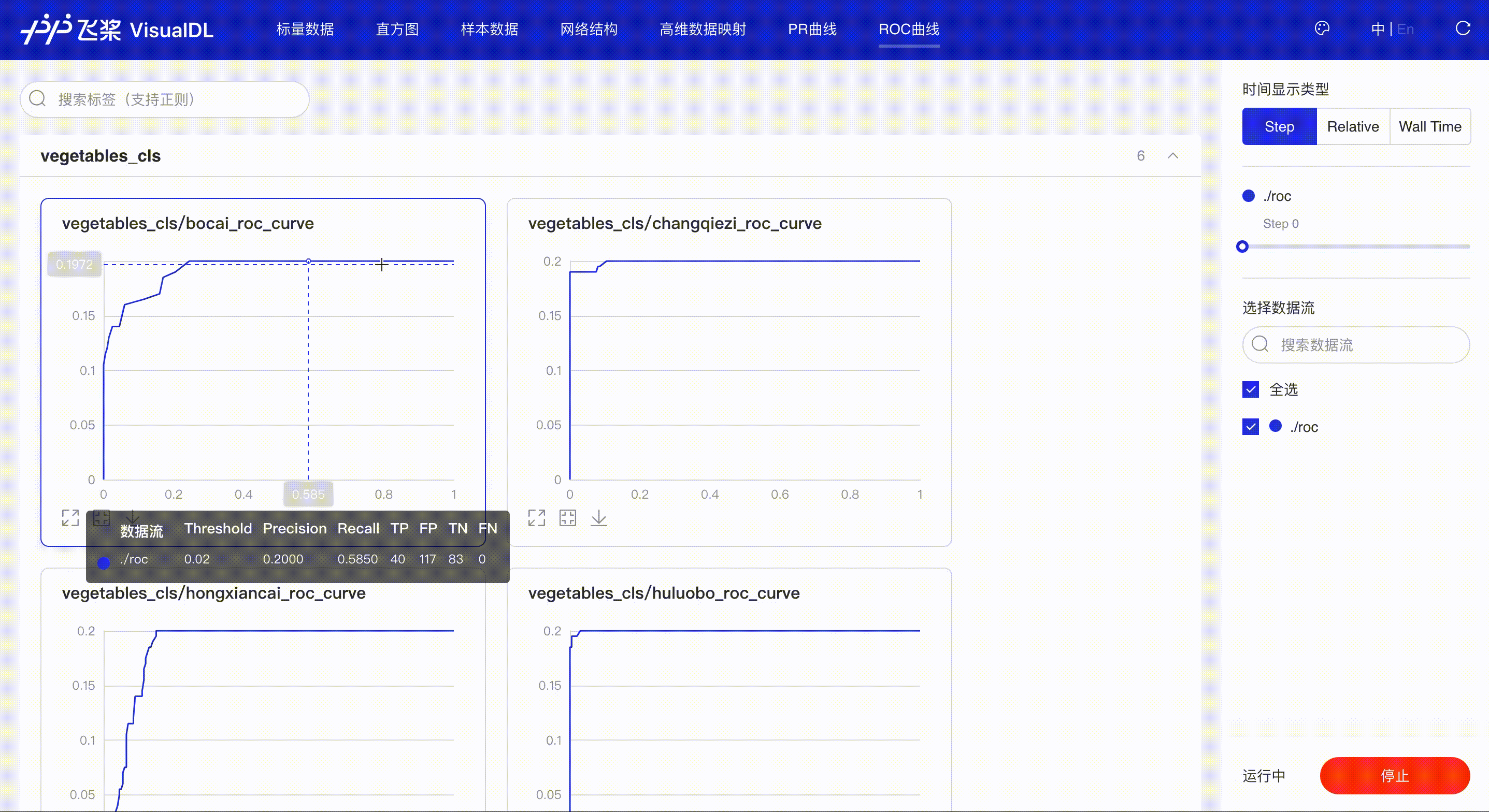
*Note: the use of ROC Curve in the frontend is the same as that of PR Curve, please refer to the instructions in PR Curve section if needed.
High Dimensional projects high-dimensional data into a low dimensional space, aiding users to have an in-depth analysis of the relationship between high-dimensional data. Two dimensionality reduction algorithms are supported:
- PCA : Principle Component Analysis
- t-SNE : t-distributed Stochastic Neighbor Embedding
- umap: Uniform Manifold Approximation and Projection
The interface of the High Dimensional is shown as follows:
add_embeddings(tag, labels, hot_vectors, walltime=None)The interface parameters are described as follows:
| parameter | format | meaning |
|---|---|---|
| tag | string | Record the name of the high dimensional data, e.g.default. Notice that the name cannot contain % |
| labels | numpy.array or list | Labels are represented by one-dimensional array. Each element is string type. |
| hot_vectors | numpy.array or list | Each element can be seen as a feature of the tag corresponding to the label. |
| walltime | int | Record the time stamp of the data, the default is the current time stamp. |
The following shows an example of how to use High Dimensional component, and script can be found in High Dimensional Demo
from visualdl import LogWriter


if __name__ == '__main__':
    hot_vectors = [
        [1.3561076367500755, 1.3116267195134017, 1.6785401875616097],
        [1.1039614644440658, 1.8891609992484688, 1.32030488587171],
        [1.9924524852447711, 1.9358920727142739, 1.2124401279391606],
        [1.4129542689796446, 1.7372166387197474, 1.7317806077076527],
        [1.3913371800587777, 1.4684674577930312, 1.5214136352476377]]

    labels = ["label_1", "label_2", "label_3", "label_4", "label_5"]
    # initialize a recorder
    with LogWriter(logdir="./log/high_dimensional_test/train") as writer:
        # recorde a set of labels and corresponding hot_vectors to the recorder
        writer.add_embeddings(tag='default',
                              labels=labels,
                              hot_vectors=hot_vectors)
After running the above program, developers can launch the panel by:
visualdl --logdir ./log --port 8080Then, open the browser and enter the addresshttp://127.0.0.1:8080 to view:
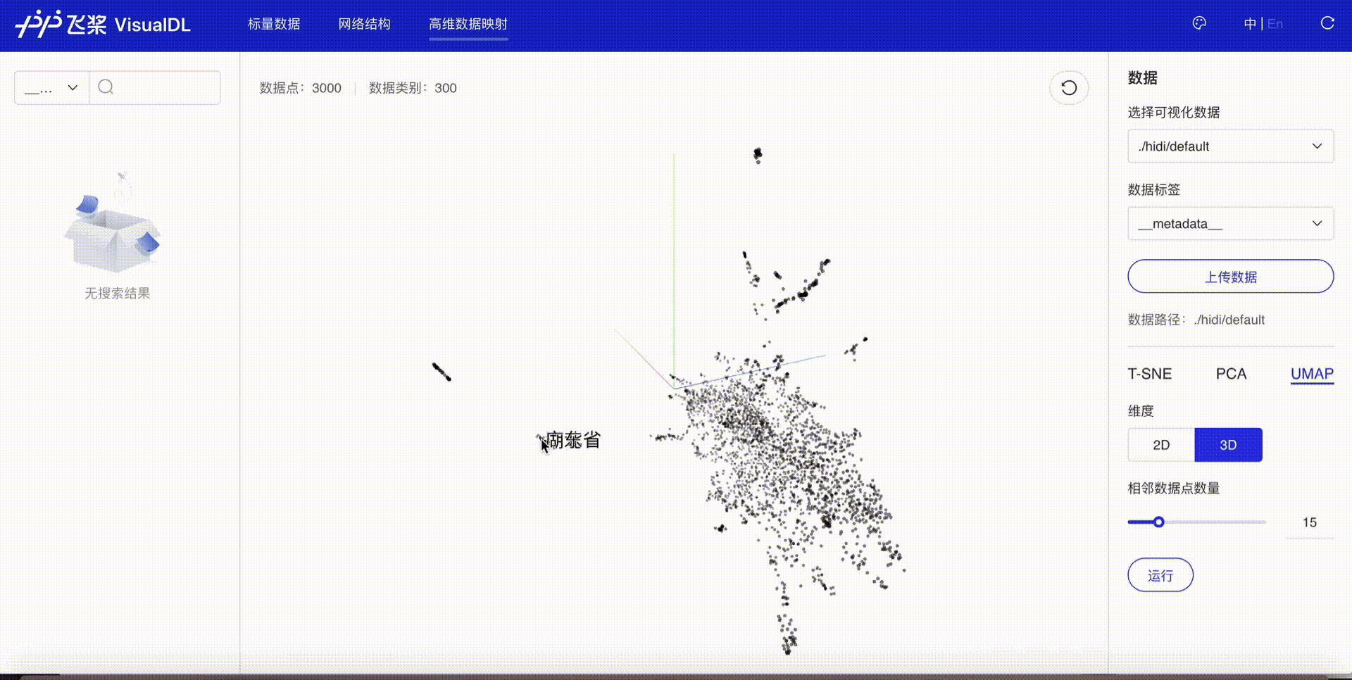
-
Developers are allowed to select specific runs of data or certain labels of data to display

-
TSNE

-
PCA

-
UMAP

VDL.service enables developers to easily save, track and share visualization results with anyone for free.
- Make sure that your get the lastest version of VisualDL, if not, please update by:
pip install visualdl --upgrade
- Upload log/model to save, track and share the visualization results.
visualdl service upload --logdir ./log \
                        --model ./__model__
- An unique URL will be given. Then you can view the visualization results by simply copying and pasting the URL to the browser.

