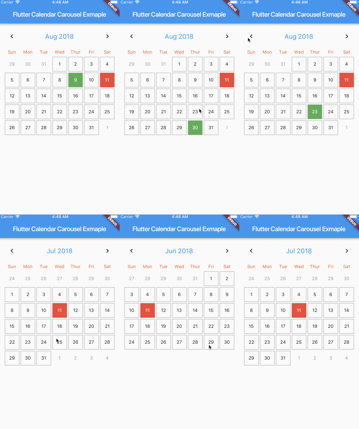
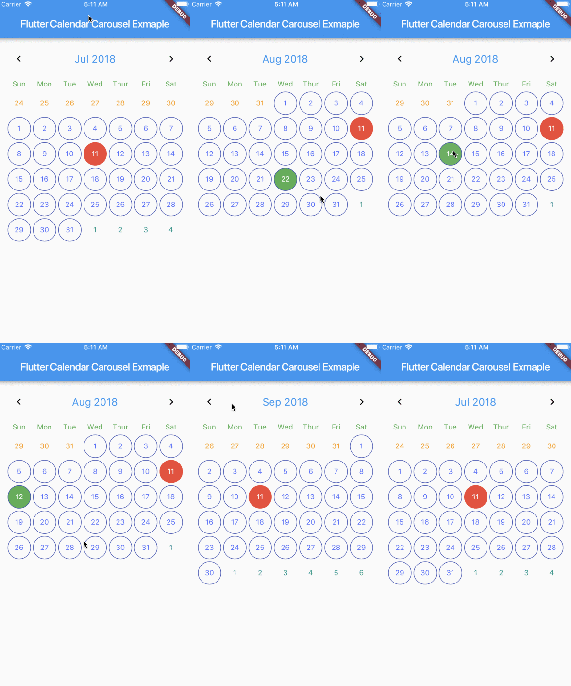
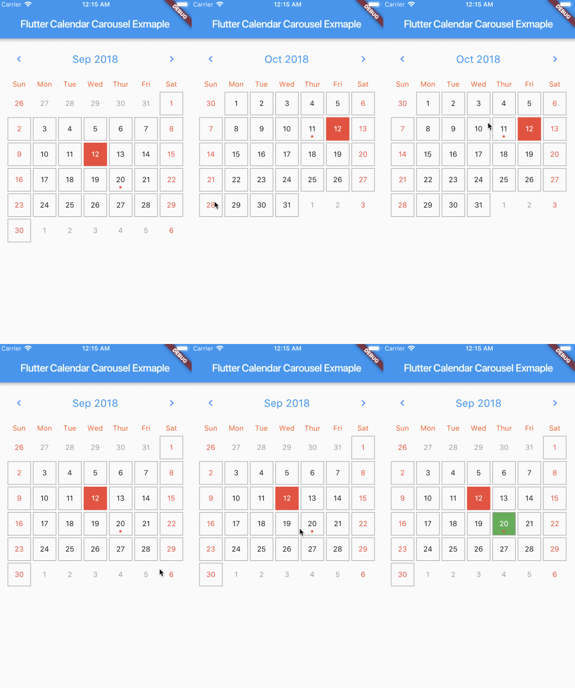
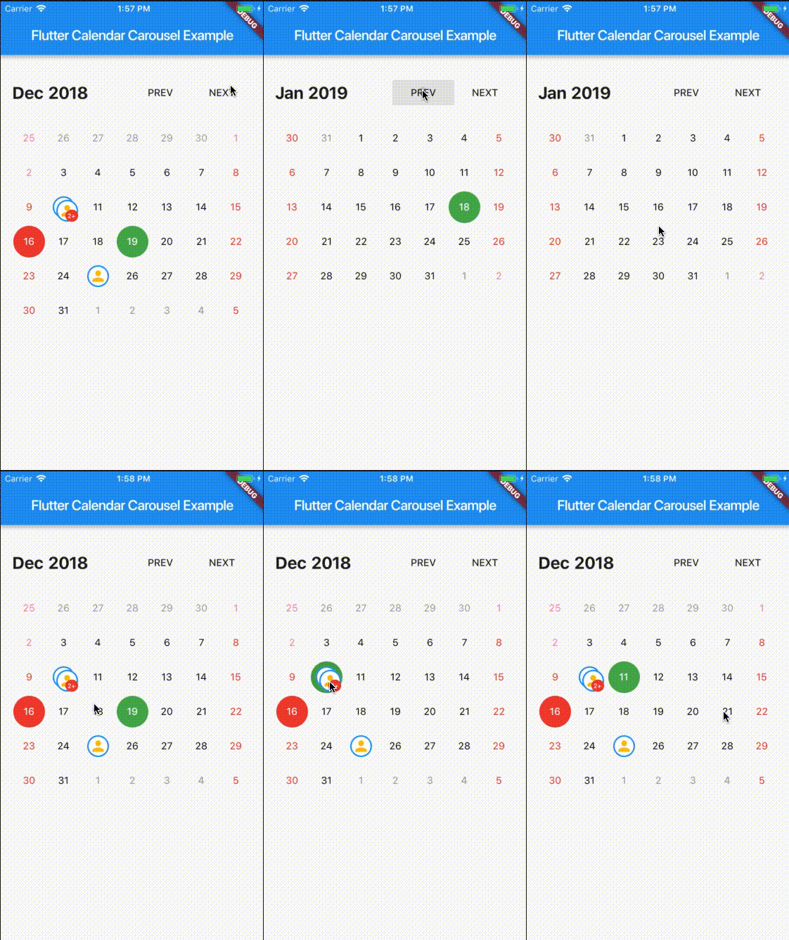
Calendar widget for flutter that is swipeable horizontally. This widget can help you build your own calendar widget highly customizable. Now you can even add your icon for each event.
- Check out great feature
customDayBuilderwork done by maxgmer 🎉.
For help getting started with Flutter, view our online documentation.
| props | types | defaultValues |
|---|---|---|
| viewPortFraction | double |
1.0 |
| prevDaysTextStyle | TextStyle |
|
| daysTextStyle | TextStyle |
|
| nextDaysTextStyle | TextStyle |
|
| prevMonthDayBorderColor | Color |
Colors.transparent |
| thisMonthDayBorderColor | Color |
Colors.transparent |
| nextMonthDayBorderColor | Color |
Colors.transparent |
| dayPadding | double |
2.0 |
| height | double |
double.infinity |
| width | double |
double.infinity |
| todayTextStyle | TextStyle |
fontSize: 14.0, color: Colors.white |
| dayButtonColor | Color |
Colors.red |
| todayBorderColor | Color |
Colors.red |
| todayButtonColor | Colors |
Colors.red |
| selectedDateTime | DateTime |
|
| selectedDayTextStyle | TextStyle |
fontSize: 14.0, color: Colors.white |
| selectedDayBorderColor | Color |
Colors.green |
| selectedDayButtonColor | Color |
Colors.green |
| daysHaveCircularBorder | bool |
|
| onDayPressed | Func |
|
| weekdayTextStyle | TextStyle |
fontSize: 14.0, color: Colors.deepOrange |
| iconColor | Color |
Colors.blueAccent |
| headerTextStyle | TextStyle |
fontSize: 20.0, color: Colors.blue |
| headerText | Text |
Text('${DateFormat.yMMM().format(this._dates[1])}') |
| weekendTextStyle | TextStyle |
fontSize: 14.0, color: Colors.pinkAccent |
| markedDatesMap | Events |
null |
| markedDateWidget | Widget |
Positioned(child: Container(color: Colors.blueAccent, height: 4.0, width: 4.0), bottom: 4.0, left: 18.0); |
| markedDateShowIcon | bool |
false |
| markedDateIconBorderColor | Color |
|
| markedDateIconMaxShown | int |
2 |
| markedDateIconMargin | double |
5.0 |
| markedDateIconBuilder | MarkedDateIconBuilder<T> |
|
| markedDateIconOffset | double |
5.0 |
| markedDateCustomShapeBorder | ShapeBorder |
null |
| markedDateCustomTextStyle | TextStyle |
null |
| markedDateMoreCustomDecoration | Decoration |
|
| markedDateMoreCustomTextStyle | TextStyle |
|
| headerMargin | EdgetInsets |
const EdgeInsets.symmetric(vertical: 16.0) |
| headerTitleTouchable | bool |
false |
| onHeaderTitlePressed | Function |
() => _selectDateFromPicker() |
| showHeader | bool |
|
| showHeaderButton | bool |
|
| childAspectRatio | double |
1.0 |
| weekDayMargin | EdgeInsets |
const EdgeInsets.only(bottom: 4.0) |
| weekFormat | bool |
false |
| locale | String |
en |
| firstDayOfWeek | int |
null |
| onCalendarChanged | Function(DateTime) |
|
| minSelectedDate | DateTime |
|
| maxSelectedDate | DateTime |
|
| inactiveDaysTextStyle | TextStyle |
|
| inactiveWeekendTextStyle | TextStyle |
|
| weekDayFormat | WeekdayFormat |
short |
| staticSixWeekFormat | bool |
false |
| showOnlyCurrentMonthDate | bool |
false |
| dayCrossAxisAlignment | CrossAxisAlignment |
CrossAxisAlignment.center |
| dayMainAxisAlignment | MainAxisAlignment |
CrossAlignment.center |
| showIconBehindDayText | bool |
false |
| pageScrollPhysics | ScrollPhysics |
ScrollPhysics |
With CalendarCarousel<YourEventClass> and EventList<YourEventClass> you can specifiy a custom Event class.
Add flutter_calendar_carousel as a dependency in pubspec.yaml
For help on adding as a dependency, view the documentation.
import 'package:flutter_calendar_carousel/flutter_calendar_carousel.dart' show CalendarCarousel;
Widget widget() {
  return Container(
    margin: EdgeInsets.symmetric(horizontal: 16.0),
    child: CalendarCarousel<Event>(
      onDayPressed: (DateTime date, List<Event> events) {
        this.setState(() => _currentDate = date);
      },
      weekendTextStyle: TextStyle(
        color: Colors.red,
      ),
      thisMonthDayBorderColor: Colors.grey,
//      weekDays: null, /// for pass null when you do not want to render weekDays
//      headerText: Container( /// Example for rendering custom header
//        child: Text('Custom Header'),
//      ),
      customDayBuilder: (   /// you can provide your own build function to make custom day containers
        bool isSelectable,
        int index,
        bool isSelectedDay,
        bool isToday,
        bool isPrevMonthDay,
        TextStyle textStyle,
        bool isNextMonthDay,
        bool isThisMonthDay,
        DateTime day,
      ) {
          /// If you return null, [CalendarCarousel] will build container for current [day] with default function.
          /// This way you can build custom containers for specific days only, leaving rest as default.

          // Example: every 15th of month, we have a flight, we can place an icon in the container like that:
          if (day.day == 15) {
            return Center(
              child: Icon(Icons.local_airport),
            );
          } else {
            return null;
          }
      },
      weekFormat: false,
      markedDatesMap: _markedDateMap,
      height: 420.0,
      selectedDateTime: _currentDate,
      daysHaveCircularBorder: false, /// null for not rendering any border, true for circular border, false for rectangular border
    ),
  );
}- Render weekdays.
- Customizable headerWidget.
- Set weekdays visibility.
- Customizable textStyles for days in weekend.
- Marked Dates.
- Multiple Marked Dates.
- Customizable weekend days.
- Week Calendar.
- Carousel Week Calendar.
- Multiple days selections.
- Widget test.
I've been maintaining quite many repos these days and burning out slowly. If you could help me cheer up, buying me a cup of coffee will make my life really happy and get much energy out of it.


