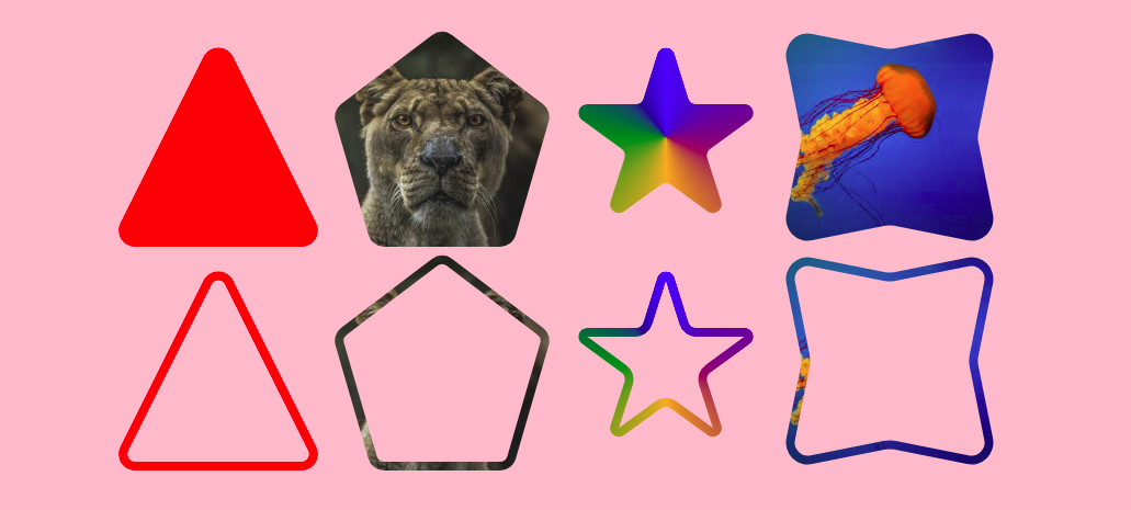
From my article: https://css-tricks.com/exploring-the-css-paint-api-rounding-shapes/
Round the corners of any kind of complex shape. You can also adjust the radius of each corner individually.
First, you include the Paint Worklet:
<script>
if(CSS.paintWorklet) {
  CSS.paintWorklet.addModule('src/rounding-shapes.js');
} else {
  console.log("Your browser doesn't support the Paint API :(");
}
</script>
Then the CSS will look like below:
@property --radius{
  syntax: '<length>';
  inherits: true;
  initial-value: 0;
}
@property --border{
  syntax: '<length>';
  inherits: true;
  initial-value: 0;
}

div {
  --radius: 5px; /* Defines the global radius */
  --border: 6px; /* Defines the border thickness */
  --path: ... ;  /* Define your shape here */

  --t: 0; /* The first type of mask on the main element */
  -webkit-mask: paint(rounding-shapes);
          mask: paint(rounding-shapes);
}

div::before {
  content: "";
  background: ...;
  /* Add the below if you want the border-only version*/
  --t: 1;
  -webkit-mask: paint(rounding-shapes);
          mask: paint(rounding-shapes);
  /**/
}
the --path variable behaves the same way as the path we define inside clip-path: polygon(). Use Clippy to generate one for you. It also accepts a third (optional) value for the radius.
A few use cases where this worklet can be useful
Find all the details in my CSS-tricks article


