React Pincode is a published NPM module that can be integrated inside any ReactJS application. It is used to extract Area, City, District, and State information as soon as the user enters valid Pin-Code. On entering a valid Pin-Code, a GET request is made to the Indian Postal Service API and the useful information is extracted and results are displayed in the respective fields. If an invalid Pincode is entered an error is thrown which can be customized by a user using a specific prop.
The four input fields are wrapped inside an <div> element and each input field is also wrapped inside <div>. So that a user can style it according to the need in the project.
Whenever the wrong Pincode is entered red border appears on the pin code input field and on entering a right pin code, city, district and state input fields get automatically filled with correct data
This will only work for Indian Pincodes.
import Pincode from 'react-pincode';import React, { useState, useEffect } from 'react';
import Pincode from 'react-pincode';
function App() {
const [pincodeData, setPincodeData] = useState('');
return (
<div className="App">
<Pincode
invalidError="Please check pincode"
lengthError="check length"
getData={(data) => setPincodeData(data)}
/>
</div>
);
}Find Codepen Implementation of the module here
- Props for changing CSS properties
| Name | Description |
|---|---|
| Container | Container which wraps all the three Input Field |
| pincodeContainer | Container which wraps pincode Input Field |
| cityContainer | Container which wraps City Input Field |
| districtContainer | Container which wraps District Input Field |
| stateContainer | Container which wraps State Input Field |
| pincodeInput | Props for styling pincode input field |
| cityInput | Props for styling city input field |
| stateInput | Props for styling state input field |
| showArea | Props for displaying Area input (default: true) |
| showState | Props for displaying State input (default: true) |
| showDistrict | Props for displaying District input (default: true) |
| showCity | Props for displaying City input (default: true) |
- Props for changing error message.
By deafult,
- For an Invalid Pincode - "Invalid PIN Code"
- If Pincode length is not valid - "ZIP code must be of 6 digits"
| Name | Description |
|---|---|
| invalidError | Props for changing invalid error message. |
| lenghtError | Props for changing invalid length message. |
import React, { Component } from 'react';
import Pincode from "react-pincode";

export default class Example extends Component {
  render() {
    return (
      <div>
        <Pincode  cityInput={{width:'200px'}}/>
        // This will set the length of city input field to 200px. You can play with rest of the props to style it according to your need.
      </div>
    )
  }
}
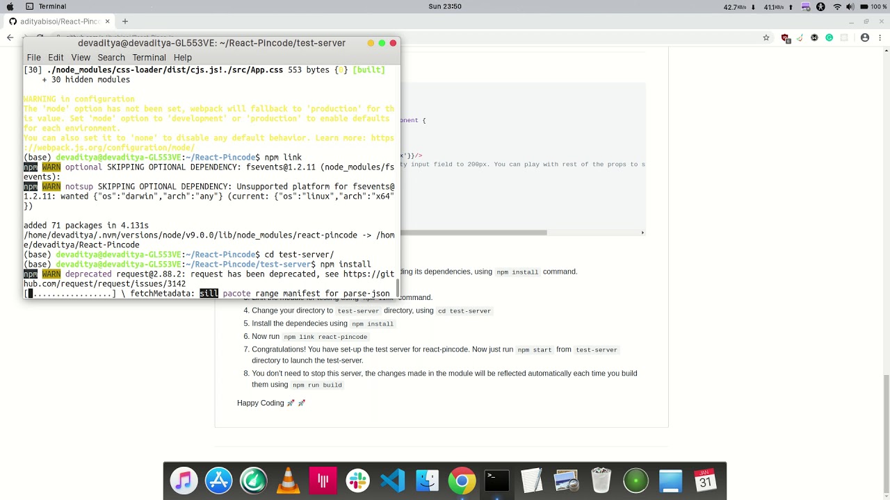
export default Example;- Set-up the React-Pincode module by dowloading its dependencies, using
npm installcommand. - Build the module using
npm run build - Link the module for testing using
npm linkcommand. - Change your directory to
test-serverdirectory, usingcd test-server - Install the dependecies using
npm install - Now run
npm link react-pincode - Congratulations! You have set-up the test server for react-pincode.
Now just run
npm startfromtest-serverdirectory to launch the test-server. - You don't need to stop this server, the changes made in the module will be reflected automatically each time you build them using
npm run build - To watch a video on installation (Click on the thumbnail):
Please read Contributing Guidelines for information on how to contribute to React-Pincode.
- Write clean and readable code with proper formatting.
- Create a branch and push your code in the branch.
- Please follow PR template to create one.
- Please read our Code of Conduct .


