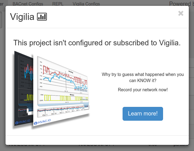
Bootstrap modal components for Reagent.
Takes care of all the little details for creating a modal with Bootstrap.
Add this to your project dependencies:
Make sure you have the jQuery and Boostrap javascript loaded in your page:
<script src="https://code.jquery.com/jquery-2.1.1.min.js"></script>
<script src="https://maxcdn.bootstrapcdn.com/bootstrap/3.2.0/js/bootstrap.min.js"></script>
Include the modal-window component in the root of your document:
(defn main-page []
	[:div
	  [:h1 "Page title"]
	  [:span "Some content"]
	  [reagent-modals/modal-window]]) ;  <-------
Now, everytime you want to show a modal to the user, you just need to call modal!:
:on-click #(reagent-modals/modal! [:div "some message to the user!"])You can customize the modal by giving it an optional configuration map.
We currently support these following configs:
-
:shown -> a function called once the modal is shown.
-
:hide -> a function called once the modal is asked to hide.
-
:hidden -> a function called once the modal is hidden.
-
:size -> Can be :lg (large) or :sm (small). Everything else defaults to medium.
-
:keyboard -> if true, `esc' key can dismiss the modal. Default to true."
-
:backdrop -> true (default): normal backdrop. || "static" : backdrop, but doesn't close the modal when clicked upon. || false : no backdrop.
:on-click #(reagent-modals/modal! [:div "some message to the user!"]
	                              {:size :lg}) ;  <----- will cause the modal to be 'large'