Post Dev PT https://dev.to/guscarpim/layout-patterns-pt-45c5
Post Dev EN https://dev.to/guscarpim/layout-patterns-en-2p27
Layout Patterns are best practices in design approaches used to organize elements in a user interface.
These patterns are excellent solutions in the field of web design, whether for websites, applications, or other digital products. They are fundamental standards to provide a consistent and intuitive experience for users.
Using a layout pattern in your project offers several benefits, such as:
Why Use
Using a layout pattern in your project offers several benefits, such as:
- Visual Consistency
- Usability
- Design Efficiency
- Adaptability
- Accessibility
- User Acceptance
- Development Efficiency
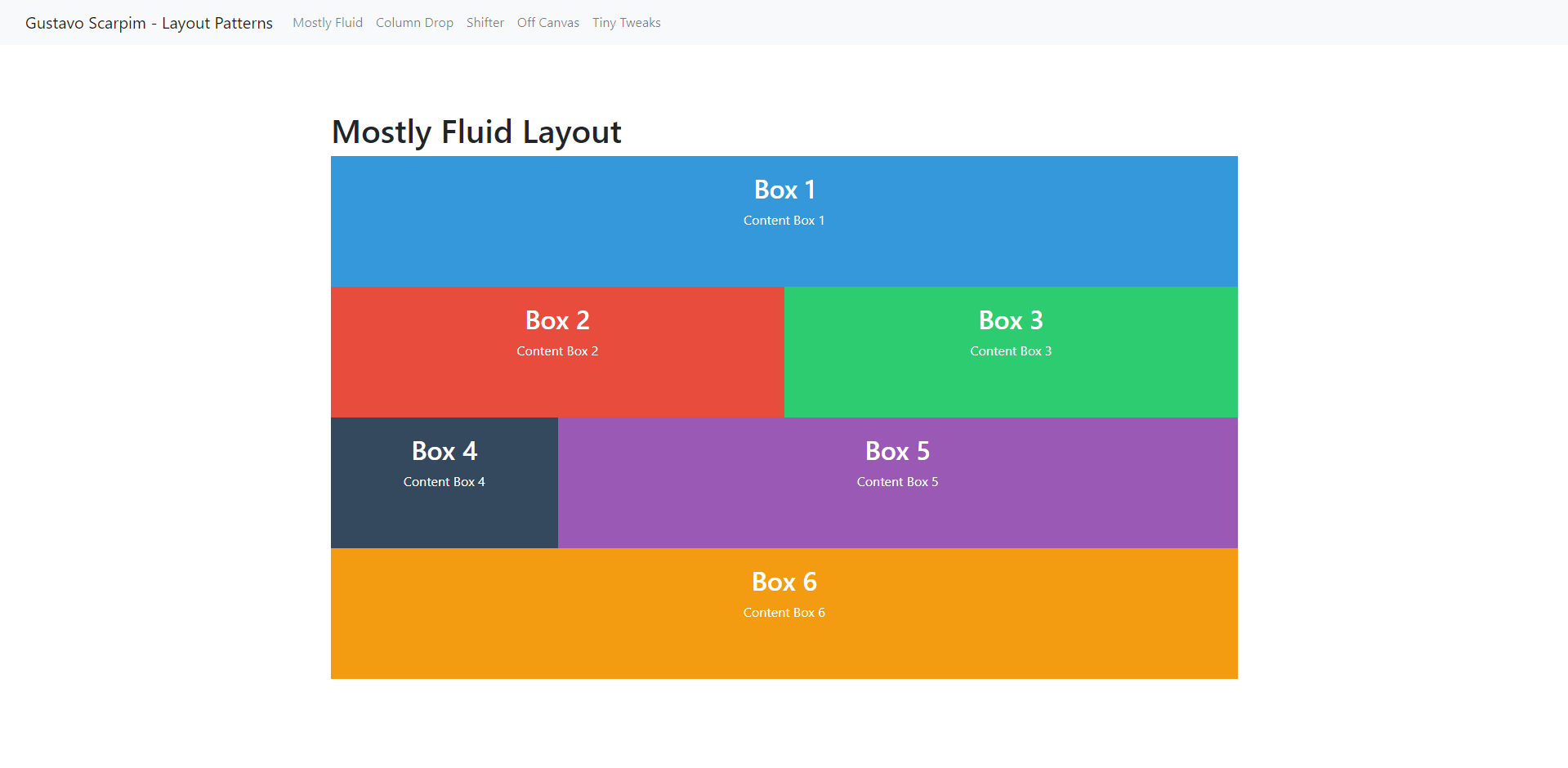
The Mostly Fluid layout provides a dynamic grid with ample margins, smoothly adapting to the screen's width. It allows a continuous response to size changes, ensuring a visually pleasing experience across various devices and resolutions.
Example: https://layoutpatterns.netlify.app/
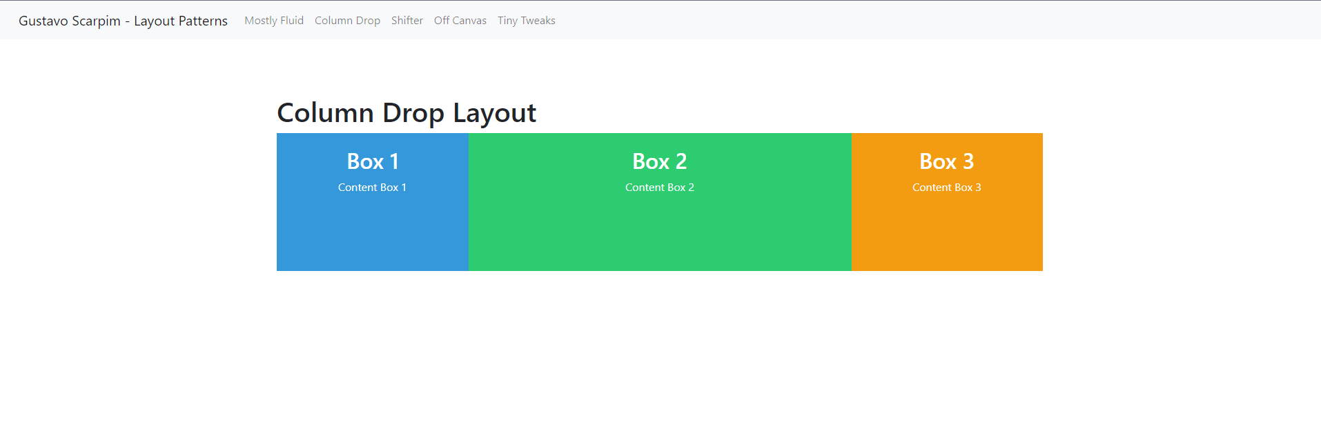
This layout involves multiple columns that stack as the screen width decreases, condensing into a single column on devices with limited space. On desktop, it expands to occupy the full width of the available column.
Example: https://layoutpatterns.netlify.app/column-drop
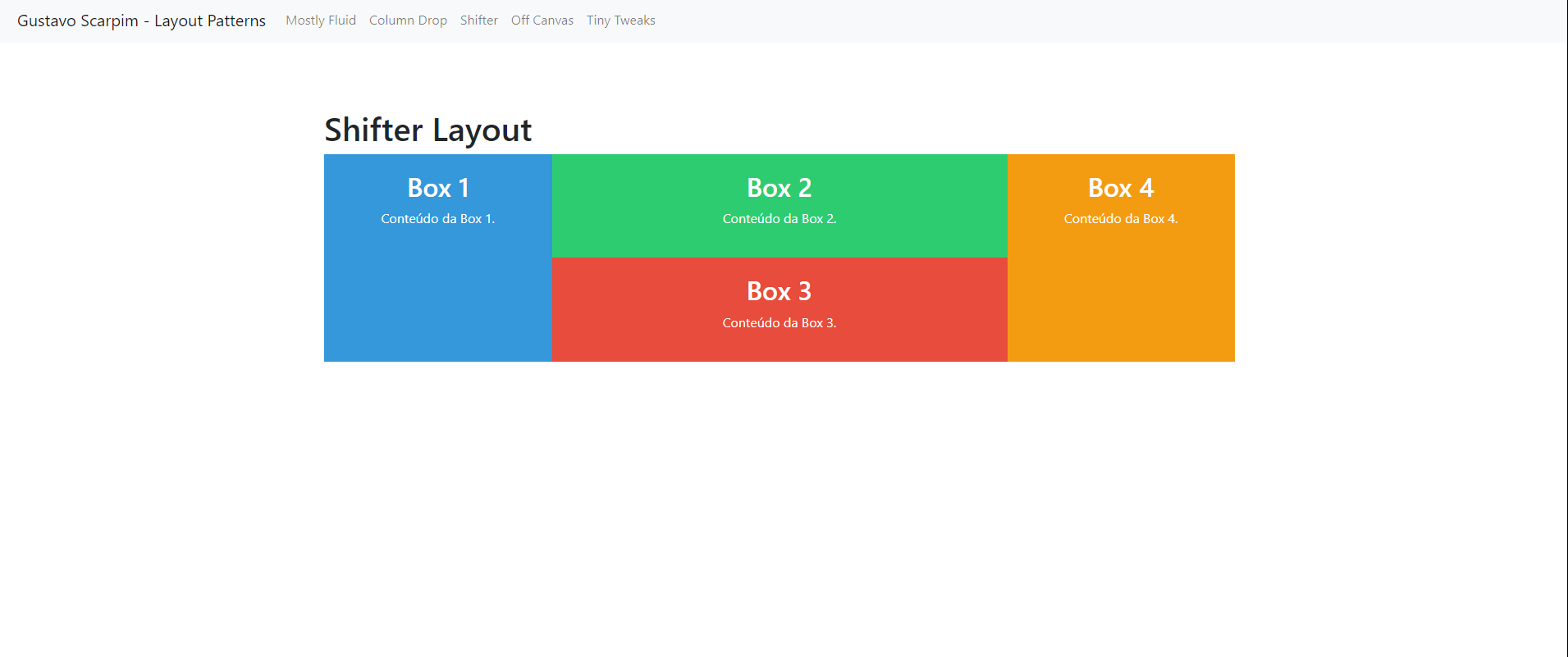
The Layout Shifter adjusts in distinct ways on large, medium, and small screens. It is more complex to implement due to the need for a specific design for each screen size, ensuring a consistent and optimized experience across various resolutions.
Example: https://layoutpatterns.netlify.app/shifter
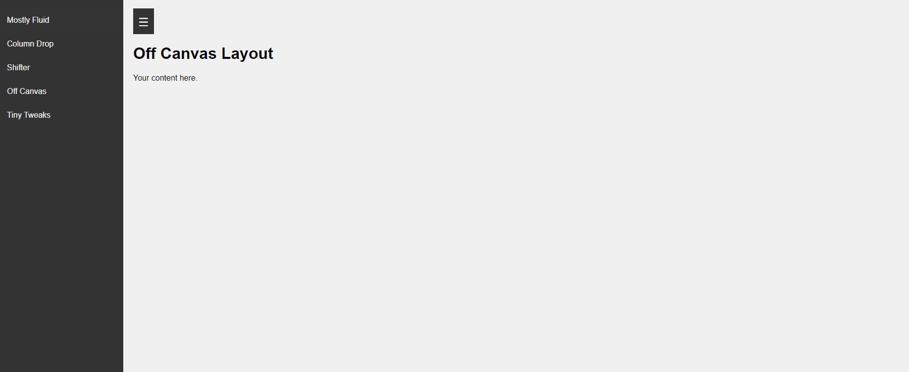
The Off-Canvas Layout consists of columns that hide certain sections as the device width decreases, allowing the user to efficiently switch between these diverse sections.
Example: https://layoutpatterns.netlify.app/off-canvas
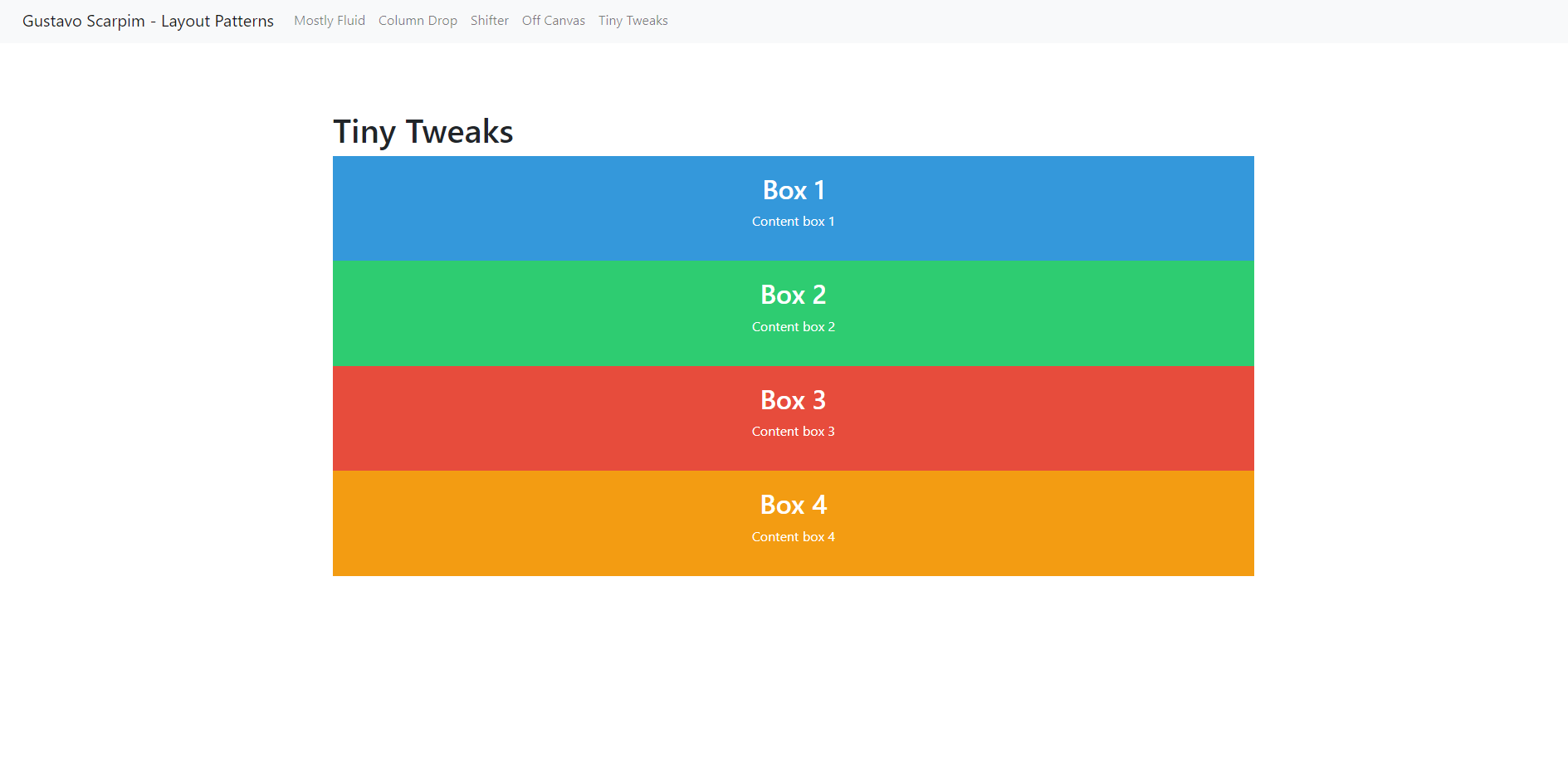
The Tiny Tweaks layout is one of the simplest, making small adjustments to content and confining itself to a few elements in a single column. Its simplicity promotes a minimalist experience, ideal for emphasizing crucial information in a direct and effective manner.
Example: https://layoutpatterns.netlify.app/tiny-tweaks
Thank you for reading.
