Simple library that allows you to easily create promise-based confirm/alert dialogs using Bootstrap
Requires Bootstrap's JS plugin:
bootstrap.min.js or bootstrap.bundle.min.js
npm install promise-bs-dialogsimport { confirm } from 'promise-bs-dialogs';
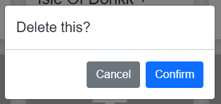
confirm('Delete this?').then(result => {
if(result) {
// do something
}
});
confirm({
title: 'Delete user',
message: `Are you sure you want to delete the user "${user.name}"? This can't be undone`,
confirmText: 'Delete',
confirmClass: 'btn-danger',
}).then(result => {
if(result) {
// do something
}
});

The promise is resolved with a boolean value after the user closes the modal, that value will be true if the user clicks the confirm button, and false if the user clicks the cancel button or closes the modal in some other way like clicking outside the modal or pressing ESC (can be controlled by the options below)
| property | type |
description | default |
|---|---|---|---|
| title | string |
Title that will be shown in the modal header | 'Confirm' |
| message | string |
Message that will be shown in the modal body | 'Are you sure you want to do this?' |
| centered | boolean |
Specifies if the modal should be vertically aligned | true |
| size | 'small' | 'default' | 'large' | 'extra-large' |
Specifies the size of the modal | 'default' |
| fade | boolean |
Enables or disables the fade transition of the modal | true |
| closeOnBackdropClick | boolean |
Specifies if the modal should close on backdrop click | true |
| closeOnEsc | boolean |
Specifies if the modal should close on ESC press | true |
| focus | boolean |
Specifies if the focus should be put on the modal | true |
| confirmText | string |
Text that will appear on the confirm button | 'Confirm' |
| confirmClass | string |
Class that the confirm button will have | 'btn-primary' |
| cancelText | string |
Text that will appear on the cancel button | Cancel |
| cancelClass | string |
Class that the cancel button will have | 'btn-secondary' |
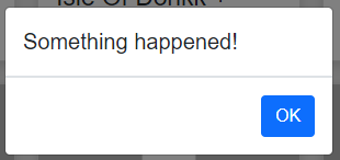
import { alert } from 'promise-bs-dialogs';

alert('Something happened!').then(() => {
  // do something
});

alert({
  title: 'Something complex happened!!',
  message: 'Lorem ipsum dolor sit amet, consectetur adipiscing elit.',
}).then(() => {
  // do something
});

The promise is resolved with void after the user closes the modal
| property | type |
description | default |
|---|---|---|---|
| title | string |
Title that will be shown in the modal header | 'Confirm' |
| message | string |
Message that will be shown in the modal body | 'Are you sure you want to do this?' |
| centered | boolean |
Specifies if the modal should be vertically aligned | true |
| size | 'small' | 'default' | 'large' | 'extra-large' |
Specifies the size of the modal | 'default' |
| fade | boolean |
Enables or disables the fade transition of the modal | true |
| closeOnBackdropClick | boolean |
Specifies if the modal should close on backdrop click | true |
| closeOnEsc | boolean |
Specifies if the modal should close on ESC press | true |
| focus | boolean |
Specifies if the focus should be put on the modal | true |
| confirmText | string |
Text that will appear on the confirm button | 'Confirm' |
| confirmClass | string |
Class that the confirm button will have | 'btn-primary' |
| cancelText | string |
Text that will appear on the cancel button | Cancel |
| cancelClass | string |
Class that the cancel button will have | 'btn-secondary' |