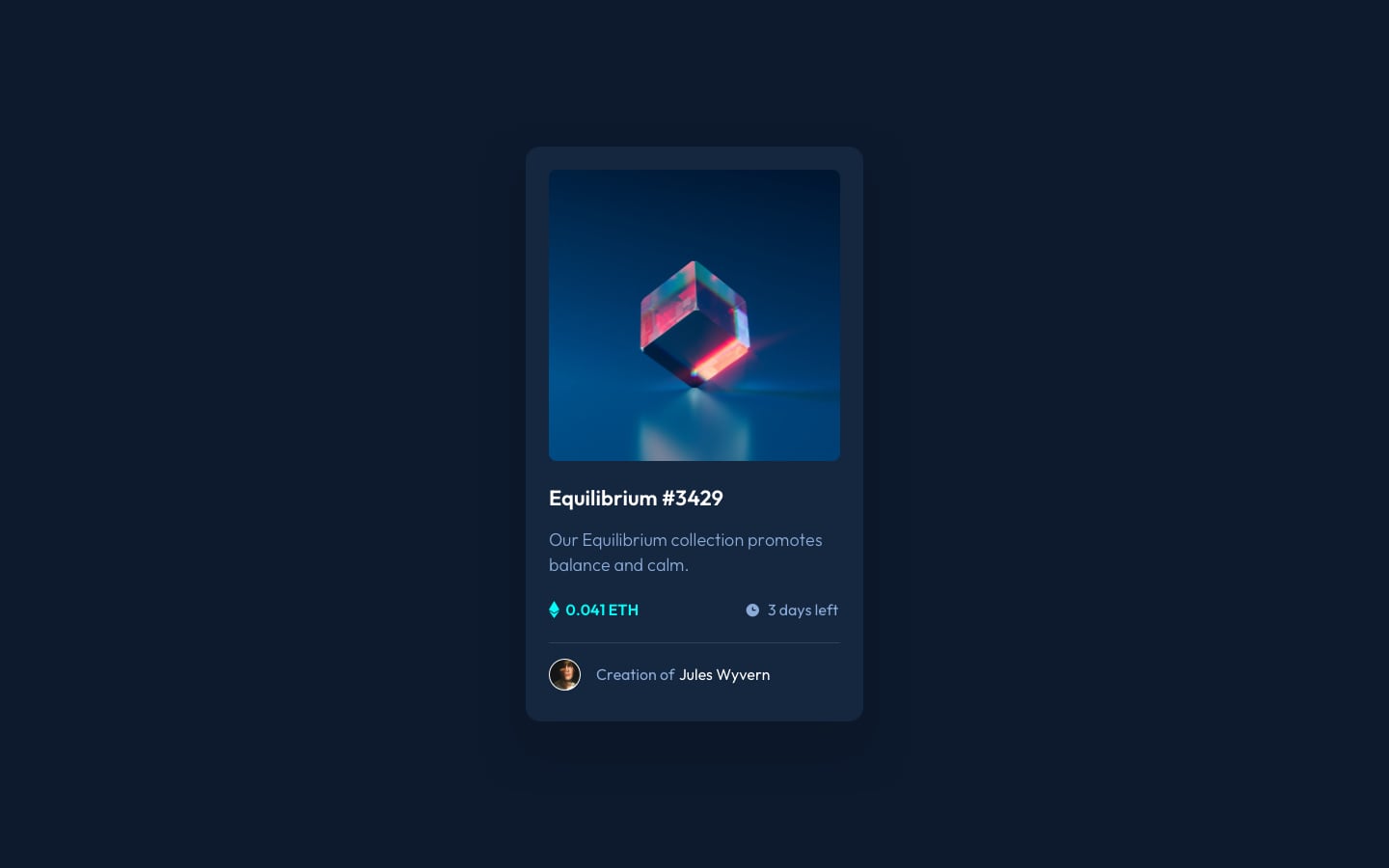
Source of the project from frontendmentor.io.
This is my 5th Frontend Mentor challenge.
This is my solution to the NFT preview card component challenge on Frontend Mentor. The goal of this challenge is to build out this preview card component and get it looking as close to the design as possible.
Users should be able to:
- View the optimal layout depending on their device's screen size
- See hover states for interactive elements
For this project i used:
- Semantic HTML5 markup
- CSS
- CSS custom properties
- Flexbox
- Mobile-first workflow
I need your opinions, feedbacks , how do you find my code structure? or any suggestions i can do to make my projects better. Also if you guys like my content, follow me this makes me happy❤👍.
- Adobe Xd - I use adobe xd to check the size of elements.
- I want to say Thanks to anyone who see my work and react with it, give me his feedback and helped me to improve myself. So thank you❤.
- My website - Well I haven't made my portfolio yet, but gonna make it soon.
Github - @FedLover
Codepen - @FedLover
 Frontend Mentor - @mo
See you in another project! 👋👩💻
