Fix blurry product/collection grid images #2277
Conversation
There was a problem hiding this comment.
A couple issues I noted:
- With the collage section. We're loading the product and collection card without passing any
columns_desktopvalue. Which means we're going to load the media like there was only 1 column which isn't great. We're going to need a bit of logic there I think to figure out the amount of column it should be using. Collage is a 3 columns grid where the card can take either 2/3, or 1/3, or 3/3 if there is only one block. Then on mobile depending on the amount of block mobile layout chosen it can be 1 or two columns. - With complementary products. We are currently not passing in any column amount. This one is tough cause there isn't any columns but it something coming up pretty small and will depend a bit of the size of the media column of the product page. If that column is small, the complementary product cards will use bigger images than when the media column is large.
snippets/card-product.liquid
Outdated
| assign desktop = columns_desktop | at_least: 1 | ||
| assign mobile = columns_mobile | at_least: 1 |
There was a problem hiding this comment.
Here we could use better descriptive naming I think. Those names don't convey clearly what the value is tied to. Maybe columns_amount_desktop 🤷 or something else
snippets/card-collection.liquid
Outdated
| assign desktop = columns_desktop | at_least: 1 | ||
| assign mobile = columns_mobile | at_least: 1 |
There was a problem hiding this comment.
Same here for the naming. Having something a bit more descriptive so it's easier to read would be great.
I think this would cover the logic for how many columns to pass into the collage section blocks (both product & collection): {% liquid
if section.blocks.size == 1
assign columns_amount_desktop = 1
elsif forloop.first and section.settings.desktop_layout == 'left' or forloop.last and section.settings.desktop_layout == 'right'
assign columns_amount_desktop = 1.5
else
assign columns_amount_desktop = 3
endif
if section.settings.mobile_layout == 'column' or section.blocks.size == 1
assign columns_amount_mobile = 1
else
if section.blocks.size == 3
if forloop.first and section.settings.desktop_layout == 'left' or forloop.last and section.settings.desktop_layout == 'right'
assign columns_amount_mobile = 1
else
assign columns_amount_mobile = 2
endif
else
assign columns_amount_mobile = 2
endif
endif
%}For desktop:
For mobile:
The image always takes 20% of its container, so I would naively multiply the number of columns the container takes by 5? {% liquid
if section.settings.media_size == 'small'
assign column_desktop = 7.5
elsif section.settings.media_size == 'medium'
assign column_desktop = 10
else
assign column_desktop = 15
endif
assign column_mobile = 5
%} For desktop:
For mobile the media size doesn't matter and we always use 20% of 1 column, so we want to divide by 5 |
| @@ -4,7 +4,8 @@ | |||
| Accepts: | |||
There was a problem hiding this comment.
To reply to your comment @Roi-Arthur
I think we can change the logic a little. the desktop variable is assigned at_least: 1 so in some cases we don't need to assign anything in the collage file.
Here is the mobile logic you have but a bit reworked, I'd have to actually test it to make sure the and is read properly:
{% liquid
  unless section.settings.mobile_layout == 'column' or section.block.size == 1
    if section.settings.mobile_layout == 'collage'
      if section.blocks.size == 3 and forloop.first and section.settings.desktop_layout == left or forloop.last and section.settings.desktop_layout == right
        assign columns_amount_mobile = 1
      else
        assign columns_amount_mobile = 2
      endif
    endif
  endunless
%}
For the complementary products it's a bit trickier 🤔 I think from what I can see their size is going from 64px wide up to potentially 140px when it's on a product with no image. And 118px on a product with images.
Maybe we could do something a bit simpler that isn't quite perfect but good enough. Something like defaulting to 10 for desktop and 5 for mobile 👍 This way we don't go into logic that's a bit hard to understand.
What do you think?
There was a problem hiding this comment.
the desktop variable is assigned at_least: 1 so in some cases we don't need to assign anything in the collage file.
I did think of this after the fact and was wondering what's preferable: one the one hand we have more liquid but it's very readable and you know exactly what you're passing to the snippet so might be more user friendly, especially for people who are getting started. On the other we can definitely remove all cases where the assign is for 1 in terms of efficiency.
I'd have to actually test it to make sure the and is read properly:
That was also my concern 😅
Haven't tried any of this yet; was just a draft starting from what sounded logical.
For the complementary products it's a bit trickier
Totally up for something that does 80% of the job if lets us sidestep making more calculations (especially since they do feel a bit arbitrary)
There was a problem hiding this comment.
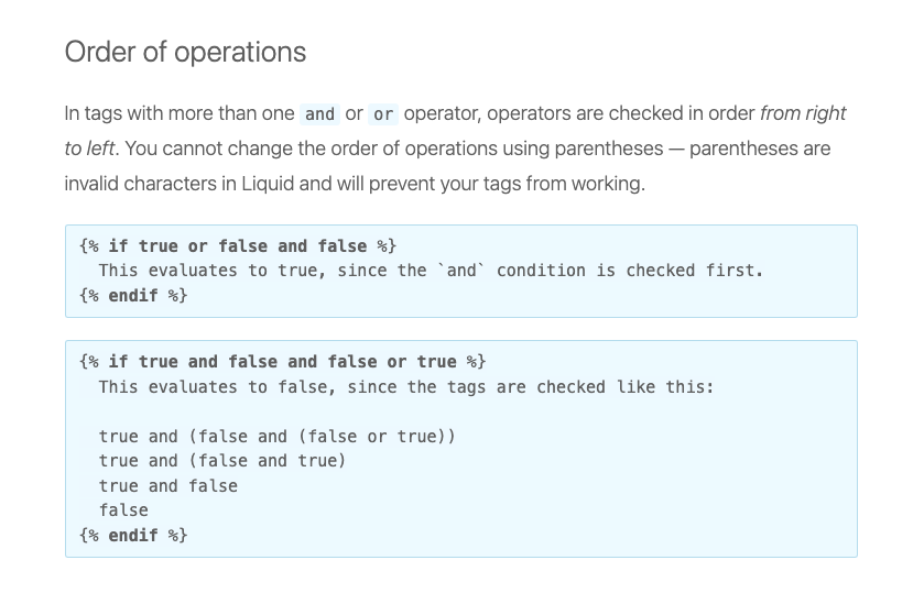
Turns out that you cannot chain Liquid operators the way you want; specifically, operators are evaluated from left to right, with no possibility to use parentheses to create "logic blocks". So with that in mind we can't do the long checks I had previously included.
As a result this is what I tested that seems to be working to declare variables before the card snippets:
{% liquid
  unless section.blocks.size == 1
    if forloop.first and section.settings.desktop_layout == 'left'
      assign columns_amount_desktop = 1.5
    elsif forloop.last and section.settings.desktop_layout == 'right'
      assign columns_amount_desktop = 1.5
    else
      assign columns_amount_desktop = 3
    endif
  endunless

  assign columns_amount_mobile = 1
  unless section.settings.mobile_layout == 'column' or section.blocks.size == 1
    unless section.blocks.size == 3 and forloop.first and section.settings.desktop_layout == 'left'
      unless section.blocks.size == 3 and forloop.last and section.settings.desktop_layout == 'right'
        assign columns_amount_mobile = 2
      endunless
    endunless
  endunless
%}
Note the assign columns_amount_mobile = 1 before the mobile assignment, as it appears that the variable value carried forward through the next iterations of the loop? At least that was my conclusion as I was ending up with "columns_amount_mobile = 2" in the last loop even when with desktop_layout = 'right' and this fixed it.
There was a problem hiding this comment.
Just a correction, you mentioned that operators are evaluated from left to right which isn't right. It's the opposite (source).
9.0.0 Update
* [Motion] Use rootMargin instread of threshold to trigger slide in animations (#2517)

* Use rootMargin instread of threshold to trigger slide in animations

* address review comment, remove threshold

* Add conditional around data-cascade attribute (#2532)

* [Motion] No animation on added/edited section (#2502)

---------

Co-authored-by: Ludo <ludo.segura@shopify.com>
|
Here we go, I think we're covered now. The current changes adjust:
|
sections/collage.liquid
Outdated
| unless section.settings.mobile_layout == 'column' or section.blocks.size == 1 | ||
| unless section.blocks.size == 3 and forloop.first and section.settings.desktop_layout == 'left' | ||
| unless section.blocks.size == 3 and forloop.last and section.settings.desktop_layout == 'right' | ||
| assign columns_amount_mobile = 2 | ||
| endunless | ||
| endunless | ||
| endunless |
There was a problem hiding this comment.
This is a little confusing to read tbh.
If statements are easier to read than unless ones.
| unless section.settings.mobile_layout == 'column' or section.blocks.size == 1 | |
| unless section.blocks.size == 3 and forloop.first and section.settings.desktop_layout == 'left' | |
| unless section.blocks.size == 3 and forloop.last and section.settings.desktop_layout == 'right' | |
| assign columns_amount_mobile = 2 | |
| endunless | |
| endunless | |
| endunless | |
| if section.settings.mobile_layout == 'collage' and section.blocks.size > 1 | |
| unless section.blocks.size == 3 and forloop.first and section.settings.desktop_layout == 'left' | |
| unless section.blocks.size == 3 and forloop.last and section.settings.desktop_layout == 'right' | |
| assign columns_amount_mobile = 2 | |
| endunless | |
| endunless | |
| endif |
As for the nesting of unless, not a big fan. We could simplify it by assigning some of those values to variables.
So having this:
assign is_large_block = false
if forloop.first and section.settings.desktop_layout == 'left'
  assign is_large_block = true
elsif forloop.last and section.settings.desktop_layout == 'right'
  assign is_large_block = true
endif
to then do that:
assign columns_amount_mobile = 1
if section.settings.mobile_layout == 'collage' and section.blocks.size > 1
  unless section.blocks.size == 3 and is_large_block
    assign columns_amount_mobile = 2
  endif
endifThere was a problem hiding this comment.
I adjusted the numbers assignment using the above:
- Assign is_large_block first (as above)
- Assign desktop columns if section.blocks.size > 1
- Assign mobile columns (as above)
sections/collage.liquid
Outdated
| {% liquid | ||
| unless section.blocks.size == 1 | ||
| if forloop.first and section.settings.desktop_layout == 'left' | ||
| assign columns_amount_desktop = 1.5 | ||
| elsif forloop.last and section.settings.desktop_layout == 'right' | ||
| assign columns_amount_desktop = 1.5 | ||
| else | ||
| assign columns_amount_desktop = 3 | ||
| endif | ||
| endunless | ||
|
|
||
| assign columns_amount_mobile = 1 | ||
| unless section.settings.mobile_layout == 'column' or section.blocks.size == 1 | ||
| unless section.blocks.size == 3 and forloop.first and section.settings.desktop_layout == 'left' | ||
| unless section.blocks.size == 3 and forloop.last and section.settings.desktop_layout == 'right' | ||
| assign columns_amount_mobile = 2 | ||
| endunless | ||
| endunless | ||
| endunless | ||
| %} |
There was a problem hiding this comment.
I wonder if we need to repeat this twice 🤔 Since it just needs to be within the for loop. We could wrap it in an if statement if block.type == 'collection' or block.type == 'product' though that adds to the list of conditional already present.
There was a problem hiding this comment.
Yeah for this one I wasn't sure what to do; having the block of code only once does seem more appealing.
it just needs to be within the for loop
My issue was "do we want to add an if check when there's already a case coming?
If we're fine with that I'm happy to move the logic before the case
|
Just wanted to see if there was any updates here? It looks like it's still happening in versions 15.0.2. Additionally, the same issue appears to effect article cards. |
PR Summary:
Fixes blurry card images by including dynamic intrinsic size calculation for the rendered images in grids.
Why are these changes introduced?
Fixes #763 | #532
What approach did you take?
Based on @hiroakiito2002's suggested solution, this change introduces a variable to store the column values based on the theme editor settings selection for the number of columns for desktop and mobile rather than the current fixed value in the calculation, which can cause card images to be displayed in lower quality.
For example, the featured collection section has the card image size calculated based on 4 product cards being displayed, however a row can contain anywhere between 1 and 5 products, which results in lower quality images when there are fewer than 4 products.
This way, the calculation for product and collection cards is based on dynamic input. There's a reference to the column values when rendering snippets in section files (collection, collection list, search, product recommendations).
Other considerations
In some cases where uploaded images are very large, the load time may be slightly increased to accommodate the larger image size.
Visual impact on existing themes
For some merchants, rendered card images will be in higher quality.
Testing steps/scenarios
ashould result in a blog page, products and a page in resultsDemo links
Checklist