This package contains many statistical recipes for concepts and types introduced in the JuliaStats organization, intended to be used with Plots.jl:
- Types:
- DataFrames (for DataTables support, checkout the
DataTablesbranch) - Distributions
- DataFrames (for DataTables support, checkout the
- Recipes:
- histogram/histogram2d
- boxplot
- violin
- marginalhist
- corrplot/cornerplot
Initialize:
#Pkg.clone("git@github.com:JuliaPlots/StatPlots.jl.git")
using StatPlots
gr(size=(400,300))
Table-like data structures, including DataFrames, IndexedTables, DataStreams, etc... (see here for an exhaustive list), are supported thanks to the macro @df which allows passing columns as symbols. Those columns can then be manipulated inside the plot call, like normal Arrays:
using DataFrames, IndexedTables
df = DataFrame(a = 1:10, b = 10*rand(10), c = 10 * rand(10))
@df df plot(:a, [:b :c], colour = [:red :blue])
@df df scatter(:a, :b, markersize = 4 * log.(:c + 0.1))
t = IndexedTable(Columns(a = collect(1:10)), Columns(b = rand(10)))
@df t scatter(2 * :b)
In case of ambiguity, symbols not referring to DataFrame columns must be escaped by ^():
df[:red] = rand(10)
@df df plot(:a, [:b :c], colour = ^([:red :blue]))
The old syntax, passing the DataFrame as the first argument to the plot call is still supported, but has several limitations (the most important being incompatibility with user recipes):
plot(df, :a, [:b :c], colour = [:red :blue])using RDatasets
iris = dataset("datasets","iris")
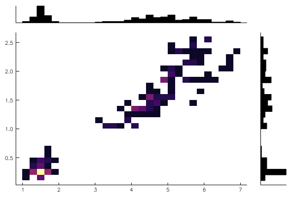
@df iris marginalhist(:PetalLength, :PetalWidth)@df iris corrplot([:SepalLength :SepalWidth :PetalLength :PetalWidth], grid = false)or also:
@df iris corrplot(cols(1:4), grid = false)A correlation plot may also be produced from a matrix:
M = randn(1000,4)
M[:,2] += 0.8sqrt.(abs.(M[:,1])) - 0.5M[:,3] + 5
M[:,3] -= 0.7M[:,1].^2 + 2
corrplot(M, label = ["x$i" for i=1:4])cornerplot(M)cornerplot(M, compact=true)import RDatasets
singers = RDatasets.dataset("lattice","singer")
@df singers violin(:VoicePart,:Height,marker=(0.2,:blue,stroke(0)))
@df singers boxplot!(:VoicePart,:Height,marker=(0.3,:orange,stroke(2)))Asymmetric violin plots can be created using the side keyword (:both - default,:right or :left), e.g.:
singers_moscow = deepcopy(singers)
singers_moscow[:Height] = singers_moscow[:Height]+5
@df singers violin(:VoicePart,:Height, side=:right, marker=(0.2,:blue,stroke(0)), label="Scala")
@df singers_moscow violin!(:VoicePart,:Height, side=:left, marker=(0.2,:red,stroke(0)), label="Moscow")The ea-histogram is an alternative histogram implementation, where every 'box' in the histogram contains the same number of sample points and all boxes have the same area. Areas with a higher density of points thus get higher boxes. This type of histogram shows spikes well, but may oversmooth in the tails. The y axis is not intuitively interpretable.
a = [randn(100); randn(100)+3; randn(100)/2+3]
ea_histogram(a, bins = :scott, fillalpha = 0.4)using Distributions
plot(Normal(3,5), fill=(0, .5,:orange))dist = Gamma(2)
scatter(dist, leg=false)
bar!(dist, func=cdf, alpha=0.3)groupedbar(rand(10,3), bar_position = :stack, bar_width=0.7)This is the default:
groupedbar(rand(10,3), bar_position = :dodge, bar_width=0.7)The group syntax is also possible in combination with groupedbar:
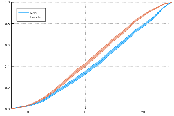
groupedbar(rand(6), group = [1, 1, 2, 2, 3, 3])There is a groupapply function that splits the data across a keyword argument "group", then applies "summarize" to get average and variability of a given analysis (density, cumulative, hazard rate and local regression are supported so far, but one can also add their own function). To get average and variability there are 3 ways:
-
compute_error = (:across, col_name), where the data is split according to columncol_namebefore being summarized.compute_error = :acrosssplits across all observations. Default summary is(mean, sem)but it can be changed with keywordsummarizeto any pair of functions. -
compute_error = (:bootstrap, n_samples), wheren_samplesfake datasets distributed like the real dataset are generated and then summarized (nonparametric bootstrapping).compute_error = :bootstrapdefaults tocompute_error = (:bootstrap, 1000). Default summary is(mean, std). This method will work with any analysis but is computationally very expensive. -
compute_error = :none, where no error is computed or displayed and the analysis is carried out normally.
The local regression uses Loess.jl and the density plot uses KernelDensity.jl. In case of categorical x variable, these function are computed by splitting the data across the x variable and then computing the density/average per bin. The choice of continuous or discrete axis can be forced via axis_type = :continuous or axis_type = :discrete. axis_type = :binned will bin the x axis in equally spaced bins (number given by the nbins keyword, defaulting to 30), and continue the analysis with the binned data, treating it as discrete.
Example use:
using DataFrames
import RDatasets
using StatPlots
gr()
school = RDatasets.dataset("mlmRev","Hsb82");
grp_error = groupapply(:cumulative, school, :MAch; compute_error = (:across,:School), group = :Sx)
plot(grp_error, line = :path, legend = :topleft)
Keywords for loess or kerneldensity can be given to groupapply:
grp_error = groupapply(:density, school, :CSES; bandwidth = 0.2, compute_error = (:bootstrap,500), group = :Minrty)
plot(grp_error, line = :path)
The bar plot
pool!(school, :Sx)
grp_error = groupapply(school, :Sx, :MAch; compute_error = :across, group = :Minrty)
plot(grp_error, line = :bar)
Density bar plot of binned data versus continuous estimation:
grp_error = groupapply(:density, school, :MAch; axis_type = :binned, nbins = 40, group = :Minrty)
plot(grp_error, line = :bar, color = ["orange" "turquoise"], legend = :topleft)

grp_error = groupapply(:density, school, :MAch; axis_type = :continuous, group = :Minrty)
plot!(grp_error, line = :path, color = ["orange" "turquoise"], label = "")


