Color contrast: shortcuts in the more menus lack a sufficient contrast ratio #10576
Comments
 afercia
added
[Type] Bug
afercia
added
[Type] Bug
|
I can look into this! |
 afercia
added
the
Good First Issue
afercia
added
the
Good First Issue
|
Especially on Windows (where keyboard shortcuts are much larger), increasing the opacity creates issues of its own. This strikes me as an instance where a High-contrast mode for Gutenberg would be great, because it's tough to service users with poorer eyesight in this case without making things harder to read for many sighted users who now find the lack of contrast affecting their reading of the menu items. I've mentioned as much in the issue, but it could be this needs a more robust solution if my suggestion of changing font size doesn't work/pass design muster. |
|
Maybe some type of outline/background that can differentiate the shortcuts? I’ll play with some options.
|
|
There's something like that in the existing keyboard shortcut help modal. It's certainly an idea to try! 🤔 |
|
@tofumatt @youknowriad Thoughts on this? I made the opacity 100% and added some of the styling that appears in the keyboard shortcut modal. |

|
First thought is that the links and the shortcuts are competing in terms of visibility and it shouldn't be the case as the links are more important. The shortcuts are optional and less important in this menu. |
|
I'll defer to designers though. Adding a label. |
|
@youknowriad I had a similar thought - although I wouldn't say the shortcuts are "optional" (especially the shortcut to pull up the modal with the rest of the shortcuts), they shouldn't be where the eye is immediately drawn. |
|
This is how it looks with a smaller font size and 100% opacity as @tofumatt suggested: |

|
Yeah, I agree too; this elevates the shortcuts a lot. I don’t think it’s the right approach.
|
|
A potential solution could be adding a keyboard shortcut to toggle keyboard hints visibility with a notice somewhere telling the user about said functionality? For example, Trello has a nice feature where pressing ? will show you available keyboard shortcuts. |
|
I agree with others that this is taking the contrast to a point where it's now causing readability issues. I would love us to explore other options. |
 tofumatt
removed
the
Good First Issue
tofumatt
removed
the
Good First Issue
|
Removing "good first issue" because the solution here is not clear. This will need more time; simply increasing the opacity here will cause readability issues too, so we'll need to find a more robust solution... |
Hello, do you have another option in mind? These items have to be discoverable by every users. I can't see any other option than to use the same color as the text on the left. :) |
|
I don't agree with the "same color as text makes it less readable" argument. Using the same color, font, size, style, and contrast is a standard approach afaik. Look at how keyboard shortcuts are surfaced on MacOS: Point of reference re: high-contrast mode:
Users in these situations are unlikely to turn to a high-contrast mode. My vote is to leave the keyboard shortcuts at the same font, size, color, contrast, and style. |
|
MacOS has concise, 2-4 character shortcuts. As mentioned above: on Windows these shortcuts are sometimes more characters than the action itself. "Code Editor", for instance, has a shortcut longer than the actual "Code Editor" text. When they're the same opacity, colour, weight, and font size, having "Code Editor" and "Ctrl+Shift+Alt+M" next to each other is at best cramped (hard to read), but also offers little indication as to which item is more important. I get why better contrast is important and I agree that the contrast of the shortcuts right now is not good but the Desktop MacOS point of reference does not cleanly apply to Gutenberg's cross-platform, responsive UI. |
|
Any updates / plans on this?
It's not only important: it's a requirement, which seems something some designers and developers here don't want to acknowledge. Re: the Windows argumentation: also on Windows the keyboard shortcuts, while larger, are of the same color of the menu items:
there's always a certain distance between the menu item and the shortcuts because the menu is larger. Seems to me this is more a design issue. Why the more menu is only 260 pixels wide to start with? Worth also noting that languages other than English typically have longer strings and the menu doesn't account for them. When a menu item label goes in two lines, it's really not nice to see:
I'd propose to:
|


|
@aduth thanks for the ping. I don't know why many elements in the editor use CSS opacity, which makes things difficult when calculating color contrast. If there's the need for some transparency, I'd tend to think single elements should use Anyways, if I'm not wrong, the block more menu shortcuts and the ones in the main more menu use two different colors: @jasmussen any reason why they're using different colors? Of course, I'd prefer the darker
If these are the colors, and the calculations are right, both have a sufficient contrast. See https://jdlsn.com/color/?type=hex&color=555d66&color2=FFFFFF&alpha=0.84 and https://jdlsn.com/color/?type=hex&color=40464d&color2=FFFFFF&alpha=0.84 |

|
This is mentioned in a recent a11y issue #15274. I've investigated, and it appears to be resolved. Since the color contrast issue is resolved, I'm going to close this. But if I'm wrong, feel free to open it back up. It would be good to investigate the opacity and different colors in another PR. |
|
Will open a new issue. Noting there's one question about opacity that hasn't got a reply yet. |
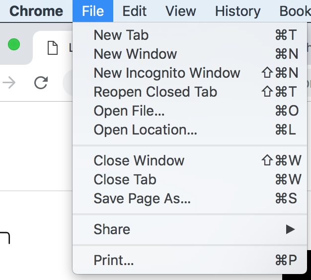
Not sure this already has a dedicated issue.
All the keyboard shortcuts displayed in the "More" menus, both the ones in the top bar meu and the ones in the blocks menu, have an insufficient color contrast ratio:
As far as I see, they use a gray
#555d66with an0.5opacity, which gives a contrast ratio as low as 2.23:1, see https://jdlsn.com/color/?type=hex&color=555d66&color2=ffffff&alpha=0.5. It needs to be 4.5:1 for compliance with WCAG level AA.The text was updated successfully, but these errors were encountered: