Visually indicate navigation mode, and make mouse accessible #17088
Comments
|
I'm concerned this introduces mode errors into Gutenberg:
https://en.wikipedia.org/wiki/Mode_(user_interface)#Mode_errors
Users will always expect to be able to drag and drop images or select a paragraph with a click and drag then drag that elsewhere, regardless of the tool used. Some questions:
|
|
Thanks for your thoughts. It's interesting that you mention vim — I encounter such errors all the time in vim, and have learned to press Ctrl + C to escape whatever trouble I got myself in at that time. So the example is great, yet ironically vim is also a very much loved productivity tool for so many. I'm not making a point here, just meandering on a delightful example. To your point, though, I would suggest your concern is very much valid, and it has already been the driving force for many aspects of the mockup shown above, the Escape key suggestion being one example, the visual distinction suggested for hover styles applied by the two tools being another example. I will share some additional ideas in a minute, but just wanted to acknowledge the thought and note that I'll add the "needs design feedback" label to expand the review range. The mode thing is not a new concern for this issue, it is one we deal with in virtually every app we use. The block editor and slack both have "navigation modes". In Slack, set focus in the chat, press tab, now the arrow keys navigate at the chat item level rather than scrolling the scrollbar. In the block editor, set the cursor in text, press Escape to enter navigation mode, now the arrow keys navigate at the block level, rather than moving the caret. Key to both of those is that it's easy to "escape" those modes. In slack, press tab, or click anywhere with the cursor. In the block editor, press Enter, tab out of the editing canvas, or click anywhere with the cursor. In Figma when you have the comment tool selected, press Escape to select the default tool, or click it from the toolbar. In Docs when you are in viewing mode, you have to press a dropdown to choose another mode to exit it. Those are a variety of different use cases for entering and exiting modes. In the best of them, entering and exiting these interfaces is virtually invisible because it doesn't get in the way. Without any prototype of the suggested interaction, it's very hard to make a proper judgement call to say with confidence that your concern is going to result in a problem. That's not to dismiss it, that is to keep the concern in mind as we do prototype it. Which brings me to so some of the other ideas I explored as I mocked these things up:
Those three all emphasize that the selection tool would be an optional interface that you can live without. Throw in #17089 and you could go about your day without using the layout affordance.
I would suggest this is an editing action, which means it exits the selection tool and appends the image after the paragraph. Same as today, in other words.
While selecting non adjacent blocks is not part of this issue (see #16811), I agree this tool would be an obvious interface for hosting that feature. And I would expect it to work same as today. Append.
Given it's an edit action, I would expect you to exit the selection mode and start typing. As a new paragraph block below the one you selected, like the aforementioned append actions.
As noted, I did explore showing the two tools side by side, which has the benefit of being able to show a selection highlight of the tool selected. But to address the very reason for your question, it should be easier to exit this tool than enter it, and the dropdown provides valuable context to what the tool offers. It may be worth expanding again on the goal here — there is no limit to how deeply a block can nest, and we're already seeing delighfully complex blocks that offer completely bonkers lovely layouts. This new market of premium blocks is one that is not gracefully handled by the current editor. The goal of providing the selection tool is to improve those layout affordances, and avoid the fiddly nature of what we have now, without breaking the direct manipulation of the current default interface: click text to edit it.
The idea of grouping these together is that they are global tools. Undo and redo still work if you are using the selection tool, and inserting a block I would imagine exits that tool immediately.
As suggested in the ticket, no real change here. If you never pick the selection tool, everything is like it is in
That's not covered by this issue. I would imagine if this becomes a requested feature and some concensus emerges that this is necessary, then the selection should start from outside the blocks. Simply making a drag action on a block in the selection mode would drag that block to rearrange it. |
|
Thanks for the feedback! 🙂
Once there's a prototype I shall open a new ticket if it still makes sense for this feature request. Here's an example for reference, it would be especially useful once people start experimenting with how blocks are arranged spatially Since this is a new mode, we can introduce other affordances into the block UI that wouldn't normally make sense, such as showing block hierarchy next to the blocks visually in the margins, padding/margin adjustments, borders, etc that would normally get in the way of the editing experience. Perhaps even the mobile UI selection design pattern of checkboxes for selection This might also be a means of implementing other modes, such as a view only, or an editor commenting/commentary/markup mode |
I've had some similar thoughts along these lines indeed. There is a great deal of potential. But I didn't want to get ahead of myself. But yes, I do hope that this opens up a way to both simplify and focus various editing experiences.
I did think of a History tool, that would surface the revision history in a sidebar, and in the editing canvas show, using |
|
hmmm, does this overlap with the visual vs code editing modes? It might well be we already have modes in the editor:
|
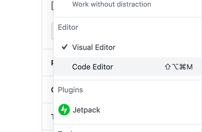
If you're referring to the history tool idea I briefly surfaced, then yes maybe. But to be clear that idea is not fully formed at all, so probably should not be considered at this point. If you're referring to the tools, I would suggest no. I consider the code editor an entirely different editor to the block editor. They may save to the same point in the database, and you can definitely jump into the code editor to debug or fix things. But the transition to and from the code editor is not always as smooth as it would need to be, in order to be comparable, I would say. |
|
This is just lovely.
I really love this. It might be my past experience with design software biasing my opinion, but this separation of modes makes so much sense. |
absolutly! So cool!! In this context I wanted to say that I really liked to use the Clickthrough. I think it's sad that the team took out the PR #17239 again. But your @jasmussen suggestion would help all of us! |
|
Thanks, @SchneiderSam, appreciat your thoughts. I do think that the clickthrough interface solved a problem, it just solved it also when you didn't want that particular problem solved, so to speak! I do believe, and it is good to get generally positive thoughts to the same, that by splitting in these two tools we can keep the best of the clickthrough, when you want it and not when you don't! |
|
We discussed this in today's Gutenberg Design Triage meeting (Slack link). Posting here for reference. 👍 |
|
Hey guys, This is how I approached the matter with Kioken Blocks:
So I was so happy as a user(so was the users of the plugins, based on the reactions I had from them) when clickthrough was introduced, and then felt disappointed when it's only enabled for mobile devices with the latest update. So I noted the shortcut whenever a parent block has this feature. |


|
Thank you for sharing, @onuro. I agree it is kind of crucial for the block editor itself to offer a mouse-friendly interface for selecting block layers. Without it, complex blocks can't thrive. Concerns were shared with both the clickthrough interface, and the "mode" aspect of the approach outlined here. I'm currently exploring a new idea that hopefully can embrace the best of both the clickthrough interface, and the ability to select text directly, and without adding confusion about which mode you're in. I hope to have something to share soon. |
Cheers! I wonder if any of you guys been using Sketch or Invision Studio. Clickthrough is a typical behavior for grouped layers (lets say parent blocks in the Gutenberg terminology), and hitting ctrl or cmd simply lets you click through the child elements. That was my starting point in solving this, rather than introducing additional clicks or new methods basic users don't understand yet. |
|
Yes! In fact that interaction, also seen I'm Figma, Illustrator, and others, was the primary inspiration for the clickthrough feature. |
|
It's also important to note that the editor is not a design tool like Figma... It gets closer when it comes to page building but it's also an editor used by a big range of people that are not designers and are not familiar with these patterns. (Writing is very different from Building designs, and modes make sense to optimize the interactions) |
This PR reverts past efforts by myself and Kjell to make parent/child block interactions easier. This is not because that effort was not necessary, it is more necessary than ever, but it was because it did not work as well as we had intended. In actual practice the added padding and dashed outlines added confusion and additional UI complexity, where it was meant to do the opposite.

Instead, there is an incoming breadcrumbs toolbar intended to alleviate the same problem. Tracked here: #17089, I would encourage you test the PR here: #17838. With this breadcrumb toolbar present, the current state of what you're editing becomes visible in a more more clear (text indication) way, with consistent buttons (breadcrumbes) to select parent blocks, without hunting pixels.

Additional efforts such as those being explored in #17088 can help as well.
|
Thank you all for the thoughtful feedback. Since the past update, I've been continuing to explore how best to find the balance between an obvious edit-first interface for the majority of people, and enhancing the tools to work with complex layouts only when you need them. In the mean time, two things have happened, which might help inform where this interface might go:
Both of these help frame how the tools-based approach might transform into an interface that addresses the concerns of adding additional cognitive load, while still providing better nested block selection than we have today. In that vein, I have renamed and updated the original ticket with fresh mockups and updated text. If you would like to see the old ticket, you can look in the edit history. Penny for your thoughts? |
|
New mockups are really cool. Amazing work!! |
I find the current 5.3 mode to be rather unexpected as I go from a block selection mode to a content editing mode rather mysteriously. I'd really like to give it a try as per your mockups above as I think being able to select a block will be really useful and intuitive in this mode. I also wonder if you'll be able to drag blocks around in this future mode by clicking anywhere on the block and dragging, but one thing at a time.. |
|
I'm still concerned by mode errors. Unless you know that button is a tool/mode modifier dropdown menu, there's no way to know how you accidentally switched modes, or that there are modes. Nothing about the UI hints it. Other than the behaviour, the two modes look the same. Most people also don't explore the UI, so they would have no reason to look at a triangle icon in the top menu bar. It's simply too well hidden, and for something that fundamentally changes how the block list works it needs to be significantly more prominent. I'd go as far as to suggest adding text and changing the colour, or adding additional UI chrome to indicate the change in mode. It's a pretty UI, but it's not discoverable, and there's no state/mode indication once used |
Do you have specific recommendations? Many of these concerns seem addressable. I'm hoping we can go ahead with Joen's mockups to prototype it and work out the issues in the prototype. I also want to point out that we're going to have to become adept at working with modes. Right now, we are faced with a dilemma in Gutenberg: How do you add functionality without adding more interface to a screen? The answer is likely going to be modes. The trick is to do it in a way that is discoverable, clear, and without breaking user expectations. We can't keep adding UI as it just doesn't carry over well on mobile. Mobile applications rely heavily on task-specific modes out of necessity and some work quite wonderfully. |
|
I know there's prior art to indicating these things, some not particularly thorough thoughts about possible things to do:
I don't envisage all of these are suitable, and that there are others, but I do believe that no single affordance on its own will solve the problem, and past a certain point they'll be small polish oriented changes that make a big difference. The question is, if we just glance at the UI, can we tell if the mode has changed? |
|
I'd also posit, that you shouldn't add more UI chrome to the same interface to account for different modes, a selection interface has different needs from an editing interface, which implies the two should have different UI. Selection is all about selecting/moving/grouping/ordering, so eliminate UI that detracts in that mode and add UI that helps E.g. when you go to reorder or delete things in a todo list on a mobile, the text entry fields dissapear, as do shortcut entries and new item buttons, including some information. At the same time new UI chrome replaces them. The reverse happens when that mode is saved/exited |
|
Don't know if that is in the scope of this issue as well, but blind or visually impaired people like me also have problems telling the modes apart. For example, I had been out of blogging for a few months, and then was hit by the fact that when creating a new post and hitting Enter after entering the title, I was dropped into navigation mode instead of in my first paragraph, ready to type. This resulted in me filing #18583 . I viewed this as a regression when indeed, as it currently looks, this is intended behavior, just didn't indicate the mode to me. |
This PR reverts past efforts by myself and Kjell to make parent/child block interactions easier. This is not because that effort was not necessary, it is more necessary than ever, but it was because it did not work as well as we had intended. In actual practice the added padding and dashed outlines added confusion and additional UI complexity, where it was meant to do the opposite.

Instead, there is an incoming breadcrumbs toolbar intended to alleviate the same problem. Tracked here: #17089, I would encourage you test the PR here: #17838. With this breadcrumb toolbar present, the current state of what you're editing becomes visible in a more more clear (text indication) way, with consistent buttons (breadcrumbes) to select parent blocks, without hunting pixels.

Additional efforts such as those being explored in #17088 can help as well.
This ticket has been updated in light of changes recently shipped. You can see the old version in the edit history.
Challenge: Blocks can nest to any depth, but selecting the right level is fiddly. E.g. it's easy to click a Paragraph nested inside a Columns block to edit it, but it's fiddly and unintuitive to select the parent column block to change its width.
"Navigation Mode"
WordPress 5.3 has just been released with a new accessibility feature called "Navigation Mode":
This improves keyboard accessibility by enabling you to tab through 10 blocks in 10 tab presses, as opposed to having to tab through all the block UI along the way. Another benefit is that in this mode, blocks are effectively selected, so you can press Delete to remove them. E.g. to delete a Paragraph, you can now press Escape to select it, press Delete, and press Enter to go back to editing.
However there are some unaddressed challenges with this mode:
Suggested Solution
By reframing "navigation mode" as tools, we might be able to address the discoverability issues, and provide an interface for selecting nested blocks in a parent-first fashion for mouse users.
1. Visually indicate the mode
By creating a visual affordance for showing what tool is selected, we are effectively acknowledging and visualizing the change that happens when you press Escape.
Additionally it provides a spot for reminding you of the shortcut keys, explaining what's going on, and provide a mouse interface for switching between the two.
For the majority of the time, users will simply see this interface:
But now there will be a clear non-default affordance to choose to enter "navigation mode"/choose the "Select" tool.
As an additional enhancement, it would likely be helpful to remove the block hover style from this default interface. "Hunting pixels" to select the parent block, as opposed to using the breadcrumb bar or the Select tool, is not an experience worth indicating with a hover style, that will "flicker" in narrow contexts.
2. Add parent-first selection
When you select the Select tool, or press Escape, blocks are selected "parent-first", i.e. click any block to select the nesting container, then the first immediate child, and so on. E.g. click a group block to select it, then you can click child blocks after, to select them.
This parent-first selection model you may recognize from Figma, or Sketch, or Adobe Illustrator, where grouped items are selected similarly. Only there, you double-click to enter a group. It has also been tested as the default interface in the Gutenberg plugin, under the name "clickthrough".
To exit the selection tool you can either:
Full flow:
Finding The Balance
Feedback suggests that we should be mindful about introducing new modes. The approach outlined in this ticket has been updated to try and address that by not introducing a mode, but rather enhancing the existing mode "navigation mode".
The goal is to both enhance that mode by adding a clear visual tool indicator, and by improving affordances for selecting those tools. At the same time, hopefully we can use this new context to provide advanced block selection tools, only when you need them.
The text was updated successfully, but these errors were encountered: