Paragraph: Color combinations can fail contrast requirements #2381
Comments
|
Just wanted to open the same ticket. Not sure if this is possibile, but I would love to have an indicator for the contrast ratio right in the Gutenberg for editing options like this. Because this would also teach and make people aware of problems like this. |
 afercia
added
the
[Focus] Accessibility (a11y)
afercia
added
the
[Focus] Accessibility (a11y)
|
I'd like to propose a feature for the color picker: color contrast suggestions. If the color picker could pre-select colors that will meet color contrast guidelines, this would go a long ways to ensuring best practices for accessibility in content. The actual functionality might vary depending on context, but as an accessibility tool it would be invaluable. |
|
Just a note - in 1.0, paragraphs now have color pickers, which have the same UI control:
|

|
The colours chosen have a lack of contrast. The colour white is also absent - and since themes can have dark backgrounds as well as light - I think it is an essential option. The default colours chosen are nice and bold but as mentioned the combinations you can make that are readable are few. If you greyscale the palette you can see the problem.
There's 2 dark colours (1 of which is black) and 1 light colour. The rest have a middling luminance so any combination that uses 2 of those colours will be almost unreadable. I also don't think the effect used for displaying the selected colour is very good. You can barely see the chosen colour. I'd use the second border effect - as seen in the colour focus - to signify the chosen colour. |

 nic-bertino
changed the title
nic-bertino
changed the title
|
Sorry I misread the issue number 😬 |
|
I did some mockup for how it could look like. I prefer the version in the sidebar (version 2). Maybe with an option to explain the color contrast a bit better. Also the content stays clean in this way and all the settings are in the sidebar. What do you think?
|


|
Rebounding off of @00travelgirl00's mock, here's what I've quickly come up with:
|

|
I like the idea of selecting a background colour, and then having WordPress automatically calculate the contrasting text colour. I always think white and black on coloured backgrounds look best anyway. You'd then end up with something like @nic-bertino's suggestion above. You can then have all the bold colours you like, safe in the knowledge the text will be readable. |
|
Suggestions are good but if you want to be really useful you need something like this: http://paletton.com And I may have found a bug. I wanted to change the colour of two words in a block. I highlit the two and used the colour selector but this changed the whole block. The doesn't appear to be a way to set the colour of anything less than a whole block |
afercia
added
the
[Priority] High
|
As the previous comment highlights, I think Gutenberg is going to put in the users hand a tool that will be abused in several ways. Plenty of colors everywhere. At this point, why not add an option to make all text Comic Sans? 🙂 At the very least, Gutenberg should warn users when a chosen color combination doesn't meet a sufficient contrast ratio, in the same way it warns when the headings hierarchy is not correct (see the Table of Contents). See also the related discussion during latest accessibility meeting on Slack: https://wordpress.slack.com/archives/C02RP4X03/p1506362229000557 |
|
See also #2770, which suggests iterations on the color picker UI pattern. I feel like we're working in parallel. |
 karmatosed
removed
the
[Priority] High
karmatosed
removed
the
[Priority] High
|
For now, removing priority high as that should be only for escalated issues not for enhancements. Not having a high priority doesn't mean it won't get done, but we should be cautious of assigning it. It's a fine balance of what the user can and the boundaries we give them. Lets debate rather than fast track something without consideration from everyone in the project. |
|
@karmatosed we've been asked from you to mark the accessibility issues we consider a priority. This is one of them, and for this reason was marked with both the accessibility and high priority labels. There are also other issues with both labels, to indicate "a11y priority". Please let us know which labels we should use to mark the "must have" accessibility improvements and fixes, as this should have an indication of higher priority. Thanks. |
|
I totally understand marking priorities but I did not ask you to mark as high, so lets keep with the accessibility label we have now. Let's clear up the communciation blip and apologies if you feel you were mislead, the marking as high priority wasn't my intention. We will tackle must haves through communication, no need for labels at this point. I asked you to let me know a11y priorities and that totally is how we should start doing this. Feel free to bring them to the weekly meeting also, there is space. We do have a milestone for must haves and I would like to add this just for minimal message though. We may not go further than that. We should only be adding things once a solution is decided on. |
|
Why not to use a new label Something like |
|
Here's the current list of Accessibility + Priority HIgh: |
|
My thinking (open to other's insights), is that yet another label is yet another thing to get lost in. The milestone I have labelled is one both leads are taking note of, which means it's not being lost. @mtias what is your feeling here? I think a lot of those aren't 'high priority' for the project ( similar for my design issues I add, I am also taking my own advice) - which is the issue with you labelling everything high priority right? Let's take a step back. We have that list now and can remove the priority label and get into a milestone. |
+100 for this. @joedolson probably knows is this the correct formula for calculating the contrast. |
|
Yes; that's the correct formula. |
|
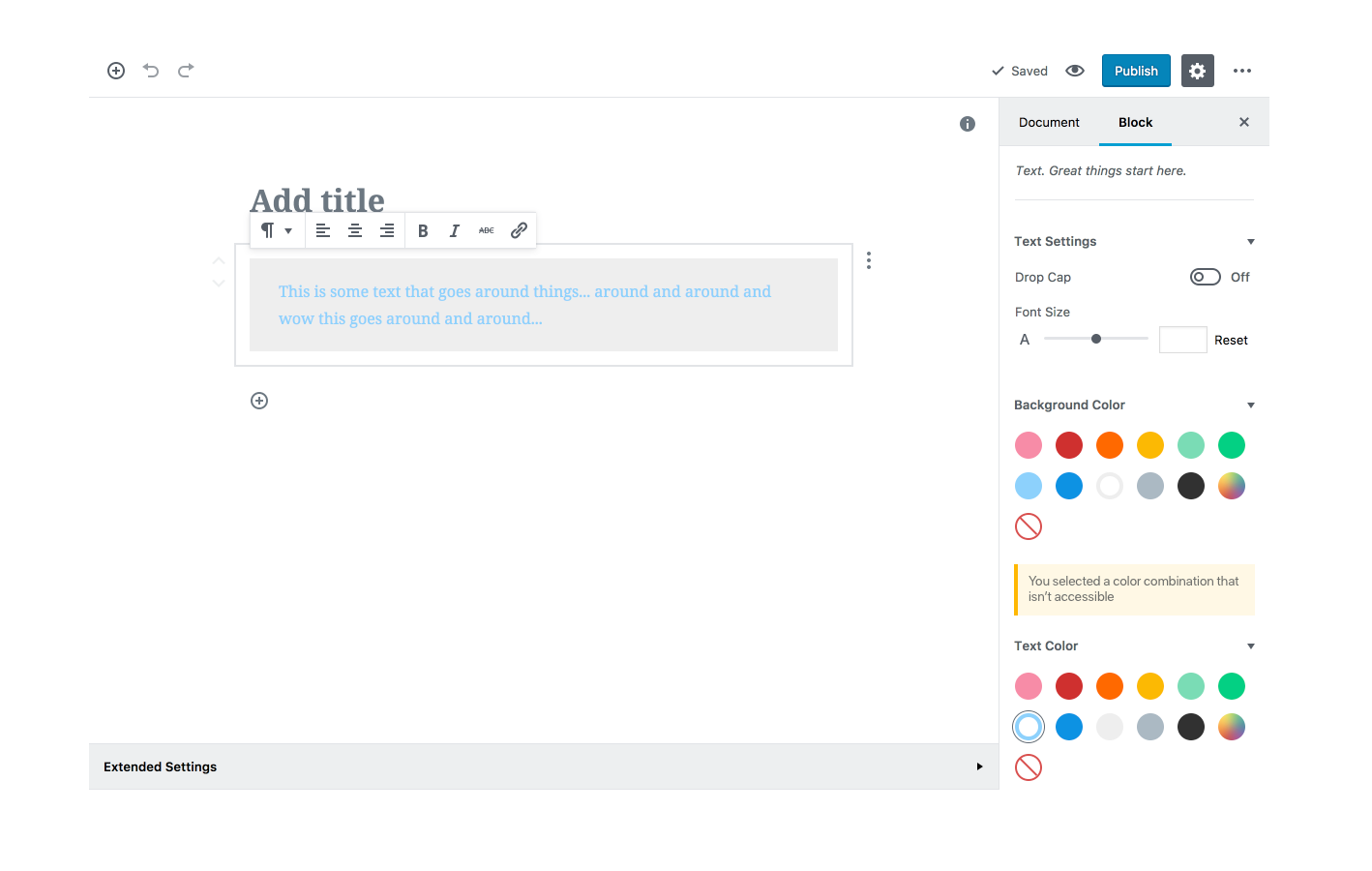
Here's a suggestion of what this could look like. I think it should kick in when you select the 'second' color. If that's text first the message can move up. We can iterate on the language, but I think a 'warning' is right not an error and not a block.
|
|
When we iterate on copy, let's be sure to offer up some tips for improvement, like:
|
|
Is there a possibility to remove the foreground colour choice entirely? If WordPress were to select the foreground colour (either white or black) based upon the background colour then accessibility would be ensured. This would also align with the Decisions not options philosophy. |
|
In principle, that would be effective, and I've done it myself in themes. However, it does create its own set of problem,largely because white and black are not necessarily the best choices for contrast, since max contrast is frequently not the best choice for accessibility. It does simplify the UI to eliminate the choice of text color, but there are many, many totally valid combinations of two colors that meet accessibility guidelines, and I don't feel that it's a good decision by the project to determine by fiat that those options will not be supported. |
|
@joedolson - no problem. Thought it was worth suggesting since I think it's best to have the minimum options possible. |
…pletion

[Android] Seamless media upload completion
Issue Overview
Certain color combinations with the Cover Text block fail to meet contrast ratios for WCAG 2.0/AA.
Current Behavior
colorandbackground-colorto create a 1.0 contrast ratio.Possible Solution
Edit: Cover text's UI controls were merged into the Paragraph controls in 1.0. The title has been updated accordingly.
The text was updated successfully, but these errors were encountered: