Add experimental ResponsiveBlockControl component
#16790
Conversation
 getdave
requested review from
ajitbohra,
ellatrix,
jorgefilipecosta,
Soean,
talldan and
youknowriad
as code owners
getdave
requested review from
ajitbohra,
ellatrix,
jorgefilipecosta,
Soean,
talldan and
youknowriad
as code owners
|
Adding a design review here there are a few points come to mind:
|

|
Took some time to work up a design.
One thing you'll notice is I've reverse the default state of the Switch to be on by default. Switching it off would show the multiple rows. An alternative ideas is to list out all available options with a Switch for each row. This tends to work great if we plan to have more than 2 options, but otherwise feels a little busy and overwhelming.
-- I mentioned some related changes to the placeholder value over in #16791 |


|
Another consideration here is that its likely we'll have many responsive settings across blocks and even within settings for a single block. For example, consider the need to adjust not only basic spacing (like we have above) but also font-size, or color, or general layout. At some point we may end up with a "mobile" switch for each of these settings. This is going to be problematic. What we might want to do instead, is have some sort of Switch for the entire editor. Something along the lines of a "mobile mode" or a "tablet mode" that would allow changes to be made to that specific view, without affecting the "desktop mode" display. I realize this is a much larger change than you initial proposed, but I think its the better way of handling the UI. |
Thanks for much for taking the time here @shaunandrews. It is much appreciated.
I see why you've done this. Playing devil's advocate here for a second. Does it feel a little odd to be turning something "off" to enable a feature?
Nice exploration. I agree this doesn't scale well though.
Yes that could get a little...noisy UI-wise!
A good idea. I wonder if @youknowriad is aware of any efforts in this area?
I agree although as you've identified it's a lot more complex. @youknowriad @mtias are you able to advise as to whether you feel the direction we're proposing here is suitable or will it be wasted effort in the long run if you have a "mobile mode" in the works? |
This seems very related to the responsive block controls that went through several iterations here: #13363 I think we came super close with this particular design from @kjellr : #13363 (comment) I understand the UI in #13363 is primarily for columns, but can help inform the design behind spacing too hopefully. |
|
@mapk Thanks very much for your feedback.
@mapk This is what I was building on having touched base with @kjellr earlier. However there have been a few iterations since and @shaunandrews has provided some more input. Are you able to advise how you feel about the designs @shaunandrews has proposed (cc @kjellr )? I'd like to avoid costly refactors in code because it takes a long time. Ideally, I've love ot get consensus from the design before I write any more code here. Much appreciated. |
For sure! Sorry to have let this stall. Regarding @shaunandrews' mockups, I definitely prefer the first concept, so I'll comment on that one specifically.
|

|
@mapk Thanks for this and sorry for the mega delay in responding. I've been away a lot recently.
I'm not completely clear on what you're recommending we do here to avoid this confusion. I've previously been asked to remove any additional "explainer" text to simplify the UI. I'd love to see/hear more detail here to help ensure I"m on the same page.
I think you're right. The solution should be
I can do that. I don't think this precludes making the other a11y changes though. |
|
@afercia Regarding this comment, I tried adding See below
Notice how the Questions
Also, are there any other ways I could look to improve this? |
 getdave
force-pushed
the
add/responsive-block-controls-component
branch
from
getdave
force-pushed
the
add/responsive-block-controls-component
branch
from
ad2c465
to
7da8329
Compare
Addresses points raised in #16790
|
Quoting from #16791 (comment) my understanding, this control is meant to add padding / margin settings to the group block, with the ability to specify this setting for different types of devices. If this is the case, I'd suggest to use |
|
@getdave I see only now the screenshot and questions before my previous comment 🤦♂ Yes, in your example the nested fieldset + legend aren't ideal. That would require to change the HTML structure and the text used for legend / labels. As general rules:
In the example above I'm not sure the labels for the select are ideal.
It really depends on the text used for the labels. It is OK to remove all the fieldsets if each label provides all the necessary information.
Couple of considerations:
|
Addresses concern raised in #16790
Address concerns raised in #16790
|
@afercia Thanks for your feedback. Here's a screenshot
I agree. So I've removed the
I believe the label per device approach is better in this case. As a result I've amended the label text to include a full description as you advise. However, previously design feedback is that including the full text is too visually "verbose". Therefore I suggest a compromise of providing the full text to screen readers whilst providing a shortened version for sighted users. I think with the context of the "Padding" fieldset legend surrounding all the controls it is clear enough that the device names refer to the setting for "padding" for that device.
I'll leave that to you and the design team. @mapk could you confirm a direction for us here please? Much appreciated.
Done 👍 |

This addresses concern that we need to be able to identify a “size” by a value that does not change due to translations.

See #16790 (comment)
getdave
force-pushed
the
add/responsive-block-controls-component
branch
from
8214e12
to
195aef5
Compare
Incomplete.
packages/block-editor/src/components/responsive-block-control/index.js
Outdated
Show resolved
Hide resolved
| function ResponsiveBlockControl( props ) { | ||
| const { legend, property, toggleLabel, responsiveControlsActive = false, renderDefaultControl, defaultLabel = __( 'All' ), devices = [ __( 'Desktop' ), __( 'Tablet' ), __( 'Mobile' ) ], renderResponsiveControls } = props; | ||
|
|
||
| const [ isResponsiveMode, setIsResponsiveMode ] = useState( responsiveControlsActive ); |
There was a problem hiding this comment.
onIsResponsiveModeChange - this is a callback purely to "notify" the consuming component that the responsive mode has changed to the value provided as an argument (ie: on/off). It doesn't do any setting.
If it does not do any setting, why we have a need to notify it? I think when there is a responsive mode change, the parent must update its state.
If we had a different padding setting per device (one value for small and one for medium), then the user clicks "Use the same padding on all screen sizes." the parent needs to update the values to remove the different settings for small and medium paddings. Otherwise, we start a disconnection between what the UI says, "Use the same padding on all screen sizes." and what is effectively stored.
So It seems like when there is a toggle on the responsive mode, the parent needs to update something probably block attributes. Depending on these attributes, the parent knows if the flag is true or not. If, during the first render, the parent needs to know if responsiveControlsActive is true or false, why can't on future updates the flag the parent passes also be used? That's the reason I think we don't need a local state the parent knows if the toggle is set or not depending on the attributes.
But right now I also not sure on the direction because we don't have storage for these settings yet. Also, I'm not totally inside the problem, so don't treat this suggestion as a blocker we can continue the current approach. When the component is used in practice it will be easier to understand the current path and if needed we can change as the component is experimental.
packages/block-editor/src/components/responsive-block-control/index.js
Outdated
Show resolved
Hide resolved
packages/block-editor/src/components/responsive-block-control/index.js
Outdated
Show resolved
Hide resolved
This prop was named based on implementation details. Switching out for more agnostic term.
Addresses #16790 (comment)

Noting that this type of comment seems to be undocumented in Gutenberg…
This is a small terminology change which could have a big change on the way developers think about repsonsive settings. We shouldn’t be thinking about “devices” but rather “viewports” / screen sizes. We can still present to the user as “devices” but the developer should not be tying layout changes to specific devices (or conceptual groups of devices - eg: “Mobile”).
Addresses #16790 (comment) by making the state of the responsive mode controlled by the consuming component. This completes the process of making the component fully controlled.
Attempt to relieve some of the overhead associated with having ResponsiveBlockControl be a fully controlled component. By consuming this hook, a developer can wire up a default handler for toggling responsive mode without having to worry about creating their own useState-based hooks.
getdave
removed
the
Needs Technical Feedback
|
@getdave thanks a lot for your efforts and also for considering my opinion :) I think small screens, medium screens, and large screens is even better than the middle-ground I suggested.
|

…rnmobile/gb-mobile-872-JSApplicationIllegalArgumentException-in-RCTAztecView

* 'master' of https://github.com/WordPress/gutenberg: (56 commits)
  Update: Default gradients. (#18214)
  Fix: setting a preset color on pullquote default style makes the block invalid (#18194)
  Fix default featured image size (#15844)
  Fix postmeta radio regression. (#18183)
  Components: Switch screen-reader-text to VisuallyHidden (#18165)
  [rnmobile] Release 1.16.0 to master (#18261)
  Template Loader: Add theme block template resolution. (#18247)
  Add a README file for storybook directory (#18245)
  Add editor-gradient-presets to get_theme_support (#17841)
  Add "Image Title Attribute" as an editable attribute on the image block (#11070)
  enables horizontal movers in social blocks (#18234)
  [RNMobile] Add mobile Spacer component (#17896)
  Add experimental `ResponsiveBlockControl` component (#16790)
  Fix mover for floats. (#18230)
  Rename Component to WPComponent in docstring (#18226)
  Colors Selector: replace `Aa` text by SVG icon (#18222)
  Removed gif from README (#18200)
  makes the submenu items stacked vertically (#18221)
  Add block navigator to sidebar panel for nav block (#18202)
  Fix: consecutive updates may trigger a blocks reset (#18219)
  ...
| /> | ||
|
|
||
| { ! isResponsive && ( | ||
| <div className="block-editor-responsive-block-control__group block-editor-responsive-block-control__group--default" > |
There was a problem hiding this comment.
Same note here about BEM convention as at: #17846 (comment)
Also:
- These classes are only referenced in tests. It's not strictly problematic to do so, but ideally the runtime implementation needn't be conformed specifically to tailor to tests.
- I think in representing this as some sort of on/off state (it either is or isn't "responsive"), we'd not need to refer to this explicitly as "default" but rather as the absence of "responsive". In other words, I'd suggest using modifier class
is-responsivefor the other condition, and for this one, simply omitting it.
The second point would actually enable us to simplify this implementation, where currently there is code duplication for block-editor-responsive-block-control__group largely because of how this class is assigned. With the above changes, it could become a unified wrapper of:
<div className={ classnames( 'block-editor-responsive-block-control__group', { 'is-responsive': isResponsive } ) } hidden={ ! isResponsive }>| ) } | ||
|
|
||
| { isResponsive && ( | ||
| <div className="block-editor-responsive-block-control__group block-editor-responsive-block-control__group--responsive" hidden={ ! isResponsive }> |
There was a problem hiding this comment.
The assignment of hidden here is effectively dead code, because this div is only rendered inside the condition of isResponsive && <div />.
|
Regarding #16790 (comment) and #16790 (comment) , I have proposed relevant changes at #19738. |
| @@ -0,0 +1,3 @@ | |||
| // Jest Snapshot v1, https://goo.gl/fbAQLP | |||
There was a problem hiding this comment.
Any idea how this snapshot ended up minified? Makes it impossible to review changes to the component 😞
There was a problem hiding this comment.
@tellthemachines It's quite likely that because the test is using a string of HTML for the snapshot, it doesn't know how to make sense of the string as markup of elements to break across lines, vs. say a React element tree. I'd agree though that it sort of defeats the purpose of a snapshot if a future maintainer is unable to assess whether changes in the snapshot are sensible.
I'm not sure exactly what our current configuration will support for those snapshots, but I'd wonder if it could be using the DOM element or if we could adapt somehow for the React element to be used. Otherwise, we may ought to avoid using the snapshot altogether and instead assert directly against specific values we're expecting in the markup.
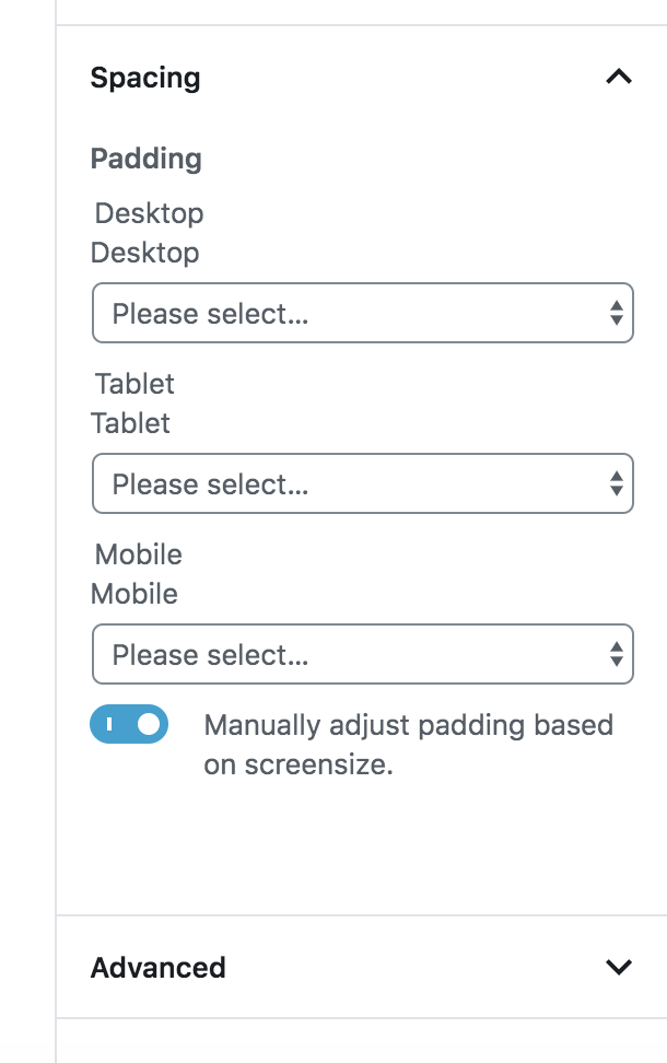
PLEASE READ THIS BEFORE REVIEWING 😀
This PR isn't in any way wired up to Block state. Therefore changing the values in the UI doesn't do anything or persist any settings whatsoever.
This is purely a PR for the UI only to allow multiple controls for different viewports only. It is a sub PR of a wider effort to allow the Group Block to define spacing controls (eg: margin / padding). See below for more details.
Description
Sub PR of Adds basic dimension controls to Group Block.
Adds a standardised
<ResponsiveBlockControl>component which provides a UI for Block controls that need to have responsive settings.Features:
fieldsetandlegendHow has this been tested?
I've temporarily hacked and implementation into the
core/groupBlock which utilises<select>inputs and temporarystatefor demo purposes.Note that this will be removed before merging.
Screenshots
Default
Responsive (toggled)
Types of changes
New feature (non-breaking change which adds functionality)
Checklist: