Note
I've full tutorial on this library on YouTube. You can check it out here
In various apps, we need to use a country code picker. There are several libraries available for this purpose. In XML we have a CCP created by hbb20, which is great. In Jetpack Compose there are few libraries but they lacks some features and updates. So, I created this library to use in Jetpack Compose. This library is highly customizable and can be used in any project. This should cover the lackings of other libraries and provide a better experience to the users.
- Minimal, lightweight and easy to use.
- Emoji Country flags, no more image assets.
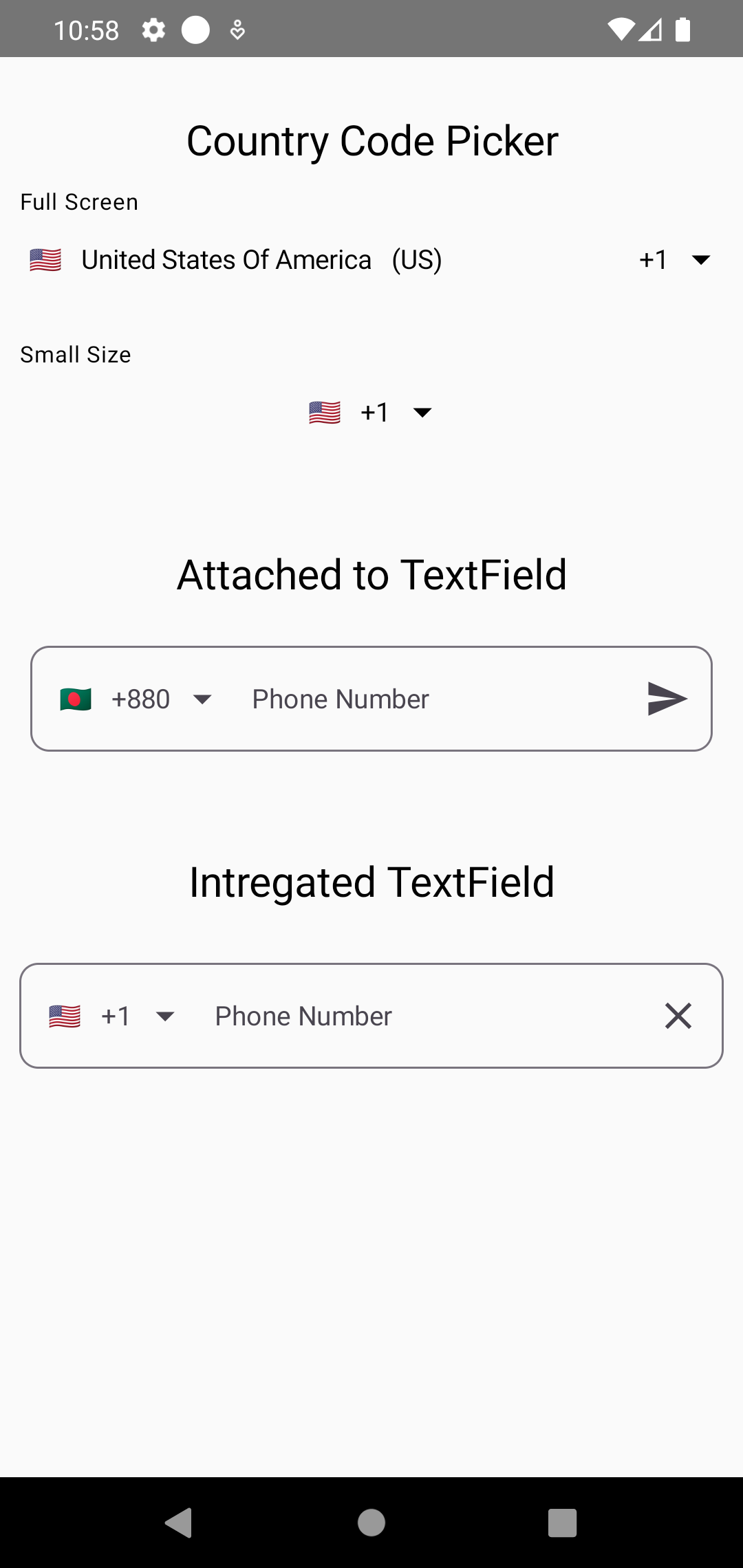
- 4 different ways to use the library.
- As a View (Full Screen or Small or Attached to TextField)
- As a TextField (Already intregated with OutlinedTextField)
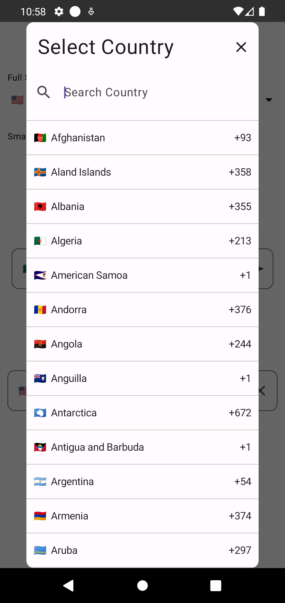
- As a Dialog (Just the picker dialog)
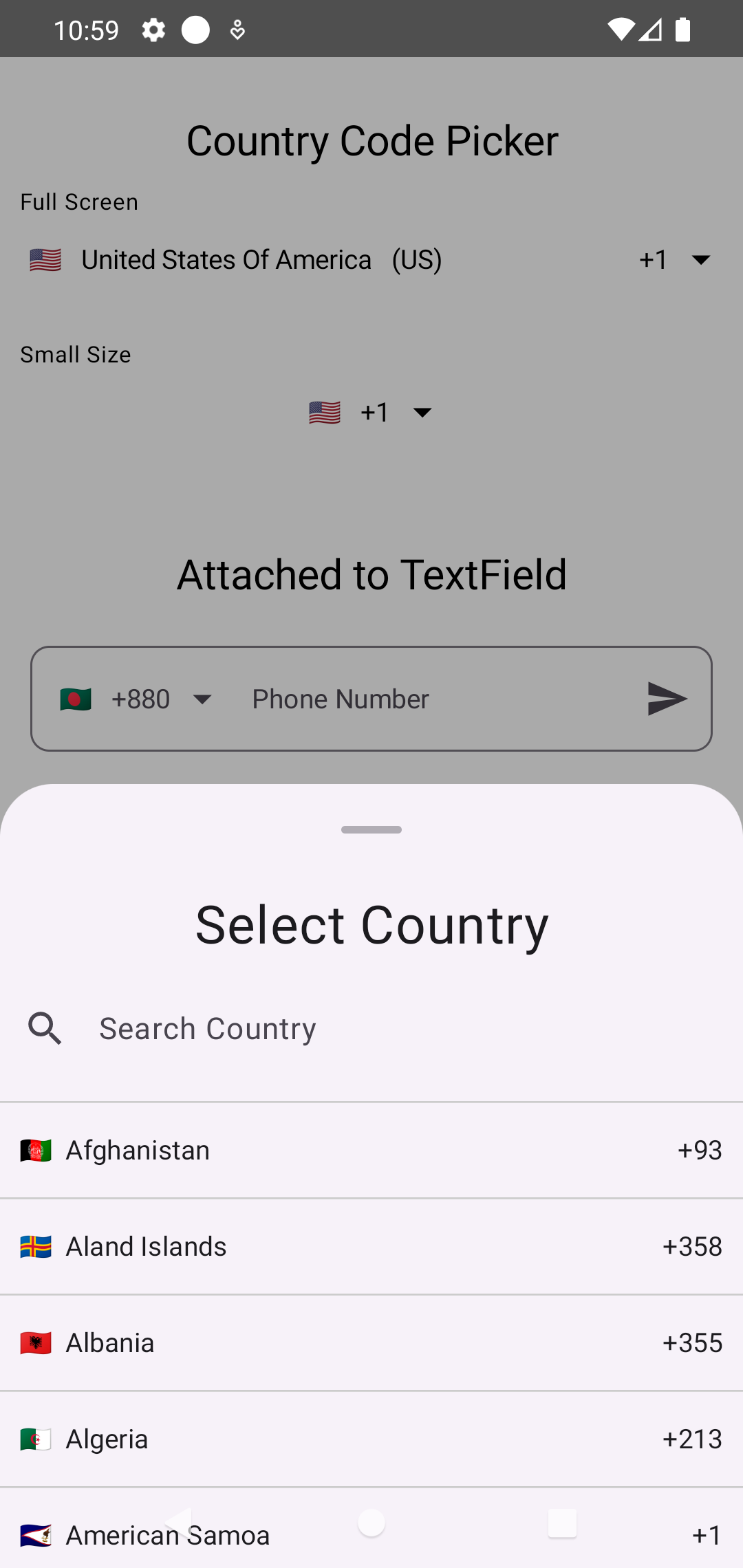
- As a BottomSheet (Just the picker bottom sheet)
- Automatic country detection based on the user's device.
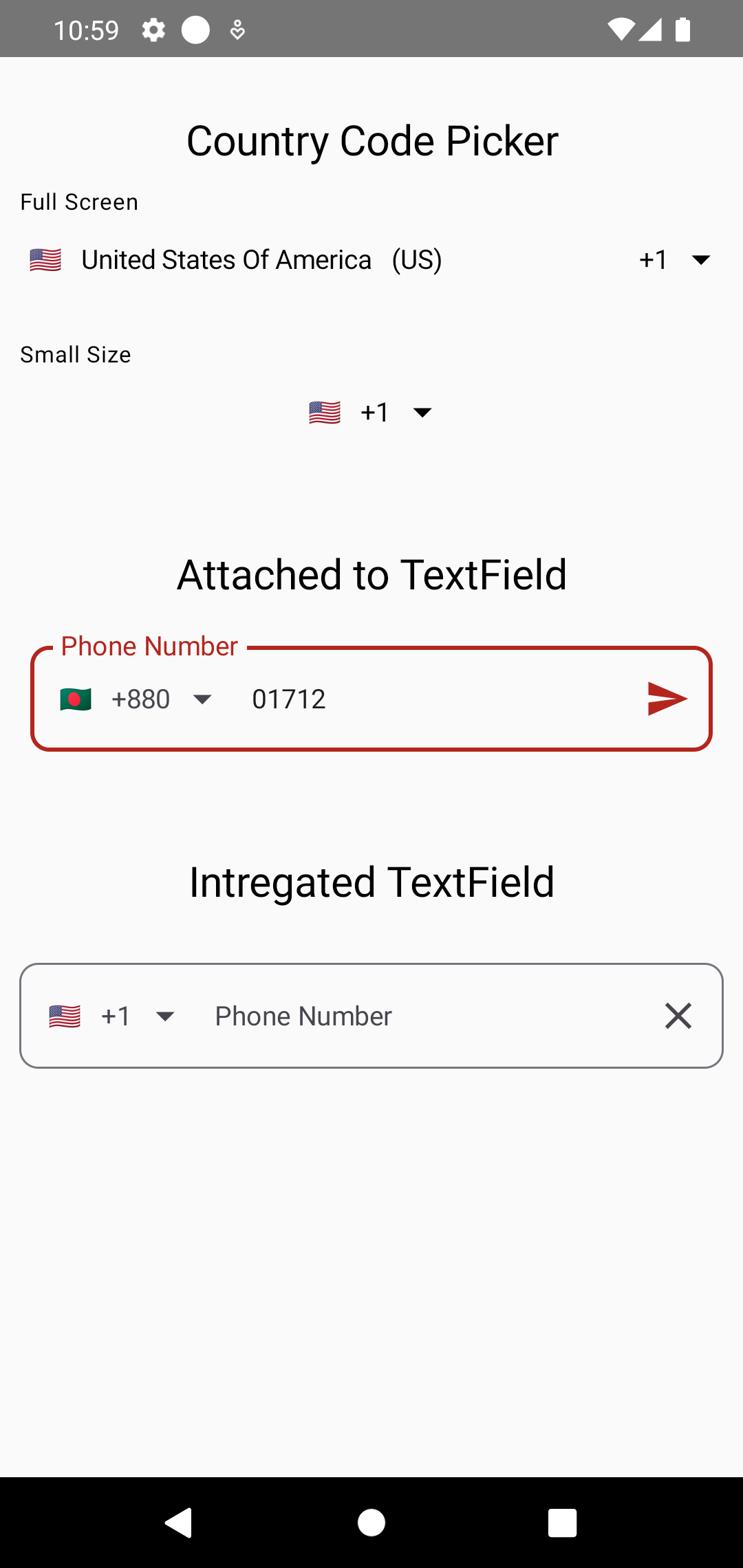
- Phone number validation.
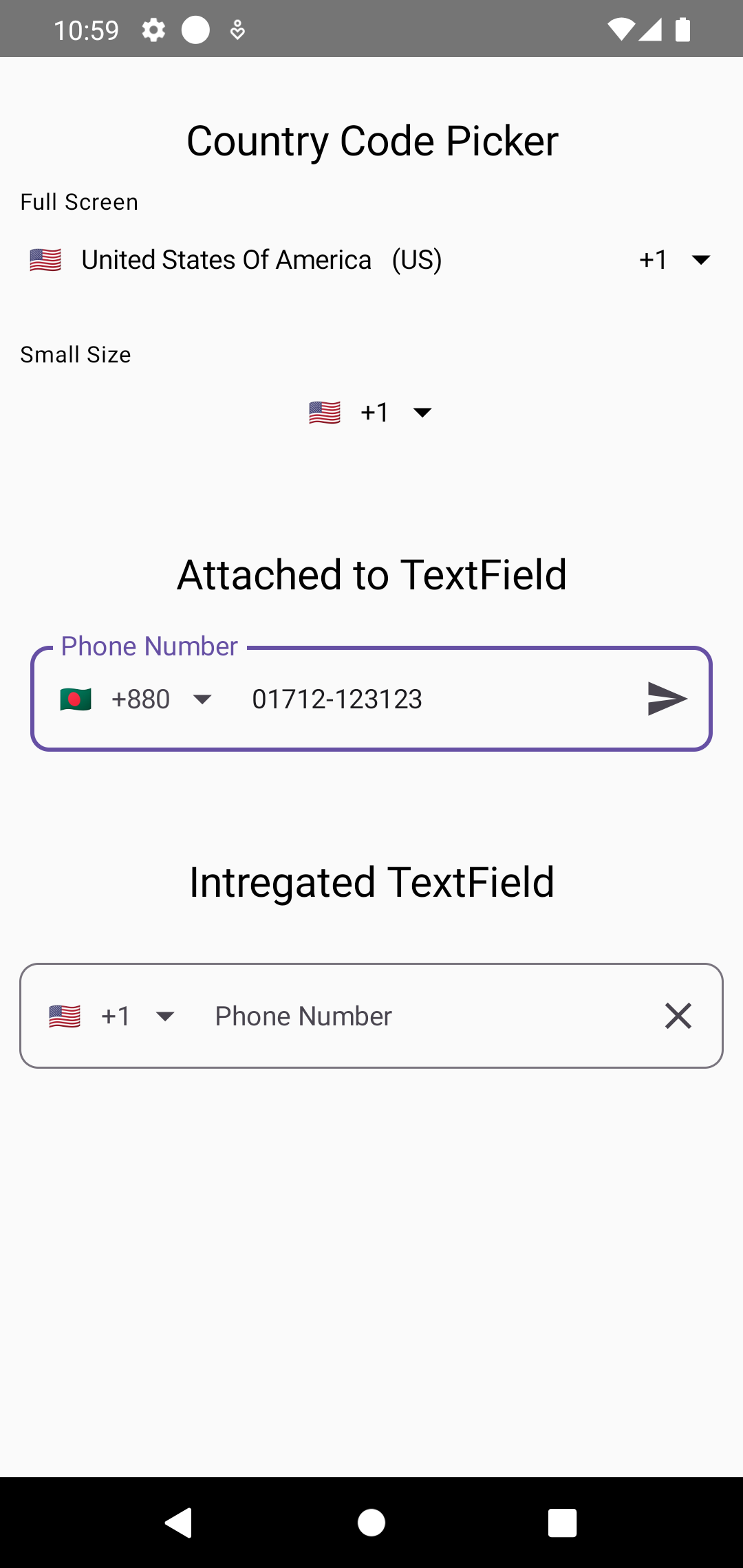
- Visual transformation of the phone number.
- Highly customizable.
| Different Use Cases | Country Picker Dialog | Picker Bottom Sheet |
|---|---|---|
 |
 |
 |
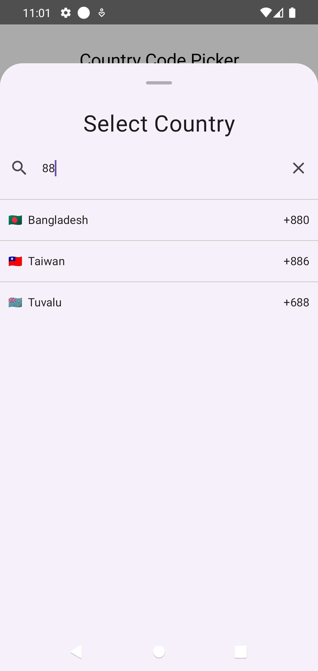
| Phone Number Validation | Visual Transformation | Picker Search Functions |
|---|---|---|
 |
 |
 |
You can download the test apk to try out the features of this library - Download
dependencyResolutionManagement {
    repositoriesMode.set(RepositoriesMode.FAIL_ON_PROJECT_REPOS)
    repositories {
        google()
        mavenCentral()
        maven{
            url = uri("https://jitpack.io")
        }
    }
}
dependencyResolutionManagement {
repositoriesMode.set(RepositoriesMode.FAIL_ON_PROJECT_REPOS)
repositories {
mavenCentral()
maven { url 'https://jitpack.io' }
}
}Add this to your module's build.gradle.kts file (latest version ):
dependencies {
    ...
    implementation("com.github.ahmmedrejowan:CountryCodePickerCompose:0.1")
}
dependencies {
...
implementation 'com.github.ahmmedrejowan:CountryCodePickerCompose:0.1'
}Usage (See Wiki)
There are 4 different usages of this library.
- As a regular Composable using
CountryCodePicker - As a OutlinedTextField Composable using
CountryCodePickerTextField - As a Picker Dialog using
CountryPickerDialog - As a Picker BottomSheet using
CountryPickerBottomSheet
This is the regular composable, it can be used in any places, can be also attached to a TextField. Here is a simple example-
      var country by remember {
            mutableStateOf(Country.Argentina)
        }

        CountryCodePicker(
            modifier = Modifier.align(Alignment.CenterHorizontally),
            selectedCountry = country,
            onCountrySelected = { country = it },
            viewCustomization = ViewCustomization(
                showFlag = true,
                showCountryIso = false,
                showCountryName = false,
                showCountryCode = true,
                clipToFull = false
            ),
            pickerCustomization = PickerCustomization(
                showFlag = false,
            ),
            showSheet = true,
)This is the OutlinedTextField Composable, it can be used as a TextField. Here is a simple example-
  var country by remember {
        mutableStateOf(Country.Bangladesh)
    }

    if (!LocalInspectionMode.current) {
        CCPUtils.getCountryAutomatically(context = LocalContext.current).let {
            it?.let {
                country = it
            }
        }
    }


    CountryCodePickerTextField(
        modifier = Modifier
            .fillMaxWidth()
            .padding(10.dp),
        enabled = true,
        textStyle = MaterialTheme.typography.bodyMedium,
        trailingIcon = {
            IconButton(onClick = { text = "" }) {
                Icon(
                    imageVector = Icons.Default.Clear, contentDescription = "Clear"
                )
            }
        },
        label = {
            Text(
                text = "Phone Number", style = MaterialTheme.typography.bodyMedium
            )
        },
        showError = true,
        shape = RoundedCornerShape(10.dp),
        onValueChange = { _, value, _ ->
            text = value
        },
        number = text,
        showSheet = true,
        selectedCountry = country


    )
This is Dialog Composable. It will return the selected country when an item is clicked. Here is a simple example-
        var country by remember { mutableStateOf(selectedCountry) }
        var isPickerOpen by remember { mutableStateOf(false) }

        CountryPickerDialog(
            modifier = Modifier.clip(shape = RoundedCornerShape(10.dp)),
            onDismissRequest = { isPickerOpen = false },
            onItemClicked = {
                country = it
                isPickerOpen = false

            },
            textStyle = textStyle,
            listOfCountry = countryList,
            pickerCustomization = pickerCustomization,
            itemPadding = itemPadding,
            backgroundColor = backgroundColor
        )
This is Dialog Composable. It will return the selected country when an item is clicked. Here is a simple example-
        var country by remember { mutableStateOf(selectedCountry) }
        var isPickerOpen by remember { mutableStateOf(false) }

        CountryPickerBottomSheet(
            modifier = Modifier.clip(shape = RoundedCornerShape(10.dp)),
            onDismissRequest = { isPickerOpen = false },
            onItemClicked = {
                country = it
                isPickerOpen = false
            },
            textStyle = textStyle,
            listOfCountry = countryList,
            pickerCustomization = pickerCustomization,
            itemPadding = itemPadding,
            backgroundColor = backgroundColor
        )
Customization (See Wiki)
All of the Composables have customization options. The full customization is available in the Wiki - See Wiki
There are several utils to make things easier. They are-
This will detect the country based on the user's device.
    var country by remember {
        mutableStateOf(Country.Bangladesh)
    }

    if (!LocalInspectionMode.current) {
        CCPUtils.getCountryAutomatically(context = LocalContext.current).let {
            it?.let {
                country = it
            }
        }
}This will validate the phone number based on the selected country.
    val validatePhoneNumber = remember(context) {
        CCPValidator(context = context)
    }

    var isNumberValid: Boolean by rememberSaveable(country, text) {
        mutableStateOf(
            validatePhoneNumber(
                number = text, countryCode = country.countryCode
            ),
        )
    }

     OutlinedTextField(
        value = text,
        onValueChange = {
            isNumberValid = validatePhoneNumber(
                number = it, countryCode = country.countryCode
            )

        },

        // Other properties

     )
This will transform the phone number based on the selected country. Attach this to text field to see the transformation. It's already integrated with CountryCodePickerTextField.
    OutlinedTextField(
        // Other properties
        visualTransformation = CCPTransformer(context, country.countryIso)
        // Other properties
    )
data class ViewCustomization(
    var showFlag: Boolean = true,
    var showCountryIso: Boolean = false,
    var showCountryName: Boolean = false,
    var showCountryCode: Boolean = true,
    var showArrow: Boolean = true,
    var clipToFull: Boolean = false,
)data class PickerCustomization(
var itemPadding: Int = 10,
var dividerColor: Color = Color.LightGray,
var headerTitle: String = "Select Country",
var searchHint: String = "Search Country",
var showSearchClearIcon: Boolean = true,
var showCountryCode: Boolean = true,
var showFlag: Boolean = true,
var showCountryIso: Boolean = false,
)- The library is in its early stages, so there may be some bugs.
- If you find any bugs, please report them in the
Issuestab. - Sample app is available in the app directory.
- Right now, it doesn't support translations. But it will be added in the future.
- Inspired by CountryCodePickerProject by hbb20
- Inspired by jetpack_compose_country_code_picker by togisoft
- Inspired by jetpack_compose_country_code_picker by jump-sdk
- Creadit to libphonenumber-android by MichaelRocks
Please fork this repository and contribute back using pull requests.
Any contributions, large or small, major features, bug fixes, are welcomed and appreciated.
Let me know which features you want in the future in Request Feature tab.
If this project helps you a little bit, then give a to Star ⭐ the Repo.
Copyright 2024 ahmmedrejowan

Licensed under the Apache License, Version 2.0 (the "License");
you may not use this file except in compliance with the License.
You may obtain a copy of the License at

 http://www.apache.org/licenses/LICENSE-2.0

Unless required by applicable law or agreed to in writing, software
distributed under the License is distributed on an "AS IS" BASIS,
WITHOUT WARRANTIES OR CONDITIONS OF ANY KIND, either express or implied.
See the License for the specific language governing permissions and
limitations under the License.
