Accordion #1
Comments
|
I've done some work to extract the Accordion javascript from the Design Manual into a standalone component which no longer requires jQuery. You can see the code here: https://github.com/frankieroberto/accordion |
|
Just a note that the DVSA heroku app link has a password. Below are the details: username: admin Also source can be found here: |
|
we're aiming for Service standard browsers support matrix right? |
|
Thanks @tameemsafi - I've updated the top comment with those details. |
|
@tameemsafi the DVSA components seems to have two versions, one with + and - icons, and the other with arrows. Have you tested both? Any reasons to prefer one over the other? Also looks like your javascript does some scrolling, which I find slightly jarring, but perhaps there's a reason for this? |
|
@frankieroberto We did test both and the one with up/down arrows is the one that was chosen as it was more user-friendly. However, I put both in the styleguide just to show the different versions. The scrolling feature works better if there is more content but I see what you mean that it looks a little annoying on the styleguide page. You can see it being used live here: |
|
@tameemsafi interesting, thanks. |
 timpaul
added
component
timpaul
added
component
|
We're trying out a version of this in a form on "Find postgraduate teacher training courses":
|

|
From Check MOT service:
|


|
@frankieroberto has very kindly agreed to work with us on developing this component. The work will be based on https://github.com/frankieroberto/accordion |
 ignaciaorellana
assigned ignaciaorellana and unassigned govuk-design-system and ignaciaorellana
ignaciaorellana
assigned ignaciaorellana and unassigned govuk-design-system and ignaciaorellana
Accordion component criteriaIn addition to meeting the Design System criteria, we have agreed that this component will meet the following additional criteria: Coding criteriaThe accordion component must:
Design criteriaThe accordion component must:
Guidance criteriaThe component guidance must:
Research criteriaThe contributor must:
Accessibility criteria
|
|
This contribution in being worked on GOV.UK Frontend by @frankieroberto, see further details here: alphagov/govuk-frontend#958 |
|
The Worldwide section of GOV.UK uses accordions on the country pages, eg:
|

|
This looks really good—nice one, Frankie! Here’s some notes/questions:
|
|
@dashouse Hey Dave. @frankieroberto asked me to do this on Monday so I duplicated my comment on the PR: alphagov/govuk-frontend#958 |
|
I have a comment on the placement and use of the 'plus' signs/ arrows:
The way that we dealt with these issues on the GOV.UK Step by Step accordion was to use descriptive link text beneath the section headings:
(Please note that the placement of the 'show all' link should ideally be on the far left to accommodate magnified screen use. It just hasn't been implemented yet!) |
|
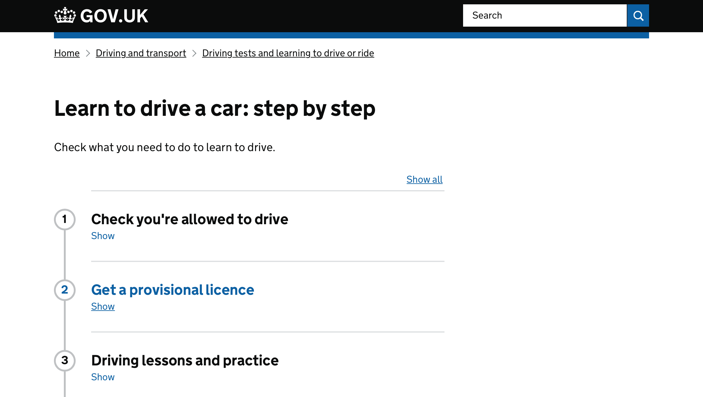
@miaallers great feedback. Thanks to your comment, I've just realised that the step by step pattern is basically an accordion but with numbers (and a connecting line). That's pretty cool and wonder if this could end up being the same pattern (or reusing what's under the hood) somehow. In the screenshot, the “Show all” text is also aligned right and may be problematic for people using a magnifier (like you said). Did you do any testing around this? |
|
@frankieroberto did you consider using several instances of the Details component as a style for the accordion?
|

Hello! I manage a few websites that run a "cousin" design system from across the pond and it seems that we share a "love" for accordions. I'm wondering if you've been looking into an issue that's been bugging me -- the inability to "link to highlight" to something inside an accordion. There's also the inability to use ctrl-f, but I'm willing to bet you've already had that conversation. Apologies if I'm posting in an inappropriate location. BTW, I love your work and generally direct colleagues to your guidance documents -- especially for best advice on using accordions. |
|
Hi @gillick, thanks for getting in touch! It's not something we've considered recently for the accordion. We do have the option to open sections by default, but not to link to something inside an accordion section. We actually have an open issue for that: alphagov/govuk-frontend#1581 but it's not an issue that has been reported frequently by users so it's not been prioritised. |
|
Hello from me as well @gillick! Thanks for the kind words. To be honest, I'd perhaps describe our relationship with accordions as "it's complicated." They can be useful to help users pick and choose the information they need, but we also see instances where accordions are used to hide messy information that just needs to be organised better. That's why we include guidance on When not to use an accordion in our guidance for the component. In cases where you'd like to "link to highlight" or link to something inside an accordion section, we'd suggest considering if it should be moved outside of the accordion, since it's likely to be important enough to not have hidden from users. Hope that's helpful. |
|
Thanks, @calvin-lau-sig7 and @vanitabarrett! It's possible that my "love" quotes weren't as clear as they could be, so I'm going to adopt "it's complicated" for the duration. Let's just say that I've shared your When not to use an accordion guidance at least twice in the past fortnight. I especially appreciate that your design system (and therefore the guidance) keeps the when to / when not to guidance visually prominent. There's also the fact that you follow what my team calls the "League of Legends" rule and doesn't spoil a good explanation with a bad example. A hat tip to your team. TBH, I was hoping for a tech answer to accordion issues because the human-factors answer (craft better stuff) is a challenge to enforce. Well, at least we're all in the same boat -- and paddling in the same direction. Good luck -- and if I can ever be of service (or provide a good pizza recommendation in the DC metro), just ping. |
|
Hello, is this component ready for production use on a service which is not allowed to use javascript and is multi-lingual? Considering that this component is expiremental as of now would it be best to use an alternative? |
|
Hi @TautvydasPocius . The accordion component can be used for services in production, although I would encourage you to read the guidance on the Design System website (specifically 'when to use this component') as it's not suitable for all scenarios. Just to be clear - services are allowed to use JavaScript, but there should be a fallback (i.e: it should still work if JavaScript is not available). The accordion component has been built using progressive enhancement, so if a user does not have JavaScript available, the content inside the accordion will display on the page by default instead. We're aware that the accordion, and some other components in GOV.UK Frontend, do not support customisable text (including translations) and this is something the team will be investigating over the next few months. The team is also aware that our 'experimental' label is unclear and we will be revisiting our use of that label in future. |
|
@TautvydasPocius Do not use an accordion. In the guidance, you will see a long list of problems and things that can go wrong with this component, But the most important one for your service, which is not allowed to use Javascript, is this one: "The accordion component uses JavaScript. When JavaScript is not available, users will see all the content displayed with the section labels as headings." So your users will see section labels as headings, so forget about accordions and work with section labels as headings instead. When you test the page, if your users are finding that it is too long to cope with then try one or more of these strategies:
This component gets far too much attention because it happens to start with an A so appears at the top of alphabetical lists of components. Related: @amyhupe and I wrote a joint blog post about long pages |
|
Hi, Sorry if this is the wrong place to write this issue I am having. I am using this accordion component and having issues with it remembering expanding selection between different sessions. Example, select "show all sections" clicked on a deal. Insert new deal and go to page with accordion on a different url-> all sections are expanded. Press "hide all sections" and insert a new deal and navigate to it on a different url and all sections are closed. Repeat. |
|
@Zainzzkk the 'remembering' of accordion state is stored against the value of the For example: <div class="govuk-accordion" data-module="govuk-accordion" id="deal-{{ $id_of_deal }}">
[...]
</div> The Hope that helps! |
|
The
|
|
I wanted to share a real-world example of how the new accordion design looks compared to previously. For our use case, I think the old design works better because of the nature of the usage and the more compact appearance. Our use case has an accordion section for each month of the year - 12 months in total - with a table within each section. There'll always be twelve sections to the accordion, but the data within might vary quite a bit. I think the old design is easier to scan - subjectively as it's just a list of dates they flow on from each other better than the revised design. I think a lot of this is the height of each section - which has gone from 61px to 114px - an 87% increase. Old accordion design: New accordion design: |


|
I have a hacky solution if you're having issues testing whether the right accordions are defaulting to open and shut because the accordion is remembering your previous selections: The js remembering the selections works using the |
|
I agree with @edwardhorsford, content is now much harder to scan and significantly more scrolling is required to get through the same amount of information. Especially for internal services, where users are expected to interact with complex data on a daily basis, the accessibility tradeoff doesn't hold up. Is there a chance to have the old design back for internal services please? |
|
Hi @edwardhorsford and @stagarz, Thanks for your feedback. We had a short discussion about this within the team last week. In short, we don't consider this to be a priority. The new accordion design has been thoroughly tested with users (including those with access needs), tested with assistive technologies, and reviewed by accessibility experts. The new implementation is WCAG compliant; the old implementation was not. Although we are aware and accept that the new accordion is harder to scan and takes up more vertical space, we consider these to be reasonable trade-offs for the sake of making the accordion accessible. We don't feel like there is a compelling reason to make changes to the design at this time, especially as many of the accessiility problems with the original version were visual in nature. We are confident that the new design is a marked improvement on the original. We encourage implementors to really think about the compromises needed to continue using the older design and to carry out user testing on anything new (or old, in this case). If you do carry out testing (ideally including assistive technology users) then we'd be interested in seeing it! |
|
Our content designers requested that direct-linking to an element ID within the accordion should open that section immediately. Therefore, I have written this JavaScript to achieve that: It is yet to be reviewed by our other developers, but I thought I'd share it here before I forget. |
|
@MalcolmVonMoJ as well as adding the
Without also taking care of these things the various bits of the interface are likely to get out of sync, and the expanded state will not be communicated correctly to assistive tech users. |
|
Thanks for replying Ollie. Originally I thought that would be the case. But it was pointed out to me that if I only add |
|
I have a use case which I believe is similar to @edwardhorsford's comment above on 17th May. It's not a public-facing service; the users are local authority staff in a role requiring some data processing expertise. We are supplying them an error report for a spreadsheet of data they've uploaded; there could be many errors in each of many rows in the spreadsheet. Ideally I'd like the first thing they see to be an overview, where each row in the spreadsheet has one row in the overview that summarises how many errors there are in that row but without going into detail. Then I'd like the user to be able to expand each row to see the full details of the errors in it. Hopefully that description makes sense. It seems to me that the "old" design Ed refers to - which I haven't used before - is a better pattern for this than the new one, as there could be dozens of rows (accordion sections) and the new accordion design would take up a lot of space, be daunting to users, and be very hard for a user to scan to get that overview of the report. Are the "old" accordion designs / macros available somewhere for my team to implement and test? (We would look into the accessibility issues at the same time and aim to test with assistive technology users. If there's a summary of the issues somewhere that would help us ensure we're addressing the right things.) Alternatively if there's a better pattern for our use case then I'm very open to recommendations! |
|
Arguably, using I'd say either use |
|
Currently, the demo at https://design-system.service.gov.uk/components/accordion/ uses |
|
We have removed the 'Experimental' tag from components, patterns, and guidance in the Design System 😌. The tag was being used on the Accordion component to raise awareness that more research is needed to validate it. However, we recently published new guidance on how to share findings from users which we hope will make it easier to collect more information about how our Design System is being used across services. If your team has used this component please let us know 💪🏻. |
|
Was there a stage in the development of this component where the following choice was made? I'm keen to hear if there was any research or user testing around this issue. Sorry if it's in here somewhere already, I have tried to find it! |
 and others
Use this issue to discuss the accordion component in the GOV.UK Design System.
The text was updated successfully, but these errors were encountered: