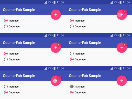
A FloatingActionButton subclass that shows a counter badge on right top corner
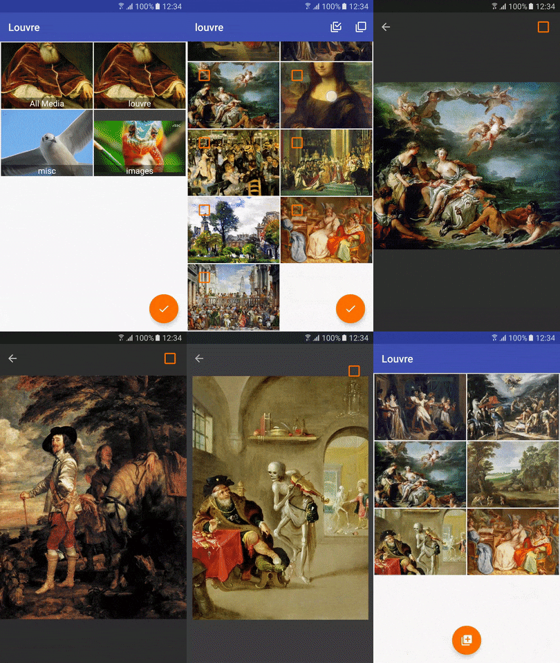
It's also used by Louvre library.
Include the library in your build.gradle (check badge at top for latest version)
dependencies{
    compile 'com.github.andremion:counterfab:x.y.z'
}
or in your pom.xml if you are using Maven
<dependency>
  <groupId>com.github.andremion</groupId>
  <artifactId>counterfab</artifactId>
  <version>x.y.z</version>
  <type>pom</type>
</dependency>Add it as a regular FloatingActionButton on layout…
<com.andremion.counterfab.CounterFab
        android:id="@+id/counter_fab"
        android:layout_width="wrap_content"
        android:layout_height="wrap_content"
        android:src="@drawable/ic_add_white_24dp" />
and programmatically you can use one of these methods:
CounterFab counterFab = (CounterFab) findViewById(R.id.counter_fab);
counterFab.setCount(10); // Set the count value to show on badge
counterFab.increase(); // Increase the current count value by 1
counterFab.decrease(); // Decrease the current count value by 1The recommended way to customize the background color is by using the app:backgroundTint attribute
<com.andremion.counterfab.CounterFab
        android:id="@+id/counter_fab"
        android:layout_width="wrap_content"
        android:layout_height="wrap_content"
        app:backgroundTint="@color/colorAccent"
        android:src="@drawable/ic_add_white_24dp" />
To change the badge style you can use these attributes:
app:badgeBackgroundColorapp:badgeTextColorapp:badgePositionasRightTop,LeftBottom,LeftToporRightBottom
For example:
<com.andremion.counterfab.CounterFab
        android:id="@+id/counter_fab"
        android:layout_width="wrap_content"
        android:layout_height="wrap_content"
        app:badgeBackgroundColor="@color/red"
        app:badgeTextColor="@color/white"
        app:badgePosition="RightTop"
        android:src="@drawable/ic_add_white_24dp" />
See more at the sample
- Design Support Library The Design package provides APIs to support adding material design components and patterns to your apps.
Copyright 2016 André Mion

Licensed under the Apache License, Version 2.0 (the "License");
you may not use this file except in compliance with the License.
You may obtain a copy of the License at

    http://www.apache.org/licenses/LICENSE-2.0

Unless required by applicable law or agreed to in writing, software
distributed under the License is distributed on an "AS IS" BASIS,
WITHOUT WARRANTIES OR CONDITIONS OF ANY KIND, either express or implied.
See the License for the specific language governing permissions and
limitations under the License.


