-
Notifications
You must be signed in to change notification settings - Fork 192
Control Groups
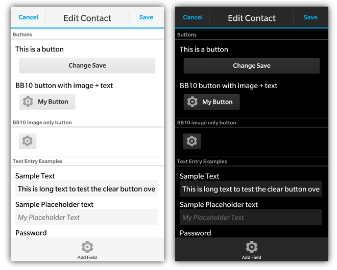
Rounded control panels are found on many of the standard BlackBerry applications. They typically group different controls together into logical groupings. Below is a screen shot of a control group that has a button and some progress indicators nested inside of it and a BlackBerry 10 control group example

To declare a control panel you create a <div> with the data-bb-type="round-panel" attribute. All content that you add to the inside of this <div> will appear inside the control panel.
On BlackBerry 5/6/7/PlayBook these will appear as a rounded panel. With BlackBerry 10 styling they will appear as a section of the screen with a title at the top (if specified).
Control panels can either be a simple panel, or they can also have a title added to them. To add a title add a <div> with the data-bb-type="panel-header" attribute. The text contained inside of this div will show up as a header on the panel. An example of what this header looks like can be seen in the Label/Control Container section below.
<div data-bb-type="screen">
    <div data-bb-type="round-panel">
        <div data-bb-type="panel-header">My Header</div>

    </div>
</div>The following JavaScript interfaces are available for dynamically manipulating a Control Group after the screen has been added to the DOM
When you want to dynamically show or hide your control group you can call it's show() and hide() functions.
document.getElementById('myGroup').show();
document.getElementById('myGroup').hide();As a convenience you can also remove your control group from the screen by calling the remove() function.
document.getElementById('myGroup').remove();