Skip to content
New issue

Have a question about this project? Sign up for a free GitHub account to open an issue and contact its maintainers and the community.

By clicking “Sign up for GitHub”, you agree to our terms of service and privacy statement. We’ll occasionally send you account related emails.

Already on GitHub? Sign in to your account

Accessibility color blindness chart is a strange size in desktop and mobile. #1679

Closed
1 of 2 tasks
mjabbink opened this issue Apr 19, 2020 · 8 comments · Fixed by #1904
Closed
1 of 2 tasks

Accessibility color blindness chart is a strange size in desktop and mobile. #1679

mjabbink opened this issue Apr 19, 2020 · 8 comments · Fixed by #1904
Assignees

Comments

@mjabbink
Copy link
Contributor

mjabbink commented Apr 19, 2020

@jeanservaas

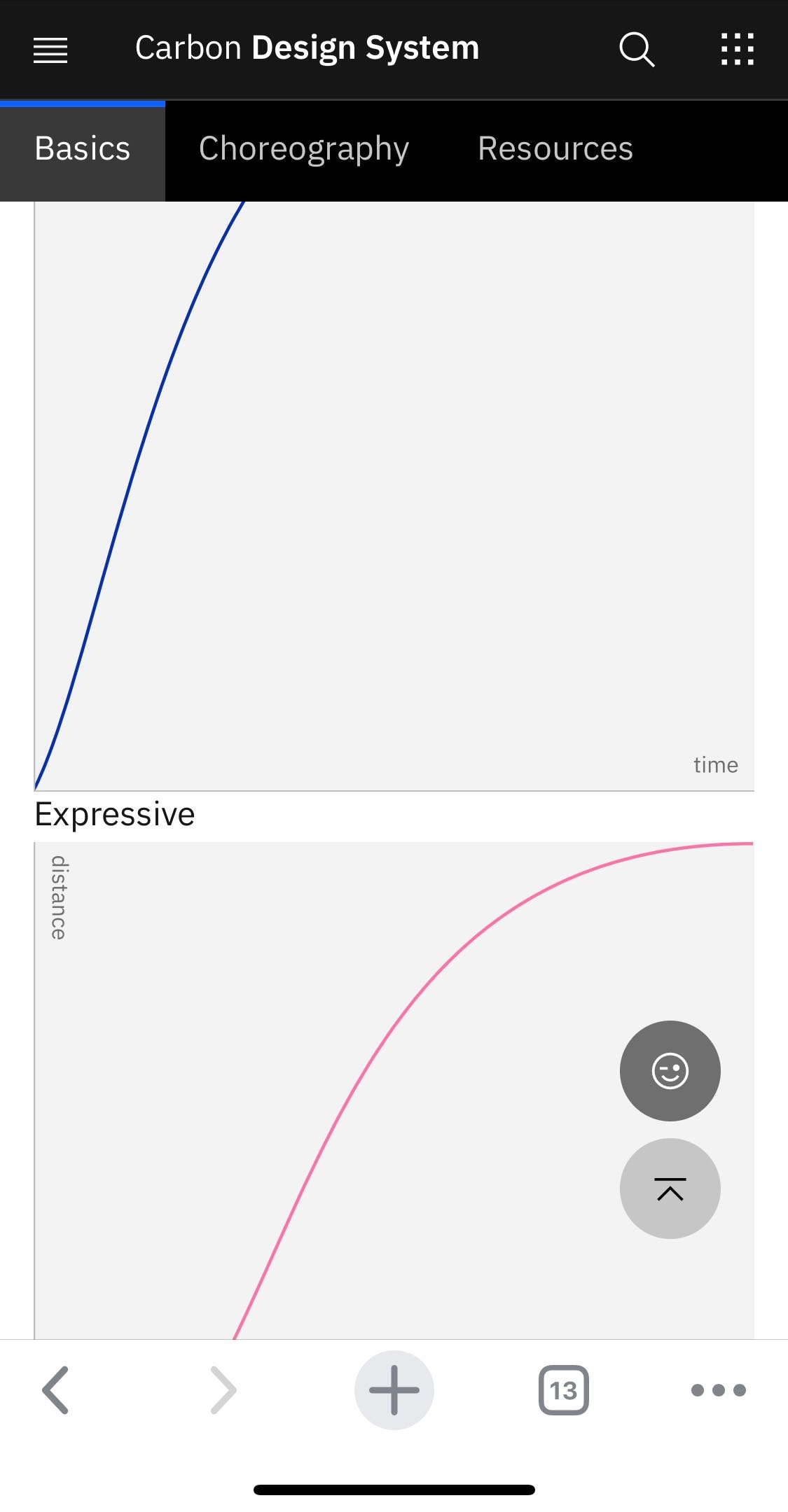
  • The Accessibility color blindness chart is a strange size in desktop and mobile.

https://www.carbondesignsystem.com/guidelines/accessibility/color#designing-for-color-blindness

IMG_5751.jpg

—————

  • Some spacing/padding issues here. The space above caption is tight and space after caption too tight

@aagonzales @jeanservaas
IMG_5752.jpg

@jnm2377 jnm2377 transferred this issue from carbon-design-system/design-language-website Sep 8, 2020
@jnm2377
Copy link
Contributor

jnm2377 commented Sep 8, 2020

Transferred this issue to the correct repo, and removed comments that already had existing issues or belong in the GTC repo. Let's try to keep issues scoped to one specific thing going forward, it's easier for us to keep track of them that way.

@jnm2377 jnm2377 self-assigned this Sep 8, 2020
@mjabbink
Copy link
Contributor Author

mjabbink commented Sep 8, 2020

I’ll do my best

@jnm2377
Copy link
Contributor

jnm2377 commented Sep 10, 2020

This is what I'm seeing for desktop. What exactly is wrong about this? I have no idea what the image should look like. 👀

Screen Shot 2020-09-10 at 1 00 15 PM

And should it just be full screen on mobile or something else entirely? Are we supposed to be using art direction with different images on this?

Screen Shot 2020-09-10 at 1 00 30 PM

@jnm2377
Copy link
Contributor

jnm2377 commented Sep 14, 2020

@jeanservaas do you know what the correct images should be?

@mjabbink
Copy link
Contributor Author

mjabbink commented Sep 14, 2020

@jnm2377 The width needs to follow the body copy widths. And in mobile it should span margin to margin

@mjabbink
Copy link
Contributor Author

Screen Shot 2020-09-14 at 6 16 14 PM

@mjabbink
Copy link
Contributor Author

Screen Shot 2020-09-14 at 6 18 39 PM

@mjabbink
Copy link
Contributor Author

Screen Shot 2020-09-14 at 6 20 10 PM

@alisonjoseph alisonjoseph changed the title [Carbon site] Series of issues Accessibility color blindness chart is a strange size in desktop and mobile. Oct 19, 2020
@alisonjoseph alisonjoseph assigned alisonjoseph and unassigned jnm2377 Oct 19, 2020
@kodiakhq kodiakhq bot closed this as completed in #1904 Oct 19, 2020
Sign up for free to join this conversation on GitHub. Already have an account? Sign in to comment
Projects
None yet
Development

Successfully merging a pull request may close this issue.

3 participants