Compatibility: FoundryVTT 10.286
Languages: English, Español, 正體中文
A clean and theme-able visual update for Foundry VTT.
- Theming
- Custom Theming
- Dark Theme
- Import/Export Theme
- Compact Mode
- Subtle Layout
- Custom Logo
- Various UI toggles (hide logo, hide scene thumbnails, and more)
https://github.com/ernieayala/ernies-modern-layout/releases/download/0.5.7/module.json
This might break your game (visually) - but this is a manual install of a pre-release version. https://raw.githubusercontent.com/ernieayala/ernies-modern-layout/master/prerelease/module.json
If you want to revert to the stable version - re-install using the link under Manifest URL.
- If you find a bug with a mod that I have marked a function - create an Issue in Github for me.
- If you want me to look at supporting a mod or system; hop into my Discord. State the mods or system you want looked at.
Message me on Discord: Ernie#4453.
- I work a full time job and have a family, my time is very limited to work on this.
- This is a side project for me that I made to support my GMing tastes.
- Many modules and systems will not have my style.
- Only tested on Chrome.
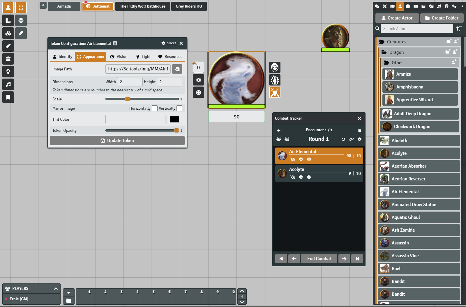
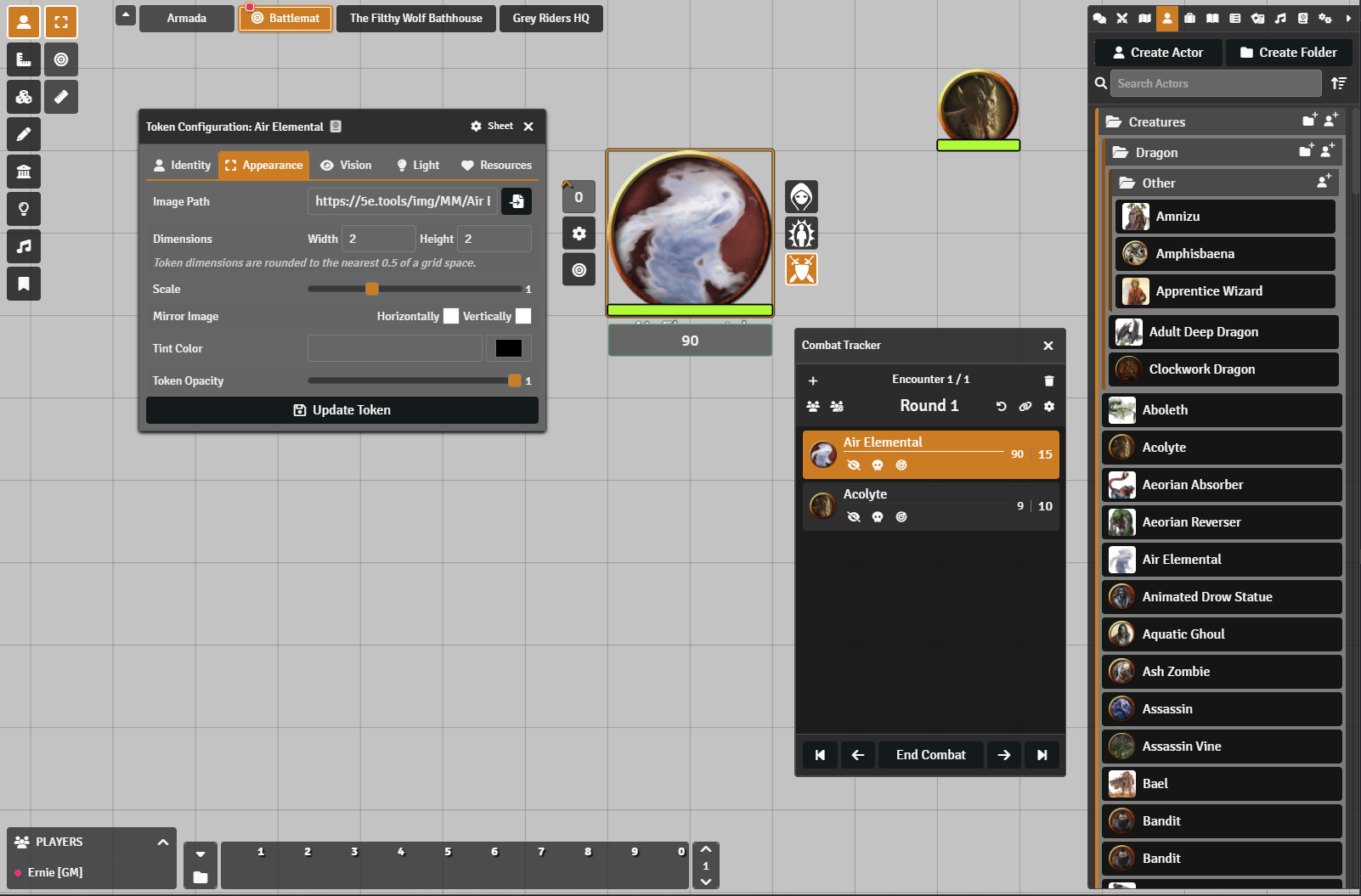
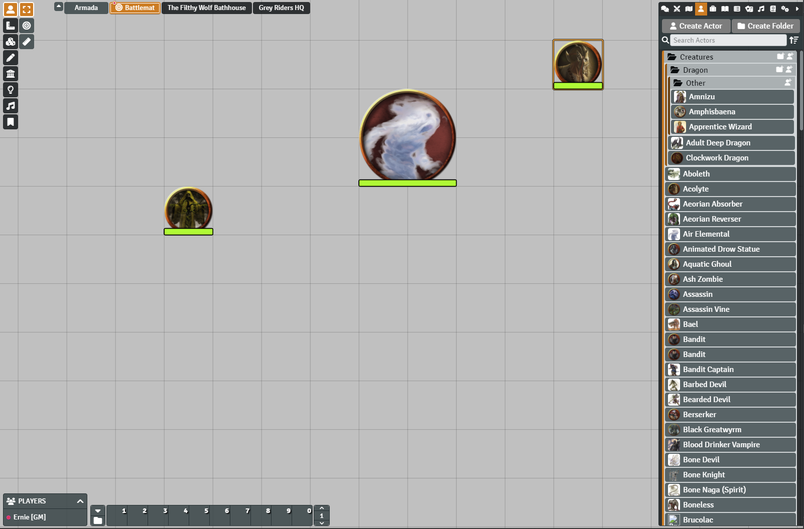
Here is a breif visual overview.
I will go over this a bit more further down.
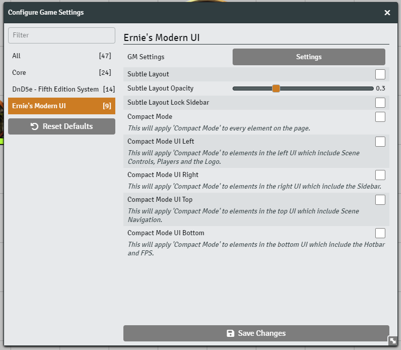
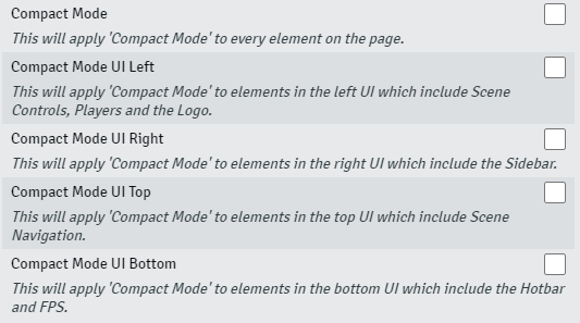
If you navigate to the module settings for Ernie's Modern UI you'll see the screen below. Everything in the initial settings (i.e. Subtle and Compact Modes) are individual client settings.
Here you will find a few variations of Compact Mode. The first options is to make everything in the application follow the compact setting. The other options are if you choose to make certain areas smaller. For example, if you only wanted the left portion of the UI to follow Compact Mode, you would only select the Compact Mode UI Left checkbox. Of course you can mix and match.
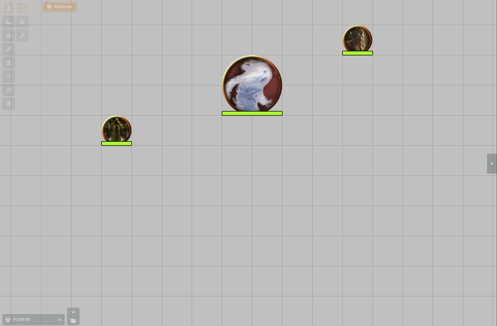
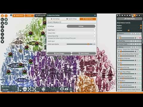
This is a setting for those who really want to see everything on the screen. There are a couple modifiers here. The opacity setting will let you set the initial opacity of the elements "off" state and the lock sidebar setting will lock the sidebar on the right portion of the screen to always be on. I recommend playing with this one to see if it works for you.
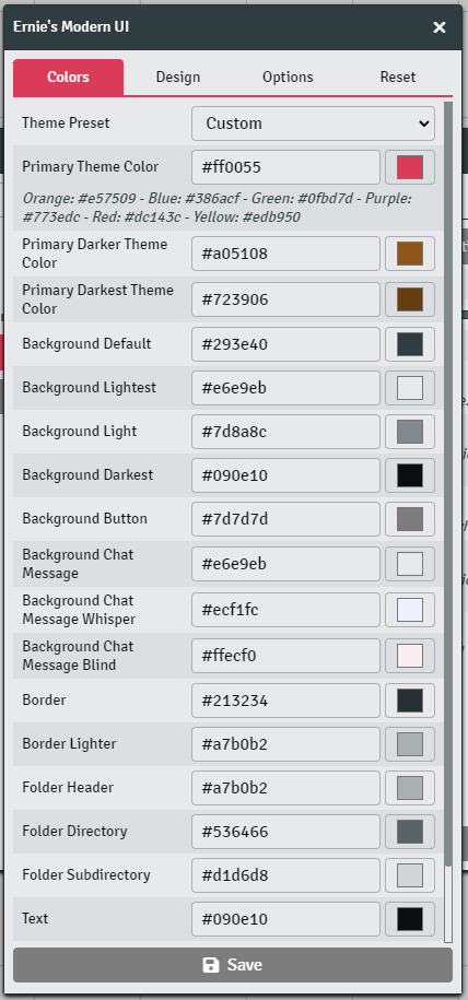
The settings here will apply to all your users. There are four tabs in this area.
- Colors, which lets you set all the colors throughout the application.
- Design, which lets you mess with fonts, spacing, sizing and other visual elements.
- Options, which has a couple toggles and the Import and Export Theme ability.
- Reset, if you want to reset all your work to the default. You will need to push the Save button at the bottom of the modal after you make any changes.
This is the bread and butter for most people. Here you can adjust colors in a semantic fashion through either hex values or using the color pick next to the field.
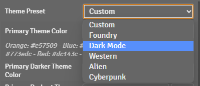
There are also a few presets here which includes Dark Mode.
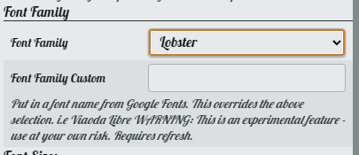
The first section on the Design tab allows you to adjust the font family by either picking from a predefined list or using a Google Fonts link.
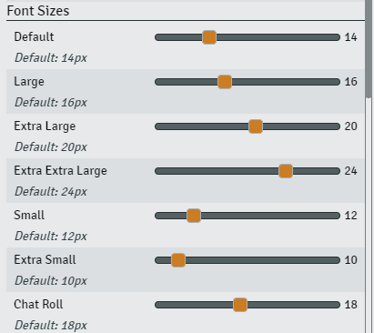
You also have the ability to adjust the font size to your liking.
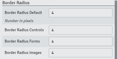
This one is pretty easy. You can adjust a numerical value to change the border radius. The lower the number the less curvy, the higher, more curvy. You can give yourself a more block look by setting everything to 0 or give yourself round buttons by setting to a higher number like 24px.
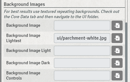
This is if you miss the textured background from base Foundry. These map 1:1 with the color naming conventions on the Colors tab. This is one that is better to test out if you're not sure what it does. In the screenshot below you can see I replaced the lightest background with a default Foundry texture instead.
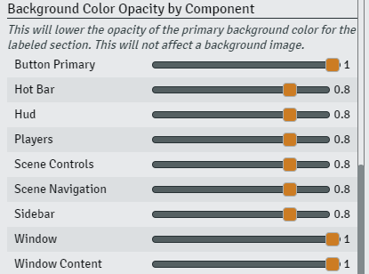
You might have noticed that the main components have a slight opacity to them. This opacity is baked into the background color using RGBA. If you want to increase or decrease the intensity of the background you can adjust theme here.
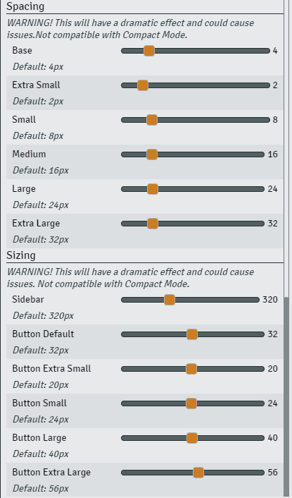
If you want to touch every single spacing modifier I use. Here you go. Small tweaks to this section would be best as you could really blow up your UI if you mess with this too much.
On the options tab you'll find three things. One, you can toggle the logo in the top left on and off. Two, you can toggle the scene background images in the right navigation on and off.
And three, you can Export all your hard work and share it with someone else or keep it for backup just in case.


