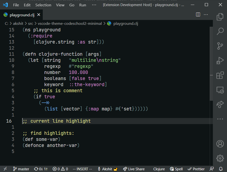
A dark theme with minimal amount of highlighting for Visual Studio Code.
Most color themes highlight everything they can, ending up looking like a fireworks show.
Instead, Alabaster uses minimal highlighting; it defines just four classes:
- Strings
- All statically known constants (numbers, symbols, keywords, boolean values)
- Comments
- Global definitions
Additionally:
-
Alabaster does not highlight standard language keywords (if, else, function, etc). They are usually least important and most obvious part of any program.
-
Alabaster highlights comments. Most themes try to dim comments by using low-contrast greys. I think if code was complex enough that it deserved an explanation then it’s that explanation we should see and read first. It would be a crime to hide it.
-
Alabaster doesn’t use font variations. It’s hard to scan code when it jumps between normal, bold and italics all the time. Also, not all fonts provide bold/italics variants.
-
Having minimal amount of rules means you can consciously use them to look for the exact piece of information you need. Most other “fireworks” themes provide only one meaningful contribution: if it’s colored it’s probably syntactically correct. Instead, in Alabaster you can actually remember all the rules, and e.g. if you need to look for a string you know that you’re looking for a green token. And all the strings really pop out because there are not many other things highlighted.
-
Alabaster only highlights things that parser could identify reliably. I believe that if highlighting works only partially then it does more harm than good. When highlighting works reliably, your brain learns to rely on it. When it’s not reliable, your brain spends precious brain cycles to re-check everything it sees on the screen.
What our users are saying?
It's like I had this weight on my eyes, and now it's gone. Awesome!
– Alex Sugak ★★★★★
After your theme others looks like unreadable neon things 🤯
– lamartire ★★★★★
Minimalistic cool
– denisgrib ★★★★★
Super minimal and undistracting. Easy to read.
– Josh Bernitt ★★★★★
A little bit confusing at first if you're from The Dark Land. But then you just chill.
– aenor.realm ★★★★★
- Go to
Extensions - Search for
alabaster dark - Install
- Go to
Preferences → Color Themeand chooseAlabaster Dark
- Dark for VS Code apust/vscode-rubber-theme
- Dark for VS Code (closer to the original ST version) gargakshit/vscode-theme-alabaster-dark
- for Sublime Text 3 tonsky/sublime-scheme-alabaster
- for JetBrains IDEs (IntelliJ IDEA etc) tonsky/intellij-alabaster
- for Sublime Text 2 (unofficial) [freetonik/Travertine](https://github.com/freetonik/Travertine]
- Original version for LigthTable tonsky/alabaster-lighttable-skin
