-
Notifications
You must be signed in to change notification settings - Fork 819
New issue
Have a question about this project? Sign up for a free GitHub account to open an issue and contact its maintainers and the community.
By clicking “Sign up for GitHub”, you agree to our terms of service and privacy statement. We’ll occasionally send you account related emails.
Already on GitHub? Sign in to your account
Bring lightness of farmland color again in line with other landuse #2821
Bring lightness of farmland color again in line with other landuse #2821
Conversation
Now that we have fading of landuse on z8-z12, I think we can revert
the fading of farmland (gravitystorm#1701). The reason for fading farmland was
mainly prominence of farmland on the mid-zoom levels, which is not
a problem anymore after the mid-zoom fading.

This brings the lightness of farmland again in line of the lightness
of similar landuses like grassland.
|
As you can see, it also plays worse with residential areas, which are also quite common, and I've seen that it's not too good with allotments (which are not that common there). I would try to keep the brown, but make it lighter than it was before. Brown plays better with natural=sand, but I think adding dot pattern to sand (#2746 (comment)) would be still very good idea for sand area (note: this example doesn't include sand pattern): |
|
See also #780 (comment) for proposed natural=heath color change. |
|
The brownish colour's definitely better than the current one. For info I went with #F4EBDF here (which was just making the existing colour "less bright" ) in |
|
Will see what I can do, perhaps some kind of middle option will work out.
Is your rendering live somewhere? |
|
Only for British Islands: https://map.atownsend.org.uk/maps/map/map.html#zoom=6&lat=54.78&lon=-4.06 |
It would be necessary to test it, but it looks really well. |
|
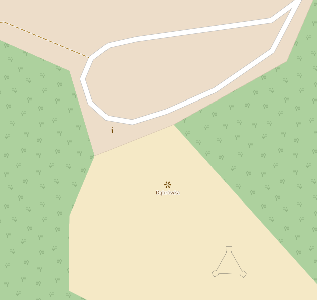
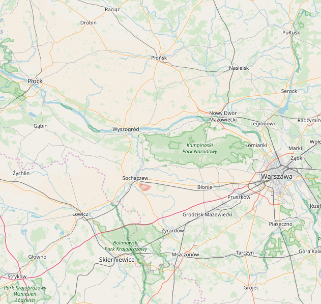
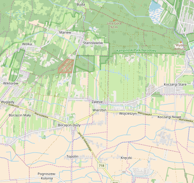
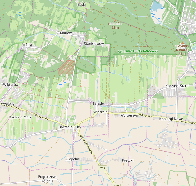
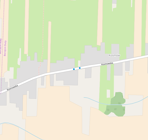
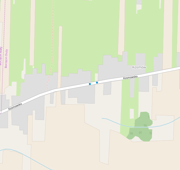
Couple of examples on different levels in Poland: z16 (with border line) @rrzefox Could you test this change on your server? |
@kocio-pl Is this based on @SomeoneElseOSM's proposal or the original PR? |
|
It's exactly like in AJT style (area+border). What do you think about it? |
|
It looks acceptable to me. It would be a step away from keeping lightness equal for similar features. |
|
I'm still thinking about making this color a bit darker, but it needs some time to test few different versions, however I like it as a basic shade (less yellow than currently). Rendering in #2821 (comment) proved me that it should be lighter than some other landuses anyway. |
This (not what's currently in this PR but color f4ebdf) has been deployed and all zoom levels rerendered. |
Testing proved me that AJT style is really too light, so I'd like to find a darker shade. |
|
Another idea would be to use this color (it's very good on high zoom levels), but just exclude it from fading, because it's light enough and close to the ground color. |
|
See also #1991. |
|
@matthijsmelissen Please add "resolves" line for #1991 in first post. |
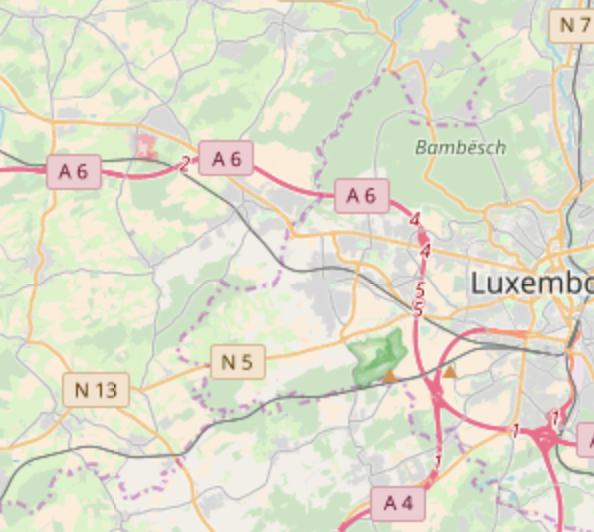


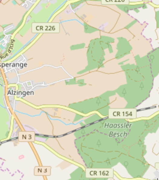




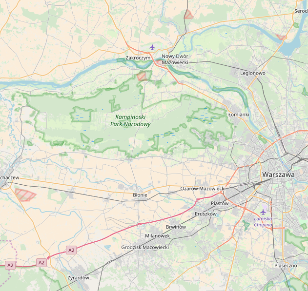
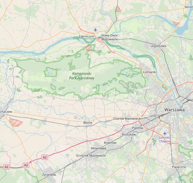

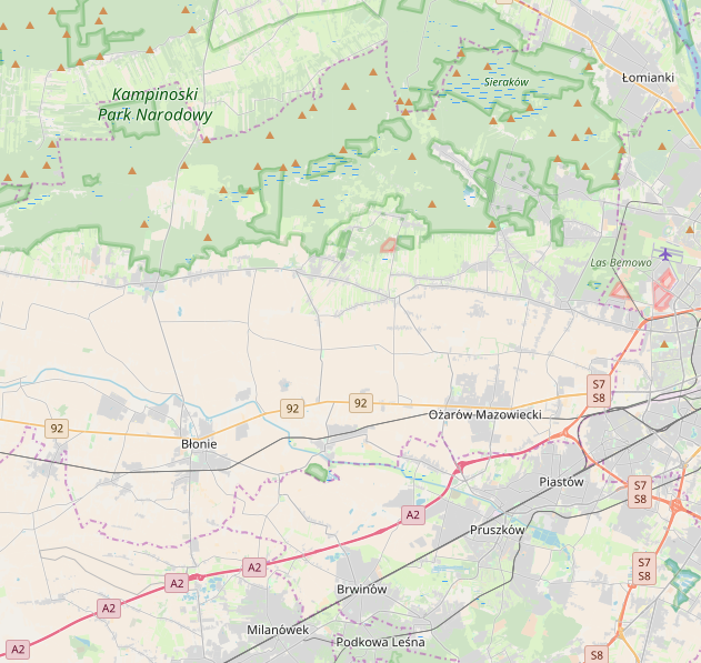
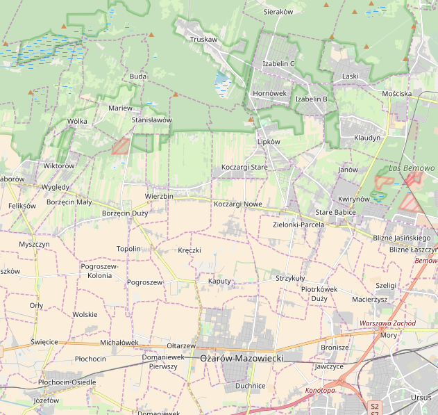

Now that we have fading of landuse on z8-z12, I think we can revert
the fading of farmland (#1701). The reason for fading farmland was
mainly prominence of farmland on the mid-zoom levels, which is not
a problem anymore after the mid-zoom fading.
This brings the lightness of farmland again in line of the lightness
of similar landuses like grassland.