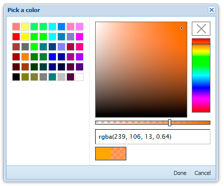
Ambient Color Picker is an ExtJs component that uses jQuery and its plugin Spectrum.
Isn't it cool?
How to install
Components are compatible with ExtJs 4.x +
Install and use Ambient Color Picker in few easy steps:
- Download and save in your project directory the last version of jQuery (for example put file like this /JavaScript/jquery.js)
- Download, unpack and save in your web directory the last version of Spectrum plugin (for example put archive contents in /JavaScript/Spectrum folder)
- Add to your main html file these lines of code
- <script type="text/javascript" src="/JavaScript/jquery.js"></script>
- <script type="text/javascript" src="/JavaScript/Spectrum/spectrum.js"></script>
- <link rel="stylesheet" type="text/css" href="/JavaScript/Spectrum/spectrum.css">
- Download Ambient Color Picker, unpack it and put into your ExtJs UX directory.
If you do not know where is your UX directory - probably you do not have it. Create in web root of your project directory new sub-directory named "ux" and add at beginning of your app.js this snippet:
Ext.Loader.setConfig({
    enabled : true,
    paths: {
        'Ext.ux': 'ux'
    }
});
Read more about setConfig() in official ExtJS Documentation
Usage example
Color picker comes with two components: Panel and Window:
Colorpicker panel, basically, is a extension to ExtJs Panel component, so you can use it as usual Panel, for example:
this.examplePanel = Ext.create('Ext.panel.Panel', {
	border: 0,
	items: [
		Ext.create('Ext.ux.picker.color.AmbientColorPicker', {
			conf: {
				color: 'blue'
			}
		})
	]
});
More advanced example
Context for this snippet may be any Panel-like component
Here, we will create two text fields and a button.
Button will open Color Picker window and text fields will display selected colors.
First field - selected in color picker, but not confirmed by clicking Done color
Second field - confirmed by clicking Done color (so you can Cancel changing of color any time without consequences)
this.items = [
	{
		xtype: 'textfield',
		fieldStyle: 'background-image: none;',
		id: 'myColorIndicator-1',
		margin: '0 10 0 0'
	},
	{
		xtype: 'textfield',
		fieldStyle: 'background-image: none;',
		id: 'myColorIndicator-2',
		margin: '0 10 0 0'
	},
	{
		xtype: 'button',
		text: 'Select color',
		handler: function () {

			this.colorPicker = Ext.create('Ext.ux.picker.color.ambientcolorpicker.Window', {
				autoShow: true,
				conf: {
					color: 'orange'
				},
				listeners: {
					colorSelected: function (el, colorString, colorObj) {
						var field = Ext.ComponentQuery.query('#myColorIndicator-1')[0];
						field.setValue(colorString);
						field.setFieldStyle('background-color: '+colorString)
					},
					colorSelectedDone: function (el, colorString, colorObj) {
						var field = Ext.ComponentQuery.query('#myColorIndicator-2')[0];
						field.setValue(colorString);
						field.setFieldStyle('background-color: '+colorString)
					}
				}
			});

		},
		scope: this
	}
];
Event colorSelected available for both Ext.ux.picker.color.ambientcolorpicker.Window and Ext.ux.picker.color.AmbientColorPicker
Event colorSelectedDone only for Ext.ux.picker.color.ambientcolorpicker.Window
For both components methods getValue() and setValue(<color>) are available. You can get and set colors at any time.
Customization
- These componends are axtensions to standart Ext.panel.Panel and Ext.window.Window so treat them like you usually do.
- You can customize component using Spectrum config, just use
conf:parameter, as it was done in example above to change default settings (in this case default color). Learn more about how to customize Spectrum on its official page.
