Learnoset Material UI is a powerful library for Android Studio that consist of
- Custom Navigation Drawer
- Material Bottom Bar
- Material Custom Dialogs
- Material Progress Bars
- Material Tab Layout
- Material Toast Messages
- Custom Designed Buttons
- Custom Designed EditText
- Easy to Use
- Don't need to right lengthy code
- Easy to implement
- Responsive Designs
- Modern Designs
1. Add below line in your module level build.gradle file
implementation 'com.github.learnoset:material:3.38'- Add below line in your project level build.gradle file
allprojects {
    repositories {
        google()
        jcenter()

        // add below line
        maven {url 'https://jitpack.io' }
    }
}- Add below code in the XML file
<?xml version="1.0" encoding="utf-8"?>
<androidx.drawerlayout.widget.DrawerLayout xmlns:android="http://schemas.android.com/apk/res/android"
    xmlns:tools="http://schemas.android.com/tools"
    android:id="@+id/drawerLayout"
    android:layout_width="match_parent"
    android:layout_height="match_parent"
    tools:context=".MainActivity">


    <LinearLayout
        android:layout_width="match_parent"
        android:layout_height="match_parent"
        android:gravity="center">

        <androidx.appcompat.widget.AppCompatButton
            android:id="@+id/openNavigation"
            android:layout_width="wrap_content"
            android:layout_height="wrap_content"
            android:text="Open Navigation" />
    </LinearLayout>

    <com.learnoset.material.ui.learnosetnavigationbar.LearnosetNavigationBar
        android:id="@+id/navigatioNabr"
        android:layout_width="wrap_content"
        android:layout_height="match_parent"
        android:layout_gravity="start" />
</androidx.drawerlayout.widget.DrawerLayout>- Using Built-In Items in the Navigation Bar
final DrawerLayout drawerLayout = findViewById(R.id.drawerLayout);
final Button openNavigationBtn = findViewById(R.id.openNavigation);
final LearnosetNavigationBar learnosetNavigationBar = findViewById(R.id.navigatioNabr);

// You can use some Built-In Navigation Items
learnosetNavigationBar.addNavItem(LearnosetNavItem.BuiltInItems.HOME);
learnosetNavigationBar.addNavItem(LearnosetNavItem.BuiltInItems.DASHBOARD);
learnosetNavigationBar.addNavItem(LearnosetNavItem.BuiltInItems.SETTINGS);

// setting Drawer Layout with Drawer Gravity. If LEFT then Navigation Bar opens from Left Side. If RIGHT then opens from right Side
learnosetNavigationBar.setDrawerLayout(drawerLayout, LearnosetNavigationBar.DrawerGravity.LEFT);

// open drawer on button click
openNavigationBtn.setOnClickListener(new View.OnClickListener() {
    @Override
    public void onClick(View v) {
        drawerLayout.openDrawer(GravityCompat.START);
    }
});- Using your own custom Item Names and Icons
// You can use Custom Items
LearnosetNavItem customItem1 = new LearnosetNavItem();
customItem1.setTitle("Custom Title");
customItem1.setIcon(R.drawable.custom_icon);

LearnosetNavItem customItem2 = new LearnosetNavItem("Custom Item 2", R.drawable.custom_item_2);

// adding custom items to Learnoset Navigation Bar
learnosetNavigationBar.addNavItem(customItem1);
learnosetNavigationBar.addNavItem(customItem2);- Creating Group of Items
// CREATING GROUP OF ITEMS
NavItemsGroup navItemsGroup = new NavItemsGroup("Group Name");

// adding Built-In Items to the group
navItemsGroup.addGroupItem(LearnosetNavItem.BuiltInItems.HOME);
navItemsGroup.addGroupItem(LearnosetNavItem.BuiltInItems.SEARCH);

// adding custom Items to the group
navItemsGroup.addGroupItem(new LearnosetNavItem("Custom Group Item", R.drawable.custom_item_icon));

LearnosetNavItem customGroupItem2 = new LearnosetNavItem("Custom Group Item 3 ", R.drawable.custom_item_3);
navItemsGroup.addGroupItem(customGroupItem2);

// adding group to the Navigation Bar
learnosetNavigationBar.addItemsGroup(navItemsGroup);- Using Navigation Themes
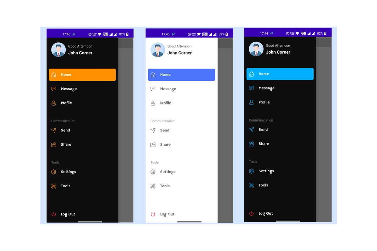
learnosetNavigationBar.setTheme(LearnosetNavigationBar.NavThemes.DARK);
// OR
learnosetNavigationBar.setTheme(LearnosetNavigationBar.NavThemes.LIGHT);
// OR
// Setting Custom Theme
CustomNavTheme customNavTheme = new CustomNavTheme();
customNavTheme.setIconsColor(Color.parseColor("#FF03DAC5"));
customNavTheme.setNavigationBackground(Color.BLACK);
customNavTheme.setSelectedItemBackgroundColor(Color.parseColor("#FF03DAC5"));
customNavTheme.setSelectedItemIconColor(Color.ORANGE);
customNavTheme.setSelectedItemTextColor(Color.YELLOW);
customNavTheme.setTextColor(Color.WHITE);

learnosetNavigationBar.setTheme(customNavTheme);- Add Event Listener
learnosetNavigationBar.setEventListener(new NavigationEventListener() {
    @Override
    public void onItemSelected(int position, LearnosetNavItem selectedNavItem) {
        // TODO Your code goes here to perform action according to the selected Item
    }
});- Change Selected Item Background Color
learnosetNavigationBar.setSelectedItemBackground(LearnosetNavigationBar.NavColors.ORANGE);- Change Icons Color
learnosetNavigationBar.setIconsColor(LearnosetNavigationBar.NavColors.RED);- Setting Header Data (Profile Name & Profile Picture)
// setting header profile name and profile image (from resources)
learnosetNavigationBar.setHeaderData("John Corner", R.drawable.profile_image);

// setting header profile name and profile image (from File)
File file = new File("You Image File Path");
try {
    learnosetNavigationBar.setHeaderData("John Corner", file);
} catch (LearnosetExceptions learnosetExceptions) {
    learnosetExceptions.printStackTrace();
}

// setting header profile name and profile image (from URL)
learnosetNavigationBar.setHeaderData("John Corner", "url of image");- Hide Log Out Button
learnosetNavigationBar.enableLogOutBtn(false);- Add below code in your XML file
<com.learnoset.material.ui.learnosetbottombar.LearnosetBottomBar
        android:id="@+id/bottomBar"
        android:layout_width="match_parent"
        android:layout_height="70dp"
android:layout_alignParentBottom="true" />- Add below code in your Activity.class file
final LearnosetBottomBar bottomBar = findViewById(R.id.bottomBar);

// adding Items to the bottom bar (You can also use Built-In Items and Icons)
bottomBar.addItem(BottomBarItem.BuiltInItems.HOME);
bottomBar.addItem(BottomBarItem.BuiltInItems.MESSAGE);
bottomBar.addItem(BottomBarItem.BuiltInItems.SETTINGS);
bottomBar.addItem(BottomBarItem.BuiltInItems.PROFILE);

// OR you can also add custom Item with your own Text and Icon
bottomBar.addItem(new BottomBarItem("Custom Item 1", R.drawable.custom_icon));- Using themes with Bottom Bar
bottomBar.setTheme(LearnosetBottomBar.BottomBarTheme.LIGHT);
// OR
bottomBar.setTheme(LearnosetBottomBar.BottomBarTheme.DARK);
// OR
CustomBottomBarTheme customBottomBarTheme = new CustomBottomBarTheme(); // creating custom theme object
customBottomBarTheme.setBackgroundColor(Color.BLACK); // set background color for bottom bar
customBottomBarTheme.setSelectedItemBackgroundColor(LearnosetBottomBar.LearnosetColors.ORANGE); // setting selected item background color
customBottomBarTheme.setIconsColor(LearnosetBottomBar.LearnosetColors.ORANGE); // setting icons color
customBottomBarTheme.setSelectedItemTextColor(Color.WHITE); // setting text color

bottomBar.setTheme(customBottomBarTheme); // setting custom theme to the bottom bar
// new bottom bar animations are coming soon.- Bottom Bar Animation
// enable animation
bottomBar.enableAnimation(true);
// OR
// disable animation
bottomBar.enableAnimation(false);

// new bottom bar animations are coming soon.
You can Visit our Website to learn more about Android App Development, Java, Python, JavaScript, Artificial Intelligence
Learnoset Website
We provide source code for Login & Register pages, Custom Dialogs, Custom Navigation Bar, Custom Toolbar, Custom Bottom Bar with material UI design and complete project files