-
-
Notifications
You must be signed in to change notification settings - Fork 32.4k
New issue
Have a question about this project? Sign up for a free GitHub account to open an issue and contact its maintainers and the community.
By clicking “Sign up for GitHub”, you agree to our terms of service and privacy statement. We’ll occasionally send you account related emails.
Already on GitHub? Sign in to your account
[Autocomplete] Multiple with many options take too much space #19137
Comments
|
The only approach I have seen related to this problem during my benchmark is: |
|
I found a temporary solution. In your renderInput Let me know if this works for you :) If you found a way to replace maxHeight in px to maxHeight to rowsMax, let me know |
|
Following up on #19137 (comment), I have tried a quick POC, it seems to be good enough. If somebody wants to complete it and open a pull request, it would be awesome. diff --git a/packages/material-ui-lab/src/Autocomplete/Autocomplete.js b/packages/material-ui-lab/src/Autocomplete/Autocomplete.js
index 463ff0f2f..85f080bc9 100644
--- a/packages/material-ui-lab/src/Autocomplete/Autocomplete.js
+++ b/packages/material-ui-lab/src/Autocomplete/Autocomplete.js
@@ -338,6 +338,14 @@ const Autocomplete = React.forwardRef(function Autocomplete(props, ref) {
/>
));
}
+
+ const filterMax = 2;
+ const more = startAdornment.length - filterMax;
+
+ if (filterMax && !focused && more > 0) {
+ startAdornment = startAdornment.splice(0, filterMax);
+ startAdornment.push(<span>{`+ ${more} more`}</span>)
+ }
}
const defaultRenderGroup = params => ( |
|
Working on this issue. |
|
@mzbyszynski Would the following solve your problem? https://deploy-preview-20209--material-ui.netlify.com/components/autocomplete/#multiple-values |
|
@oliviertassinari Yes limit tags as a great solution! |
|
Is it possible to set maximum number of tags that will be visible when focused? |
|
@mzbyszynski You can customize the component for doing such. There is a |
do we have support for this now? |
Is there a documented example of this? I can't see anything in the docs, just the |
|
@itsravenous The It feels like the UX should be changed if it ever becomes an issue 🤔 |
|
Thanks @oliviertassinari - I'll check that out when I'm working tomorrow! |
|
Sorry, @oliviertassinari, it was a while before I got back to this feature - your suggestion works great! For anyone else wanting to just get it working, this will show text labels for the first two selected options and a "+ n more" label when more than two are selected. I wanted plain text labels, but you could also use the <Autocomplete
// ...other props here
renderTags={(value, getTagProps) => {
const numTags = value.length;
return (
<Typography variant="body2">
{value
.slice(0, 2)
.map((option, _) => option.title)
.join(", ")}
{numTags > 2 && ` +${numTags - 2} more`}
</Typography>
);
}}I do think an option to enable |
|
use condition on the renderTags to make it scrollable onFocus. Here is an Example
{value.map((option, index) => (
10
? option.title.substring(0, 7) +
"..."
: option.title
}
size="small"
{...getTagProps({ index })}
/>
))}
); |
|
Duplicate of #20782 |
|
You can probably use something like this. I am limiting the tags to 1 in my example but you can adjust to your needs. |
|
|
limitTags is useful when it is on Blur. Main issue is when MUI is in focus
|


Summary 💡
Currently for an Autocomplete with the
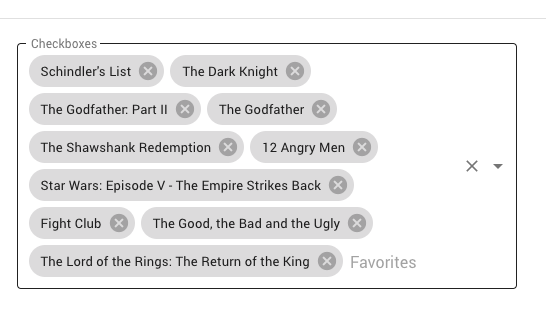
multipleoption, the height of the autocomplete will grow as more items are selected and more chips are displayed. It would be useful to have an option to limit the number of rows of chips that can be displayed, so that a vertically growing list of chips will not disrupt the layout of the rest of the page.Examples 🌈
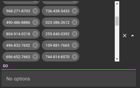
Here is the current behavior from material-ui component demo:

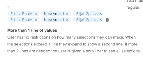
Here is a design spec for multi-line that has vertical scrolling rather than horizontal (this is actually what we were asked to implement)

The material design specification on Input Chips has a section labeled "Placement" that indicates that chips can appear in a horizontal scrollable list, which is slightly different but might work for us as well.
https://material.io/components/chips/#input-chips
Motivation 🔦
In our application design we have many multiple select auto complete filter boxes in a grid and we don't want the layout to be disrupted by displaying a lot of chips. We love your new Autocomplete component and this seemed like a useful feature or at least one that would make our designer happy.
The text was updated successfully, but these errors were encountered: