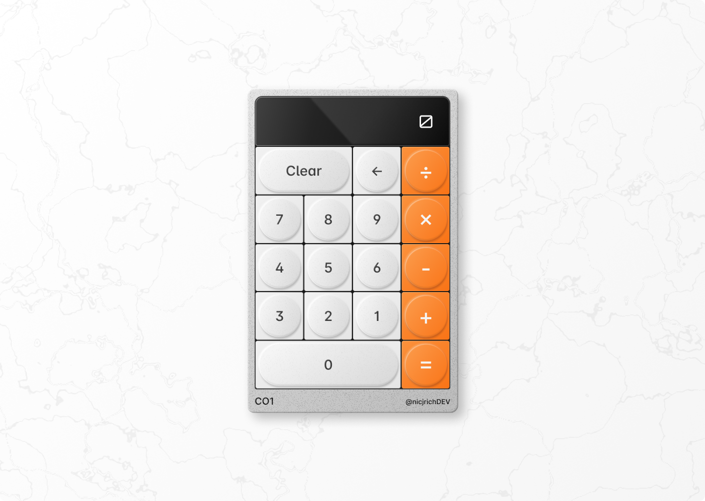
To stretch my CSS skills I created a design in Figma taking inspiration from some Teenage Engineering products to try and make the calculator feel a bit more releastic. This is for sure not my speciality when it comes to design but it has been fun to get a better understanding of how designers create photo releastic objects by using simple vectors, shadows, color, and opacity.
I am currently taking the beginner path on Frontend Masters which you can find here.
Below is an image of the end goal and a link to the Figma design here.
