Menu refactoring using popup #227
Conversation
|
@ltfschoen if you have time could you give it a shot with an iphone to make sure things compile properly, I could only test on android. |
|
I'm digging the UI. You're still working on this (as per the edit in the top comment)? |
|
Nop I'm done. Removing the edit as it caused confusion |
|
👍 comments addressed. I'd like to get a confirmation from @ltfschoen before merging |
Yes, I just got my hands on an iPhone so will look at it asap |
|
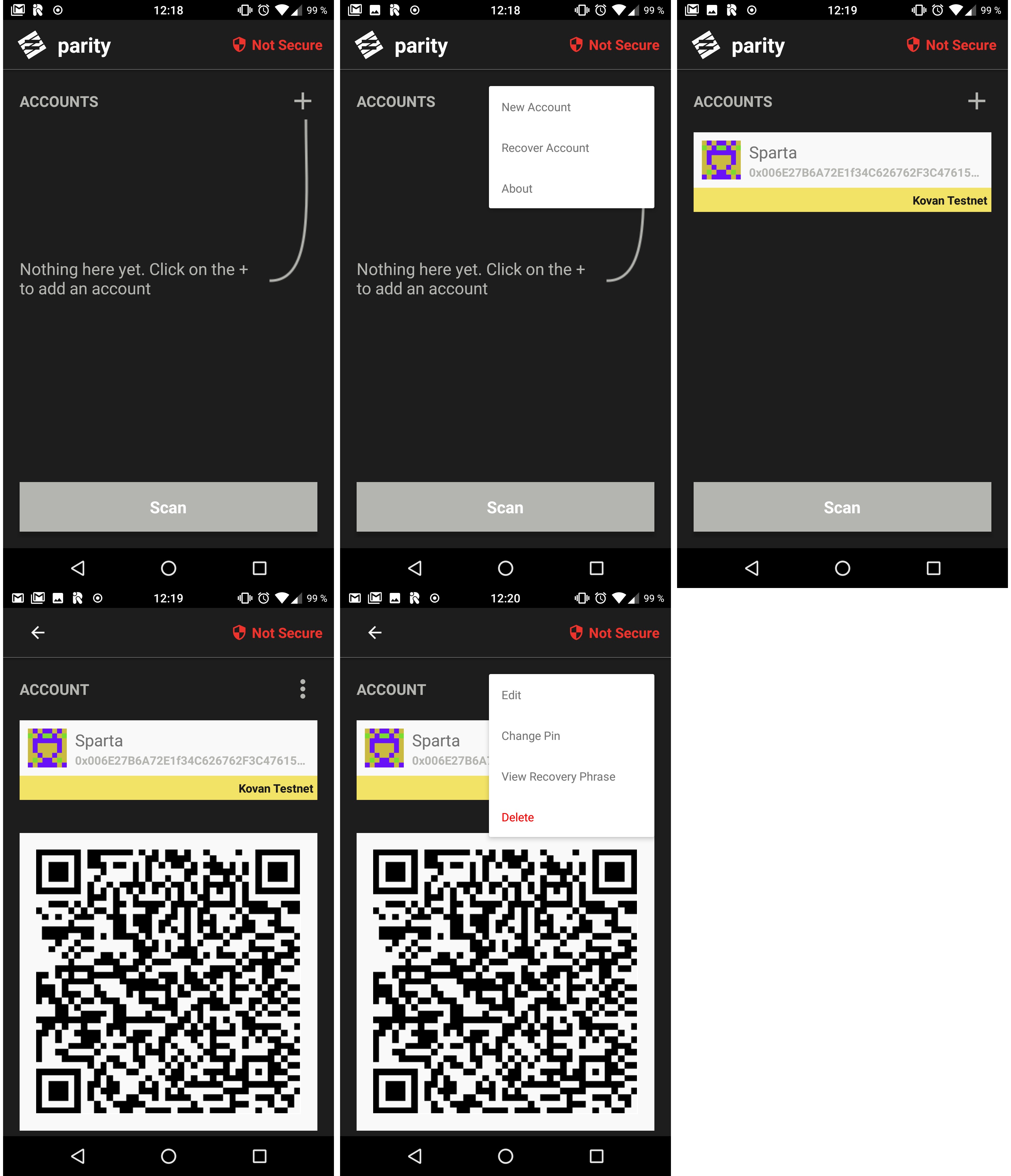
There is no such a menus on iOS. So I predict user's dissatisfaction if such a menu will appear in iOS app too (I am an iPhone user). As an alternative and in order to reach coherence between platforms I'd recommend to use the following menu:
The better idea - to is avoid of using the "popup" menu at all and use a separate screen. I don't see any reason to not use the current dedicated screen we have. In a conclusion: the idea to move the button to top - it's a good idea. The idea to make it as a popup menu - it's a wrong idea. It's better to just navigate user (on tap) to the following screen:
This way we can successfully avoid the unnecessary addition of the not native UI element. |


|
There is how popups are look like on iOS: |
|
I'm sorry but I disagree. Also I believe that this PR is not the right place to discuss design decisions. Although this implementation is surely not perfect, it streamlines processes and makes the app easier to navigate. Things are not set in stone, we can change them later on (and discuss them in an issue). |
where is the right place then?
It's against guidelines. It's frustrating for (iOS at least) users. |
|
Apple guidelines are just that, guidelines, it's not a crime to break them. Given that we are making a cross-platform app, not adhering to guidelines of the underlying OS is, maybe not ideal, but totally fine. UI or UX issues that would be show stoppers here are things like:
On both of these points I think the UI changes are improvements. The PR is accepted, it will be merged as soon as we solve the (recurring) issues with |
screenshots: