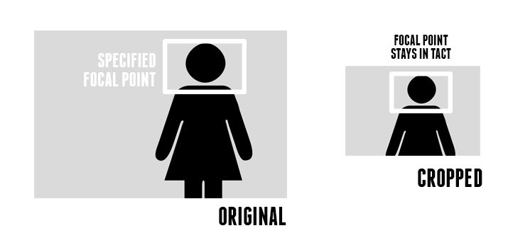
A small set of CSS classnames to help keep images cropped on the focal point for responsive designs. Using only HTML/CSS, web authors can specify an image's focal point, which stays as the image's primary focus as the image scales on responsive webpages. This puts web authors in control of art direction for responsive and high-resolution images. Crop and re-size images depending on available width and let CSS to do all of the work, and without any JavaScript. Resize your browser down to as small as it can go when viewing the demos. View the full Focal Point CSS documentation.
The Focal Point Framework gives web authors the flexibility of how responsive and hi-res images should be rendered depending on the image. For example, images can use common CSS classnames which allows a standard pattern to be resuabled throughout an entire site, which drastically reduces HTML markup and CSS required. Additionally, each individual image can also be given specific CSS for the general crop/size needed. All this without the use of any JavaScript!
Developers also have control to add and subtract from the framework's CSS as needed. The CSS is minimal in size, 2.98KB compressed (723 bytes gzipped), and can be grouped with existing CSS files as to not add any additional HTTP requests.
- Author: Adam Bradley, cdnconnect.com (c) 2013
- License: MIT/GPLv2
- Complete Documentation
(Image Source: design shack)
(Image Source: noupe)
Is there a better/simpler/easier/smaller way to write the HTML/CSS all while keeping it reusable, compact, simple and meets the requirements below? Submit a pull request or contact me: @adamdbradley
Requirements:
- All browsers must be able to at least view the image (ie: images do not crop and change focal points for IE8 and below, but the image still resizes according to available width. In my book that's still good to go. If a different method doesn't allow the image to load at all in IE8 then that's a no go.)
- Only one img request per image
- Set image breakpoints depending on available CSS width
- Re-crop and re-size images depending on available CSS width
- Image web authoring can be assigned to sitewide patterns
- Each image can also have its own individual crop/resize
- Keep the CSS file as small as possible
- Works without JavaScript
- Entirely static and controlled only by HTML/CSS. ie: No requirements for HTTP headers/cookies
- No DOM manipulation
- Crawlable by search engines so the image can be indexed and associated to page content
- Accessible text (ie: alt tag)
- Printable images
- Context menu usable when "right-clicking" content images, ie: "Save image as..."
- Focal Point CSS Documentation
- CDNConnect: Production File Management & Fast Content Delivery For The Team
- Responding to the New High-Resolution Web: Considerations for High-Density Displays [slidedeck]
- Focal Point: Intelligent Cropping of Responsive Images [DesignShack]
- Focal Point: CSS-Framework Scales Down Images In Responsive Designs Intelligently [noupe]
- A framework for discussing responsive images solutions [Jason Grigsby]
- Foresight.js: JavaScript plugin that judges device display and network connectivity, then requests the appropriate image. Used by Washington Post's mobile site.
- Which responsive images solution should you use? [CSS-Tricks]

