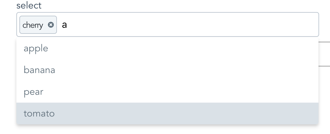
A Vue component that makes long, unwieldy select boxes user friendly.
vue-simple-multi-select provides an elegant, user-friendly component to replace long, unwieldy multi select elements. Great for users. Simple for developers.
This simple:
This simple
<vue-multi-select
	v-model="fruit"
	:options="['apple','cherry','banana','pear', 'tomato']"
></vue-multi-select>Nope no regular selects. See vue-single-select for this.
No ajax loading.
<div id="app">
    <lable>Choose a fruit!</lable>
    <vue-multi-select
	    v-model="fruit"
	    :options="fruits"
    ></vue-multi-select>
</div><script src="https://unpkg.com/vue@latest"></script>
<script src="https://unpkg.com/vue-simple-multi-select@latest"></script>
<script>
new Vue({
el:"#app",
data: {
fruit: null,
fruits: ['peach','pear','apple','orange']
}
});
</script>$ npm i vue-simple-multi-selectIn your component:
import VueMultiSelect from "vue-simple-multi-select";
export default {
components: {
     VueMultiSelect
  },
  //...
}
Globally:
import VueMultiSelect from "vue-simple-multi-select";
Vue.component('vue-multi-select', VuemultiSelect);<vue-multi-select
v-model="fruit"
:options="['apple','banana','cherry','tomato']"
:required="true"
></vue-multi-select><vue-multi-select
name="maybe"
placeholder="pick a post"
you-want-to-select-a-post="ok"
v-model="post"
out-of-all-these-posts="makes sense"
:options="posts"
a-post-has-an-id="good for search and display"
option-key="id"
the-post-has-a-title="make sure to show these"
option-label="title"
></vue-multi-select><vue-multi-select
you-want-to-select-a-reply="yes"
v-model="reply"
out-of-all-these-replies="yep"
:options="replies"
a-reply-only-has-a-reply="sounds about right"
option-label="reply"
seed-an-initial-value="what's seed mean?"
initial="seed me"
you-only-want-20-options-to-show="is 20 enough?"
:max-results="20"
></vue-multi-select>You can override some of it. Like so:
<vue-multi-select
        id="selected-reply"
        name="a_reply"
        option-label="reply"
        v-model="reply"
        :options="replies"
        you-like-huge-dropdowns="1000px is long!"
        max-height="1000px"
        :classes='{
            active: "active",
            wrapper: "multi-select-wrapper",
            searchWrapper: "search-wrapper",
            searchInput: "search-input",
            pill: "pill",
            required: "required",
            dropdown: "dropdown"
        }'
></vue-multi-select>
Then all you need to do is provide some class definitions like so:
.active {
	background-color: pink;
}
.multi-select-wrapper {
	display: block;
	font-size: 16px;
}
.search-input {
	color: black;
}
.pill {
	padding: .5em;
}
... and so on.
Note: Bootstrap 3 Users May want to increase the size of the icons.
If so do this:
.icons svg {
    height: 1em;
    width: 1em;
}Meh, see props below.
-
It handles custom label/value props for displaying options.
Other select components require you to conform to their format. Which often means data wrangling.
-
It's easier on the DOM.
Other components will load up all the options available in the select element. This can be heavy. vue-multi-select makes an executive decision that you probably will not want to scroll more than N options before you want to narrow things down a bit. You can change this, but the default is 30.
-
Snappy Event Handling
- up and down arrows for selecting options
- enter to select first match
- remembers selection on change
- hit the escape key to, well, escape
- hit delete to remove the last selection
-
Lightweight
- Why are the other packages so big and actually have dependencies?
-
It works for regular 'POST backs' to the server.
If you are doing a regular post or just gathering the form data you don't need to do anything extra to provide a name and value for the selected option.
-
Mine just looks nicer
A lot nicer!
-
It's simple!!
props: {
    // This corresponds to v-model
    value: {
        required: true
    },
    // Use classes to override the look and feel
    // Provide these 7 classes.
    classes: {
        type: Object,
        required: false,
        default: () => {
            return {
                active: 'active',
                wrapper: "multi-select-wrapper",
                searchWrapper: "search-wrapper",
                searchInput: "search-input",
                pill: "pill",
                required: "required",
                dropdown: "dropdown"
            };
        }
    },
    // Give your input a name
    // Good for posting forms
    name: {
        type: String,
        required: false,
        default: () => ""
    },
    // Your list of things for the select
    options: {
        type: Array,
        required: false,
        default: () => []
    },
    // Tells vue-simple-multi-select what key to use
    // for generating option labels
    optionLabel: {
        type: String,
        required: false,
        default: () => null
    },
    // Tells vue-multi-select the value
    // you want populated in the select for the
    // input
    optionKey: {
        type: String,
        required: false,
        default: () => null
    },
    // Give your input an html element id
    placeholder: {
        type: String,
        required: false,
        default: () => "Search Here"
    },
    maxHeight: {
        type: String,
        default: () => "220px",
        required: false
    },
    //Give the input an id
    inputId: {
        type: String,
        default: () => "multi-select",
        required: false
    },
    // Seed search text with initial value
    initial: {
        type: String,
        required: false,
        default: () => null
    },
    // Make it required
    required: {
        type: Boolean,
        required: false,
        default: () => false
    },
    // Max number of results to show.
    maxResults: {
        type: Number,
        required: false,
        default: () => 30
    },
    //Meh
    tabindex: {
        type: String,
        required: false,
        default: () => {
            return "";
        }
    },
    // Remove previously selected options
    // via the delete key
    keyboardDelete: {
        type: Boolean,
        required: false,
        default: () => {
            return true;
        }
    },
    // Tell vue-multi-select how to display
    // selected options
    getOptionDescription: {
        type: Function,
        default(option) {
            if (this.optionKey && this.optionLabel) {
                return option[this.optionKey] + " " + option[this.optionLabel];
            }
            if (this.optionLabel) {
                return option[this.optionLabel];
            }
            if (this.optionKey) {
                return option[this.optionKey];
            }
            return option;
        }
    },
    // Use this to tell vue-multi-select
    // the values are for doing a submit
    getOptionValue: {
        type: Function,
        default(option) {
            if (this.optionKey) {
                return option[this.optionKey];
            }

            if (this.optionLabel) {
                return option[this.optionLabel];
            }

            return option;
        }
    }
},