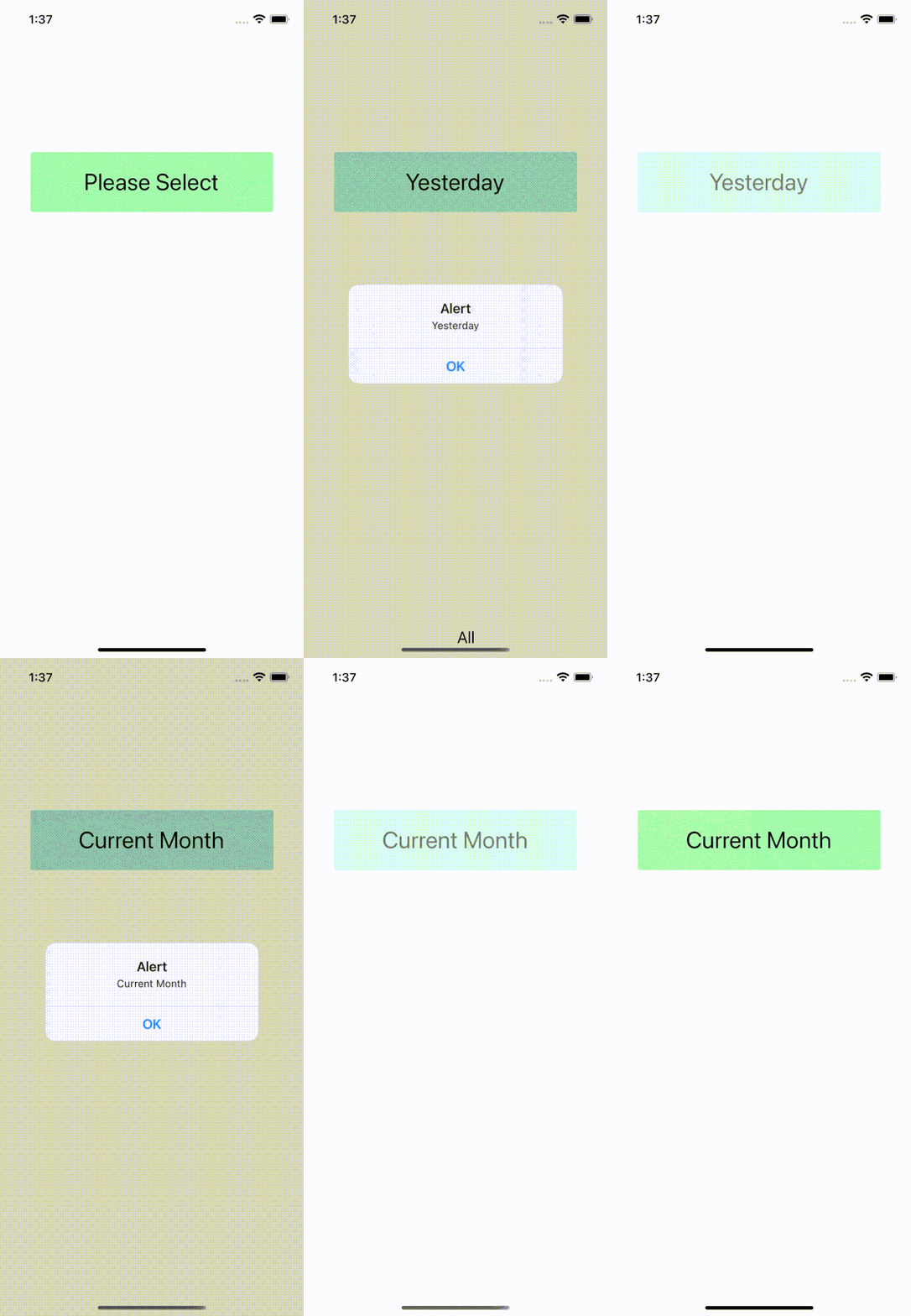
| Demo 1 | Demo 2 |
|---|---|
 |
 |
This library is created in an attempt to provide a lightweight, simple and customizable dropdown solution for react native apps .
It try to solve the problem of having to install very heavy and big libraries for something as simple as a dropdown, as react native does not have any by default. this library is build by deafult react native tools so it's not dependent on other libraries.
It is so simple you can go to your project node_modules/react-native-option-dropdown/index.js and edit the code yourself and cusomize it even more. OR copy the code from there and use it anywhere as a component, no need to installing anything else. 🎉
$ npm i react-native-option-dropdown
CocoaPods on MacOS needs this extra step , Go to ios folder and run.
pod install
Import Dropdown from react-native-option-dropdown
import Dropdown from 'react-native-option-dropdown';Create state which will be used by the Dropdown:
const [selectedItem, setSelectedItem] = useState(null);Add Dropdown like this:
import { StyleSheet, Text, View } from 'react-native'
import React, {useState} from 'react';
import Dropdown from 'react-native-option-dropdown'

const App = () => {
    const [selectedItem, setSelectedItem] = useState(null);

    let data = [
        {id: 1, name: 'All'},
        {id: 2, name: 'Today'},
        {id: 3, name: 'Yesterday'},
        {id: 4, name: 'Current Week'},
      ];

      const onSelect = item=>{
        setSelectedItem(item);
        alert(item.name)
      }
  return (
    <View style={{marginTop:'10%'}}>
          <Dropdown
          data={data}
          onSelect={onSelect}
          value={selectedItem}
          transparent ={false}
          alignList={'center'}
          fontSize={20}
          defaultText={"Please Select"}
          animationType={'slide'}
          DropdownWidth={'50%'}
          dropDownStyle ={
               {paddingVertical: 4,
               paddingHorizontal: 8,
               borderRadius: 3,
               minHeight: 32,
               justifyContent: 'space-between',
               flexDirection: 'row',
               alignItems: 'center',
               marginBottom: 8,
               borderColor: '#000',
               borderWidth: 0.5,
             overflow:'scroll' }
          }
        />
    </View>
  )
}

export default App| Prop | Type | Optional | Default | Description |
|---|---|---|---|---|
data |
Array of objects . (id: Key must be there in every object) as shown above |
No | false | Data for the dropdown options. |
onSelect |
Function | No | false | function that will run after selecting the option from dropdown. |
transparent |
Bool | No | false | It will change the dropdown backround, will take true & false . |
value |
String | No | false | It will take the value of state to show after selecting a option (as shown in the example above). |
alignList |
String | No | false | It is for postion of dropdown list, will take tree options as string center , flex-end & flex-start. |
fontSize |
Number | No | false | It will change the font size. |
animationType |
String | No | false | The animationType prop controls how the modal animates. It will take three values none , slide & fade as String. |
defaultText |
String | No | false | It is default text when nothing is selected. |
dropDownStyle |
Object | No | false | This is for dropdown style. It will take any default React Native style . |