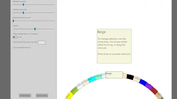
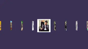
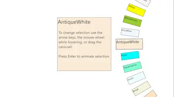
It has unique features not found in other carousel controls such as wheel mode, warping, adjustible lazy loading, and CompositionBrush animation support.
The original object of the selected item in Items.
Returns the FrameworkElement of the SelectedItem.
Returns a collection of items generated from the ItemsSource.
Returns an integer value of the wheel diameter in pixels.
Use this element's Manipulation event handlers for gesture controls.
Assign or bind the data source you wish to present to this property.
Assign a DataTempate here that will be used to present each item in your data collection.
The index of the currently selected item in Items.
This can be used to animate a CompositionBrush property of a custom control. The control must have a container parent with a name that starts with "CarouselItemMedia." The child element's property to animate must be of type CompositionColorBrush or CompositionLinearGradientBrush. These types can be found in the namespace Windows.UI.Composition for legacy UWP, or Microsoft.UI.Composition for WinUI. Set your control's brush property to what you want for the deselected state. For the selected state, set this this property. An expression animation will be added which will create a smooth animated transition between the two brushes as items animate in and out of the selected item position. Win2D may be required to create a custom control that allows text with a CompositionBrush.
For MVVM. Bind this to a viewmodel property and you can call the 'SelectionAnimation()' method whenever you change its value to anything other than null.
Example: Bind a property like this (One-Way) and use an INotifyPropertyChanged handler to trigger it.
    private bool _animationTrigger;
    public bool AnimationTrigger
    {
        get { return !_animationTrigger;}
    }
The time it takes, in milliseconds, for a selection change to animate.
For carousel configurations with overlapping items. When this is disabled, the ZIndex of items update immediately upon interaction. Enable this so that it updates only after the animation is halfway complete (NavigationSpeed / 2).
Sets the scale of the selected item to make it more prominent. The Framework's UIElement scaling does not do vector scaling of text or SVG images, unfortunately, so keep that in mind when using this.
Set the number of additional items surrounding the selected item to also scale, creating a 'falloff' effect. This value also applies to Fliptych.
Set the number of additional items surrounding the selected item to also warp, creating a 'falloff' effect.
Sets the type of carousel. Chose a Column, a Row, or a Wheel.
When CarouselType is set to Wheel, use this property to set the conainer edge the wheel should be aligned to.
Then number of presented items to be in the UI at once. Increasing this value may help hide visual lag associated with the lazy loading while scrolling. Decreasing it may improve performance. When CarouselType is set to wheel, use this property to adjust the space between items.
Amount of 3-D rotation to apply to deselected items, creating a fliptych or "Coverflow" type of effect.
For Row and Column mode only. Use this in combination with WarpCurve and AdditionalItemsToWarp to create an effect where the selected item juts out from the rest.
For Row and Column mode only. Use this in combination with WarpIntensity and AdditionalItemsToWarp to create an effect where the selected item juts out from the rest.
For Row and Column mode only. Increase or decrease (overlap) space between items.
For MVVM. Bind this to a viewmodel property and you can call 'ChangeSelection(false)' whenever you change its value to anything other than null.
Example: Bind to a property like this (One-Way) and use an INotifyPropertyChanged handler to trigger it.
    private bool _selectNextTrigger;
    public bool SelectNextTrigger
    {
        get { return !_selectNextTrigger;}
    }
For MVVM. Bind this to a viewmodel property and you can call 'ChangeSelection(true)' whenever you change its value to anything other than null.
Example: Bind to a property like this (One-Way) and use an INotifyPropertyChanged handler to trigger it.
    private bool _selectPreviousTrigger;
    public bool SelectPreviousTrigger
    {
        get { return !_selectPreviousTrigger;}
    }
For MVVM. Bind this to a viewmodel property and you can call the 'ManipulationStarted()' method whenever you change its value to anything other than null.
    private bool _manipulationStartedTrigger;
    public bool ManipulationStartedTrigger
    {
        get { return !_manipulationStartedTrigger;}
    }
For MVVM. Bind this to a viewmodel property and you can call the 'ManipulationCompleted()' method whenever you change its value to anything other than null.
    private bool _manipulationCompletedTrigger;
    public bool ManipulationCompletedTrigger
    {
        get { return !_manipulationCompletedTrigger;}
    }
Use a ManipulationDelta event to update this value to control the carousel with a dragging gesture or analog stick of a gamepade. It is important to call 'StartManipulationMode()' and 'StopManipulationMode()' before and after (respectively) updating this with a ManipulationDelta. Use ManipulationStarted and ManipulationCompleted events accordingly.
Use a ManipulationDelta event to update this value to control the carousel with a dragging gesture or analog stick of a gamepade. It is important to call 'StartManipulationMode()' and 'StopManipulationMode()' before and after (respectively) updating this with a ManipulationDelta. Use ManipulationStarted and ManipulationCompleted events accordingly.
Use a ManipulationDelta event to update this value to control the carousel with a dragging gesture or analog stick of a gamepade. It is important to call 'StartManipulationMode()' and 'StopManipulationMode()' before and after (respectively) updating this with a ManipulationDelta. Use ManipulationStarted and ManipulationCompleted events accordingly.
This must be called prior updating the carousel with ManipulationDelta events. MMVM implementations can use the trigger property to call it.
This must be called after updating the carousel with a sequence of ManipulationDelta events from a single gesture. MMVM implementations can use the trigger property to call it.
This is used to trigger a storyboard animation for the selected item. Add a storyboard to resources of the root element of your ItemTemplate and assign the key "SelectionAnimation".
Raises whenever the selection changes.


