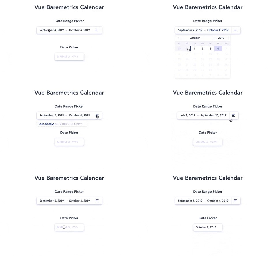
A Vue.js wrapper for the beautiful date-range picker made by the Baremetrics team.
The Vue-Baremetrics date range picker is a simplified solution for selecting both date ranges and single dates all from a single calender view. With a revamped minimalistic redesign.
Redesigned and Wrapped for Vue.js by Divyansh Tripathi
npm i --save vue2-baremetrics-calendar
Global Registeration via Vue.use() method.
// main.js
import Vue from "vue";
import App from "./App.vue";
import router from "./router";
// import the plugin
import Calendar from "vue2-baremetrics-calendar";

Vue.config.productionTip = false;

// use the plugin
Vue.use(Calendar);

new Vue({
  router,
  render: h => h(App)
}).$mount("#app");
Once registered you can use the component in its default settings with as follows:-
<Calendar
  type="double"
  @rangeEdit="processDateRange()"
  elementName="doubleRangePicker"
/>

<Calendar
  type="single"
  @dateEdit="processDate()"
  elementName="singleRangePicker"
/>
REMEMBER elementName is the only required prop and it should be different for each datepicker in your component
<template>
  <div id="app">
    <Calendar
      @rangeEdit="processOutput"
      type="double"
      elementName="otherRangePicker"
    />

    <Calendar
      @dateEdit="processOutput"
      type="single"
      elementName="primaryRangePicker"
    />
  </div>
</template>

<script>
  import Calendar from "./components/Calendar";
  export default {
    components: {
      Calendar
    },
    methods: {
      processOutput(output) {
        console.log(output);
      }
    }
  };
</script>| Name | Type | Output | Description |
|---|---|---|---|
dateEdit |
double | [Timestamp(begin), Timestamp(end)] | Array of start date and end date |
dateEdit |
single | Timestamp | Selected date Timestamp |
- elementName *required
[string]- DOM object of the calendar div you're working on
- earliest_date
[date YYYY-MM-DD]- The earliest date to show in the calendar
- latest_date
[date YYYY-MM-DD]- The latest date to show in the calendar
- format
[object]- Object containing formatting strings for.. you guessed it.. formatting your dates
  format: {
    input: 'MMMM D, YYYY', // Format for the input fields
    jump_month: 'MMMM', // Format for the month switcher
    jump_year: 'YYYY' // Format for the year switcher
  }
- days_array
[array]- Array of the 7 strings you'd like to represent your days in the calendar
days_array: ["S", "M", "T", "W", "T", "F", "S"];
- current_date
[date YYYY-MM-DD]- The date to start the calendar on
- required
[boolean]- Toggle if this field must have always have a valid selected date
- placeholder
[string]- Set placeholder text (note this will only apply if the required key is set to
false). The default will be whatever moment date format you're using. (i.e. 'M/D/YYYY')
- Set placeholder text (note this will only apply if the required key is set to
- start_date
[date YYYY-MM-DD]- The date to start the selection on for the calendar
- end_date
[date YYYY-MM-DD]- The date to end the selection on for the calendar
- same_day_range
[boolean]- Allow a range selection of a single day
- format
[preset key in format object] // see above- The double calendar adds the
presetkey to the format object for formatting the preset dates in the preset dropdown
- The double calendar adds the
- presets
[boolean] or [object]- If you don't want to show the preset link just set this to
falseotherwise the default is true which will just give you a basic preset of.. yep.. presets. BOOM! - Otherwise, if you want to customize it up you can include an array of preset objects. Something like:
presets: [
  {
    label: "Last month",
    start: moment()
      .subtract(1, "month")
      .startOf("month"),
    end: moment()
      .subtract(1, "month")
      .endOf("month")
  },
  {
    label: "Last year",
    start: moment()
      .subtract(1, "year")
      .startOf("year"),
    end: moment()
      .subtract(1, "year")
      .endOf("year")
  }
];
- If you don't want to show the preset link just set this to


