-
Notifications
You must be signed in to change notification settings - Fork 714
Talk Bubbles
stubbornella edited this page Sep 13, 2010
·
4 revisions
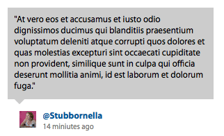
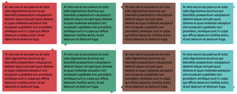
Talk bubbles were created to give context specific help, however they may be used for other purposes like blog comments, cartoon-style talk bubbles, etc.
- No images required
- Secondary elements in place to allow for borders (just make the lower b a bit larger and set the border color)
- Easy to adapt the size of the arrow
- Compatible with border-radius generated rounded corners
- Base CSS objects are 1K
- IE6 uses page background color for the transparent bits because it doesn’t support the color keyword “transparent”
- Allows eight different arrow positions
| Property | Description |
|---|---|
bubble |
Applied to the mod wrapper, this is the base class for all talk bubbles. To change the size of the pointer edit this class (margin and border width should always be equal). |
bubbleTop |
Structural class that extends .bubble, positions the pointer at the top of the module. |
bubbleRight |
Structural class that extends .bubble, positions the pointer at the right of the module. |
bubbleBottom |
Structural class that extends .bubble, positions the pointer at the bottom of the module. |
bubbleLeft |
Structural class that extends .bubble, positions the pointer at the left of the module. |
bubbleHorizontalExt |
A class which can be used in conjunction with .bubbleLeft or .bubbleRight to move the talk pointer to the bottom portion of the left or right sides |
bubbleVerticalExt |
A class which can be used in conjunction with .bubbleTop or .bubbleBottom to move the talk pointer to the right edge of the top or bottom sides |
- talk.html
- /css/talk.css
- /css/talk_skins.css
Unless you are building a complex application or interactive site it is unlikely that you will need all of the code for the different positions of the talk-nub. Keep the ones you need to make the stylesheet even smaller.

