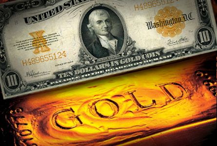
Currency has played a major role in society for thousands of years. Having an established currency was the mark of humanity's first step towards "functioning modern society". Countries all established different currencies, yet all mutually recognized gold as a valuable commodity. To facilitate trading, many countries adopted the gold standard or simply settled traded disputes with gold, since all countries had a common conception of gold's value. Gold's significance in the history of commerce and the maintained international understanding makes it the perfect benchmark to compare the buying power of different currencies. This project aims to draw insights from the buying power of different currencies using gold as the standard to determine each of their value.
We gathered the data for the Minimum Hourly-Wages around the world and for the price of 1 troy oz of gold.
From:
https://www.investing.com/currencies/xau-usd-historical-data
-
Mexico and Russia have paid the lowest minimum hourly-wages over the years.
-
Australia, Luxemburg, France, Belgium, and Netherlands paid the highest minimum hourly-wages over the years.
-
Korea and the UK have been continuosly increasing the minimum hourly-wage over the years.
-
US has high standard of living, but it is not among the top 5 countreis with the highest minimum hourly-wage.
-
European countries tend to pay higher minimum hourly-wage and South American countries tend to pay lower minimum hourly-wage.
-
Cost of living in each country can be considered for further studies.
-
This project used the gold price in U.S. dollar as currency to analyze the work hours to purchase the same amount (1 troy oz) of gold around the world, as this provides a clearer picture of the global economy. (the inverse of work hours = Purchasing Power)
-
Weak currency is related to more work hours to buy 1 troy oz of gold. (e.g. current (Nov. 14, 2020) 1 Mexico Peso = 0.049 USD ~ 20 times more work hours of US)
-
Gold behaves like a currency, in a sense, so it is sensitive to changes in exchange rates between national fiat currencies and the divergence in monetary policies of the major central banks.
 This graph shows Price of gold from the 2001 up until 2019. We decided to select this date range, so we can have an ample timeframe to observe enough of gold’s price fluctuations throughout different economic climates. As shown, the price of gold increased heavily after the Great Recession in 2008 because people flocked to the safe heaven asset in fears of the dollar losing value.
 This graph plots the hourly minimum wage from 2001 through 2019. Each line represents a country’s hourly minimum wage (in USD) at a given time.
 With this graph, we visualized the amount of work hours it takes for a person earn enough money in their native currency to buy 1 troy oz of gold. A higher a curve suggests that it would take a larger amount of time to work in order to buy an ounce of gold.
 The histogram illustrates the normal distribution of the return of gold investment from our Monte Carlo simulations over the next five years. The distribution is normal and right skewed distribution.
 The parallel coordinate chart maps out the minimum hourly-wages over the years from the top 5 countries with the highest minimum hourly-wages. Each line represents the minimum hourly-wage in a given year and illustrates how the minimum wage varies from country to country in that year.
 This map displays the location of each country the currencies we included in our project. Each circle proportionally represents how much time it would take to buy an ounce of gold. The bigger a circle is the more hours of work are needed to buy an ounce of gold.
