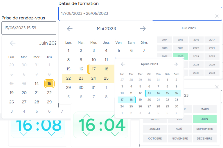
Here is a date, dateTime and date range picker for livewire made for Tall Stack
Here is a date, dateTime and date range picker for livewire made for Tall Stack
You can install the package via composer:
composer require webplusmultimedia/date-time-range-pickerAdd the following settings to your Tailwindcss config file, tailwind.config.js
module.exports = {
    presets: [
        require('./vendor/webplusmultimedia/date-time-range-picker/tailwind.config.js')
    ],
    content: [
        '...',
        /* Date time Range */
        './vendor/webplusmultimedia/date-time-range-picker/js/**/*.js',
        './vendor/webplusmultimedia/date-time-range-picker/resources/views/**/*.blade.php',
    ],

    theme: {}
}
In your ./resources/js/app.js, import the js file
import './../../vendor/webplusmultimedia/filemanager/resources/dist/js/date_time_range'You can customize the color theme by changing just one variable in your tailwind.config.js
const colors = require('tailwindcss/colors')

module.exports = {
    ...
    theme: {
        extend: {
            colors: {
                ...
                'primary-datepicker' : colors.cyan // Or what ever you want
            },
        },
    },
    ...
}
Optionally, you can publish the views using, but don't need that.
php artisan vendor:publish --tag="date-time-range-picker-views"In your blade livewire view :
<div class="pt-5">
    <x-webplusm-date-time-range-picker type="range" label="Dates de formation"
                                       wire:model="date"
    />
</div>- type : {string} (date by default) date, datetime or range
- label : {string} (null by default) the Label to play
- minDate and maxDate : {ISO8601 (Carbon\CarbonInterface|null)} (null by default), if you need restricting dates
- lang : {dateString} (fr by default(e.g : fr-FR ...))
- minTime : {int} (7(h) by default) , minimum time to reach
- maxTime : {int} (17(h) by default) , maximum time to reach
- intervalMinute : {int} (5 by default) , interval up/down for minutes (time and datetime type)
Coming sooner
composer testPlease see CHANGELOG for more information on what has changed recently.
Please see CONTRIBUTING for details.
Please review our security policy on how to report security vulnerabilities.
The MIT License (MIT). Please see License File for more information.


