-
Notifications
You must be signed in to change notification settings - Fork 17
WMultiSelectPair
WMultiSelectPair is a component for creating a multi select tool which allows for implicit null selection. It also contains the ability to have the user determine the order of the selected options.
- Why use WMultiSelectPair
- Accessibility
- Selection constraints
- Appearance
- HTML output
- Disabling
- Hiding
- Read-only
- Related components
- Further information
WMultiSelectPair is a good tool for selecting multiple non-contiguous options from a large list. It implements a selection paradigm which is complex but not unusual and therefore is generally a better option than WMultiDropdown. WMultiSelectPair does support no selection and is therefore a better choice for mandatory selection than WMultiDropdown.
WMultiSelectPair does have problems:
- it occupies a lot of horizontal space, especially when the options are long as the width of each list will potentially be the length of the longest option plus scroll bars;
- it is almost unusable on iOS.
At the time of writing (WComponents 1.4.x) it is recommended that WMultiSelectPair is not used in any application which may have an audience which includes iOS users. iOS takes an interesting approach to rendering select elements in the multiple state which causes significant usability problems.
It is proposed that WMultiSelectPair be completely rewritten in WComponents v2 to overcome this limitation.
See alternate multi-select components listed below for possible alternatives. WCheckBoxSelect may be a better choice for making selections from a small number of options. If the primary use case is to make one or few (fewer than four) selections from a moderate list or selections which are often contiguous then WMultiSelect is a significantly better option.
All aspects of WMultiSelectPair are operable from a keyboard:
- switching between the "available" and "selected" lists is done using the LEFT and RIGHT arrow keys;
- moving within a list is done using the UP and DOWN arrow keys;
- moving an option to the other list is done using the RETURN key;
- moving from a list to the buttons or from button to button is done using TAB and SHIFT + TAB as they are in standard focus order.
All WMultiSelectPair in a UI must be associated with a label. This may be done using:
- WLabel (preferred) this is required if the label must be visible in the UI; or
- using the toolTip property if the label does not have to be visible in the UI; or
- using the accessibleText property of WMultiSelectPair.
A WMultiSelectPair which is not appropriately labelled may display an unlabelled control warning.
The WLabel should be added to the UI before the WMultiSelectPair. The best way to add a WMultiSelectPair and its WLabel to a UI is to add it to a WFieldLayout.
A label for a WMultiSelectPair is implemented as a HTML legend element immediate child of the WMultiSelectPair's fieldset.
If the WMultiSelectPair is associated with a WLabel (including by being added to a WField) then the content of the label is also output in-situ as a HTML span element. This span is then marked as aria-hidden="true" to prevent double reading in PC mode but has scripted helpers to ensure it behaves in a manner equivalent to a legend (for access key support) and a label (for mouse users).
Under most circumstances the pseudo-label will be hidden from all users and the legend will be visible. When in a WFieldLayout with LAYOUT_FLAT, however, this is changed and the pseudo-label is made visible and the legend moved out of viewport (not hidden). This keeps the label for a WMultiSelectPair consistent with WLabels for simple inputs.
Where a WMultiSelectPair has its toolTip property set but is not associated with a WLabel the content of the toolTip is placed in the legend and may be rendered out of viewport.
If the WMultiSelectPair has selection constraints then there must be an indication of these constraints somewhere in the UI and available to all users. The appropriate place for this information is in the WLabel hint.
If the control is mandatory this indication is automatically generated within the legend element and the legend (if visible) and pseudo-label (if present) are both decorated accordingly.
The two option lists are labelled using the fromListName and toListName properties. If these are set they must have a value which adequately describes the purpose of the list.
See toolTip. A WMultiSelectPair may use the toolTip property if it is not possible to include a label in the UI. This should be a last resort.
// with WMultiSelectPair field
field.setToolTip("Some further context to this selection.");WMultiSelectPair may have accessible text applied as information additional to the visible label text. This should be used with care and restraint as it may result in less accessible applications.
// with WMultiSelectPair field
field.setAccessibleText("Some further context to this selection.");A WLabel for a WMultiSelectPair may be given an access key to provide rapid keyboard access.
A WMultiSelectPair in an enabled, interactive state may be set as the default focus point for a page. If this is specified it must comply with accessibility principles regarding focus and not put users into a position where they may skip content required for full understanding of the current view. See Setting focus for more information. When focussed the "available list" select element in the component will receive focus.
Up to and including WComponents 1.4.x WMultiSelectPair supported the notion of SubmitOnChange. This should be avoided as much as possible.
A WMultiSelectPair may be constrained to accept a minimum or maximum number of selected options and/or to be mandatory.
A WMultiSelectPair may be marked as being a mandatory field in the UI. The primary indicator of this is the presence of the required attribute on the HTML select element. The WLabel for the component is decorated with a visual indicator that the component is mandatory as a secondary indicator.
// make WMultiSelectPair `field` mandatory
field.setMandatory(true);The minimum number of selected options which constitutes a valid selection may be set on any WMultiSelectPair in an interactive state.
This property is set as an integer. It should not be specified as 1; if the component must have a selection then the mandatory state should be used, if the component is optional and the minimum number of selections, if any are made, is 1 then setting the min property is superfluous and merely adds unnecessary testing overhead. If this property is set then the minimum number of options which are to be selected should be indicated in the WLabel for the component. This could be done in the label text or as a label hint.
// with WMultiSelectPair `field`
field.setMinSelect(3);
// set the label hint...
fieldLabel.setHint("select at least three options");
Setting a minimum number of selected options will not automatically make the component mandatory. The minimum selection is validated only if the user has made any selection. To make a component mandatory use the mandatory state. These may be used in conjunction to enforce a required minimum selection by the user.
The maximum number of selected options which constitutes a valid selection may be set on any WMultiSelectPair in an interactive state. If set then an indication of this should be included in the component's WLabel. It is entirely inappropriate to set the maximum selection to 1: for this use case use WDropdown or WSingleSelect.
// with WMultiDropdown `field`
field.setMaxSelect(3);
// set the label hint...
fieldLabel.setHint("select no more than least three options");If the order of selection is important it may be set by the user if the WMultiSelectPair uses the shuffle property.

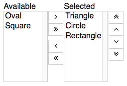
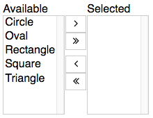
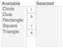
WMultiSelectPair consists of a pair of select lists separated by a column of buttons used to change selections.

The height of the select elements (i.e. how many options to show at any time) is able to be configured. If this property is not set then WMultiSelectPair's height will be determined by the theme and is commonly large enough to roughly equal the height of the selection buttons. The minimum setting for this property is 2 which is determined to remove usability problems which occur if only one row is specified.
Each select element is labelled. The "available" options are labelled using the WMultiSelectPair's fromListName and the currently selected options by the toListName. If not specified the default values are "Available" and "Selected" and are internationalisable as they are set using properties in the wcomponents-i18n module bordertech.wcomponents.message.multiSelectPair.options and bordertech.wcomponents.message.multiSelectPair.selections respectively.
WMultiSelectPair may have one or more values to be added to the component's wrapper element. This can be used for fine-grain styling of specific components but should be used with care and is not recommended for any input control.
For more information see WComponents HTML class property.
WMultiSelectPair outputs a HTML fieldset element. The select elements are then placed inside this fieldset. The selection tools consist of two internally labelled selection lists, a set of buttons for moving options from one list to the other and an optional set of buttons for adjusting the order of selected options. The WLabel (or content of the toolTip) for a WMultiSelectPair is output as the fieldset's legend element.
WMultiSelectPair outputs non-phrasing content and form-related interactive content and must not be used in any context which forbids these content categories.
A WMultiSelectPair may be disabled on page load. When disabled the WMultiSelectPair will not respond to user input or interaction. This property may be used in conjunction with WSubordinateControl controls to enable or disable content without making another server call.

A WMultiSelectPair may be hidden on page load. When hidden the WMultiSelectPair is not available to any compliant user agent. It is present in the source and is not obscured in any way. This property is determined by a WSubordinateControl. When a WMultiSelectPair is hidden a WLabel associated with it is also hidden.
The read-only state changes the output rendering of the WMultiSelectPair so that it appears as a appears as text output of the selected options of the control. The control is not able to be interacted with by the user and does not return any value back to the application.
A WMultiSelectPair in a read-only state may be the target of a WSubordinateControl or WAjaxControl. If it is the target of an AJAX action its state may be changed to remove the read-only setting.
