-
Notifications
You must be signed in to change notification settings - Fork 4.3k
New issue
Have a question about this project? Sign up for a free GitHub account to open an issue and contact its maintainers and the community.
By clicking “Sign up for GitHub”, you agree to our terms of service and privacy statement. We’ll occasionally send you account related emails.
Already on GitHub? Sign in to your account
Enhance the Publishing flow #7602
Comments
|
Since there's a rather a lot at play here, it might make sense to split these into two different issues. This is how I currently see these two improvements breaking down (and I have questions!):
I'm having a comb through issues to surface history and prior conversations around these two experiences as well, but if there are particular discussions that it'd be helpful to read, I'd appreciate a link or two as well. 😸 |
|
Thanks for tackling this one @sarahmonster. I am totally into splitting into issues and leave that up to you if want to. I do think it's perhaps the same flow but totally could be.
Both! Mostly improving perceived loading time but also engaging is good here.
This can vary but usually isn't long at all, it just 'could' be. Also having anything is better than even a flash of white blank screen.
This used to be a bug, it shouldn't be anymore... if it still is lets get it fixed over designing around a flaw.
Yes.
So it can be extended and it's a better experience than a modal, there also doesn't need to be a full screen take over. Right now let's stick with sidebar.
Most seem to want to see post or just carry on. It feels like a 50/50 split from observations. |
|
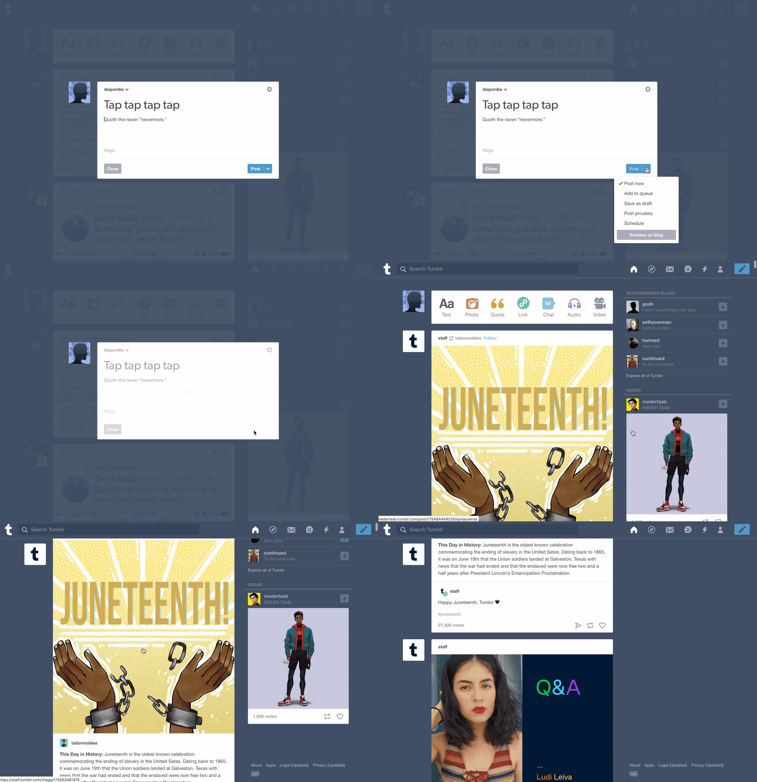
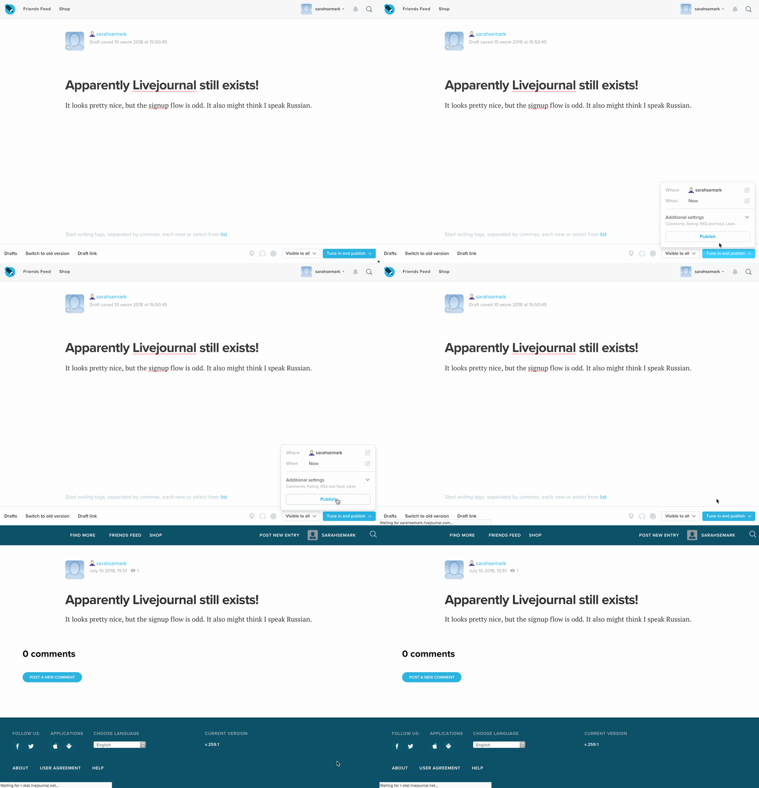
I'm splitting the preview loading experience into #7922 and will leave some ideas there, so as to keep this thread focussed. Benchmarking other publishing flowsBefore making recommended changes, I looked at what other services are doing, to get a sense of how it's handled elsewhere, what works well, and what's not so great. It turns out there's a wide variety of experiences offered by different services. WordPress.comTwo presses to publish, then redirects to post itself, with a "Post published on [site]!" dismissible notification and a top header bar that allows for previewing the post at different breakpoints, going back to edit the post, and copying the link. Updating a post just prompts a notification whilst remaining on the same screen. Very similar to the current Gutenberg experience, but a bit more polished. WixOne button with a dropdown. Pressing publish opens a (dismissible into the future) modal that offers to share to social media (email, Facebook, Twitter, LinkedIn). MediumPublish button pulls up a pre-publish panel with some tips (add tags, add an image, share on social media) and a second publish button (below!). Pressing the second button redirects to the new post. (Post = "story") GhostV similar to Medium, with a publish (indicated by a dropdown, not a button) then pulling up a post-publish panel that gives the option of "ready to publish your post?" + a post now/schedule for later option, and a second publish button at the bottom. Nice animation and use of icons on the button from publish > publishing > published. Also shows a "Published! View post" modal at the bottom left hand side of the screen, although it's super easy to miss. HubpagesThis is a pretty terrible experience overall, and required a text message confirmation before it would publish. Once you finally get all that sorted though, you get a "Congratulations! You've posted your first article!" notification that also includes some info about their QA process, suggests to write another article ("Your new article is lonely: Create another article!"), and a copyable link to the article itself. (Two, actually.) ContentfulRequired a German version and a specific format for the title before it'd allow me to actually post anything. Uses a single "publish" button with a drop-down for more (change status.) Never actually got through the publishing flow, so who knows what happens at the end! TumblrThere's a button with some drop-down options (post later, etc). One click to publish ("post", in this case.) Clicking through redirects you to the main homepage/feed, with no indication the post published. (Where did my post go?) BloggerUses a simple "publish" button. Redirects back to a post list. Gives me a whole slew of notifications, but nothing related to the actual post I published. SvbtleFirst you need to use the "save idea" button, then an additional menu area appears with settings, preview, publish button, and save button. Hovering changes the text to "publish now". Clicking through causes a modal ("You sure you want to publish now?) Clicking through makes the whole screen pulse green, then a bright blue "published" notification appears, + a link to view post. LivejournalUses a drop-down "Tune in and publish" button (drop up?) that opens more options, similar to Ghost/Medium but with some button styling, rather than just the dropdown styling. Pressing opens the dropdown/up with additional settings (post to different journals, publish date, plus RSS, x-post, sticky, etc options), with a second "publish" button at the bottom. Clicking that then redirects to the new post. Pen.ioSuuuuuuuper simple. Hit a publish button, your post (page) is published. No bells and/or whistles. |
Suggested improvements to our flowFor comparison, here's Gutenberg's current publishing flow in action: Here's my current thinking for how we can improve this flow: Pre-publish
Post-publish
On "hurray!"The first time you publish a post is very different from the hundredth time you publish a post. How do we account for these varied experiences? Should WordPress commemorate this in some way? We could consider congratulatory milestones: published first post, published six posts this month, written x words, etc. Nothing too confetti-laden, but perhaps a simple message in the post-publish screen: "Great work on your first post!" This would be a nice way of putting a bit more emotion in the interface, but we don't want to annoy or disrupt users. Can we note important milestones without potentially seeming tone-deaf if someone's writing a blog for therapeutic purposes, or about a traumatic subject? ResearchI've tried to approach this with the intention of being as helpful as possible. How do we help users get the most from their new post? What do they want to do immediately after publishing a post? I looked for research into this but couldn't find anything specific to "what do users want to do after publishing a post?" Thus, my recommendations here are mostly based on guesswork, assumptions, and/or looking to what others are doing in this space. I think it could be super beneficial to do some user testing here, both of the before flow and the after flow. My thinking is that it would be ideal to test it with the following types of users:
Do we have a pool of users anywhere to test with, or have usability testers typically been recruited on a per-test basis? Next stepsI'll work on some mockups for this suggested flow next, but I'd welcome any ideas or thoughts on the suggested approach here! |
|
This is all really great @sarahmonster as an exploration, thanks. Let me dig into some responses.
Now onto your improvements to respond. Firstly some super interesting ones here, thank you for your suggestions already there.
This is interesting. How do you get it back if want to change mind?
How would you suggest this?
Yep :)
I'd love to see your explorations there considering the extensibility complexity.
I am torn about this, I don't think double buttons work in this sense. Maybe explore other things first? I'm not ruling it out as much as want to see the other impacts then loop back. I'd love to see you explore all your post-publish points. Same goes for your 'hurray' points, love to see what you come up with from those. Thank you for taking such a considered approach, look forward to see where this goes. |
|
|
I've mocked up two different solutions to this problem, exploring different approaches to various different parts of the problem. I understand that this may, in a few cases, be re-introducing patterns that have been decided against in a previous iteration, but given that a great deal has changed since, I figured it would be good to approach it with fresh eyes. I've designed this from a mobile perspective first in order to ensure that we prioritise for the simplest possible display first. I've just started with two different explorations, in order to get some ideas out there, but I expect we'll combine some of the component elements as we iterate on this flow. Animations and UI elements are obviously pretty mockuppy at this stage! 😜 Variant 1Prototype: https://automattic.invisionapp.com/share/USMZOBPWMHZ#/ Here, I've split the "publish" button to allow for two different actions here, depending on how trigger-shy the user is. Clicking the main part of the button publishes the post immediately, and clicking on the drop-down icons pulls down the pre-publish panel, now as a popover container instead of a sidebar element, so it feels more consistent with other patterns. (See conversation in #7878, and my understanding is that this may also help with some accessibility concerns.) I've also dimmed the background to reduce noise and improve focus. This one makes use of a secondary publish button in the popover, but either button would work to publish the post. My thinking here is that if you're opting to go through a pre-publish check by clicking on the down-arrow portion of the button, you want to actually read through those checks in a (relatively) linear, down-headed sort of fashion. Putting a button below all that would be a logical place for people to expect it, and we don't need to design in this case for the impatient user who just wants to click through and get it over with, since they can avoid the double-click on the button altogether. The focus here is on the post-publish panel, which appears to give tips and next steps. I expect that plugins would make heavy use of this and would likely be responsible for adding a lot of the functionality that people would want post-publish (fine-tuning SEO settings, sharing on social media, etc). I've tried to focus on what we can do with the out-of-the-box experience to make it feel like an accomplishment, without trying to be too celebratory or cutesy, as well as to guide the user in getting the most from their post. Variant 2Prototype: https://automattic.invisionapp.com/share/7FMZOEYZST6#/ This variant uses an alternate iteration on the "publish" button, more aligned to the WordPress.com solution. It does mean it's a bit harder to decide on-the-fly if you want a pre-publish checkup, but the panel will be more discoverable for more users. It also means we'd need to store a setting somewhere to allow users to opt out of the double-click publishing experience, which I think we'd need to store under "Settings" in the ellipses bar menu. In this, your post is highlighted more immediately after publishing, but it feels less like something important's happened. It is, however, a lot easier to review your post for any issues, then work on any post-publishing follow-up actions, like adding tags or sharing on social media. |
|
Thanks for all this work @sarahmonster, so much in good way to process. First, I am very pleased to see a focus on mobile first. I do wonder as an over-arching point how does this work if someone extends the sidebar? Maybe could you also explore a full sidebar just as a comparison? Someone could have a few plugin that check things like SEO, tags, spelling and even have more options on publish like sending to social media. What would those look like as a stress case? First version:
Second version:
|
|
Closing in favor of #7922. |
|
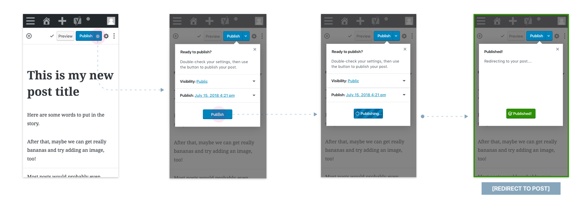
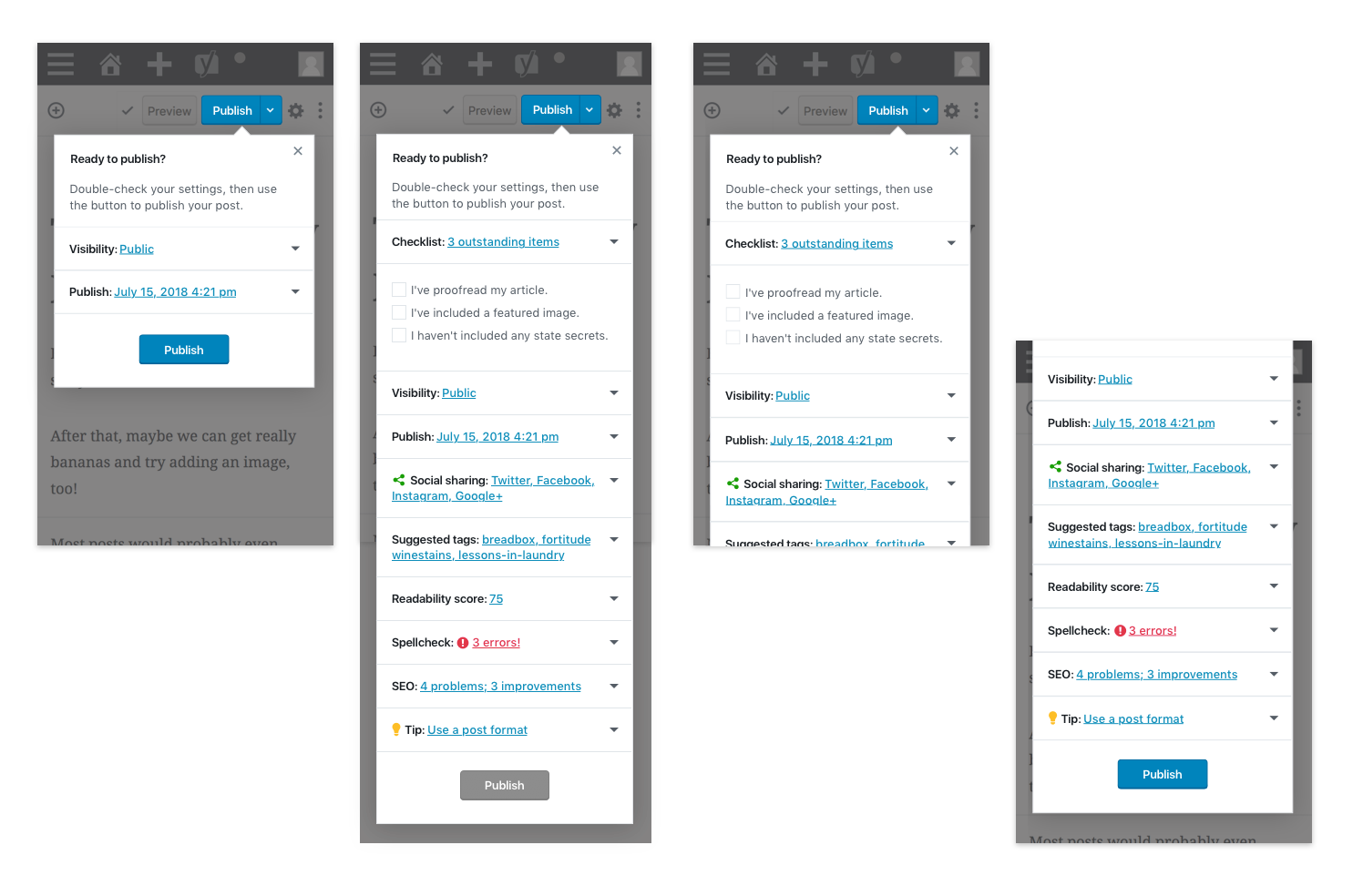
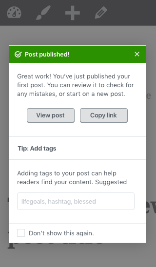
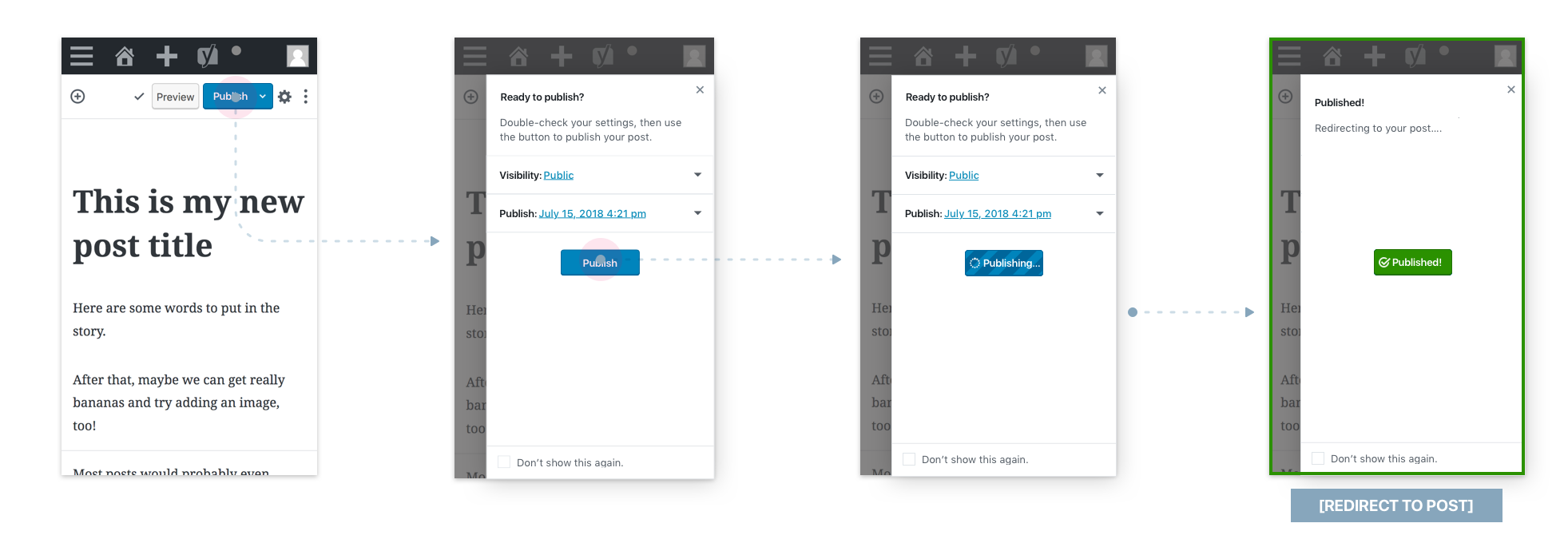
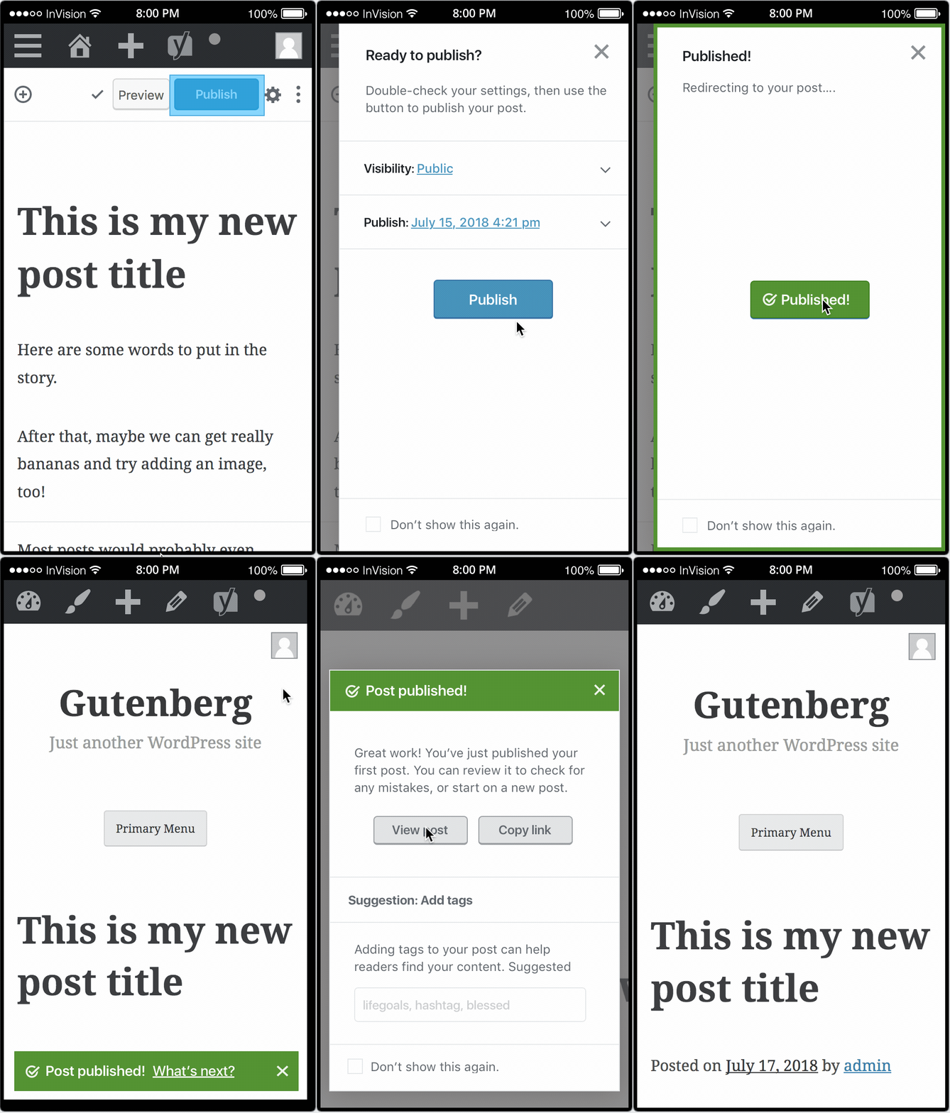
I'm going to break this flow down into its constituent components here so that we can evaluate the different options for different parts of the flow separately, then I'll bring them all back together to test out a full prototype again. Again, I think testing on users could be really helpful here, so I'm going to see about a good way of going about doing that. Publish buttonHaving thought on it more, I'm thinking the split button solution is a better option for users, as long as we can ensure they understand how it works. I'm heartened here by the fact that we have prior art in the form of the New Post button... except of course that'll only be familiar to users who've already installed or played around with Gutenberg. That said, it's a bit more flexible than the "don't show this again" checkbox in allowing users to decide, on the fly, if they'd like to publish immediately, or if they'd prefer to double-check everything first. One way to introduce this to users would be via a tip, or by showing the pre-publish panel the first time a user goes to publish a post, regardless of which option they choose. If they choose the "publish" button, they're directly taken to see their post: If they choose the "dropdown", they're shown the pre-publish panel: Note that the last screen in each of these flows is just a temporary screen whilst we redirect more-or-less-immediately to the new post (more on that below). The alternate to this solution (as illustrated in the original flow 2) is that we have a single "Publish" button that opens up the pre-publish panel and offers the user the option to hide the pre-publish panel in the future. This has its advantages (namely, a simpler button), but doesn't allow for as much flexibility in how people publish, and it also requires that we add an extra setting (for "do/don't show me the pre-flight check). Allowing users to dynamically choose which way to publish their post gives them the most flexibility, as well as being kinder to established users, who may be annoyed by a sudden jump to a two-click publishing process. Since we're going to go with the assumption that users are going to want to double-check their settings prior to publishing (ie, actually read the stuff in the popover), it'd make sense to put a secondary "publish" button at the bottom, as shown above. In this setup, the original "Publish" button at the top of the page would still work—if you pressed it while the pre-flight popover was open, you'd immediately start the publish process. 💥 Pre-publish panelHere I've opted for a popover in order to ensure focus is retained for those users who want to be able to double-check their settings prior to publishing the post. This also allows us to use a visually distinct element from the settings sidebar, rather than a sidebar that looks similar-but-not-quite-the-same, and provides a more consistent behaviour across different screen sizes (because the width will remain the same throughout). It also seems to be a more commonly used pattern for those services that make use of a pre-publish panel (Medium, Ghost, Livejournal, Wix) where only WordPress.com uses a sidebar pattern. In terms of plugin extensibility, it's more or less the same as the sidebar option. I haven't been able to find examples of plugins that add any modules here, but let's see what it would look like with the usual suspects here: This demonstrates how it might look with a whole bunch of plugins adding extra checks, and some extra pre-flight checks disabling the publish button as in the case of #7020. The worst thing we'd need to deal with is a little bit of scroll, which we'd need to do anyway with a sidebar scenario. Breaking everything into individual panels (ideally collapsed by default) keeps things clean and visually parseable. Post-publish redirectionIn my review of other services, redirecting post-publish to the post itself was overwhelmingly the most common behaviour, and I suspect it will work for the majority of users who, after publishing their post, just want to go look at it. I don't think we have any data or research on user behaviour and wants post-publish, so this is largely an assumption, but anecdotal data (see: asking people casually) indicates that the most common responses to "what do you want to do after publishing a post?" is "look at it". (Closely followed by "write another post" and "do something else altogether". Leaving them at the edit post page isn't the right solution for any of these desires, so I think it makes sense to optimise for the people who want to go look at their post and see if it's all okay. (Which I suspect is the vast majority of people.) There's an opportunity to do some sort of brief animation in here as well, but I think we'd want to go super simple. Post-publish panelHere's what I'm thinking would be optimal here, and it sort of combines elements of the two flows above. The first time you publish a post, you're redirected to your new post, with a full takeover (dismissable) modal like this: It has a "Don't show this again" checkbox option, so users who just want to get on with it don't need to see it again. Still debating if we should check this by default or not. When you dismiss the modal, it collapses into a little notification bar: (Note: I'm not opposed to the x button closing the modal and the notification entirely, but I thought it could be useful to retain access to the modal, so it doesn't just totally disappear if you want to look at your post.) From the notification bar, you can re-open the full modal (so useful if you want to look at your post, then come back to the modal to share to an email newsletter or edit the post or whatnot) or close it entirely. The next time you publish a post, you're immediately redirected to your new post, with either the full modal or the notification bar, depending on if you opted for "don't show me this" at some point. Failing that, if we want to avoid adding a setting, we could just opt for defaulting to the notification bar only for subsequent posts. The bar is then dismissable if you just want to get on with it already, or you can pull up the full post-publish panel by clicking through. This whole mico-flow ends up looking something like this: I see the post-publish screen potentially being more useful for plugin extensibility than the pre-publish screen, because lots of things (additional sharing, checking SEO stuff, adding tags) makes sense to do (or at least as much sense to do) after you've published the post. This part is likely the roughest part of both the original/current flow right now, and this updated flow as well. It'll need some iteration to get a good balance of options and extensibility in place, as well as some fine-tuning of the visuals themselves. For now, I'm trying to focus on getting the broad strokes worked out, and then we can work on more of the finer details. 😅 |
|
Also: I'm reopening this since #7922 refers to the animation/load state on pressing the "preview" button, not the publish-button experience itself. And also this is where all the work is. 😜 |
|
Adding the Accessibility label, as the Publish flow is pretty critical for inclusive design.
From an accessibility perspective, yes please 🙂for keyboard and assistive technology users, navigation is a linearized experience so having the Publish button at the end of the logical flow is super beneficial (this was noted several times in several issues)
Not fully convinced that always redirecting to the post itself after publishing would be ideal, as it seems a too brad assumption on the users intent. |
|
P.S. just to note that any visual indication (icons, animations, etc.) used to communicate important information about the flow needs also a semantic equivalent and an audible message. |
|
Thanks for exploring this @sarahmonster. I think it's important we get a balance between accessibility here also but I feel that's an easy goal to reach as this is worked with mindfully. I am wondering on seeing the dropdown if this pattern isn't a little limited. Could you explore a sliding? I do think it could provide a lot more flexibility and not add a new pattern. What do you think? Something similar to https://material.io/design/components/sheets-side.html. I also really like exploring the 'publish' being at the bottom. I also would like to maybe throw in an exploration of having the sliding page use a wider space. This would take it also away from being like the sidebar. |
|
@afercia thanks for the notes—I think the icons/animations used here all do have corresponding text elements (when the icon changes, the text associated with it also changes) but please do let me know if there are any concerns with the patterns and flows suggested here. It's definitely helpful to keep these things in mind in the design phase, to be sure we catch things before they've developed. Hopefully we can improve the overall accessibility of this flow. @karmatosed we could use a side sheet instead of a dropdown, but I'm not certain it's a better pattern here—it means we can't use the split button, which means that we either force users to always double-click through to publish their post, or we have to introduce an additional setting. I couldn't find anything using an existing side-sheet pattern in Gutenberg, but do let me know if I've missed one somewhere. It seems like the Material pattern would be very suited to the sidebar itself. Here, using a side-sheet pattern breaks with convention of other services' publishing flows, which tend to use popovers for a pre-publish panel. That's not necessarily a bad thing if we're improving on the pattern, but I'm not sure we are. This pattern does have the benefit of obscuring more of the screen below, which certainly helps improve focus. Here's what that portion of the flow would look like with a side sheet. We'll want to introduce a setting to allow users to avoid the "double click" publishing flow, since there isn't a good way to use a split button with this approach. It's definitely closer to the sidebar in look & feel, but that's largely unavoidable. We shouldn't be trying to make it much wider here, since it won't accomodate smaller devices, but we don't really need more space with the current setup—even with the "kitchen sink" plugin example above, it's busy, but it's not the restricted width that causes the busyness. For apples-to-apples, here it is using the popover: The popover is an established pattern in Gutenberg, although I can't find cases where it's used quite as heavily as it is here. This option does allow us to use a split button pattern, which gives users the option to on-the-fly decide if they want to use the pre-publish panel. That said, that may be an option we don't want to give to users. It's also following a pattern that's been pre-established by other services, which means it could be familiar to some users. That said, I think either of these approaches is a good improvement on the existing pre-publish panel, so I'm happy to go with the prevailing opinion here. 😺 |
|
@sarahmonster I think we are on the right track with the thinking here. I would very much like to explore the side sheet if possible. I really think on desktop this could even be a lot wider than we have now - although then we have an issue with looking at making too big an area for people to fill up. We have a modal but not an existing pattern. I think we could explore one at least in prototype. I also wouldn't be against testing both in prototype if we had time to rough test. I feel testing side sheet is a good start.
I very much believe the work you are doing here is far better than we have now. Thank you for doing it. |
|
I've created a new prototype that uses the side-sheet approach, as well as introducing a tiny bit more whitespace and typographic hierarchy—we'd probably want to dial that back unless the spacing were introduced across the board, which is obviously a much bigger change, but this is mostly to test out how it might work with a bit more breathing room: Clickable here: https://automattic.invisionapp.com/share/DGNHVJ5ZKBC#/ There's a lot of finer detail (animation, transitions, etc) that isn't possible to properly prototype in Invision, so if this feels like a good direction, I think it'd be good to try to get it into a code prototype to test. I'd like to A/B test this as much as possible to determine its effectiveness, but I haven't found much information (I may be looking in the wrong place!) about user research efforts attached to the project. Do we have a pool of people from whom we can recruit testers, or have efforts typically been on a one-off basis? Has there been any testing done prior to this on this particular flow? Where are test results and data shared? |
|
The design team discussed this during a triage session in Slack yesterday (Note: You may need a Slack account to log in.) Since this has turned into something of a ahem long-winded (my fault!) issue, let's treat it as a tracking issue, and try to split all the different improvements into a series of smaller tickets. I'd still appreciate design feedback on the overall approach suggested here, but we can also forge ahead with Here's how I think we can break this one down:
I'm working to file issues for each of these issues individually so we can make progress on this issue. |
|
Thanks for wrangling this, Sarah!
It feels awkward to have a question as the label for a button. If I'm clicking a button, I'm performing the action it should be suggesting, right? I noticed Amazon has a "Proceed to checkout" label on their button. I wonder if that's kind of what we're doing here? Maybe, "Proceed to publish" or "Prepare for publish".
I'm on board with this! Good call. "It's also going to be a more consistent experience across mobile devices and larger screens." is a great point!
Yep! 💯
Good thinking. This little fix help reinforce the changes made too!
I think we can drop the tag suggestions. Let's try to keep the user's focus on the immediate things they need to check before commiting.
I like that idea. Let's keep this issue updated with links to all the smaller ones. |
|
Thanks for the feedback @mapk! I've moved your idea over to # 16342 for further discussion. I've now refined the original concept here based primarily on findings from usability studies and intuition: I've split these recommendations into component issues and have updated the original issue text here, so it's easier to find these linked tickets. We'll use this issue as a tracking issue, and discuss individual changes recommended on these tickets:
|
|
@sarahmonster does this issue need keeping open if those others are being worked on? Just checking if we can tidy up this one? |
|
Let's keep this open as a tracking issue—it's helpful to be able to find all the related issues in one place. Once those related issues are dealt with, we can close the tracking issue. |
|
Circling back here, I've combined some of the conversations from #15847, #16127, #16342, #16308, #16311, #16310, #16327, #16341, and other publishing-related issues into a single, combined prototype. Some of the finer details are missing here (datepicker behaviours and improvements, error handling, editing dates and visibility directly from the pre-publish panel, surfacing visibility and publishing options in the document settings, the title block, etc), but it should be enough to get the broad strokes of the proposed changes here: Note that the transition between pre- and post- publish panels is still subject to change—more solutions illustrated in #16327. I'm not sure anymore if I'm leaning toward the dialog-snackbar-dialog pattern shown here, or the dialog-dialog-dialog pattern. That decision may be contingent upon accessibility and usability feedback. |
|
First, thanks for taking the time to create this mock walkthrough @sarahmonser. I do have a few points this brings to mind, some of them because of the recent explorations in full screen modal. It does feel a little disjointed as it goes between screens, the changes in height and spacing is a little jarring to the flow. I think it takes me out of the flow of publishing. I know I've been vocally against a modal here and I still feel in current version this leads to a weird ending to the writing journey. Looping back to the idea of a journey when you write, this is the end in some ways. I feel the modal takes me out of that and doesn't lead me to the celebratory high point. Just a thought to add to this. Personally, I wonder how this could change 'if' the full-screen modal @youknowriad proposes gets in. A few things I wonder about the modal: |
|
I share the feeling that the size change of the modal through the steps is a bit confusing. That could be solved in many ways, including but not limited to the full-screen modal dialog proposal. |
|
As the efforts here continue, and as the archive is getting increasingly buried and hard to browse, I thought I'd resurrect some of the thoughts we formed while designing the first iteration of the pre-publish flow. I present these only as historical context, not as a value judgement in favor of one design or another. The pre-publish experience is super important:
We did learn as we went about the designs, that we wanted to be somber and neutral in this pre-publish dialog, as the words a user might publish are not always appropriate to celebrate. This is why we opted to not include too much colorful language or illustrations. This bit is a delicate balance. |
|
+1 to everything you wrote @jasmussen. I think with phrases like 'Great job' we have to consider what if someone is writing about a loved one that is no longer around, something personally traumatic. The pace and journey are essential to consider here. |
|
Thanks for the feedback, everyone! It sounds as though I may not have yet landed on a solution that solves the problem at hand. Since there's been some lengthy back-and-forth in this issue (and others!) without landing on a good solution, it may help to take a few steps back and clarifying:
Once we have answers to those questions, we can look to revisiting and/or closing out this issue and its component sub-issues. |
|
The prototype really helps convey this flow! Thanks for doing this. The three-modal version shared here #16327 (comment) feels visually like the better way to go between the two choices. The user is in the modal flow, and stays in until done. As for the modal jumping around, I think it can be refined by fixing the top position of the modal and only changing the height? Or maybe animating through the modals would provide a better transition, similar to: #16327 (comment) |
|
I have updated my Draft PR #16715 to be based on @sarahmonster's latest prototype if anyone wants to take it for a spin, I did make some changes detailed in the comments. It needs some overall design clean up, but it should allow you to experience what using a publishing modal "feels" like. I hope to create a branch that combines this and @youknowriad's full-screen modal early next week to give an idea of what that would feel like as well. |
|
This was brought up in design triage and for now, closing to review later in iterations. There is a lot going on with the flows right now which means letting that settle then look at everything holistically is a great plan. If someone still wants to explore they can as issues can always be reopened later. |










Update 28 June 2019 (exactly one year after originally opening!) by @sarahmonster:
This issue is a long discussion about the overall experience of publishing a post and is now being used as a tracking issue to. To contribute ideas, feedback, or just follow along with the conversation, please use the following issues:
Reconsider "Publish..." label?: Publishing flow: Reconsider label for "Publish..." button #16342Show a preview panel in pre-publish panel: Publishing flow: consider including a "post preview" in pre-publish panel #16311Original issue text from 28 June 2018 by @karmatosed:
Right now on publishing the experience comes to an abrupt end. For example:
Whilst the content of the post may not mean we want to celebrate with balloons and ribbons the publishing, having something that doesn't just stop at this empty end is needed.
Preview looks like this....
A few ideas could be to have an animation such as here: https://www.wired.com/2013/12/a-sandbox-for-experimenting-with-animated-typography-built-by-a-google-designer/.
This has been talked about in other issues and it's worth creating one here to just focus on this and explore. Along with adding some flourish to this page of engagement also looking at the format. This is pretty flat as an end to the experience. Beyond any animation this screen showed above could do with some iterations itself.
Could perhaps bringing in a better previewing to this all also be wrapped in? Thinking about this in stages may be the best, what can we get in for phase one. Then maybe having a preview modal or something on preview could be brought in later phases. I think it's worth in designs exploring freely then distilling back.
Worth noting that exploring things like having this across all devices is important. What could be created that adapts well?
The text was updated successfully, but these errors were encountered: