-
Notifications
You must be signed in to change notification settings - Fork 4.3k
New issue
Have a question about this project? Sign up for a free GitHub account to open an issue and contact its maintainers and the community.
By clicking “Sign up for GitHub”, you agree to our terms of service and privacy statement. We’ll occasionally send you account related emails.
Already on GitHub? Sign in to your account
Try an alternative modal style #16896
Conversation
|
hey @youknowriad, I tested it and it works wonderfully, just one caveat, having full screen modals can be confusing to people because it loses context, as they might not know where they're now, or if the page changed or is it in the same page. a nice discussion went here about it |
|
@senadir Thanks for testing. As I explained in the title, I thiink there's no loss of context because:
In the link you shared they say "A full screen modal interrupts the workflow of the user and forces their attention towards the modal content" and that's exactly what our Modal component is meant for. If you take a look at the previous iteration, you'll notice that the overlay is very dark and there's no "context" to retain. |
|
your points are very valid and I agree with them mostly. I think we can extend the animation just a bit longer since a huge element being scaled so quickly can cause lag*. this modal design seems to work great in cases where the content doesn't directly compliment the editing experience, as long as we introduce new modals with caution I think it's great. I'm approving this, but I would feel much more relieved if someone else from the design team approved it as well. * I tested the PR in 2013 macbook air with 4gb, a relatively slow machine but could represent the median user base |
| @@ -5,53 +5,44 @@ | |||
| right: 0; | |||
| bottom: 0; | |||
| left: 0; | |||
| background-color: rgba($black, 0.7); | |||
| padding: 20px; | |||
| background: $white; | |||
There was a problem hiding this comment.
Choose a reason for hiding this comment
The reason will be displayed to describe this comment to others. Learn more.
I feel like this should be animated as well since it suddenly shows up.
There was a problem hiding this comment.
Choose a reason for hiding this comment
The reason will be displayed to describe this comment to others. Learn more.
The idea was that if we animate the overlay instead, it feels like there's a lot happening. While if we animate just the content it's more subtle.
| } | ||
| // Animate the modal frame/contents appearing on the page. | ||
| transform-origin: top center; | ||
| animation: components-modal__appear-animation 0.2s forwards; |
There was a problem hiding this comment.
Choose a reason for hiding this comment
The reason will be displayed to describe this comment to others. Learn more.
the animation length here is quite small, maybe 0.4s can be good, it should however be coupled with animation on .components-modal__screen-overlay or else it will be useless.
|
I think this is a valiant effort, and it's very pretty, and I hate to be coming to the PR from a place of negativity, but my gut reaction to this was really don't like this. I don't feel like I have such strong responses too often, which is particularly why I wanted to note it; I'm usually pretty adaptable but this feels significant in a way that really got me. This is a design that works really great for a modal that is just a single scrolling pane, ideally one that's on the longer side. But — at least for me, although I suspect it's the case for other devs too — that's actually a fairly rare usage of the modal component. At the day job, we're building modals of all shapes, sizes, and configurations where this approach works really poorly. We have really small modals (400x200 or so), which are effectively acting purely as confirmatory dialogs and brief messages to the user. We have complex modals, with multiple separately scrolling panes, with complex logic controlling the user interface. These modals don't scale well to this type of design. I also disagree strongly in the loss of context. I know you don't feel the loss is significant but it's the first thing that struck me. While a modal is intended to be a total separation in terms of user focus, that slightly-visible background grounds the modal in a "sense of place". As a developer-toggleable option, maybe this works — I know there have been discussions around the idea of a "full screen takeover" modal in earlier stages of the project, and perhaps this is an entrypoint to that concept again. But I would strongly disagree with this as an implementation applied broadly to all modals. I think it's attractive, but not suited to the types of complex modals that third party developers have been building. |
|
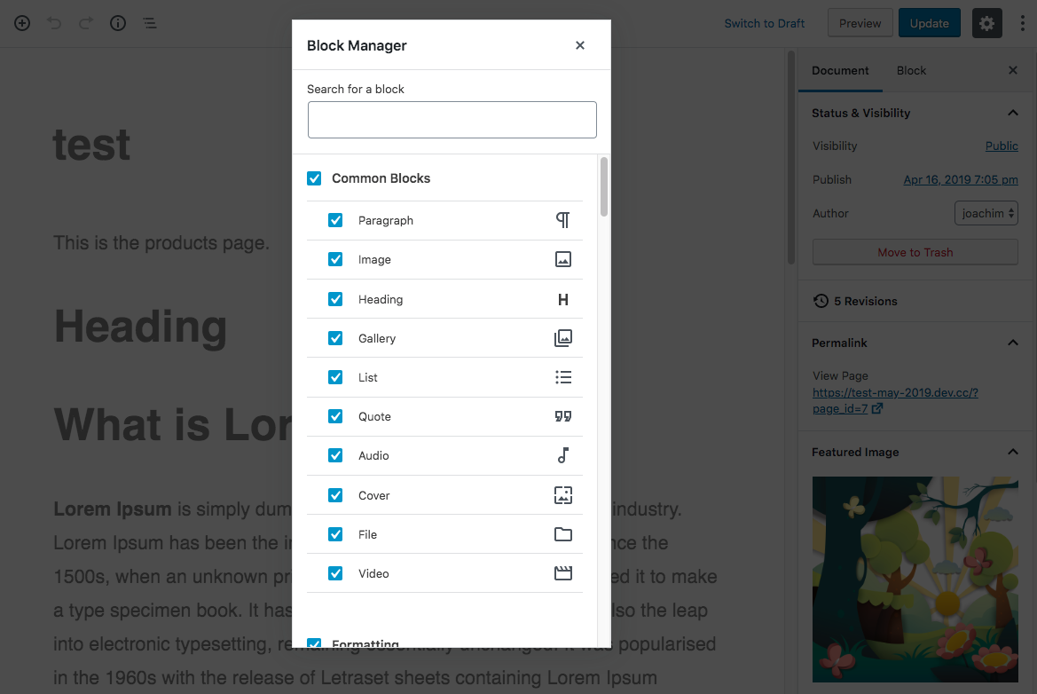
I’ve come back to this a few times today as I’m trying to piece together why I had such a strong initial reaction, and I think it comes back to the contextual element. For some of the core Gutenberg modals, such as the block manager and keyboard shortcuts screen, I suspect this type of design actually makes a good deal of sense, because the contents of those modal dialogs relate to the context of the entire editor application. Taking over the whole screen is fine because you know you’re in the editor, and you know those interfaces control the entire editor. But for modals which are triggered by blocks or from blocks, or which relate to a specific part of the document — and these are the types of modal dialogs I deal with most from day-to-day — this UI enforces a profound contextual break that feels super disconcerting. I’m reminded of a psychological study I once read about, trying to understand why people entering a room forget why they had walked in that room in the first place. It boiled down (essentially) to the shift in context: without any type of anchor to provide continuity, you are vulnerable to those moments of confusion and distraction. I think that, to a degree, is what I’m experiencing here. The loss of an anchoring context in practise just feels cognitively burdensome: now I not only need to be aware of the action I want to take, but also how I got here in the first place (and what state I will be in when I exit this screen). Without that ambient information, I just feel lost. |
|
I've gotten back & forth with this design with Riad, and to an essence, I like the design & how clean it is, the context it was used in feels really intuitive & correct (keyboard shortcuts, block manager, settings). But my final call was to use with caution, not using this correctly as @chrisvanpatten stated could cause a huge contextual problems, and with the modal being exported, I'm sure it's being used outside of those states in which it will cause contextual problems. so I'm thinking this would fit more in a dedicated component or an independent style, maybe something to indicate that this is a full frame modal not a normal sized modal, with proper design docs, I think it could be really beneficial |
|
Thanks all for the discussion, this is really helpful. I rarely had strong feelings too but I have very strong and bad feeling about the abused use of modals in general :). My opinion is that modals are in general misused. When we add modals to add informational messages to the user, or contextual information in general, I could argue that modals are probably a bad UI choice. In an effort to try to keep the context, modals obfuscate that same context, making hard to "know" the context but also adding "noise" to the screen adding that feeling of heaviness. Modals are about interrupting the user flow, performing a side task and potentially going back to the main flow. They are for blocking operations that require the immediate attention of the user. The content of the modals should have all the necessary context required to make that decision. For example, if you open a dialog to remove a post, I think it's a good idea to include the title of the post in the content, there's no way the blurred background can give me enough context to know which post I'm talking about (I doubt it passes any a11y contrast checking ... anyway) That said, I acknowledge that today modals might not be used that way today and I agree with @paaljoachim it has a lot to do with habits, I don't think that should prevent us from trying to push for the right use of modals. It doesn't mean people can't use alternative modals in their own plugins/apps. Here's a good article about modality https://uxplanet.org/modality-the-one-ux-concept-you-need-to-understand-when-designing-intuitive-user-interfaces-e5e941c7acb1 |
|
I really like this for a few reasons and the biggest of these is focus. It allows the person interacting with the screen to have a full focus. I actually don't like modals usually because they have a really bad 2 focus layer, even if there is a scrim and dimming, it's still showing the layer behind. Not only does this allow for the total focus, but it also gives space for both additional information and plugins/developers to hook in. Imagine a 2 column options list (avoiding endless scrolling), or imagine a publishing flow with extra pre-publish checks from a plugin. From your link @senadir :
I think in the case where this will be used there actually isn't the need for context of where you are because you have gone totally into it. What we could do is access which screens need this and which may need different even non-modal treatment based on that criteria. However, I feel the modal as a total experience shown is a benefit and fitting. For me, what we do know isn't a great version of modals and I openly admit I have a lot of trouble with our almost overuse of them. So much so, I was trying to suggest even an elevation sliding panel approach to avoid yet another one in the publishing flow. We really are in the experience over using modals right now where we should consider where the focus is and path of the journey. This is why I think this is a step in the right direction, thank you @youknowriad for being adventurous and experimenting here. |
|
I think @chrisvanpatten made some good points here: #16896 (comment)
I really like the full-screen modal when I don't need that visual relationship to the content behind the modal. Offering a full-screen modal and a regular modal as options could be the way to go. A few use cases where I noticed a smaller modal made more sense to be were these examples below: The "Login" modal - I like seeing the page behind the modal so I know what I'm logging into. The Leave or Stay model - It feel important to see the page behind the modal before making this decision. The explorations used by @youknowriad for the site settings make sense to use as a full screen modal in my opinion. But ultimately I do see scenarios where a smaller modal is needed to provide context. Shall we create some rules around the use of each? |
This feels like a logical next step to me. I'll take a first pass (this is going to need iterating to please do everyone):
I will note that whilst I included the confirmations, the confirm/leave is a system modal not one from Gutenberg so falls outside our patterns here. I have a feeling the login might also be WordPress wide over specific to Gutenberg, but having a component is fine for this too. |
|
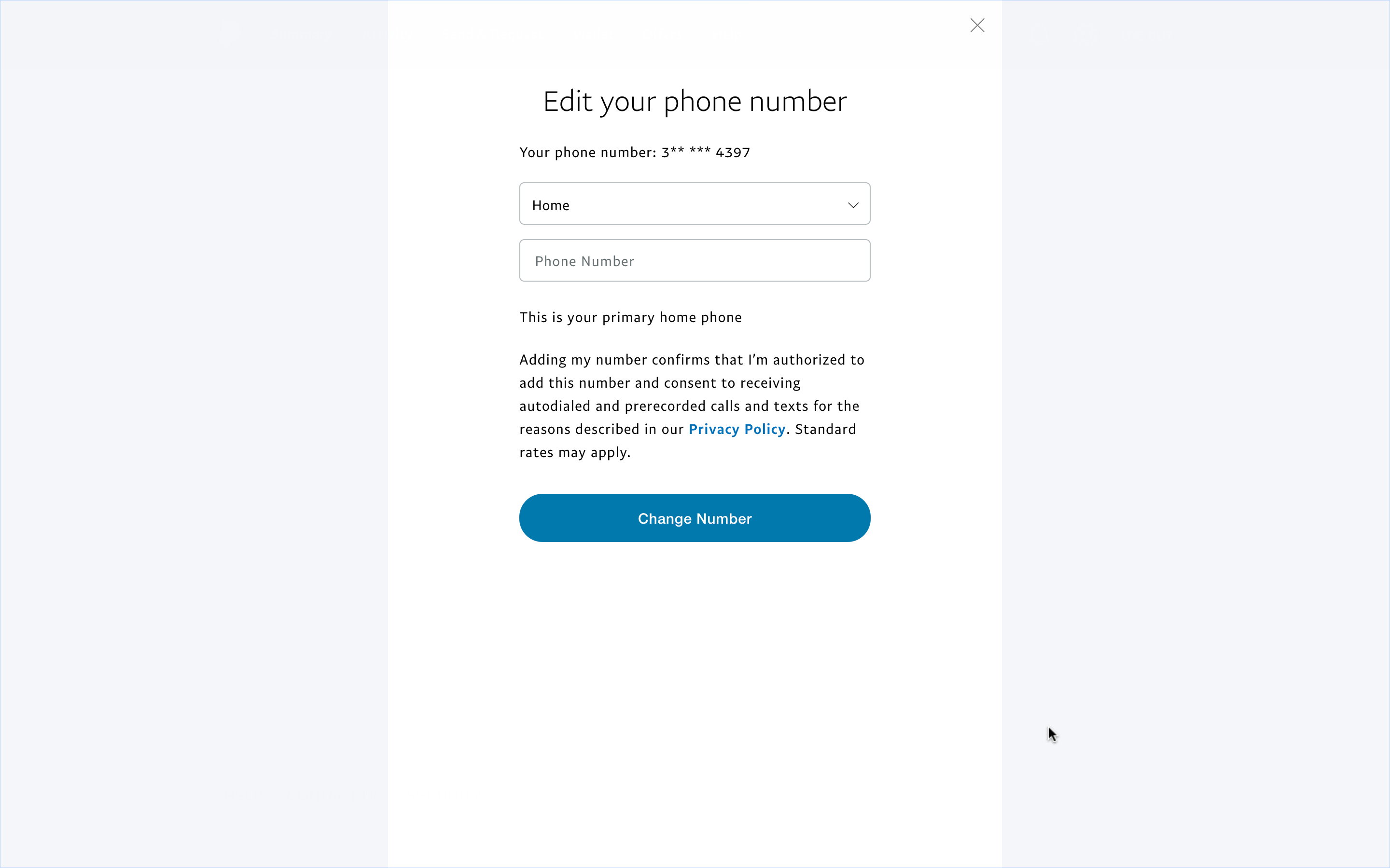
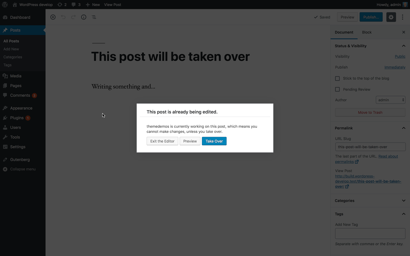
For what is worth, I wouldn't be opposed to experiment a full-screen modal dialog for some of the cases across core where a modal pattern is used. I'd recommend to consider all the current usages in core, as this is a reusable component and sooner or later it will be used in the admin pages too. There are cases where the modal dialog is very small, for example: login, post take-over. Not sure in these cases a full-screen dialog would be best, but worth trying Something similar to a full-screen modal dialog is already used in core. For example: the Theme installer: Appearance > Add New > click "Details & Preview" on a theme. The implementation is simple and leverages the CSS Working examples of full-screen modal dialogs can be seen on various "big" web apps. For example: some settings pages on the Paypal website use a full-screen modal dialog: The dialog there uses a quick animation: it slides in from the bottom. Regardless, it's very similar to this proposal: the dialog background covers all the page content. The dialog content is narrower for better readability. Seems to me it makes perfectly sense when there is a specific task users have to focus on. Especially when the modal dialog content is made of a complex form or other complex content. |
|
Hi there, |
|
It looks to me that the modal windows that are not quite suitable are lacking information themselves. If the full context of what is going on in the modal window is provided, in clear textual form, then perhaps that would provide enough context for the new proposed design. |
|
The more I look at this the more I like it. The one thing that sticks out to me as an issue is the only clue that I opened a modal is the animation and the small close button. It makes me wonder about @audrasjb's point that users may get confused about navigating to a new page. I also noticed that while clicking outside of the modal closes it (as it should), there is no visual distinction between the end of the modal and the background, so how do I know where to click to close it? A solution to both of those could be something similar to the screenshot @afercia posted which has a solid colored background, but not an overlay? |
|
@audrasjb good point, good point. There should be a way to make the context very clear. What @anevins12 suggested could be an option. Worth noting in core there are already modal dialogs that take almost all the available space. The media modal dialog is a good example:
However, I guess this pattern should be experimented on a case by case basis. For example, I wouldn't make full-screen modal dialogs that have short content, for example: Lastly: I checked again the Paypal implementation: clicking on the overlay / background doesn't close the modal. Only Escape and the X button close it. Not saying Gutenberg should necessarily follow this pattern but it doesn't feel right to me that clicking on a solid-colored overlay closes the modal. As @brentswisher pointed out, the UI doesn't communicate that in any way. |
|
I’ll add my two cents towards the “this feels wrong” camp. Not only do I lose all context of where I am, I also lose the ability to click outside the model to dismiss it. |
|
@shaunandrews clicking outside (sides) or hitting esc should close it, you can also close it using the X, of course, it's just a little bit implicit now |
|
Clicking outside of the popup window to close it should always be a secondary action and not the primary method of closing it - because an overlay is not a button. It's just a DIV that has JavaScript applied to that, which is only for one audience. The sighted and pointer/ touch audience. The primary way of closing a popup is the close Button, which is available for everyone. If popups before were relying on implicitly closing them by clicking on the overlay, they were doing it very wrong. |
I don't think this was ever the case; it was always a secondary method afaik. |
|
First, I'd like to point people to the Modal guidelines: https://github.com/WordPress/gutenberg/tree/master/packages/components/src/modal It has some general guidance on when to use them:
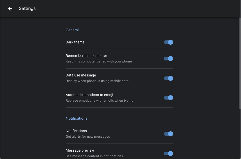
We could expand these guidelines with examples so that it's easier to decide whether or not a dialog should be used. That's a separate issue though. When we first wrote those guidelines, I'd planned on writing guidelines for multiple types, including full-screen dialogs, but it was too much to wrangle at the time. I agree that we need to review the dialogs in WordPress, not just the editor. As mentioned, some are small, some take over most of the screen (media dialog), and some take over the entire screen. It definitely sounds like we need to document and expand the Modal component to have multiple variants. In that case, we should follow the process laid out in the contributing guidelines (note: not merged yet!). Material has the most comprehensive guidelines on Dialogs that I know of (GNOME is also great), and it's a great starting point for categorizing different types. A For most dialogs, I suggest we retain the dark overlay — it's interruptive by design, and it's more clear that the rest of the UI is disabled, and the dialog is "on top" of the application. We should do this, even on mobile and small viewports. For other dialogs that require a series of tasks to complete, a full-screen option would be great. Because there probably isn't an overlay or background in this case, the animation will be useful in showing that the dialog is "on top". A sliding up animation is common. On the specific Modal use of Block Manager, Keyboard Shortcuts, and Options: It's definitely hard for me to categorize these, because they don't clearly fit into any type of dialogs that I've seen. It's not the primary use case for a dialog. Pretty close to Carbon's "Passive" dialog or GNOME's "Presentation" one though. Certainly a handful of settings is fine for a dialog, but for a lot of settings, here's an alternative idea: This would take the user to a new view. I particularly like this on large screens, because I feel the X icon aligned all the way to the right gets lost on large viewports: |
|
I already mentioned in other PRs and issues that Material doesn't shine when it comes to accessibility:
I'd like to invite again everyone to make an effort and refrain to look at Material as source of inspiration. WordPress aims to be as accessible as possible. Material goes in another direction and it's deeply inspired by mobile design patterns, which don't fit very well with accessibility. Any design system can be used as research but it shouldn't be followed verbatim.
I suggest we consider semantics and web standards first. There are only two standard, accessible patterns for dialogs. It's not just about abstract semantics. This is what browsers and assistive technologies support: dialog alertdialog The choice between the two types depends first on the dialog content, then on the kind of interaction. A dialog can be either modal or non-modal. An alertdialog is always modal. I'm not sure I understand how other dialog categories like Alert, Confirmation, Simple, Message, Action, and Presentation can help semantics and interaction in any way. Those are, maybe, useful categories for visual purposes.
I kindly disagree. I know pretty well the kind of content used in most of the WordPress dialogs and on small screens there's really the need to make them take the entire screen. I'd like to see an in-depth research of the current usages in core before reading statements like the one above.
I'm not sure I understand what a
I kindly disagree with some of the statements made there. Also, those guidelines were made specifically for Gutenberg and discussed only in the context of the Gutenberg project. Certainly they weren't discussed in the broader context of WordPress core, nor they cover the actual usages in core. Lastly, the term "Modal" used there is incorrect (it was mentioned previously in some PR or issue that also the component name is incorrect). "Modal" is a behavior of a dialog. Both the component and the guidelines should refer to "dialog". |
I remember when you originally mentioned this. I've never meant to suggest that we should follow Material verbatim. The only motivation I have is to build upon these well-established design systems and try to make them better. I don't see anything wrong with mentioning Material for research, and I'll continue to do so if I think it's appropriate. Material is just one of several design systems that I look at frequently (Polaris, Carbon, Evergreen, Deque, Ant, Mineral UI, GNOME, Apple HIG, etc.).
I am well aware of
It's not just visual. It depends on dialog "content" and "interaction" as you mentioned. For example, Carbon has a "Passive" dialog that has no actions (only close). It's purpose is to inform the user with a message. Carbon also has a "Transactional" dialog that has two actions. It's purpose is to provide a secondary confirmation in response to a user action. How is this purely visual?
I was merely pointing out that they don't have to be full-screen dialogs and it's worth discussing.
I encourage you to please review the guidelines with the broader context of WordPress in mind, and provide any feedback you have. The goal was to create general guidelines that will also apply to WordPress core.
I opened an issue several months ago to rename the Modal component to Dialog. When I use "Modal" I'm referring to the Gutenberg component. When I use "dialog" I'm referring to the generic "descendant window". |
|
I'd rather this not linger too long due to semantics. @karmatosed's work on separating when/how a full-screen dialog is used seems like a good direction.
@drw158 can you do an audit on this? How does this sound? Are there instances we're not thinking of that need to be documented? |
|
I don't want to dismiss the awesome feedback provided here. I'm planning to update the PR soon and provide both possibilities. We might still keep the full screen modal for the current Core usage. |
|
I added both styles for now, I kept the KeyboardShortcuts as a dialog to ease testing. |
|
Great idea for testing, @youknowriad! I messed around a bit, and noticed the animation for the full-screen modal is too much right now. Is there a way we can not have the content animate/expand? Maybe if it just fades in, but I don't think it should move at all. |
|
@karmatosed - I have a draft PR that I should be able to update this week to include this modal style and the latest prototype from @sarahmonster in #7602 |
|
@brentswisher that's super cool to hear. |
|
Closing this PR as people don't seem to like it much ;) |


This is basically a design change to modals. I've been using several websites that rely on full-screen modals and I believe it's a better design because when a modal is opened, the user should only focus on that modal, there's no point of having a dark overlay to hide the remaining part of the screen.
It also matches the a11y behavior pretty well since when a modal is opened, the remaining part of the screen is disabled entirely
Testing instructions