Heading block: move alignment controls to toolbar #16682
Conversation
 draganescu
requested review from
ajitbohra,
gziolo,
jorgefilipecosta,
Soean,
talldan and
youknowriad
as code owners
draganescu
requested review from
ajitbohra,
gziolo,
jorgefilipecosta,
Soean,
talldan and
youknowriad
as code owners
|
This issue would then also be associated with moving alignment options of the heading to the toolbar. Try: Always collapse block alignments. |
Yep, let's do that. Right now I'm seeing them doubled up. Let's just remove them all now that they are included in the toolbar.
|

Yes, they should be removed from the sidebar with the proposed change. We should also make sure that this PR takes into account changes proposed in #16557. I guess it would make sense to land the latter first and then apply it here. |
|
This is looking good overall. A few things about consistency and collapsing.
Questioins
Thoughts @mapk @mtias @jasmussen @kjellr |
|
@youknowriad, see this comment under PR I lined earlier today: #16557 (comment) I think this work started by @jasmussen together with my updates addressed most of the issues you listed. |
Yes. I tested @gziolo's additional commits to that PR and the collapsed toolbar elements didn't bother me. It felt natural to open them up even when there was more than one to interact with. |
|
When there are alternatives to a specific tool (in the toolbar) associated with doing a similar thing it becomes natural to have them in a drop down. The drop down shows variation of one specific feature. The additional More drop down signals an area that has a mix of tools not so often used, but good to have available. |
|
Btw @draganescu we should also have the h tags in a drop down in the toolbar. |
 mcsf
changed the title
draganescu
force-pushed
the
try/unify-formatting-tools
branch
from
mcsf
changed the title
draganescu
force-pushed
the
try/unify-formatting-tools
branch
from
1ab31f2
to
29c994d
Compare
|
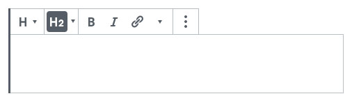
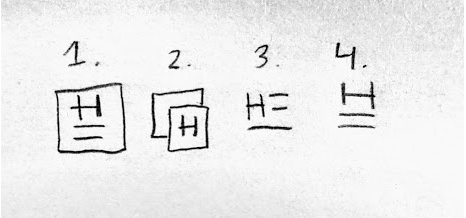
I have removed the align tools from the inspector, added a collapsing item in the toolbar for the heading levels and kept the heading levels always expanded in the inspector. The problem is that the heading collapsed icon is very confusing:
I am unsure what to use instead as the "H" icon is already there in the block switcher, @mapk any suggestions :D |

|
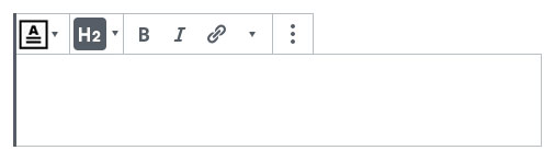
I am looking at what it might look like. I am sure not sure if this is a good solution though.
Having two H drop downs next to each other can be somewhat confusing. |
|
@paaljoachim I like your solution because it shows which level heading is selected. An additional enhancement would be to tweak the H icon on the left to something like this maybe (imagine an H instead the letters shown): My favorite is 2 or a variation of that idea. |


|
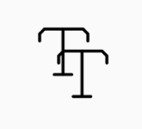
Here is the earlier T that is still in use in the Core version of Gutenberg. With a Heading drop down next to it.
Hey Dave
|


|
Thanks for the mockups, that helps.I think the decision to use an
|
|
Here are additional mockups.
|


|
I think 5 works best as usually headings clear floats and content is below. Also the other resemble drop cap too much. |
As long as the H2 icon adapts to switchever is active I’d say this is ok. The hierarchy between the H and following Hx icons works fine here. I vote for keeping the H heading icon as is. |
|
Have you tried to make SVG icon more dynamic using text or something similar for numbers? |
Good catch, @draganescu! I'd say don't show the background color in the top toolbar level. This way it's consistent with all other toolbar dropdowns. Basically, keep it as you have it. |
No, but that should be something to check out too. Not sure if in this PR. The H icons are half SVG half subscript :) |
I'm still against using "H" here because, while standard in terms of HTML tags, it perpetuates using English as the canonical source of meaning — the H on its own can be really confusing in other languages for people not familiar with HTML. (I'm totally fine with H being used for the hierarchy level as it's more technical.) I like some of the ideas proposed by @drw158 for the icon as it gives a bit more context. Also, the dropdown here seems like a perfect case for showing the actual size rendering of the heading like we used to do on the font-size dropdown. (cc @enriquesanchez) It would also be a great place to pre-warn if you are choosing an incorrect heading level for the current context. |
This is a great point! All the more reason to get this selectbox right in #16473 (comment) |
I lean towards not having actual size rendering of headings here. UI wise, that implementation could lead to display issues for headings that may not follow "standard" sizes. For example, how would we account for actual heading sizes if a theme opts for rather large headings. I see value in having the sizes there, but the cognitive load may not be worth it - likely over complicating the component. I could be convinced otherwise though - I'd appreciate any further insight. :) |
|
It seems this PR which seemed straight forward now has added elements.
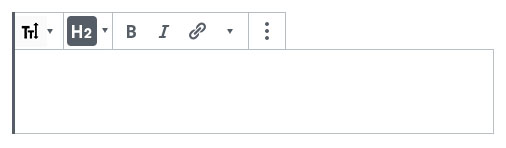
These are additional elements that we can get back to later on. Lets get this merged as it is right now as a first iteration. Uses the H in the Heading drop down. (H2, H3, H4 etc)
To something like this:
Thanks. |

|
I can't get this PR running locally, and so am leaving a proper review to someone who can. In light of @paaljoachim's comment above, I'd agree that we should keep this PR focused for now. Moving the heading levels into the dropdown while showing the active heading level in the toolbar's icon looks like a reasonable solution since most everything else in the toolbar is also in a dropdown nowadays. I'd rather not change the Heading icon back to something else. There was good discussion about this here: #15340 and seemed to fulfill a11y needs better. I don't believe the "T" was any more cross-language compatible than an "H". And the "H" at least jives with the Heading levels. So let's keep it as is. That being said, I'm totally okay with expanding on the "H" and iconizing it more. But that's another PR. |
|
I believe this PR is ready for a Code Review. |
| @@ -43,6 +43,13 @@ function DropdownMenu( { | |||
| } | |||
| } | |||
|
|
|||
| let activeControl = false; | |||
| flatMap( controlSets, ( controlSet ) => { | |||
There was a problem hiding this comment.
It seems like a very specific implementation of the heading dropdown. Can you think of an alternative approach where DropdownMenu stays unmodified so we could leave this component as is? Ideally, all those CSS styles are applied directly to HeadingToolbar components or alternatively, we modify SVG icons to take the number as param.
There was a problem hiding this comment.
Maybe, but that would complicate this PR. I tried to follow the same pattern in the interest of pushing the feature forward. We do already use isActive in the DropdownMenu so I don't feel I've introduced specific Heading related behavior, just some logic to determine the active DropdownMenu element.
I will look into implementing the heading icons differently and get rid of the subscript in the heading component but we'll see. I wonder if there is any benefit of still using subscript for these kinds of icons?
There was a problem hiding this comment.
Can you think of other use cases for subscripts like these?
This reverts commit d9895ae.
|
Hopefully we can get this merged into the next version of Gutenberg. It will have an important effect on the heading UI. |
 youknowriad
added
the
[Release] Do Not Punt
youknowriad
added
the
[Release] Do Not Punt
| @@ -43,6 +43,13 @@ function DropdownMenu( { | |||
| } | |||
| } | |||
|
|
|||
| let activeControl = false; | |||
| flatMap( controlSets, ( controlSet ) => { | |||
There was a problem hiding this comment.
We shouldn't be using flatMap if we don't need the return value.
| @@ -43,6 +43,13 @@ function DropdownMenu( { | |||
| } | |||
| } | |||
|
|
|||
| let activeControl = false; | |||
| flatMap( controlSets, ( controlSet ) => { | |||
| activeControl = find( controlSet, ( control ) => { | |||
There was a problem hiding this comment.
Can we break after finding the active control?
| @@ -43,6 +43,13 @@ function DropdownMenu( { | |||
| } | |||
| } | |||
|
|
|||
| let activeControl = false; | |||
| flatMap( controlSets, ( controlSet ) => { | |||
There was a problem hiding this comment.
Can you think of other use cases for subscripts like these?
| } | ||
|
|
||
| &:not(:disabled):not([aria-disabled="true"]):not(.is-default).is-active > svg { | ||
| @include formatting-button-style__active(); | ||
| } | ||
|
|
There was a problem hiding this comment.
Looks like this new line snuck in.
|
@epiqueras thanks for the review. I will close this in favor of #17419 which rightfully removes the whole subscript implementation. |
|
@draganescu, many thanks for all work on this PR 🙇 #17419 is now merged. |
Description
Closes #16648
How has this been tested?
Tested locally.
Screenshots
Types of changes
Added an alignment toolbar component to the heading block's toolbar.
I think we should also remove them from the inspector, right @mapk ?