Skip to content
New issue

Have a question about this project? Sign up for a free GitHub account to open an issue and contact its maintainers and the community.

By clicking “Sign up for GitHub”, you agree to our terms of service and privacy statement. We’ll occasionally send you account related emails.

Already on GitHub? Sign in to your account

Add fullScreen control to the block alignment toolbar #16738

Closed

Conversation

retrofox
Copy link
Contributor

@retrofox retrofox commented Jul 24, 2019

Description

This PR adds a fullScreen control to the <BlockAlignmentToolbar /> component., trying to tackle the Full Screen alignment/display option on several blocks (#16385) issue.

Screen Shot 2019-09-04 at 10 27 47 AM

Related Issues:

How does it look

It adds the fullScreen control into the Alignment toolbar:

How does it work

It applies almost the same behavior to the full mode does, but cut the height to the current height of the viewport.

wide alignment (already done)

It applies almost the same behavior to the full mode does, but cut the height to the current height of the viewport.

full alignment (already done)

wide alignment (already done)

fullScreen alignment

How has this been tested?

TBD

Pending Tasks

  • Experiment with background image CSS.
  • Consider finding a better control Icon
  • Consider joining the expand control into the alignment toolbar.
  • Test deeply all combinations in different devices/platforms.

@retrofox retrofox marked this pull request as ready for review July 24, 2019 20:05
@gziolo gziolo added the First-time Contributor Pull request opened by a first-time contributor to Gutenberg repository label Jul 25, 2019
@youknowriad youknowriad added the Needs Design Feedback Needs general design feedback. label Jul 25, 2019
@youknowriad youknowriad requested a review from mtias July 25, 2019 09:30
@mapk
Copy link
Contributor

mapk commented Jul 26, 2019

I really like the concept, @retrofox! I believe adjusting a block to be full-screen-height could open up some amazing layout design.

I am concerned about adding another toolbar section for this control. If we do ever decide to include wide width or full width in this section, I could see its validity. However, it does operate well paired with some of those other alignments, so being able to multiselect those is a big part of this feature.

I haven't looked at the code, but taking a look at how it functions in the Editor, I found a few areas needing refinement. I'm using the Gutenberg Starter Theme for testing which uses basic default Gutenberg styles in both the Editor and the frontend.

  1. The icon for this feature left me confused. It took me some time to figure out that it was indicating height and not horizontal margins or fluctuations. Once I understood, it made perfect sense, but I wonder if there's another option?

  2. When toggled "on" the full-screen height distorted the image in my Image block. It probably shouldn't do that. Maybe it should default with something like background-size:cover?

  3. When toggled "on" and having the wide width or full width options "on" the block inside the editor expanded a great deal lower than the image in my Image block. I would imagine the image should fill the block height, but it wasn't.

distort

While you're working on this PR, I'd love to get more design feedback from others.

@mapk
Copy link
Contributor

mapk commented Jul 26, 2019

Also congrats on your first PR!! 🎉

@mtias
Copy link
Member

mtias commented Jul 26, 2019

@mapk I tend to agree, this makes sense as part of the general alignments group, specially if we are looking at collapsing it always: #16557

However, this also has the advantage of being orthogonal to some of the wide alignments so you could make different interesting combinations. Perhaps we could split the alignment group within the dropdown (with a separator)? Not sure if that would increase or decrease its usability.

@retrofox
Copy link
Contributor Author

The icon for this feature left me confused. It took me some time to figure out that it was indicating height and not horizontal margins or fluctuations.

I only turned the full width icon 90 degrees.

Once I understood, it made perfect sense, but I wonder if there's another option?

I'd like listening to suggestions in this case since I'm not a designer which leads me to do implementations that only me understand :-D

When toggled "on" the full-screen height distorted the image in my Image block.

Something to fix. 👍

It probably shouldn't do that. Maybe it should default with something like background-size:cover?

yes, for instance, I like how the core/cover handles the image using background-size instead of an <img /> tag. I'm afraid that switching to use CSS for the core/image could require more investment and changes, though. Will glad to follow this path if we consider it worths.

When toggled "on" and having the wide width or full width options "on" the block inside the editor expanded a great deal lower than the image in my Image block. I would imagine the image should fill the block height, but it wasn't.

Yup confirmed. Let me do another iteration.

@retrofox
Copy link
Contributor Author

Perhaps we could split the alignment group within the dropdown (with a separator)?

Good option imo.

@retrofox
Copy link
Contributor Author

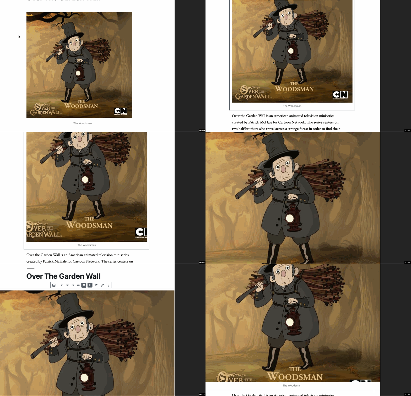
Hi @mapk!, I've creates a different approach to implement the expand mode fo the core/image block to deal with the issues that mentioned last week. As you suggested, I've tried using the background image CSS approach. I've activated gutenberg-starter-theme as well.

I've added an animation but tbh it isn't enough to show the whole changes. It seems that's just a matter of testing deeply :-D

gutenberg-wide-full-expand

@retrofox retrofox changed the title Update/add block expand toolbar Add expando toolbar control Jul 30, 2019
@retrofox retrofox changed the title Add expando toolbar control Add expand toolbar control Jul 30, 2019
@BinaryMoon
Copy link

I like the idea of stretching content to 100vh but am not sure about using background-size.

Using the image element means we can take advantage of responsive images sizes, but background-size cover requires the largest image likely to be used, which is bad for small devices on slow connections.

Could this use object-fit instead? There is a cover option available so images can still be scaled nicely.

@retrofox
Copy link
Contributor Author

retrofox commented Aug 4, 2019

Could this use object-fit instead? There is a cover option available so images can still be scaled nicely.

Definitely going to dig on this, @BinaryMoon. 👍

@jasmussen
Copy link
Contributor

Really nice work.

I would definitely echo Mark and Matías on this one — the only challenge with this one is how we show it in the toolbar. And an additional toolbar group feels like the wrong path for this.

I understand that wide and fullwide are not traditional "alignments" thinking like how we're used to, but they have fit very nicely with left/center/right for exactly the reason you allude to: they do not stack.

At the same time, in the same design, Bold and Italic buttons stack — those are just toggle buttons.

For that reason, I think the option to explore is this one: #16738 (comment)

Go with the dropdown, and put a separator into the dropdown. You could even have a subheading, like:

Block Layout
- Left
- Center
- Right
- Wide
- Full wide
___________
Additional Layout Effects
- Full-height

One of the reasons for the dropdown PR is to enable clearer labels and additional layout options like this. By adding a separator in that dropdown, we keep the "non-stackable" effect of the basic alignments, but allow additional on top of that.

@mapk
Copy link
Contributor

mapk commented Aug 5, 2019

@retrofox, this is feeling really good. Let's implement Joen's suggestion above #16738 (comment). This probably involves rebasing with master to get the latest collapsed block toolbar version.

After that we can revisit the icon.

@retrofox retrofox force-pushed the update/add-block-expand-toolbar branch 2 times, most recently from e54da29 to 682d95b Compare August 12, 2019 14:43
@retrofox retrofox force-pushed the update/add-block-expand-toolbar branch from 3623d6a to ea0fc5d Compare September 10, 2019 15:44
@retrofox retrofox force-pushed the update/add-block-expand-toolbar branch from 5e9eb27 to 31ef94b Compare September 10, 2019 19:11
@retrofox
Copy link
Contributor Author

I've been updated the PR:

  • <BlockAlignmentToolbar > handles this new mode
  • Implement this alignment in the <EditImage /> block (only in the Editor side)
  • Implement frontend is wip

I've seen that some styles are already handled by the theme. I've added the root css rules in order to make it work as better as possible.

How it works:

It applies almost the same behavior to the full mode does, but cut the height to the current height of the viewport. I think it's a good scope before to start to explore other functionalities.

@retrofox
Copy link
Contributor Author

Updated PR description

@mapk
Copy link
Contributor

mapk commented Oct 3, 2019

Hey @retrofox, would you mind rebasing this PR? I'd like to see where it's at. Thanks!

@retrofox
Copy link
Contributor Author

Going to update soon. It needs a deep rebase.

@paaljoachim
Copy link
Contributor

Just a heads up alignments are being reworked these days. There are two links right above here to take a closer look at.

@retrofox retrofox requested a review from ajlende as a code owner October 1, 2020 09:40
@paaljoachim
Copy link
Contributor

Hey @retrofox
It would be great with a status update of this PR.
Thanks.

@retrofox
Copy link
Contributor Author

closing in favor of #26615

@retrofox retrofox closed this Oct 30, 2020
Sign up for free to join this conversation on GitHub. Already have an account? Sign in to comment
Labels
First-time Contributor Pull request opened by a first-time contributor to Gutenberg repository Needs Design Feedback Needs general design feedback.
Projects
None yet
Development

Successfully merging this pull request may close these issues.

10 participants