-
Notifications
You must be signed in to change notification settings - Fork 4.3k
New issue
Have a question about this project? Sign up for a free GitHub account to open an issue and contact its maintainers and the community.
By clicking “Sign up for GitHub”, you agree to our terms of service and privacy statement. We’ll occasionally send you account related emails.
Already on GitHub? Sign in to your account
Try: Remove/refactor complex left/right block margins #17877
Conversation
02e07f6 to
3ca67ae
Compare
There was a problem hiding this comment.
Choose a reason for hiding this comment
The reason will be displayed to describe this comment to others. Learn more.
Nice PR, seems to work well but when I tried the widgets screen, it was empty. I wonder if a rebase should fix it or maybe there's something else?
|
I'll try a rebase. Given it's CSS only (albeit quite extensive CSS), it shouldn't make the widget screen break. |
10fd31d to
6acfdd2
Compare
There was a problem hiding this comment.
Choose a reason for hiding this comment
The reason will be displayed to describe this comment to others. Learn more.
LGTM
|
Wow, that went easier than I'd expected :) Thank you for the review. I think I'll still want a few more eyes on it — it is unfortunately likely to require quite a few editor styles to need adjustments. |
6acfdd2 to
1d6548a
Compare
There was a problem hiding this comment.
Choose a reason for hiding this comment
The reason will be displayed to describe this comment to others. Learn more.
|
Thanks Mark for testing, and thanks everyone else for also testing. It's important to get many eyes on this, not just to test that it's good, but also to raise awareness of the change happening, so that if/when subsequent issues pop up, there's a chance you know why they're happening and where they originated :) Anyone know why the tests are failing? Given the depth of the changes it could definitely be legitimate failures, so would appreciate insights by anyone who has the time to look. |
|
Suggested dev note: |
|
I think the test failure is unrelated, I restarted the job to see. |
61864f9 to
4c4ef90
Compare
|
Rebased and squashed, just to keep it simpler to shepard along. I've also tested image floats, and they work well here. |
|
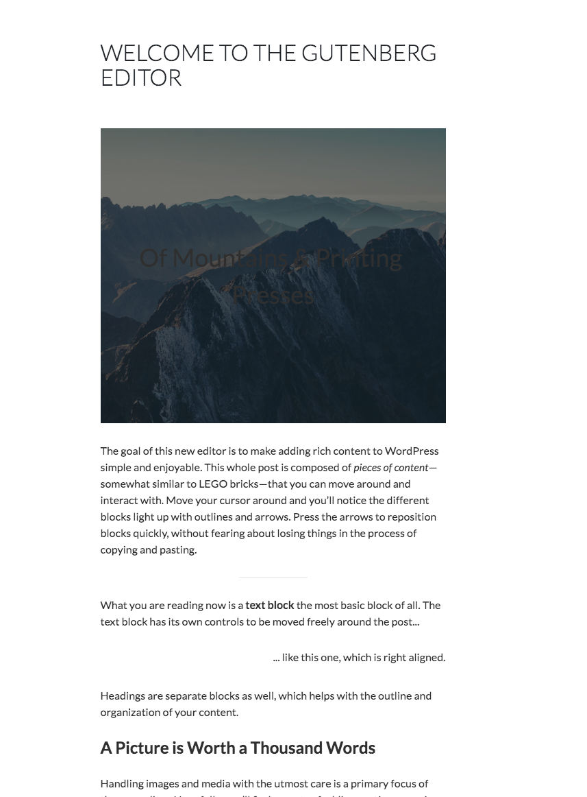
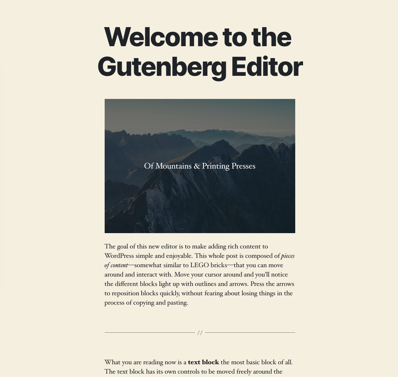
I restored a rule for the title block that I had deemed unnecessary. But resting it fixes the issue with TwentyNineteen, and therefore very probably a ton of other themes, so in doing so it makes this PR more resilient and less risky. I also included a todo in the CSS: c104127 — we will revisit that area regardless if/when the Title becomes a block. I did a bunch of testing in themes, and it's looking good: Astra: Vanilla: A bunch of the Twenty themes: TwentyTwenty, notably, looks delightful: With all this, I'm feeling much more calm about merging this. It still needs a dev note, and it would still be good to go out in the next Gutenberg plugin so themers and block devs can be aware of this early. |
79de22e to
a83b49d
Compare
Those margins were created to accommodate a mover control that was available on hover. Given the mover control is now on-select only, this margin is no longer necessary.

This is a work in progress. When done it needs to not land in 5.3, and it will need a dev-note when ready.
a83b49d to
910fd0d
Compare
|
Rebased this again, also to see if that makes the tests pass. If not, I could use some help to figure out if there's a legitimate test failure. @gziolo if you have time? |
Travis seems to be happy about your work. It should be given that this PR adds only visual changes applied through CSS styles. I guess this is good to go based on the previous approvals. |
|
Woop! I guess it's merge time. It will require a patch to TwentyNineteen, so I'll probably put this on my schedule for tomorrow, merge then patch twentynineteen. Thanks! |
|
I have created https://core.trac.wordpress.org/ticket/48526 to address the issues introduced in TwentyNineteen by this patch. The dev note for this patch is in #17877 (comment). I'm merging now and hopefully we can get the core patch in shortly after 5.3. |
| width: 100%; | ||
| } | ||
| margin-left: -$block-padding - $block-padding - $block-side-ui-width - $border-width - $border-width; | ||
| margin-right: -$block-padding - $block-padding - $block-side-ui-width - $border-width - $border-width; |
There was a problem hiding this comment.
Choose a reason for hiding this comment
The reason will be displayed to describe this comment to others. Learn more.
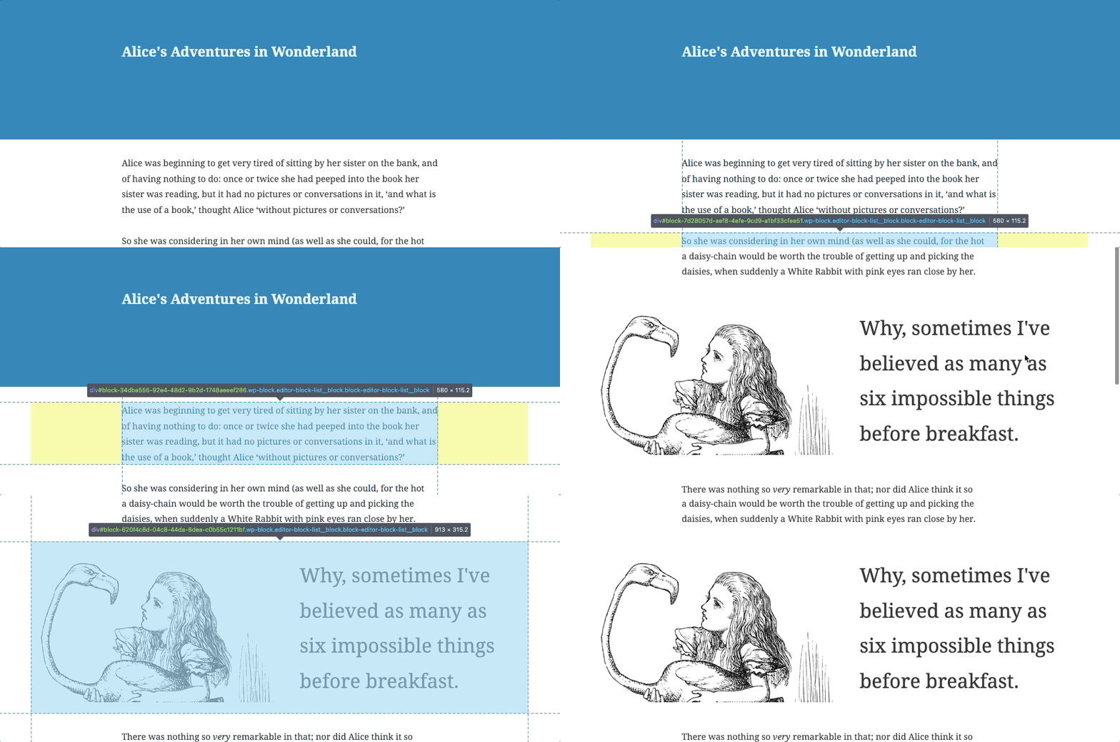
This is a followup to a regression found in #17875, specifically #17877 (comment).

The PR refactored horizontal margins, including for full-wide blocks. As a result, full-wide blocks would, on the mboile breakpoint, receive too much negative margin.

This PR addresses that.
This is a followup to a regression found in #17875, specifically #17877 (comment).

The PR refactored horizontal margins, including for full-wide blocks. As a result, full-wide blocks would, on the mboile breakpoint, receive too much negative margin.

This PR addresses that.
This is a followup to a regression found in #17875, specifically #17877 (comment).

The PR refactored horizontal margins, including for full-wide blocks. As a result, full-wide blocks would, on the mboile breakpoint, receive too much negative margin.

This PR addresses that.
This is a followup to a regression found in #17875, specifically #17877 (comment).

The PR refactored horizontal margins, including for full-wide blocks. As a result, full-wide blocks would, on the mboile breakpoint, receive too much negative margin.

This PR addresses that.
This became unnecessary with #17877.
* Remove horizontal margin from generic appender.

This became unnecessary with #17877.

* Fix similar issue for columns.


Every block, specifically
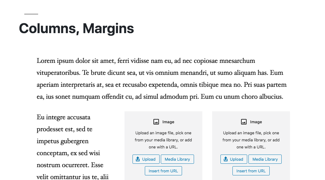
.block-editor-block-list__block, has had paddings left and right to increase the hoverable area to invoke the up/down mover. This padding is then compensated for by a deeper container with negative left and right margins.Since the mover control is now only visible on-select, those negative margins are no longer necessary.
This PR refactors/removes those negative margins. This drastically simplifies the CSS of the block list component, and should make it easier for themes to get good results when they style the editor.
This is a work in progress. When done it needs to not land in 5.3, and it will need a dev-note when ready because unfortunately it is likely to break a number of existing editor styles. For example it breaks the off-set column and wide/full-wide styles in TwentyNineteen. The good news is that it should be easy to fix by removing a ton of hacky TwentyNineteen editor CSS.
Things to test when the PR becomes ready for review:
While this PR is ready for review, it needs a lot of testing, and given its post-5.3 destination, I wouldn't call it urgent.
However the code quality is drastically improved, and there's lots of red to be found, so it's definitely worth it.