Skip to content
New issue

Have a question about this project? Sign up for a free GitHub account to open an issue and contact its maintainers and the community.

By clicking “Sign up for GitHub”, you agree to our terms of service and privacy statement. We’ll occasionally send you account related emails.

Already on GitHub? Sign in to your account

Modal component #6261

Merged
merged 77 commits into from
Jul 4, 2018
Merged

Modal component #6261

merged 77 commits into from
Jul 4, 2018

Conversation

abotteram
Copy link
Contributor

@abotteram abotteram commented Apr 18, 2018

Description

Adds a modal component. A more feature rich version of the one used in #6244.

Note: I've attempted to mimic the API from react-modal as much as possible.

Controlling whether the modal shows or not is the responsibility of the developer that implements the modal, using the isOpen props.

The modal mounts itself in the document body using createPortal.

For accessibility reasons, when opening a modal all other elements in the body get an aria-hidden="true" attribute, except for script tags and elements that already have an aria-hidden="true" element.

How has this been tested?

To see an overview of its features go to components/modal/README.md.

To test create a modal.js file in the ./edit-post folder with tthe following contents and add import './modal'; somewhere in edit-post/index.js.

import { Component, Fragment } from '@wordpress/element';
import { Modal } from '@wordpress/components';
import { PluginSidebar, PluginSidebarMoreMenuItem } from './';
import { registerPlugin } from '@wordpress/plugins';
import { dispatch } from '@wordpress/data';

const Icon = (
	<svg width="100%" height="100%" viewBox="0 0 100 100">
		<circle cx="50" cy="50" r="40" stroke="black" strokeWidth="3" fill="red" />
	</svg>
);

const Content = () => (
	<div>
		<p> Lorem ipsum dolor sit amet, consectetur adipiscing elit. Phasellus euismod ex sed sem pulvinar vehicula. Sed lobortis mauris at sem sodales, molestie malesuada mauris vehicula. Aliquam dictum, urna vitae pharetra lacinia, ipsum lectus fringilla justo, eget condimentum nisi lorem quis tortor. Ut sed molestie quam. Integer sit amet libero blandit, finibus odio ac, ornare nisi. In hac habitasse platea dictumst. Sed ullamcorper at neque varius blandit. Morbi eget ligula vel arcu scelerisque pretium. Aliquam odio felis, eleifend non augue in, sodales suscipit tellus. Nam tincidunt congue nulla sit amet efficitur.</p>
		<p> Nulla egestas augue a mi ultrices, quis consequat dui aliquet. Cras elementum a felis vel scelerisque. Curabitur mollis ipsum a turpis elementum tempus. Fusce ut dui eu eros rhoncus vulputate. Sed tristique nunc ut velit tempor mollis. In sed ligula vulputate, fermentum est sit amet, maximus nulla. Pellentesque pulvinar egestas eros, nec varius mi commodo eget. </p>
		<p> Nam nulla felis, hendrerit sed turpis id, luctus vestibulum sapien. Nullam vel vehicula odio, fringilla aliquet arcu. Pellentesque tristique ac leo ac auctor. Aliquam dapibus urna vel ante convallis, id accumsan ipsum lacinia. Mauris pulvinar at sem at molestie. Phasellus risus augue, elementum sit amet rutrum vel, iaculis in leo. Fusce at viverra nulla, eget auctor augue. Phasellus eu elit vel mi ultricies dapibus. Vivamus varius in nunc sodales euismod. Proin velit elit, convallis et fermentum eget, suscipit aliquet nibh. Interdum et malesuada fames ac ante ipsum primis in faucibus. Aliquam quis odio ac nisi dictum fringilla. Nullam condimentum nulla ac nisl malesuada, at semper magna tempus. In varius orci nisl, in sagittis lacus faucibus quis. Mauris rutrum vestibulum dolor, quis maximus turpis venenatis nec. </p>
		<p> Donec facilisis libero vel nisi venenatis porttitor. Donec at dapibus sem. Nulla scelerisque et lorem sit amet accumsan. Donec ac pulvinar sem. Maecenas libero neque, bibendum quis mollis nec, pulvinar at sapien. Vestibulum lacinia tellus quam, in gravida felis volutpat nec. Aliquam erat volutpat. Proin varius placerat libero malesuada gravida. Nam ac purus ut eros convallis fringilla. Nam velit ipsum, bibendum sit amet dapibus at, hendrerit in justo. Donec efficitur nibh mi, in gravida massa aliquet sit amet. Sed augue libero, aliquet Nullam ut nulla metus. Ut condimentum pellentesque finibus. Vestibulum cursus diam vel metus feugiat pretium. Mauris cursus ornare erat. Curabitur posuere lacinia libero, sed consequat quam rhoncus vel. Nam vel ipsum nec leo porta pulvinar. Etiam a pharetra purus. Vestibulum id efficitur risus, venenatis tristique leo. In porttitor sit amet mauris vitae luctus. Sed lacinia urna interdum libero hendrerit, maximus mollis elit facilisis. Mauris augue purus, tincidunt a nibh laoreet, gravida bibendum metus. Integer maximus leo urna, in dignissim mauris eleifend eget. Cras at leo a odio vulputate lacinia a eget turpis. Proin in vehicula purus. Phasellus rutrum metus et suscipit suscipit. Suspendisse at dui a dui ornare consectetur. </p>
		<p> Lorem ipsum dolor sit amet, consectetur adipiscing elit. Phasellus euismod ex sed sem pulvinar vehicula. Sed lobortis mauris at sem sodales, molestie malesuada mauris vehicula. Aliquam dictum, urna vitae pharetra lacinia, ipsum lectus fringilla justo, eget condimentum nisi lorem quis tortor. Ut sed molestie quam. Integer sit amet libero blandit, finibus odio ac, ornare nisi. In hac habitasse platea dictumst. Sed ullamcorper at neque varius blandit. Morbi eget ligula vel arcu scelerisque pretium. Aliquam odio felis, eleifend non augue in, sodales suscipit tellus. Nam tincidunt congue nulla sit amet efficitur.</p>
		<p> Nulla egestas augue a mi ultrices, quis consequat dui aliquet. Cras elementum a felis vel scelerisque. Curabitur mollis ipsum a turpis elementum tempus. Fusce ut dui eu eros rhoncus vulputate. Sed tristique nunc ut velit tempor mollis. In sed ligula vulputate, fermentum est sit amet, maximus nulla. Pellentesque pulvinar egestas eros, nec varius mi commodo eget. </p>
		<p> Nam nulla felis, hendrerit sed turpis id, luctus vestibulum sapien. Nullam vel vehicula odio, fringilla aliquet arcu. Pellentesque tristique ac leo ac auctor. Aliquam dapibus urna vel ante convallis, id accumsan ipsum lacinia. Mauris pulvinar at sem at molestie. Phasellus risus augue, elementum sit amet rutrum vel, iaculis in leo. Fusce at viverra nulla, eget auctor augue. Phasellus eu elit vel mi ultricies dapibus. Vivamus varius in nunc sodales euismod. Proin velit elit, convallis et fermentum eget, suscipit aliquet nibh. Interdum et malesuada fames ac ante ipsum primis in faucibus. Aliquam quis odio ac nisi dictum fringilla. Nullam condimentum nulla ac nisl malesuada, at semper magna tempus. In varius orci nisl, in sagittis lacus faucibus quis. Mauris rutrum vestibulum dolor, quis maximus turpis venenatis nec. </p>
		<p> Donec facilisis libero vel nisi venenatis porttitor. Donec at dapibus sem. Nulla scelerisque et lorem sit amet accumsan. Donec ac pulvinar sem. Maecenas libero neque, bibendum quis mollis nec, pulvinar at sapien. Vestibulum lacinia tellus quam, in gravida felis volutpat nec. Aliquam erat volutpat. Proin varius placerat libero malesuada gravida. Nam ac purus ut eros convallis fringilla. Nam velit ipsum, bibendum sit amet dapibus at, hendrerit in justo. Donec efficitur nibh mi, in gravida massa aliquet sit amet. Sed augue libero, aliquet Nullam ut nulla metus. Ut condimentum pellentesque finibus. Vestibulum cursus diam vel metus feugiat pretium. Mauris cursus ornare erat. Curabitur posuere lacinia libero, sed consequat quam rhoncus vel. Nam vel ipsum nec leo porta pulvinar. Etiam a pharetra purus. Vestibulum id efficitur risus, venenatis tristique leo. In porttitor sit amet mauris vitae luctus. Sed lacinia urna interdum libero hendrerit, maximus mollis elit facilisis. Mauris augue purus, tincidunt a nibh laoreet, gravida bibendum metus. Integer maximus leo urna, in dignissim mauris eleifend eget. Cras at leo a odio vulputate lacinia a eget turpis. Proin in vehicula purus. Phasellus rutrum metus et suscipit suscipit. Suspendisse at dui a dui ornare consectetur. </p>
		<p> Lorem ipsum dolor sit amet, consectetur adipiscing elit. Phasellus euismod ex sed sem pulvinar vehicula. Sed lobortis mauris at sem sodales, molestie malesuada mauris vehicula. Aliquam dictum, urna vitae pharetra lacinia, ipsum lectus fringilla justo, eget condimentum nisi lorem quis tortor. Ut sed molestie quam. Integer sit amet libero blandit, finibus odio ac, ornare nisi. In hac habitasse platea dictumst. Sed ullamcorper at neque varius blandit. Morbi eget ligula vel arcu scelerisque pretium. Aliquam odio felis, eleifend non augue in, sodales suscipit tellus. Nam tincidunt congue nulla sit amet efficitur.</p>
		<p> Nulla egestas augue a mi ultrices, quis consequat dui aliquet. Cras elementum a felis vel scelerisque. Curabitur mollis ipsum a turpis elementum tempus. Fusce ut dui eu eros rhoncus vulputate. Sed tristique nunc ut velit tempor mollis. In sed ligula vulputate, fermentum est sit amet, maximus nulla. Pellentesque pulvinar egestas eros, nec varius mi commodo eget. </p>
		<p> Nam nulla felis, hendrerit sed turpis id, luctus vestibulum sapien. Nullam vel vehicula odio, fringilla aliquet arcu. Pellentesque tristique ac leo ac auctor. Aliquam dapibus urna vel ante convallis, id accumsan ipsum lacinia. Mauris pulvinar at sem at molestie. Phasellus risus augue, elementum sit amet rutrum vel, iaculis in leo. Fusce at viverra nulla, eget auctor augue. Phasellus eu elit vel mi ultricies dapibus. Vivamus varius in nunc sodales euismod. Proin velit elit, convallis et fermentum eget, suscipit aliquet nibh. Interdum et malesuada fames ac ante ipsum primis in faucibus. Aliquam quis odio ac nisi dictum fringilla. Nullam condimentum nulla ac nisl malesuada, at semper magna tempus. In varius orci nisl, in sagittis lacus faucibus quis. Mauris rutrum vestibulum dolor, quis maximus turpis venenatis nec. </p>
		<p> Donec facilisis libero vel nisi venenatis porttitor. Donec at dapibus sem. Nulla scelerisque et lorem sit amet accumsan. Donec ac pulvinar sem. Maecenas libero neque, bibendum quis mollis nec, pulvinar at sapien. Vestibulum lacinia tellus quam, in gravida felis volutpat nec. Aliquam erat volutpat. Proin varius placerat libero malesuada gravida. Nam ac purus ut eros convallis fringilla. Nam velit ipsum, bibendum sit amet dapibus at, hendrerit in justo. Donec efficitur nibh mi, in gravida massa aliquet sit amet. Sed augue libero, aliquet pretium sapien vel, pulvinar auctor nisl. </p>
		<p> Nullam ut nulla metus. Ut condimentum pellentesque finibus. Vestibulum cursus diam vel metus feugiat pretium. Mauris cursus ornare erat. Curabitur posuere lacinia libero, sed consequat quam rhoncus vel. Nam vel ipsum nec leo porta pulvinar. Etiam a pharetra purus. Vestibulum id efficitur risus, venenatis tristique leo. In porttitor sit amet mauris vitae luctus. Sed lacinia urna interdum libero hendrerit, maximus mollis elit facilisis. Mauris augue purus, tincidunt a nibh laoreet, gravida bibendum metus. Integer maximus leo urna, in dignissim mauris eleifend eget. Cras at leo a odio vulputate lacinia a eget turpis. Proin in vehicula purus. Phasellus rutrum metus et suscipit suscipit. Suspendisse at dui a dui ornare consectetur. </p>
	</div>
);

class ModalWrapper extends Component {
	constructor() {
		super( ...arguments );

		this.state = {
			isOpen: false,
		};

		this.onOpen = this.onOpen.bind( this );
		this.onClose = this.onClose.bind( this );
	}

	onOpen() {
		this.setState( {
			isOpen: true,
		} );
	}

	onClose() {
		this.setState( {
			isOpen: false,
		} );
	}

	render() {
		return (
			<Fragment>
				<button onClick={ this.onOpen }>Open modal</button>
				{ this.state.isOpen ? <Modal
					title="My Modal"
					onRequestClose={ this.onClose }>
					<button onClick={ this.onClose }>Close</button>
					<Content />
				</Modal> : null }
			</Fragment>
		);
	}
}

const SidebarContents = () => {
	const onClose = dispatch( 'core/edit-post' ).closeGeneralSidebar;
	return (
		<div>
			<ModalWrapper />
			<p>Here is the sidebar content!</p>
			<button onClick={ onClose }>Close</button>
		</div>
	);
};

const PluginComponent = () => {
	return (
		<Fragment>
			<PluginSidebar name="my-sidebar" title="My modal sidebar">
				<SidebarContents />
			</PluginSidebar>
			<PluginSidebarMoreMenuItem
				icon={ Icon }
				target="my-sidebar">
				My modal sidebar
			</PluginSidebarMoreMenuItem>}
		</Fragment>
	);
};

registerPlugin( 'my-modal-plugin', {
	render: PluginComponent,
} );

Screenshots

Ouput of the code above:
screen shot 2018-04-30 at 16 21 08

Types of changes

New feature

Checklist:

  • My code is tested.
    Note: Tests are failing due to enzyme not recognizing the React forwardRef function.
    Forward ref enzymejs/enzyme#1592
  • My code follows the WordPress code style.
  • My code follows the accessibility standards.
  • My code has proper inline documentation.

@abotteram abotteram added the [Feature] UI Components Impacts or related to the UI component system label Apr 19, 2018
import withFocusReturn from '../higher-order/with-focus-return';
import withFocusContain from '../higher-order/with-focus-contain';

const ESC_KEY = 27;
Copy link
Contributor

Choose a reason for hiding this comment

The reason will be displayed to describe this comment to others. Learn more.

There is a utility inside @wordpress/utils named keycodes for this, withkeycodes.ESCAPE being the one you want.

}

handleTabBehaviour( event ) {
if ( event.keyCode === 9 ) {
Copy link
Contributor

Choose a reason for hiding this comment

The reason will be displayed to describe this comment to others. Learn more.

There is a utility inside @wordpress/utils named keycodes which will allow you to use a readable version of the keycode instead of using the number.

@paulwilde
Copy link
Contributor

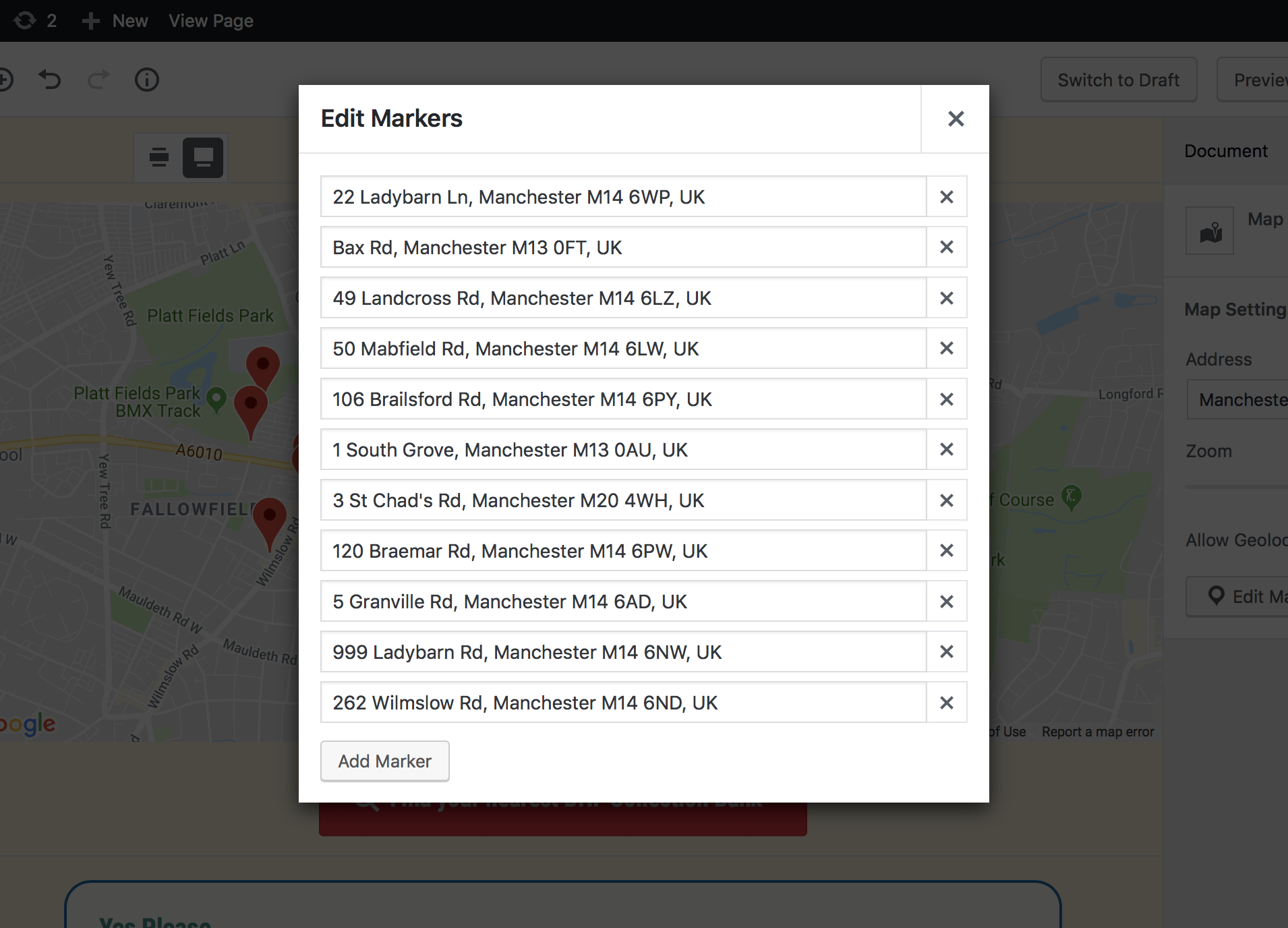
Rather than relying on a bunch of inline styles it would make sense for such component to have at least some basic styling in place, as otherwise once plugins start to adopt this component we'd be left with a bunch of different looking modals rather than having consistency. If the concern is that the component would then be too limited in how it looks, then maybe a prop could be introduced where it would remove the CSS class which is applying those styles.

I have personally already built my own Modal component for a project which has a custom Map block with the ability to plot markers:

screen shot 2018-04-19 at 09 24 46

For the most part this modal pretty much matches all the modals already in WordPress Core. The overlay background colour, the shadow on the modal itself, etc.

I think a modal component should at the very minimum have a title prop whilst all of the body of the modal itself is left up to the plugin developer.

Here is the inner markup I've used for my modal:

<div role="document" className="modal-dialog">
    <div className="modal-content">
        <div className="modal-header">
            { title && <h1 className="modal-title">{ title }</h1> }
            <IconButton icon="no-alt" className="modal-close" onClick={ onClose } />
        </div>
        { children }
    </div>
</div>

@abotteram
Copy link
Contributor Author

@paulwilde Thank you for your review. I agree it needs some styling, but because in gutenberg it should not overlay the WordPress-menu I wanted to create a specific gutenberg implementation in edit-post.

It also accepts classNames for both the content and the overlay. The style prop is mostly to keep it consistent with react-modal.

@boblinthorst boblinthorst mentioned this pull request Apr 24, 2018
4 tasks
}

componentWillUnmount() {
this.focusContainRef.current.addEventListener( 'keydown', this.handleTabBehaviour );
Copy link
Member

Choose a reason for hiding this comment

The reason will be displayed to describe this comment to others. Learn more.

removeEventListener ?

Copy link
Contributor Author

Choose a reason for hiding this comment

The reason will be displayed to describe this comment to others. Learn more.

See next comment.

}

componentDidMount() {
this.focusContainRef.current.addEventListener( 'keydown', this.handleTabBehaviour );
Copy link
Member

Choose a reason for hiding this comment

The reason will be displayed to describe this comment to others. Learn more.

Why do we need to bind this on the node directly instead of a prop onKeyDown on the rendered div ?

Should we include a code comment informing future maintainers?

}

handleTabBehaviour( event ) {
if ( event.keyCode === 9 ) {
Copy link
Member

Choose a reason for hiding this comment

The reason will be displayed to describe this comment to others. Learn more.

Minor: Early return lets you avoid indenting the rest of the function, and I find to be generally more readable:

if ( event.keyCode !== 9 ) {
	return;
}

@@ -0,0 +1,117 @@
RangeControl
Copy link
Member

Choose a reason for hiding this comment

The reason will be displayed to describe this comment to others. Learn more.

Copy-pasta. 🍝


componentDidMount() {
// Focus on mount
if ( this.props.focusOnMount ) {
Copy link
Member

Choose a reason for hiding this comment

The reason will be displayed to describe this comment to others. Learn more.

Documentation claims this is default to true but I'm not seeing where that takes effect.

@@ -0,0 +1,9 @@
.components-modal {
&__screen-overlay {
Copy link
Member

Choose a reason for hiding this comment

The reason will be displayed to describe this comment to others. Learn more.

Minor: My recommendation would be to avoid the nesting and just create separate rules for them. This is a bit too clever.

.components-modal__screen-overlay {

}

Modal.defaultProps = {
className: null,
Copy link
Member

Choose a reason for hiding this comment

The reason will be displayed to describe this comment to others. Learn more.

What value is providing a default here doing?

};

function setElements() {
const wpwrapEl = document.getElementById( 'wpwrap' );
Copy link
Member

Choose a reason for hiding this comment

The reason will be displayed to describe this comment to others. Learn more.

This binds usage to a specific WordPress context, eliminating reusability of the component. The component shouldn't have any awareness of its ancestry. Can we pass this data via context instead?


if ( event.shiftKey && event.target === firstTabbable ) {
event.preventDefault();
return lastTabbable.focus();
Copy link
Member

Choose a reason for hiding this comment

The reason will be displayed to describe this comment to others. Learn more.

What/why are we return-ing here?

...otherProps
} = this.props;

if ( ! this.node ) {
Copy link
Member

Choose a reason for hiding this comment

The reason will be displayed to describe this comment to others. Learn more.

This should be in the constructor. A render should have no side effects.

@afercia
Copy link
Contributor

afercia commented May 1, 2018

Updated instructions to see this modal in action (readme and instructions in the first comment need to be updated):

In edit-post/editor.js

First, import what is needed:
import Modal, { ModalContextProvider } from '../components/modal';
import { __ } from '@wordpress/i18n';

Then, after the <Layout /> component, add this:

<ModalContextProvider value={ { appElementId: 'wpwrap' } }>
	<Modal
		aria={ {
			labelledby: 'modal-title',
			describedby: 'modal-description',
		} }
		parentSelector={ () => {
			return document.getElementById( 'wpwrap' );
		} }
		isOpen={ true }
		title={ __( 'My awesome modal!' ) }
		>
		<div>
			<h2 id="modal-title">My modal content!</h2>
			<p id="modal-description">This modal is meant to be awesome!</p>
			<p>moar text!</p>
		</div>
	</Modal>
</ModalContextProvider>

}

handleTabBehaviour( event ) {
if ( ! event.keyCode === TAB ) {
Copy link
Contributor

Choose a reason for hiding this comment

The reason will be displayed to describe this comment to others. Learn more.

This is false for any key pressed, please double check. It should be if ( event.keyCode !== TAB )

Copy link
Member

@aduth aduth May 1, 2018

Choose a reason for hiding this comment

The reason will be displayed to describe this comment to others. Learn more.

To clarify what's happening here, the negation occurs before the equality check, so this is effectively:

if ( false === TAB ) {

Makes me wish this ESLint rule were expanded to cover this case: https://eslint.org/docs/rules/no-unsafe-negation

Copy link
Contributor Author

Choose a reason for hiding this comment

The reason will be displayed to describe this comment to others. Learn more.

No idea how I made this mistake... :/

style={ style }
ref={ this.containerRef }
role="dialog"
aria-modal={ true }
Copy link
Contributor

Choose a reason for hiding this comment

The reason will be displayed to describe this comment to others. Learn more.

For some reason, aria-modal="true" prevents Safari + VoiceOver to read out the content of the modal when using Control-Option-Arrows. This doesn't happen on react-modal because it (incorrectlysets it on the overlay. aria-modalis new in ARIA 1.1 and apparently not well supported. We should investigate this, since its effect is supposed to be the same we get witharia-hidden` on the content outside the modal, maybe we should just not use it for now.

className={ 'components-modal__header' }
>
<div>
<span aria-hidden="true">
Copy link
Contributor

Choose a reason for hiding this comment

The reason will be displayed to describe this comment to others. Learn more.

we should avoid to render an empty span if an icon prop is not passed

Copy link
Member

@aduth aduth left a comment

Choose a reason for hiding this comment

The reason will be displayed to describe this comment to others. Learn more.

Looks good, thanks for working through this one. I pushed a couple revisions in 1a0bf75 and 8778706 .

I also observed an unexpected behavior where multiple div were created in the parent element. In a strange coincidence, I found this tracked back to another issue I discovered today with StrictMode where apparently two copies of the component are being constructed, thus the extra node. This will only apply to development environments, not the plugin distributable. It's an issue we should sort through, but outside the scope of these immediate changes.

};
}

return forwardRef( ( props, ref ) => {
Copy link
Member

Choose a reason for hiding this comment

The reason will be displayed to describe this comment to others. Learn more.

Should this be built-in to createHigherOrderComponent ?

See similar mention at #6480 (comment)

This comment has yet to be addressed or responded.

For future readers, see related effort at #7557 .

*
* @param {Object} nextProps The component's next props.
*/
componentWillReceiveProps( nextProps ) {
Copy link
Member

Choose a reason for hiding this comment

The reason will be displayed to describe this comment to others. Learn more.

componentWillReceiveProps is effectively deprecated.

https://reactjs.org/docs/react-component.html#the-component-lifecycle

For this type of usage, you may consider static getDerivedStateFromProps instead:

https://reactjs.org/docs/react-component.html#static-getderivedstatefromprops

However, in this case I don't think this requires state. I think we can just use the withInstanceId higher-order component.

I will make these revisions in an upcoming commit.

@aduth aduth merged commit 8b21632 into master Jul 4, 2018
@aduth aduth deleted the add/modal branch July 4, 2018 01:30
@aduth aduth mentioned this pull request Jul 4, 2018
4 tasks
@gziolo
Copy link
Member

gziolo commented Jul 4, 2018

🎉 thank you for landing this one!

@xyfi @atimmer @omarreiss, what are next steps planned? We still need to provide Plugins API integration with pinning support for easier consumption for plugin developers. I see that #6241 contains some logic in that area. Do you plan to continue working on it or should I put up some PR next week?

@phpbits
Copy link
Contributor

phpbits commented Jul 7, 2018

@gziolo Tested and should the .components-modal__screen-overlay background color dark instead of using white? Thanks!

@gziolo
Copy link
Member

gziolo commented Jul 9, 2018

Tested and should the .components-modal__screen-overlay background color dark instead of using white? Thanks!

@xyfi @jasmussen any thoughts on this one? I didn't follow closely design decisions made for this PR.

@mtias
Copy link
Member

mtias commented Jul 20, 2018

It's meant to be white, it's more coherent with the design of the editor.

@afercia
Copy link
Contributor

afercia commented Jul 20, 2018

This should be discussed during a dev chat and preferably with @helen
Gutenberg is not an isolated piece of software. It will be part of WordPress. In WordPress, the modal overlays are darker. Introducing a white overlay introduces inconsistency. Well, to be honest there are many other inconsistencies in core, but this is pretty noticeable.

@mtias
Copy link
Member

mtias commented Jul 20, 2018

These modals will also work differently in how they are invoked.

@phpbits
Copy link
Contributor

phpbits commented Jul 20, 2018

@mtias I see, then why does the overlay color is using darker version on the screenshots above? Thanks!

@pento
Copy link
Member

pento commented Jul 23, 2018

This should be discussed during a dev chat

Dev chat isn't really the appropriate venue for discussing Gutenberg design issues, that's what the design meetings are for, as well as the editor meetings. There's certainly a discussion to be had over ensuring consistency, but I'll leave it to @karmatosed as the Gutenberg Design Lead to expend on her thoughts here.

Given that Gutenberg introduces a whole pile of new design elements to WordPress, many of which are different to existing elements, it seems to me there's a reasonable argument that Gutenberg is introducing a new design language, so there will be some inconsistencies for a while, as the scope of Gutenberg expands beyond the editor page, to site customisation, and beyond.

@afercia
Copy link
Contributor

afercia commented Jul 23, 2018

As I see it this is not just a "Gutenberg design" issue. It's about integration in WordPress and introduction of new patterns in WordPress so, in my opinion, dev chat is the appropriate place to discuss it.

@karmatosed
Copy link
Member

karmatosed commented Jul 24, 2018

I agree with @pento there is no need to have this discussed in a dev chat. This issue works for discussion. If it were to happen in any chat this would be for a design chat, not dev one also. This is talking about inconsistencies in design and would be something the design team (who meet every week) could discuss there. I still think that's the wrong approach and standby it should be within this issue.

In many patterns new design has been created within Gutenberg that doesn't exist in core. Some does, some doesn't. We don't and shouldn't limit everything to what came before. We can respect it but maybe we have a better option and that's to have an open mind about. On merge perhaps over time core will adopt the new modals.

Regarding the modal, ideally we do have one treatment but we don't have to be limited by what exists today in core. Therefore, I standby the work done here so far.

@afercia
Copy link
Contributor

afercia commented Jul 24, 2018

We agree we disagree 🙂Introducing new patterns without considering the overall impact and consistency with the existing ones in core is not necessarily good. I'm not saying which one is better. I'd just like to see consistency. In my opinion, it's a responsibility of the Gutenberg team to make sure consistency is respected. In this specific case, if the team thinks a lighter overlay is better, then it's a team responsibility to make a proposal to change the overlays in core.

cbravobernal added a commit that referenced this pull request Mar 15, 2024
* Add mode to directive processing

* Add #59886 wp-develop fix

* Add #6251 fix

* Fix linter

* Include #6261 wp-develop

* Fix spacing

Co-authored-by: c4rl0sbr4v0 <cbravobernal@git.wordpress.org>
Co-authored-by: SantosGuillamot <santosguillamot@git.wordpress.org>
Co-authored-by: sirreal <jonsurrell@git.wordpress.org>
carstingaxion pushed a commit to carstingaxion/gutenberg that referenced this pull request Mar 27, 2024
* Add mode to directive processing

* Add WordPress#59886 wp-develop fix

* Add WordPress#6251 fix

* Fix linter

* Include WordPress#6261 wp-develop

* Fix spacing

Co-authored-by: c4rl0sbr4v0 <cbravobernal@git.wordpress.org>
Co-authored-by: SantosGuillamot <santosguillamot@git.wordpress.org>
Co-authored-by: sirreal <jonsurrell@git.wordpress.org>
Sign up for free to join this conversation on GitHub. Already have an account? Sign in to comment
Labels
[Feature] UI Components Impacts or related to the UI component system [Priority] High Used to indicate top priority items that need quick attention
Projects
None yet
Development

Successfully merging this pull request may close these issues.