Make editor more compact and detailed #9
Comments
|
I don't know, I always hated the blender inspector because everything was so scrunched together. I like the extra spacing. However, that's not saying this isn't a good idea. Different strokes for different folks I guess |
|
I agree, the Godot UI is too distended to the point it feels relatively confusing and hard to navigate. I always notice that when I pass from Godot to Unity or vice versa:
|
|
For the record, this is how the editor looks like at font size 13 with a window size of 1920×1080 (including window borders, which I displayed for completeness):
This is with font size 14 (the current default value):
Decreasing the font size increases the vertical screen real estate significantly, but care needs to be taken as to not make list elements too hard to click. For example, when the editor font size is set to 13, menu buttons become difficult to target:
This could be solved by increasing the vertical separation at lower font sizes. However, there's another problem that stems from the code font. We'll likely want to resize it so it's not too big compared to the rest of the editor. The issue is that it looks poor at size 13, even though it looks good at sizes 12 and 14:
This is the code font at size 12:
This is the code font at size 14:
Size 12 might end up looking too small on some displays (or for people with not-great vision), so I'm not sure what we should do about the code font size. |


|
It's worth keeping in mind that the first screen shot comparison in this issue is (AFAICT) Blender 2.79 and recently Blender 2.80 was released with a revised UI after a lot of evaluation:
|
|
Considering Blender recently redesigned their UI with Blender 2.8, if you're comparing with Blender, this proposal would be incomplete without a comparison with Blender 2.8's UI. Overall I quite like Godot's current UI, but there are certainly ways to improve it. Checkboxes are an obvious example, currently each takes up the entire inspector width. |
|
@aaronfranke I don't know how checkbox design could be improved as to take less space in the inspector. Cramming multiple checkboxes on the same row sounds difficult to do, unless you resize the inspector to be very wide. Even then, you may end up displaying completely unrelated properties on the same row. |
|
I think the UI issue is not just a matter of sizes. As food for thought:
Maybe this is material for another proposal, but just wanted to explain why changing sizes is not enough imo. |
|
@samdze One way to improve the situation would be to align property names to the right, while keeping the property values left-aligned. This is commonly done in column-based interfaces to make two columns easier to read (look at music players). |
|
related: godotengine/godot#2207. |
|
@Jummit the concept proposed there is very nice and also much more well organized and displayed than the current theme. @Calinou I'm not sure it would be enough, I think there are other graphic elements that should be moved, resized and/or changed in shape/color. The concept godotengine/godot#2207 really gets this right. |
Interesting! To me, that uniformity of being all the same makes me feel more confident |
|
@girng Yeah, interesting. Why do you think it gives you more confidence? |
Lol, not really sure tbh, it just does because I know the inspector will be uniform dependent on any possible future node I click (except the row title text might be different). This eases my mind I guess, hard to explain. I like that |
|
Check this: I've only changed the font to With only that change the inspector is much more compact. |

...but, despite the fact that font looks just ugly there, each line looks like it would clamp with the bottom neighbour :( Maybe selection of right font would do the trick for you? |
|
Well, a proper font can make or break UI, this is true. I would like to note that we can achieve more concise look with the same font size using a shorter font. I was trying out different Google Fonts to find a better fit, and Work Sans seems to be pretty and clear even at smaller sizes. I went for a thicker one (Medium), but it looks fine on regular thickness as well. Thicker style may work better, if changing font size from 14 to 13 or 12. Here is an overall comparison: As you can see, it's shorter, but wider. Which is a compromise: shorter font gives more vertical space, while eating more horizontal space to preserve clarity. Personally, I'm okay with that. In screenshots above this font gives a couple more lines of content on screen. Here's the Inspector with similar results: I don't feel like it adds more clutter with reduced vertical spacing, at least between blocks of text. Inside blocks, however, there is still a problem, that smaller font makes some buttons harder to click. I suggest, that in some areas font should be adjusted independently from the main font size and style. There might not be a universal solution, that is as good for Inspector as it is for the menus. Here's the main menu (the difference is 2 pixels): I would like to add, that for the most part, Godot Editor is fine on smaller screens. I mainly use it on a 15.6" laptop, and while there is a criminally small amount of space for script editor because of the vertical list of script files (tabs would be much better, like in every other code editor), I wouldn't say, that the work is crippled or completely uncomfortable. |
|
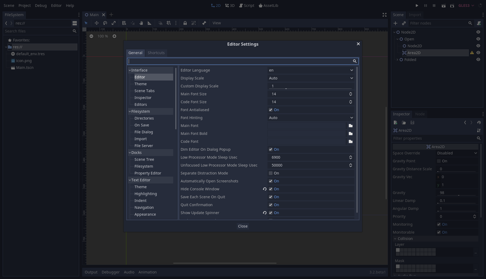
@pycbouh Keep in mind character set support is an important criterion for us, as we'd like the editor to support as many languages as possible (without resorting to too many fallback fonts). I don't know how wide Work Sans' character set is, but it's most likely not as expansive as Noto Sans'. Also, Work Sans tends to look too "stretched" when used as an UI font, so I'm not really convinced anyway. |
|
@Calinou Yes, obviously, we need a font with full character set. I'm not advertising this particular font, this is just what I have found as an interesting alternative among the first 20-30 fonts available from Google and haven't checked if it did support characters beyond ASCII. As to the stretched look, I think it's a matter of familiarity. Current one looks too stretched vertically, given a comparison. It's hard to have a font be smaller vertically and not use extra space horizontally, if we want it to remain readable. |
|
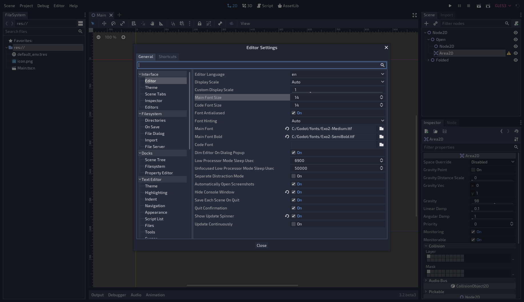
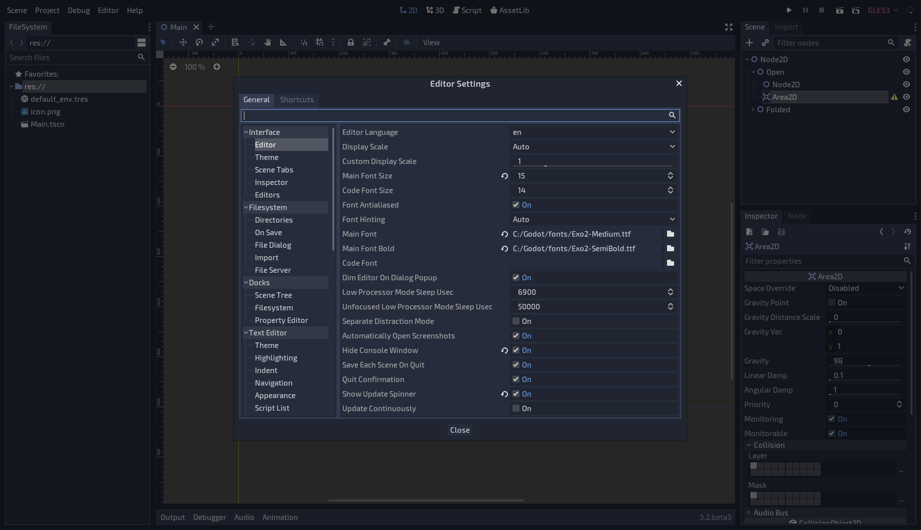
@Calinou Here's another example. Exo 2 looks like a font for a sci-fi game, which may be a turn-off, but even at 15 it allows for more information to be displayed on screen. At 14 it turns less readable IMO, but the amount of space available is enormous compared to Noto Sans. Editor Settings, Exo 2 at size 14 We can all look for a more proper font, but to do so we need to establish, first and foremost, if we indeed see the benefit of changing it. If the maintainer team does not think that the change is needed or is beneficial, at least in principle, then this research is moot. And then we need to formalize requirements for such font, like character set support, font style, preferable dimensions, etc. |
|
I think the main reason why the concept from godotengine/godot#2207 looks visually pleasing is that it gets rid of the boxy outlines everything in Godot has. It also uses round edges for some elements and gets rid of some clutter, like the lines in the scene tree. |
|
@Jummit That's precisely the style I've been using for my Godot editor theme redesign 🙂 |
|
@Jummit Yes, all the current clutter, the unnecessary outlines and borders, the blocky style, make for a unpleasant UI compared to that one. The font then really adds to that, very elegant. I think Godot should try to hide as much as possible the underlying structure that is obviously composed by block shapes, and this can be achieved, as already said, removing lines, rounding a few key UI shapes, highlighting UI elements in a smart and pleasant way and choosing a new coherent font. @Calinou Can we see your progress? |
|
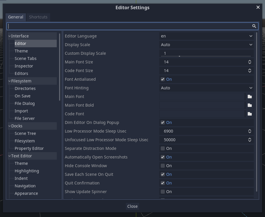
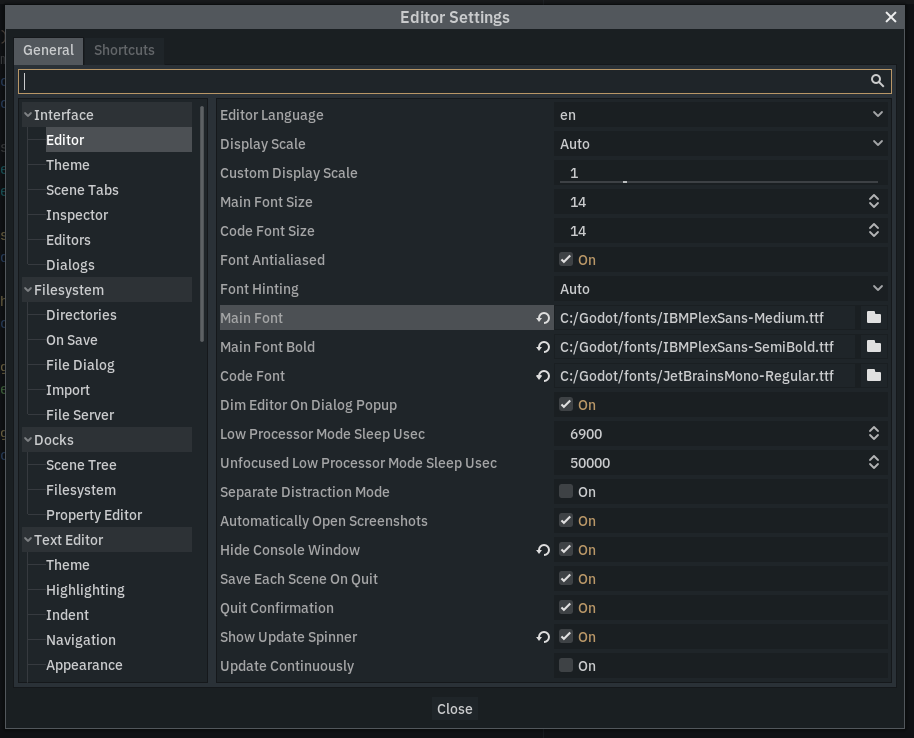
By the way, since we discussed fonts in December I've adapted IBM Plex Sans as my main GUI font for the editor. It does not have a dramatic effect on the editor space, but at medium thickness it looks much easier on the eye. Default Noto Sans It's distributed under SIL OFL and has less glyphs than Noto, but European languages, including Cyrillic alphabet, should be covered. Now, looking at Noto Sans' glyphs in Google Fonts does not feel as bad as it does in the editor. I can think of two things: there is some issue with rendering scaled down fonts in Godot; or Medium does it for me, and Noto does not have a Medium style. While thickness may be subjective and down to one's (bad) eyesight, one of the issues with Noto I can show objectively: look at the "i"s. The dot is almost indistinguishable. And that's how the whole font feels to me. |
|
@samdze I keep the current work-in-progress branch here: https://github.com/Calinou/godot/tree/improve-editor-theme It needs further tweaks to solve some quirks and avoid reducing the screen real estate available.
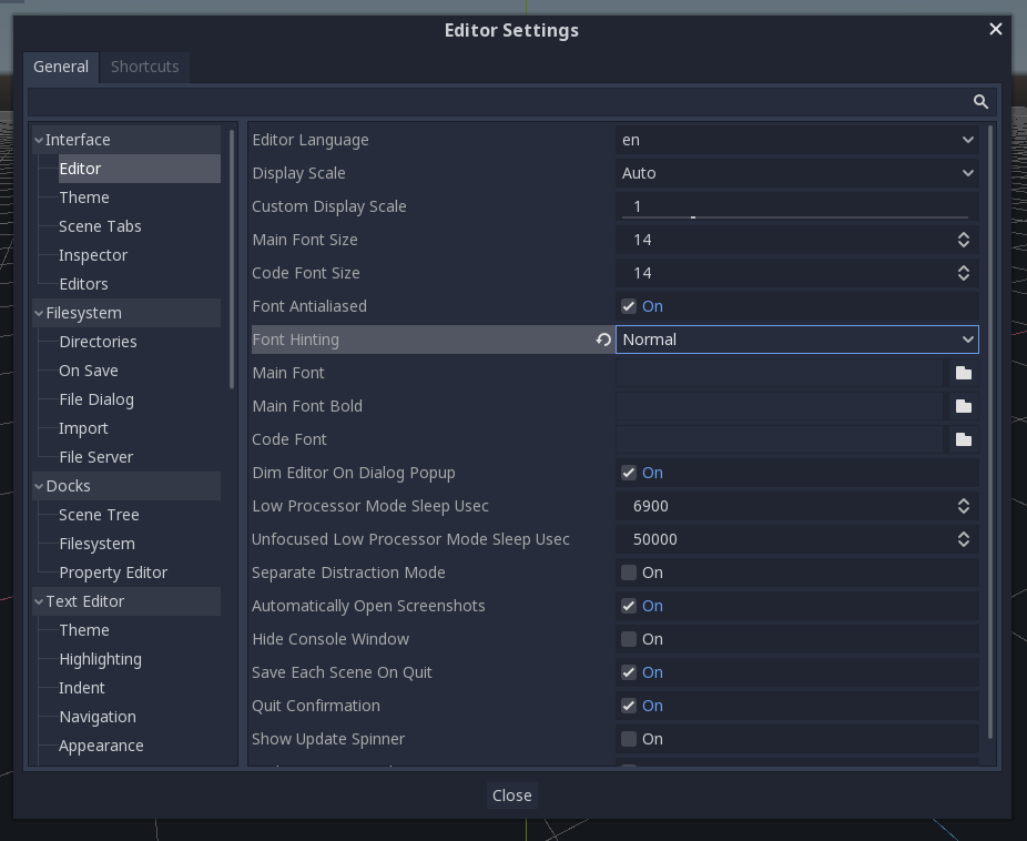
Can you take a screenshot of Noto Sans in your browser at the same size as the default Godot font? This is probably due to different font hinting settings, which you can configure in the Editor Settings (on Editor > Interface). To match the OS' default settings, Godot 3.2 onwards defaults to Light font hinting on Linux and Windows, and None on macOS. Note that in any case, Godot won't perform LCD subpixel optimization. Last time I checked, FreeType supports this, but it's unfortunately difficult to implement in a game engine as you need a specialized blend mode to deal with transparent backgrounds.
It does, it's just not available on Google Fonts 😉 |
Sure. Though I still find that glyphs themselves are easier to read at a glance in case of IBM Plex. Things like a small curve at the bottom of lowercase "l" help me, personally. Changing hinting to "Normal" setting reduces some blurriness in the editor, but letter spacing suffers in some cases. Which is why Medium works for me, I guess. Glyphs just are a bit thicker, which reduces blur from "Light" hinting, while still having a more even spacing. |
|
I think we can decrease the font size and padding a little. But I'm against hiding the setting values just to save space in the width. |
See #2980. |
|
If it's at all possible I think a variable spacing option would probably be the best implementation. I personally prefer the wider spacing though. |
This is already available in 4.3 and later with the Interface > Theme > Spacing Preset editor settings. You can choose between Normal (default), Compact and Spacious. |
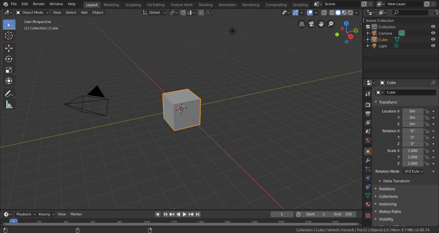
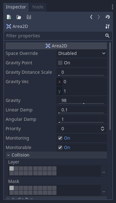
Looking at the blender editor you can see a lot of information that are ready to be used without any scroll. Each section like the inspector or the scene navigation is really detailed since no space is wasted.
Opposed to this the Godot editor uses too much spaces to represent even a checkbox, and this make the editor to look at first glance too spartan and later too uncomfortable. And is easy find yourself scrolling a lot during editor usage.
(Down a comparison)
The fact that Godot editor looks so spartan is due to two main factors in my opinion.
Considering these two factors I think that the first one is good to have and difficult to improve, but the second one is easy to improve and changing is a benefit.
For this reason I want to propose to use a better font like the one used by blender (that is called blender and probably is OS) and then match the same font size used in blender.
Thanks to this change we may improve the look and feel of the editor a lot.
Some measurements:
The text was updated successfully, but these errors were encountered: