Skip to content
New issue

Have a question about this project? Sign up for a free GitHub account to open an issue and contact its maintainers and the community.

By clicking “Sign up for GitHub”, you agree to our terms of service and privacy statement. We’ll occasionally send you account related emails.

Already on GitHub? Sign in to your account

Improve tab icons in left panel #5920

Merged
merged 2 commits into from
Apr 2, 2019
Merged

Conversation

gnestor
Copy link
Contributor

@gnestor gnestor commented Jan 30, 2019

Fixes #5269

To do:

  • Agree on better icons for left panel tabs
  • Improve icon handling in lab so that icon color doesn't need to be hard-coded in SVGs (I'm going to create a new issue for this)

Here are some ideas:

One variation:

image

Another variation:

image

@ian-r-rose
Copy link
Member

My two cents:

  • I like the play icon for the "Running" tab. Since the panel also serves to shut down sessions, perhaps a play/pause icon?
  • The cog and slider images for the cell tools are a bit confusing, they seem to me like they might open the settings editor. I thought the wrench was okay.
  • The command icons are tough. The '>' icon looks a lot like the play icon, which is confusing. The = icon looks kind of like the icon that is used for @jupyterlab/toc, and doesn't really connote commands to me. I don't know that I have a good suggestion here, though.

@gnestor
Copy link
Contributor Author

gnestor commented Feb 1, 2019

I like the play icon for the "Running" tab. Since the panel also serves to shut down sessions, perhaps a play/pause icon?

Play/pause is a good idea 👍

The cog and slider images for the cell tools are a bit confusing, they seem to me like they might open the settings editor. I thought the wrench was okay.

Looks like there is consensus here...

The command icons are tough. The '>' icon looks a lot like the play icon, which is confusing. The = icon looks kind of like the icon that is used for @jupyterlab/toc, and doesn't really connote commands to me. I don't know that I have a good suggestion here, though.

This is tough...

@t-makaro
Copy link

t-makaro commented Feb 4, 2019

I like the idea of play/pause much better than just a play button, but since one can only see and shutdown stuff from the running panel, and not pause/resume it doesn't make total sense. I still like the idea of a power icon, but what about a stop icon?

@gnestor
Copy link
Contributor Author

gnestor commented Feb 4, 2019

I like stop but the material icon for stop is just a square: https://material.io/tools/icons/?search=stop&icon=stop&style=baseline

@mangecoeur
Copy link

Nice! Some suggestions:

To avoid confusion with the play/pause button and the console why not use one in a circle:

iconfinder_ic_play_circle_outline_48px_352074

And/or use a double-chevron for the command palette

64x64

@jasongrout
Copy link
Contributor

A double Chevron also reminds me of a command prompt, which is close to commands in my mind.

@t-makaro
Copy link

For the running (shutdown/stop menu), we could use a stop icon in a circle:
image from here

Just spit balling:

For the command palette:

how about this superpowers icon? The command palette is a place of super powers...
image

On that same theme: a wand
image

I was also think about a "remote" icon, but I can't find a nice one that doesn't look like it is sending a signal.

Maybe the adjust icon
image

@gnestor
Copy link
Contributor Author

gnestor commented Feb 15, 2019

@t-makaro We're currently using Material Icons so let's look for icon candidates in that set vs. Font Awesome 👍

I like the remote control icon for command palette but Material Icons' version is not the best...

I updated the description with suggetions from here and #5269.

@ellisonbg ellisonbg self-requested a review February 25, 2019 05:09
@ellisonbg
Copy link
Contributor

I will have a look at this and give some background on how the existing icons were chosen.

@ellisonbg
Copy link
Contributor

Catching up...

  • Last summer, we really struggled with the command palette icon. We probably spent 20-30 hours on it. The challenge is that our notion of a "command" is very abstract, and all our attempts to find an icon to represent a command, were too concrete and misleading (too focused on a particular type of action, like code). The idea of the palette was that "here is a set of things you can use in your work." But I agree the palette icon doesn't have a connotation of being somehow related to visual effect or color. I will look through the MD icons again, but this one is really tough.
  • For the running panel. I like the ideas being explored here, with some combination of a play or stop button, but a circle around it. The idea I probably like the best is a stop button with a circle around it - as it best matches the action you can take in the panel. I didn't see it in the MD icon set, but we can create it manually with little effort in Figma is there is support for the idea.
  • I think we should leave the others as is (cell tools, etc.)

@gnestor gnestor force-pushed the issue-5269 branch 2 times, most recently from 05d4f8f to 11b60a1 Compare March 8, 2019 01:49
@gnestor
Copy link
Contributor Author

gnestor commented Mar 8, 2019

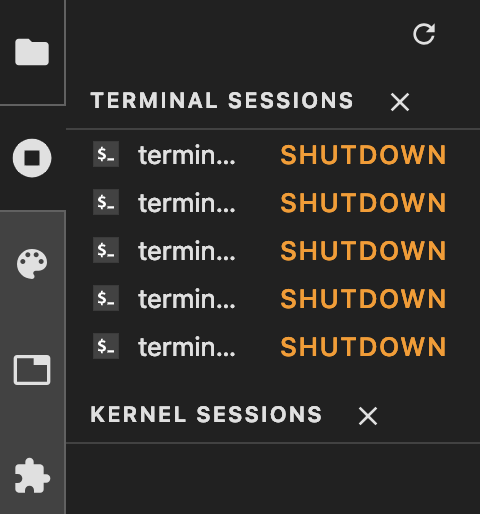
I've updated this branch so that it only changes the running icon. We can iterate on other sidebar icons.

We have 2 options, the current branch is using "stop circle" icon.

Stop circle icon:
image

Remove circle icon:
image

@gnestor gnestor changed the title [WIP] Improve tab icons in left panel Improve tab icons in left panel Mar 8, 2019
@jasongrout
Copy link
Contributor

Is there still more to do on this PR? I notice the WIP in the title was removed.

@gnestor
Copy link
Contributor Author

gnestor commented Mar 19, 2019

This current branch replaces the running icon with the stop circle icon (which seems like an improvement to me). It's ready to merge 👍

@jasongrout
Copy link
Contributor

Thanks. It seems that there is confusion in the final changes between remove-circle and stop-circle. Can we take out the remove-circle icon if we aren't using it, and change all the wording to stop-circle?

@gnestor gnestor force-pushed the issue-5269 branch 3 times, most recently from 9ae7dcf to 99deb0a Compare March 25, 2019 06:16
@afshin afshin requested a review from jasongrout March 27, 2019 17:21
@afshin afshin requested a review from tgeorgeux March 27, 2019 17:21
@ian-r-rose
Copy link
Member

Can we also remove the CSS classes and SVGs for the "running person" icon?

@ian-r-rose
Copy link
Member

Otherwise, I think we should move forwards with this.

@gnestor
Copy link
Contributor Author

gnestor commented Apr 1, 2019

Done!

@jasongrout jasongrout merged commit e20c5bc into jupyterlab:master Apr 2, 2019
@jasongrout
Copy link
Contributor

Thanks!

@gnestor gnestor deleted the issue-5269 branch April 2, 2019 14:46
@lock lock bot added the status:resolved-locked Closed issues are locked after 30 days inactivity. Please open a new issue for related discussion. label Aug 7, 2019
@lock lock bot locked as resolved and limited conversation to collaborators Aug 7, 2019
Sign up for free to subscribe to this conversation on GitHub. Already have an account? Sign in.
Labels
pkg:themes status:resolved-locked Closed issues are locked after 30 days inactivity. Please open a new issue for related discussion. tag:Design and UX tag:Pre-Release
Projects
None yet
Development

Successfully merging this pull request may close these issues.

UX: Sidebar icons improvements
7 participants