-
Notifications
You must be signed in to change notification settings - Fork 10
April22
- OctaneGUI
- Application
- Icons
- ScrollBar
- Overview
- ScrollableViewControl
- Separator
- Splitter
- Table
- TextInput
- Timers
- Tools
- Tree
- Unit Tests
Here are a list of updates made during the month of April. Big improvements have been made to existing controls as well as adding a few new controls.


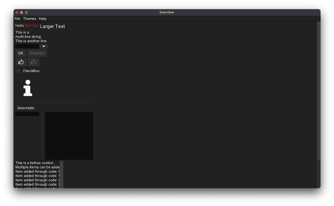
The project has been renamed from OctaneUI to OctaneGUI. This is to help with naming consistencies with other GUI libraries when referring to this project. The standard term used to describe libraries like this is 'Graphical User Interface' instead of 'User Interface'.
The json used to define the application properties can now specify a theme to load. This is achieved through the 'Theme' property. This property can either be a string to refer to a file name or can be an object that defines the theme inline.
The following icons have been added.
- ArrowLeft
- ArrowUp
- Collapse
- Expand
- Minus
- Plus
![]()
This control has been converted to be a container. This is to split the button behavior for the handle and the up/down/left/right buttons.
ScrollBars now have a theme property 'ScrollBar_AlwaysPaint' (Boolean) to always paint the scroll bars even if the contents fit within the parent container. This is used for the 'Classic' theme, which resembles scroll bars found in the classic Windows 95 operating system. If the contents fit within the scrollable size, then no handle is painted. No interaction can occur with the scroll bar.

A new theme property 'ScrollBar_Buttons' (Boolean) has been added to paint up/down/left/right buttons. This is used for the 'Classic' theme to resemble scroll bars with buttons found in the Windows 95 operating system. The buttons will only be enabled if the contents of the container exceeds the size of the container.

This app now supports loading different themes through the command-line. This is achieved with the '--theme [NAME]' option with name being the file name without the extension.
New container added as a utility to help controls which has contents that can be scrolled into view. This contains a single child, the ScrollableContainer. The ScrollableViewControl does not alter it's position where as the ScrollableContainer does to manage what contents are scrolled into view. The ListBox and TextInput controls inherit from this container.
Vertical separators are now supported. The orientation can be defined through the JSON property 'Orientation', which can either be 'Horiztonal' or 'Vertical'.
Control that provides two containers split either horizontally or vertically. The separator between the two containers can be moved to grow/shrink either container to display more in one than the other.

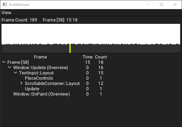
Container to allow controls be placed in columns. The container has a header that can display labels for each column. This is a very early concept so a lot of features are not implemented and proper scrolling of the contents minus the header is not supported. These features will be looking into in the coming updates. An example usage of this can be seen in the Profiler window below.
Several improvements have been made to this control. Along with the items listed below, the paste command with Ctrl-V is now supported.
The cursor for a focused TextInput control now blinks using a Timer object to manage the behavior.

All strings are now stored as UTF-32 strings so that non-ASCII characters can be rendered from the font texture. Font improvements had to be made in order to support rendering the bitmaps from the extended character ranges. By default, all fonts only load the Basic Latin and the Latin 1 Supplement character ranges. A system to define what ranges to load will be implemented in future updates.

Timer objects have been introduced to the library. The Window class provides an API to create, start, and clear timers. Each Window object manages the lifetime of these timers and will invoke the supplied callback when the timer has elapsed its desired time. The interval supplied should be given in milliseconds and there is an option for the timer to repeat. An example usage of this can be seen with the blinking cursor timer found in the TextInput control.
The concept of Tools have been introduced to contain controls that aid in debugging various aspects of the library. By default, these controls are not compiled with the library. To enable, -DTOOLS=ON must be passed into CMake when generating the project.
The command palette is a tool that can be opened with the Ctrl+P key combination. This opens an input box which is used to execute commands. This aids in opening other tools or other debugging utilities. Currently, this can only be opened in the main window. Future updates will support openeing in any window.

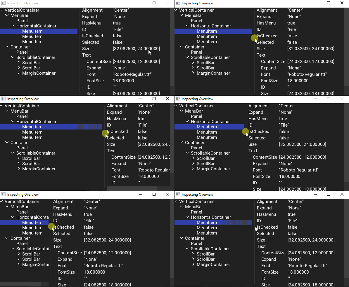
Tool used to view the controls of the main window in a tree structure. Selecting a control in the tree view will display a list of properties associated with the control in the right panel. Due to the restriction with the command palette, only the main window can be inspected.

Tool to display the stats gathered in a profiled run. The tool is made up of two containers. The top container displays a bar graph showing either the total frame time of each update, or the total event count. The bottom container shows a tree of the currently selected frame. The tree is the list of events that can be expanded and each tree row dispays its frame time and event count. This can be used to drill down and find problematic areas of a single frame.
To generate a profiled run, typing in 'profiler e' or 'profiler enable' will start the run and 'profiler d' or 'profiler disable' will disable the enabled run. When the run is disabled, the profiler window will be displayed with the generated stats.
Only a few samples have been implemented. Future updates will include more samples for a more robust profile.

Container used to display the list of objects in a JSON object or array. An example usage of this container can be found in the Inspector tool.
Tool that shows a list of loaded textures in the left container. The selected texture is shown in the right container. All textures in the TextureCache object are added along with all loaded fonts and the Icons texture.
This tool can be opened with the 'textureviewer' or 'tv' command in the command palette.

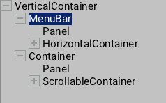
Control to show a hierarchy of items has been added. Each root element of the hierarchy can be collapsed or expanded which may hide or display its child items. If the element contains no children, then no icon to expand/collapse is displayed. This is similar to how Tree controls work found in other GUI frameworks.
Each element in the hierarchy can be selected and callbacks are provided when a selection change occurs.
The icons used for the Expand/Collapse toggle changes based on the theme. The 'Dark' theme uses a right/down arrow icons while the 'Classic' theme uses a plus/minus icons.


A ComboBox test has been added. This test checks the open and selection behavior.